Pie Chart
Pie charts are an effective way to show different parts of a whole. A simple comparison is data that adds up to 100. So if 100 students were surveyed about their favorite subject this data could be transferred into a visually appealing and easy. to understand pie chart.
I found data about the many different degrees people received in 2019. The 5 most popular were highlighted in the chart and to complete the whole survey I used “other” to represent the many degrees people had earned.

Lollipop Chart
A lollipop chart is useful for showing specific data, that is not a range of information. When looking at the chart it brings the readers eye directly to the significant data point. Other types of charts or graphs show ranges of information, but a lollipop chart is perfect for few numbers that are compared to each other.
Data Comparisons- Climate
As the winter months are quickly approaching climate change begins to appear more in many environmental spaces. The projection of the weather this season will be interesting to hear about, as each year the changes are becoming more and more drastic. Not only are the winter months getting colder, but the summer months are only getting hotter. CNN’s, Jen Christensen, wrote the article “With climate change what will your city’s climate feel like in 60 years?”.
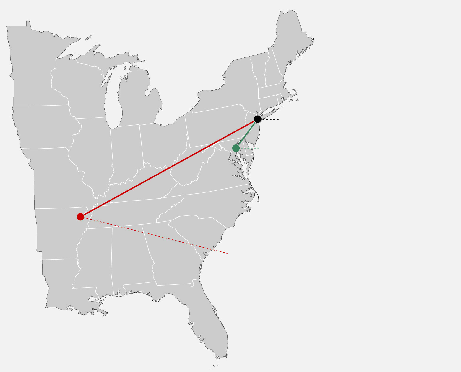
The data in the image uses segments to connect the cities in which NYC will feel like in the future. This helps the audience understand how climate is changing by comparing climate of other places. If the author simply wrote that NYC would be 10 degrees hotter in 2080, that may be frightening. When it is compared to a city that already exists and people live in it brings it down to a simple, easily understood level. The images use simple, bold colored line segments to show a clear connection, and dotted lines of the same color to explain the data with a caption.


Podcast: Play in new window | Download
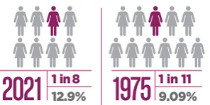
Comparing Numbers
When studying data and analyzing numbers, they can become overwhelming and lose their significance. When numbers are compared the perspective of the data changes giving information more meaning, or less meaning. October is breast cancer awareness month, so many statistics are shared to bring awareness to how many people are diagnosed with cancer. When larger statistics at a larger scale are used it is easier to see how many people are effected by breast cancer. “About 1 in 8 U.S. women (about 13%) will develop invasive breast cancer over the course of her lifetime” (breast cancer.org, 2021). This statistic alone is meaningful and easily recognized as significant. Then when a second statistic is added, the data becomes even more shocking. “Breast cancer became the most common cancer globally as of 2021, accounting for 12% of all new annual cancer cases worldwide, according to the World Health Organization” (breast cancer.org, 2021).
https://www.cancer.org/cancer/breast-cancer/about/how-common-is-breast-cancer.html
INFOGRAPHICS
Infographics are used everyday to visualize information, and give a deeper understanding to data or statistics. By seeing numbers and data, and being able to look at graphs, number and statistics can be easily compared and understood. Infographics are beneficial to use in classrooms, corporate jobs, social media, news outlets, newspapers, anywhere people can access quick information.
“We need relative figures that are connected to other data, so we can see a fuller picture, and then that can lead to us changing our perspective.”
David McCandless, The Beauty of Data Visualization (2010)
Recent Comments