Benchmark
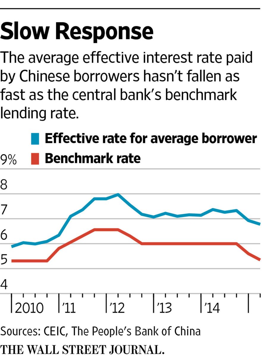
This is a graph from the wall street journal showing the effective rate vs the benchmark rate. We can clearly see that the effective rate is not meeting the benchmark rate.

I also feel like this is another good example because it shows the benchmark as the x axis
Visual Benchmark Comparisons
Benchmark comparisons are some of the most important visualizations used in everyday applications. Some of these applications include business sales performance, educational performance, and investment analyses. Regardless of the situation, all benchmarks are used to show a comparison that allows the viewer to make a conclusion such as under or over performing.
Investing Applications
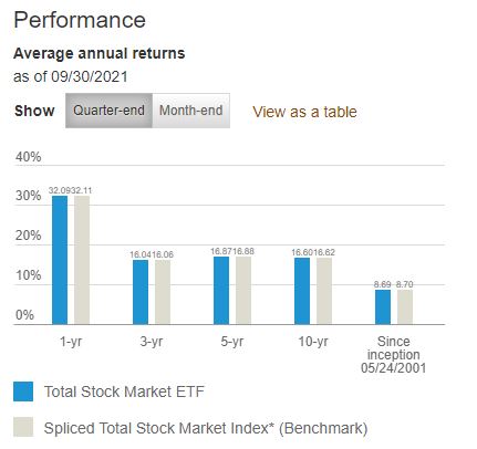
One real world example of a benchmark comparison is in investment analyses or stock performance graphs. As available from Vanguard.com, they have a performance graph that compares the average annual returns of their Total Stock Market ETF (VTI) with a benchmark Spliced Total Stock Market Index across multiple chunks of time. In this case, they used a bar graph to visualize the difference where the data of interest is highlighted in a vibrant blue color and the benchmark is in a less distracting grey shade.
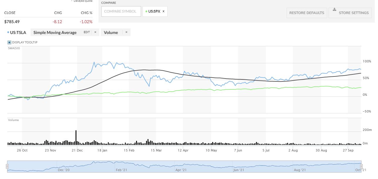
Another investment application is in the performance comparison graph between Tesla (TSLA) and the S&P 500 (SPX) from MarketWatch.com This graph is more complicated but it has a greater difference between the two that gives the viewer a better visualization of which one had a greater performance.
In this case, MarketWatch outlines Tesla’s stock price performance in blue while the price performance of the S&P 500 is in a vibrant green color. As seen in the graph, Tesla clearly outperformed the S&P 500 by a wide margin in the past year but it was much more volatile throughout the year.
Other Applications
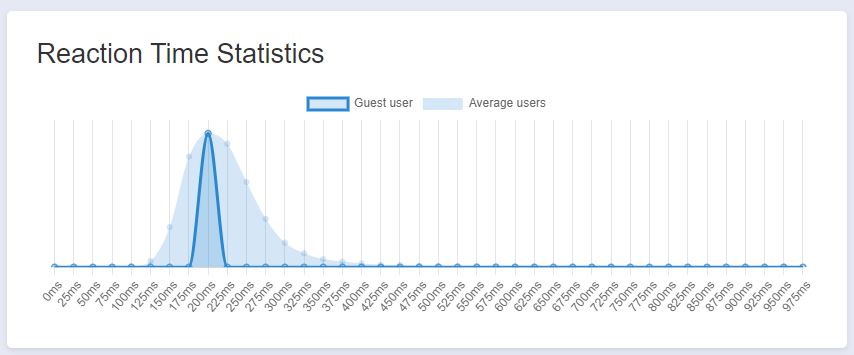
Another application of benchmark comparisons is with performance of bodily functions such as reaction time. There are various websites that have reaction time tests and will provide statistics based on a user’s results. The website I used is HumanBenchmark.com where I scored an average reaction time of 203 ms. The graph that is generated shows your score highlighted in a dark blue with the average of all other users in a lighter blue. Based on the graph, my score was almost directly in the middle of the bell curve that seems to be skewed to the right. I can conclude that my reaction time is right around average compared to other users.
Benchmarking Displayed in NYT Article
New York Times Company (The) Net Promoter Score 2021 Benchmarks | Customer.guru
In this article by the New York Times, there is a graph depicted that entitled “Net Promoter Score for Top Brands Compared with New York Times Company. The way that they benchmark is not only with the change in direction in which the data is facing, but there is a dark shaded dot on the graph to put emphasis on the data change.
Visualizing Benchmark
Identifying areas of improvement and understand the performance of the company is also done when showing comparison benchmarks using data visualization. Using comparisons benchmark helps with determining the best possible strategies and take advantage of where to gain competitive advantage.
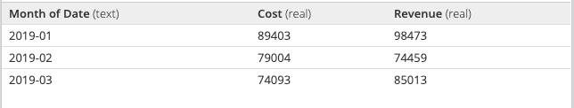
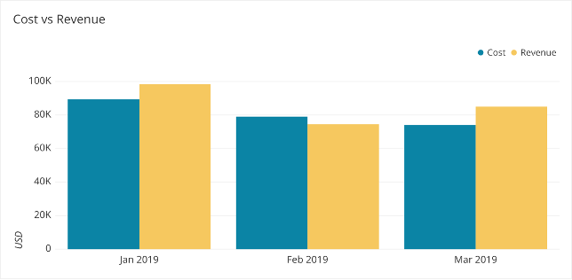
As discussed on The Data School.com, there are ways to find the best the visualizations for your metrics, and showing comparison effectively. With a bar graph, assisting in determining when revenue is greater than cost or how much revenue differs across months. It is easier to compare with Data Visualizations, than just numbers. Understanding the data is easier after being placed in a visual context.

Which is easier to understand?
1 OR 2
1.
2.
The Data School discusses the best way to visualize your numbers, and how creating these data visualizations for the decision makers to determine future operations is very beneficial for companies. When there are different goals or benchmarks for each category, you can use a combo chart or the many different combinations to represent the information best.
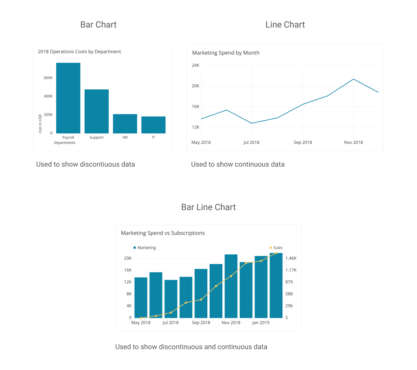
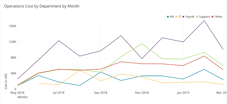
Showing comparison to meet expectations for future, the most direct method for adding comparison on your graph is using a line. This works especially well when all the data share the same comparison point or goal. For example, operation cost by departments in the following data visualization. Including different colors and comparison give the audience a better insight on performance, and this specific charts shows operations costs per month by departments assisting in decisions in future operation costs in multiple departments.
THE DATA SCHOOL : FIND THE BEST VISUALIZATION FOR YOUR METRICS
Benchmark Comparison
There are many different ways to make benchmark comparisons in data visualizations, its really all about the creators preference. The most common and easiest from what I’ve seen is using a consistent color for all the data points except for the one that the main focal point of the comparison. This is to ensure that that stands out to the viewers compared to the other data in the visualization. The better a data entry stands out in relation to the rest of the data set makes it easier for the view to distinguish what is trying to be compared a long with the message that is trying to be conveyed to them.
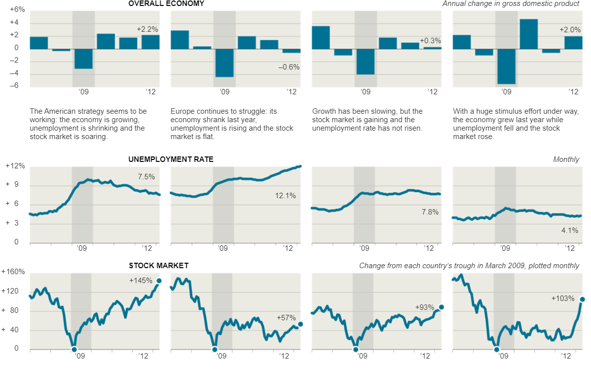
For example, take the visualizations that were displayed in the New York Times article, Three Measures of Central Banks’ Effectiveness. Here they were showing the effects of the financial and economic crisis of 2008 and 2009. In their visualization they placed a light grey highlight around the 2009 column to create a greater contrast to the other bars in the visualizations to let the viewers know this is the year that we are focusing on in relation to the others. This is effective because open viewing the visualization my eyes were immediately drawn to it.
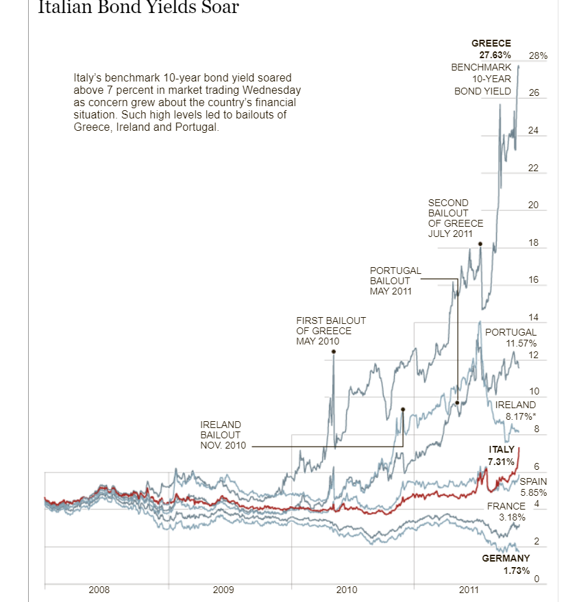
Furthermore, the Italian Bond Yields Soar visualization in the New York Times uses the same technique of changing colors in their crowded line graph in order to make the line they want to compare the data to stand out. The visualization keeps every line a consistent shade while using a darker red color on the Italian Bond line to make it stand out against all of the light grey lines allowing the viewers to easily follow and compare the Italian Bond to the others when comparing the growth rates.
Benchmark Comparisons in News and Other Media
Displaying performance through a benchmark gives context to data and shows how well they meet expectations. Often displayed as simple graphs, it is no wonder that they accompany news articles, a place where ease of comprehension is paramount.
In an article from 2018, Drew DeSilver from the Pew Research Center examined the purchasing power of the average wage throughout the past five decades. DeSilver used text to describe the statistics and their implications. Additionally, he included a graph that compares the dollar amount to its equivalence in 2018.
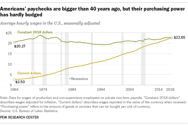
… today’s real average wage (that is, the wage after accounting for inflation) has about the same purchasing power it did 40 years ago. And what wage gains there have been have mostly flowed to the highest-paid tier of workers.
Drew DeSilver, Pew Research Center, August 7. 2018
Though incidental, this graph sees the line for “Constant 2018 dollars” acting as an average or standard, both potential facets of focus Stephanie DH. Evergreen describes in Effective Data Visualization. Through it, the audience can see how the two values compare and their trends: whereas “Constant 2018 dollars” has, indeed, remained relatively constant since 1964, “Current dollars” has continuously grown, narrowing the gap to a point.
Other examples can be more cut-and-dry. Isaiah Mitchell reported on end-of-year exam results for Texan public schools in a 2021 article. The report included several graphs, most of which compared grade averages in Texas to their national counterparts.

The data is self-explanatory, a testament to how well it is suited to the graphic. It is clear to see the progression of both averages and the overall decline in Texas’ marks.
Comparisons to a benchmark are not exclusive to news articles, however. An example that might be more familiar to students, in particular, might be their results of standardized tests.
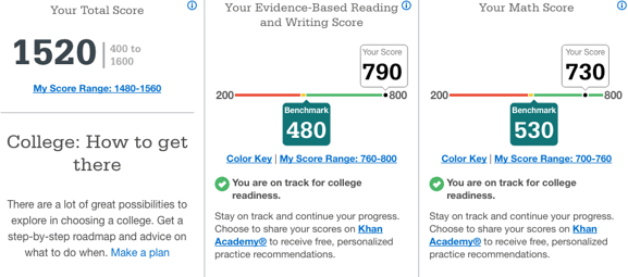
Here, the comparison is more obvious. The graphic takes the liberty of even labeling the benchmark for both areas that were tested. This makes it even easier for the viewer to determine how well they fared relative to what is deemed “on track for college readiness”. In Effective Data Visualization, this style best reflects a “bullet graph” (page 105). There are distinct acceptable and unacceptable areas, a target line (seen here as the transition from yellow to green), and the actual value depicted as a dot.
Though their forms may vary greatly, the purpose benchmarks serve is the same. As evergreen put it, their stories “… help a reader to determine whether performance was good, bad, or close to the mark,” (page 91). They offer necessary information for an audience and gives a data set an easy-to-understand meaning. As previous examples showed, complex, sometimes convoluted information can be well displayed through a benchmark.
Social Media Brand BenchMark Comparisons
These are three benchmark data visuals below that discuss the same idea. Each one presents statistics around advertisements, marketers, brands, etc, however, they all are presented in different ways.

For example, the very first one displays several kind of content brands use to reach out to consumers. Videos, emails, and more are the categories that are shaded in different colors with different percents, since brands may use on for the other or even multiple. Overall, the main discovery of this benchmark is how videos help brands get their idea/products seen and sold out to the world.
Marketing for Social Media

Now, the second benchmark also has numerous categories catered to a similar idea, which is the ways marketing on social media can help. The top is increased exposure of the business, but what is different in compared to the last is the 3D model. Not to mention, this benchmark inserted the percent(%) throughout the grid to help viewers read the numbers and compare the numbers easier.

As for the last set of data, this one separated the age groups along with genders for who uses social media for brand research. Here we just have two colors, the red and the orange, that separate females and males, all in 5 age ranges. Viewers can notice the drop in social media brand research the older people get, as well as the usual audience of each group, asides from ages 55-64, being females. The data labels are also put above the benchmarks throughout, which is another way each of these graphs differ from one another. In conclusion, there are various ways to construct and/or explain topics in the form of a benchmark, even with little changes to the color, labels, angles, etc.
Comparison Chart Builders
Piktochart
URL: https://piktochart.com/features/comparison-chart-maker/
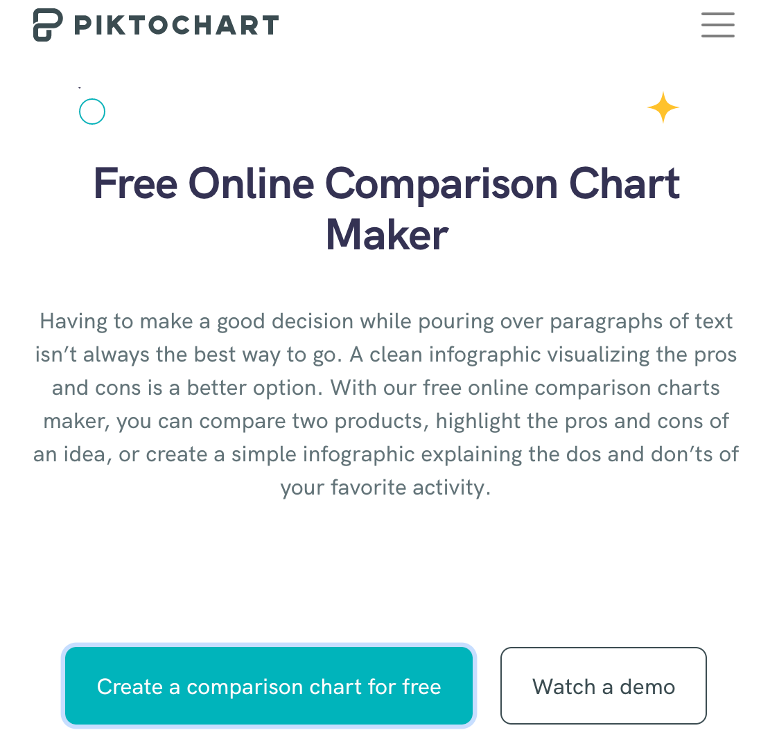
Piktochart is a free comparison chart making website for the basic user. In order to access their templates, the user must already have an account through Google or by simply signing up for free. By creating an account, the user is given a folder to store their creations which is useful for later editing and storage. The website offers demos to the user to help format their data to their benefit for a more efficient comparison.
Adobe
URL: https://www.adobe.com/express/create/chart/comparative
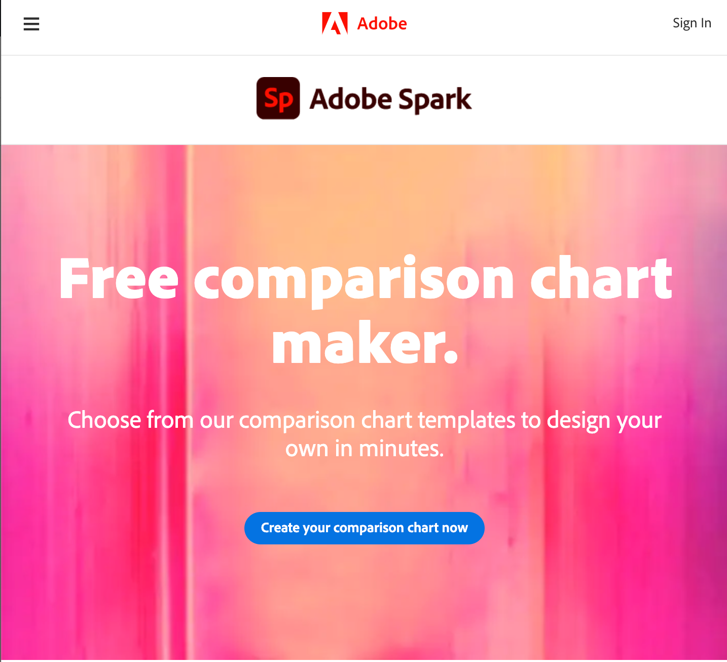
Adobe Spark is another free comparison chart making website. Adobe is a trustworthy computer design company that has put out many other editing programs i.e. photoshop, acrobat, and animator. The user can sign up through Google, Facebook, or any email. It also allows schools to set up student accounts for school assignments and projects. Adobe offers a more customizable and free range interface as it requires more creativity from the user and how they want to present their data to the viewer.
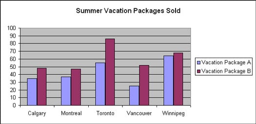
Comparing Numbers
One of the best methods to compare numbers/data is a bar graph. They are bars that are used in vertical or horizontal form to represent numbers/data. The length of the bar is used to display the value and the color of the bar is used to label what the number is representing. Bar graphs are the best and simplest way to represent and compare data among different groups easily. Bar graphs can show the major changes in numbers and values in data over time.

Comparing Numbers
www.dummies.com/education/math/basic-math/compare-numbers-using-a-bar-graph/
This graph does a good job of comparing two different vacation packages from the same company. Here we can compare the companies sales from their different Canada offices. Something like this would be used as a way for a company to improve itself, and the bar graph is good for visualizing the data.
Recent Comments