The Use of A Pivot Table
What is a Pivot Table?
Excel has a neat feature to input different values into one data set called a pivot table. A pivot table can allow you to then make calculations, comparisons, and trends from a large set. Accountants, Data Analysts, and managers of a product/service are occupational examples that may use a pivot table.
Examples
Below is an example of a pivot table in Excel, most likely based upon produce stock.
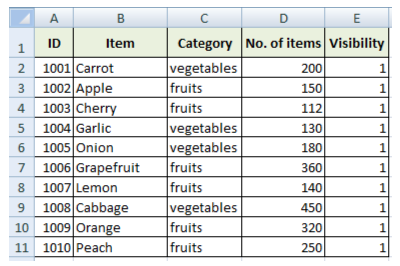
As you can see, there are multiple different categories highlighted in green, which include; ID number, item, type of produce, etc. This is a perfect example of a data set consisting of significant, organized values. Here is another example of a pivot table with an addition to interval of time category.
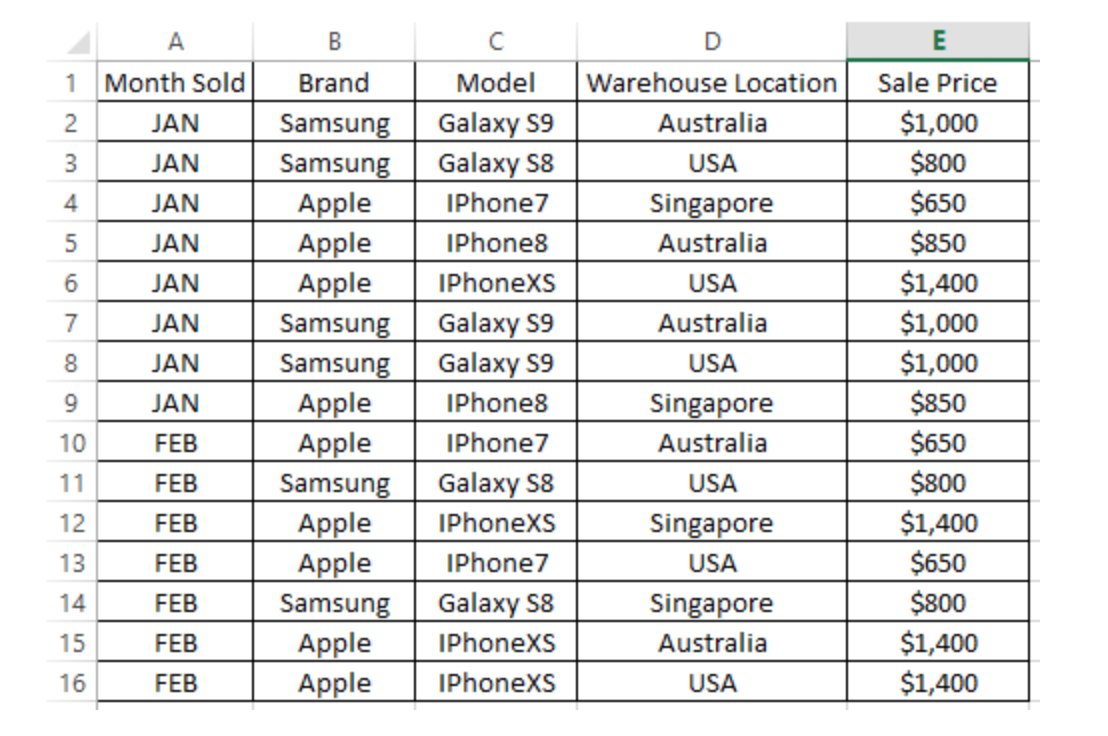
This example is based off two kinds of phones from two different brands. Throughout months of sales for these kinds of phone, plus in different locations, compares then the sales price. Notice how each row breaks down key components for this data example. People are able to compare maybe the prices amongst the different warehouse locations or maybe the Apple IPhone7 sold in U.S from Jan-Feb. Therefore, the business can make an analysis on future sales and/or adjustments to reach success and productivity.
Link to Create Your Own Pivot Table
Blog Post on Sankey Visualizations
What are Sankey Visualizations?
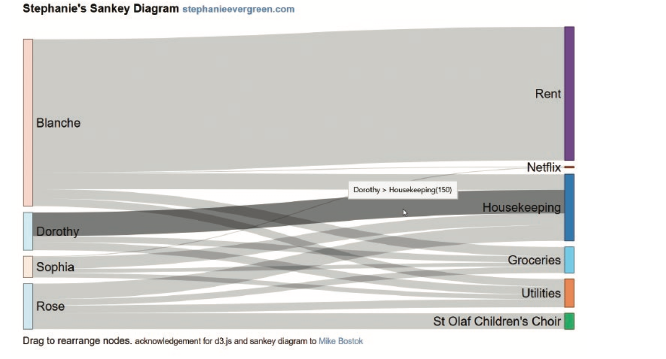
According to our text book, Effective Data Visualizations, Sankey visualizations are used to depict a flow throughout different stations over time. The author denotes how these diagrams capture flow from one point to another, and the thickness of those lines represent quantity. Here is the authors example in the text book for a better insight:
Essentially, these visuals are best used when there are multiple categories between multiple groups, as well as comparing time periods.
Website Review About Sankey Visualizations
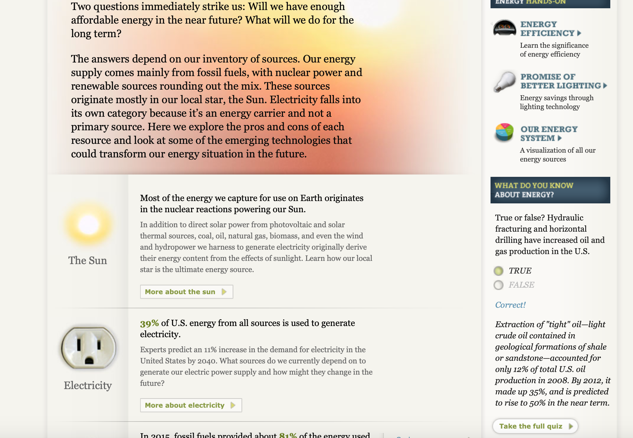
What is another example in the real world that would use this type of visual? There is a website that discusses important and interesting information on energy. The title literally being What You Need To Know About Energy, link here: http://needtoknow.nas.edu/energy/interactive/our-energy-system/. The website is nicely organized with several pages, divided into different objectives on energy. The link will bring you right to a section called Our Energy System, which is where the Sankey Visualizations are demonstrated. Below is an image from the site of a Sankey Visualization
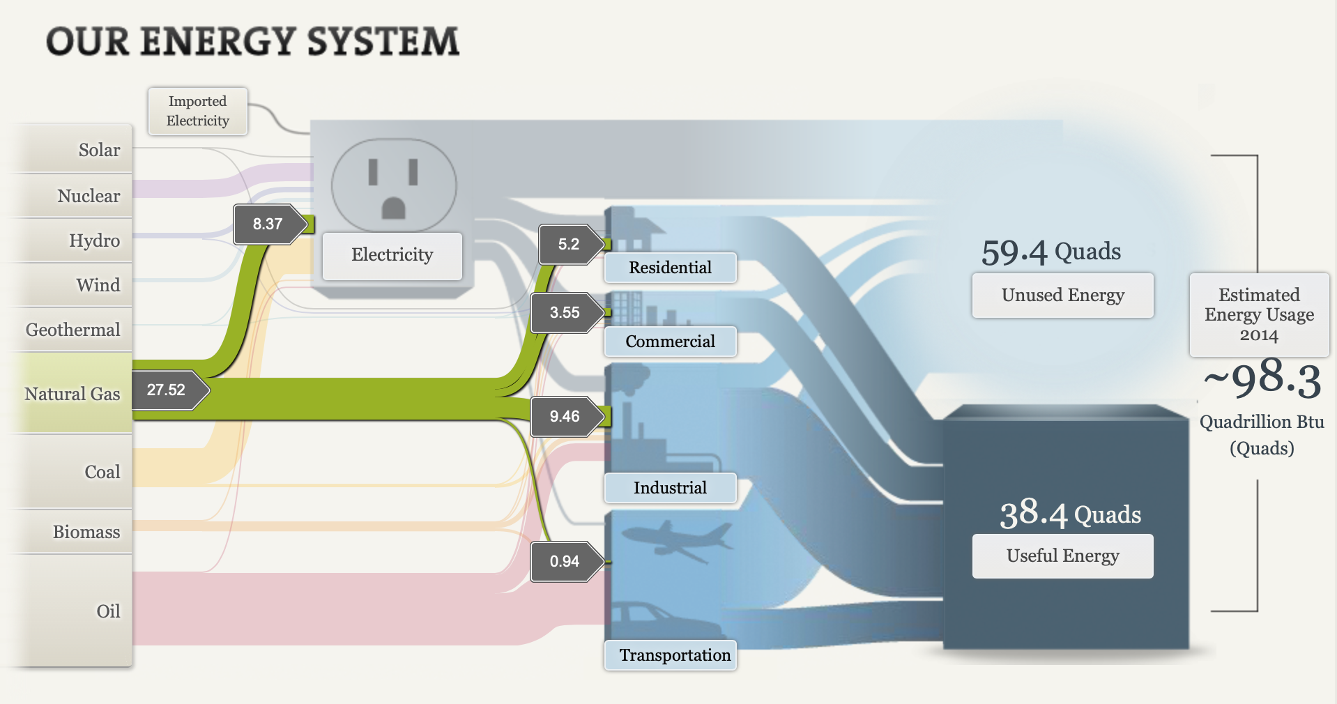
Notice: As you select one of the many categories, Natural Gas selected in this image, it guides you through its process. Those numbers in the gray boxes throughout represent number of quads, traveling along each area’s usage. Though this data was captured back in 2014, the Sankey diagram was a great tool for this example. It certainly captures the flow from one area to another, plus in a very neat way by clicking on different groups and highlighting its path. Not to mention, the website also provides other neat information on different pages, like seen here:
Personally, I like the way they designed the pages with visuals on the side and other information/quiz question on the side panel.
Conclusion
After going over the definition of a Sankey Visual in our text book, it is easier to acknowledge why the website chose that diagram. Overall, the website reviewed in this post helps better explain an idea the world uses everyday in the form of a Sankey diagram. The site also provides other useful facts and statistics throughout to learn more about. There’s bound to be other ways to implement this kind of visualization, so share other every day ideas that would make a great example for a Sankey Visualization down below!
References:
- ISBN: 9781071811832
Breaking Down Budgeting
Intro
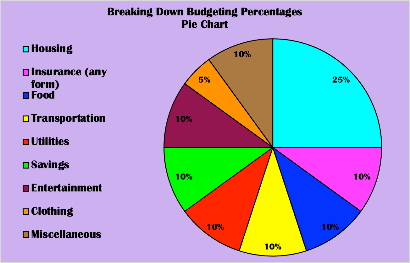
Who plans on living on their own or with someone in the next 5 years? Hey, maybe you currently are, in which you understand how important it is to plan your monthly expenditure. Since just about every home owner will have to put down their expenses, it may come off as a bit of a challenge for some. Every penny counts because one costly purchase can make a huge difference int he end. Not only do home owners have to worry about this organizational process, but so do business owners in order to successfully survive. Honestly, every individual who acquires any amount of cash is in their own way of budgeting. Thus, budgeting is vital and breaking down each percent spent on each category matters. Below is a helpful pie chart that separates each payment category you will have to contribute throughout the month, typically based on your payment period as an adult.
About Pie Chart And Why a Pie Chart is the Best Visual
This information constructed as a pie chart is the perfect chart to use because these expenses count as a whole. Each percent included will total your overall expenditures, which clearly is 100%. The bright colors of the rainbow, which I incorporated on the pie chart, help decipher each category, as well as the labels along the side. The elements that make up the chart are conveniently situated to want to discover a basic yet important topic. The pie chart is manageable to comprehend useful percent divisions for the future. Who knows, you could learn about your spending habits, perhaps even what you may have to give up. The website that the data was gathered on also discusses tips to remember such as; added taxes, staying realistic, and so on.
Summary
Yes, adulting is tough, however, it can be easier to get through the hardships with this given guideline. Owners of any kind will value this guidance in the form of a pie chart. It’s visually interesting, encouraging, and critical. Well, what are you waiting for? Start budgeting or start preparing to budget because each category listed above will be part of your life years to come.
About The Lollipop Chart
About Lollipop Chart
What is a lollipop chart you may ask? A lollipop chart is very similar to a bar chart, except there is a line and a dot at the end. It is shaped just like a lollipop stick with the percent near and/or in the dot.
My Lollipop Chart
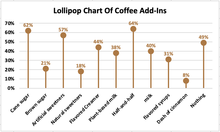
Now I decided to design my own lollipop chart referencing my favorite drink: coffee. I thought why not list all the options people may put in their cup of coffee, which are all common add-ins everyone sees on the basis in any coffee shop, cafe, etc. Then, going by general assumptions of the population/respondents, I filled in the percentages of each category. What viewers can acknowledge from just glimpsing at this lollipop chart is how half-and-half ranks highest compared to a dash of cinnamon which ranks lowest out of the bunch.
Other Ways to Use a Lollipop Chart
Asides from collecting the ranks, this data/layout may also help companies with their inventory and/or revenue. For instance, say this data actually came from a local coffee shop. The owners will be able to keep up with purchasing either less or more of the item, based on the categories’ percentages. An extra supply of half-and-half, cane sugar, and even artificial sweeteners is important if they want to leave their customers happy. Another way lollipop charts aid companies is by getting to know their customer’s tastes and preferences. That way, the business can stay on top of the most/least popular choices and can stay on top of creating new ideas/ways to make old/new customers purchase more
Summary
In conclusion, a lollipop chart is a bar chart, just with a dot on the end that looks exactly like a lollipop. These charts can be easily read and be easily used in business, surveys, and more. They are important for inventory, consumer’s preferences, and to expand opportunity in the business’s name. My example I made especially shows and helps viewers understand the structure and the purpose of incorporating this chart in the real world.
Social Media Brand BenchMark Comparisons
These are three benchmark data visuals below that discuss the same idea. Each one presents statistics around advertisements, marketers, brands, etc, however, they all are presented in different ways.

For example, the very first one displays several kind of content brands use to reach out to consumers. Videos, emails, and more are the categories that are shaded in different colors with different percents, since brands may use on for the other or even multiple. Overall, the main discovery of this benchmark is how videos help brands get their idea/products seen and sold out to the world.
Marketing for Social Media

Now, the second benchmark also has numerous categories catered to a similar idea, which is the ways marketing on social media can help. The top is increased exposure of the business, but what is different in compared to the last is the 3D model. Not to mention, this benchmark inserted the percent(%) throughout the grid to help viewers read the numbers and compare the numbers easier.

As for the last set of data, this one separated the age groups along with genders for who uses social media for brand research. Here we just have two colors, the red and the orange, that separate females and males, all in 5 age ranges. Viewers can notice the drop in social media brand research the older people get, as well as the usual audience of each group, asides from ages 55-64, being females. The data labels are also put above the benchmarks throughout, which is another way each of these graphs differ from one another. In conclusion, there are various ways to construct and/or explain topics in the form of a benchmark, even with little changes to the color, labels, angles, etc.
Comparing Percentages of The Most Common Reasons Both Genders Shop Online
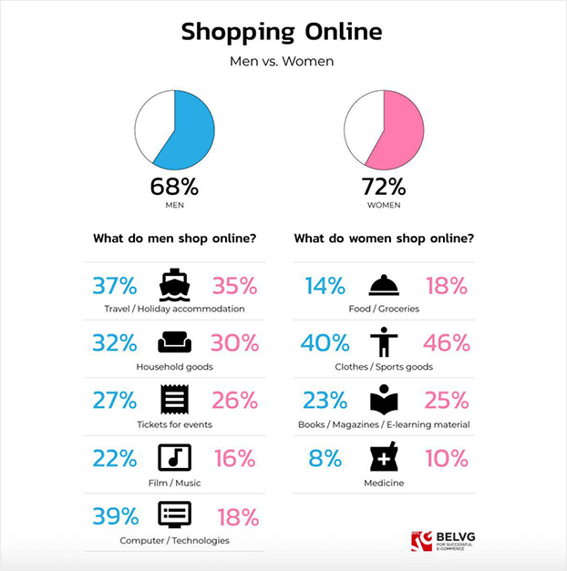
Here are statistics based on men vs. women shopping habits online. The pie charts above, blue resembles men and pink resembles women, signify the entire percentage of each gender that shops online. Then, they pull it apart and separate it within the common reasons men shop and common reasons women shop. Finally, as they collect that percent, they then compare the opposing gender’s percent on that same shopping reason. After observing this data visualization, it is quite interesting how most percentages are close between both genders, except for technology. Men spend more time and money wanting computers/technologies than women by almost half percent of the women’s side. Furthermore this information/numbers can definitely help business/marketers and the world see who shops more online and in what category.
https://belvg.com/blog/men-vs-women-who-runs-the-online-shopping-world.html
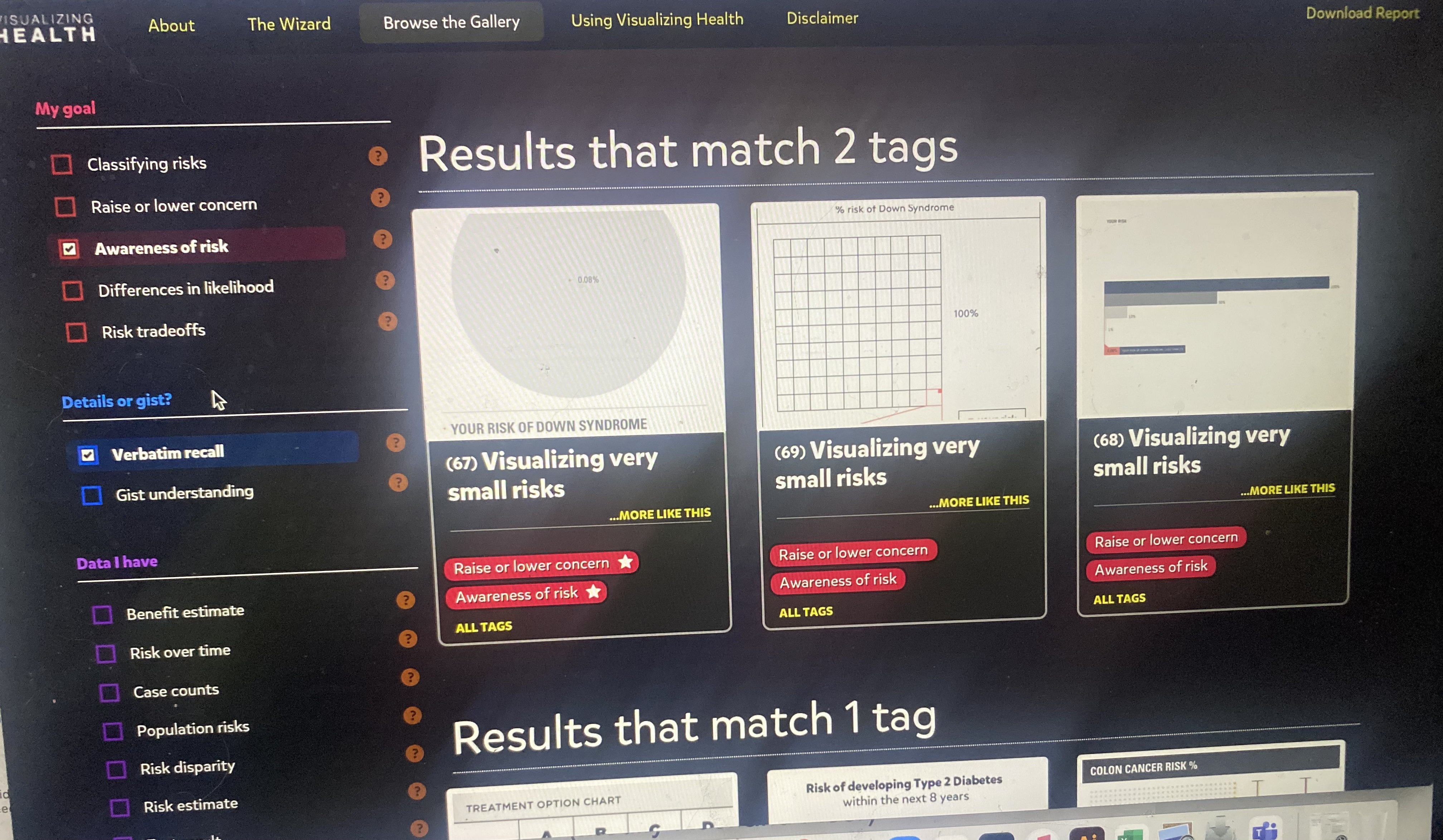
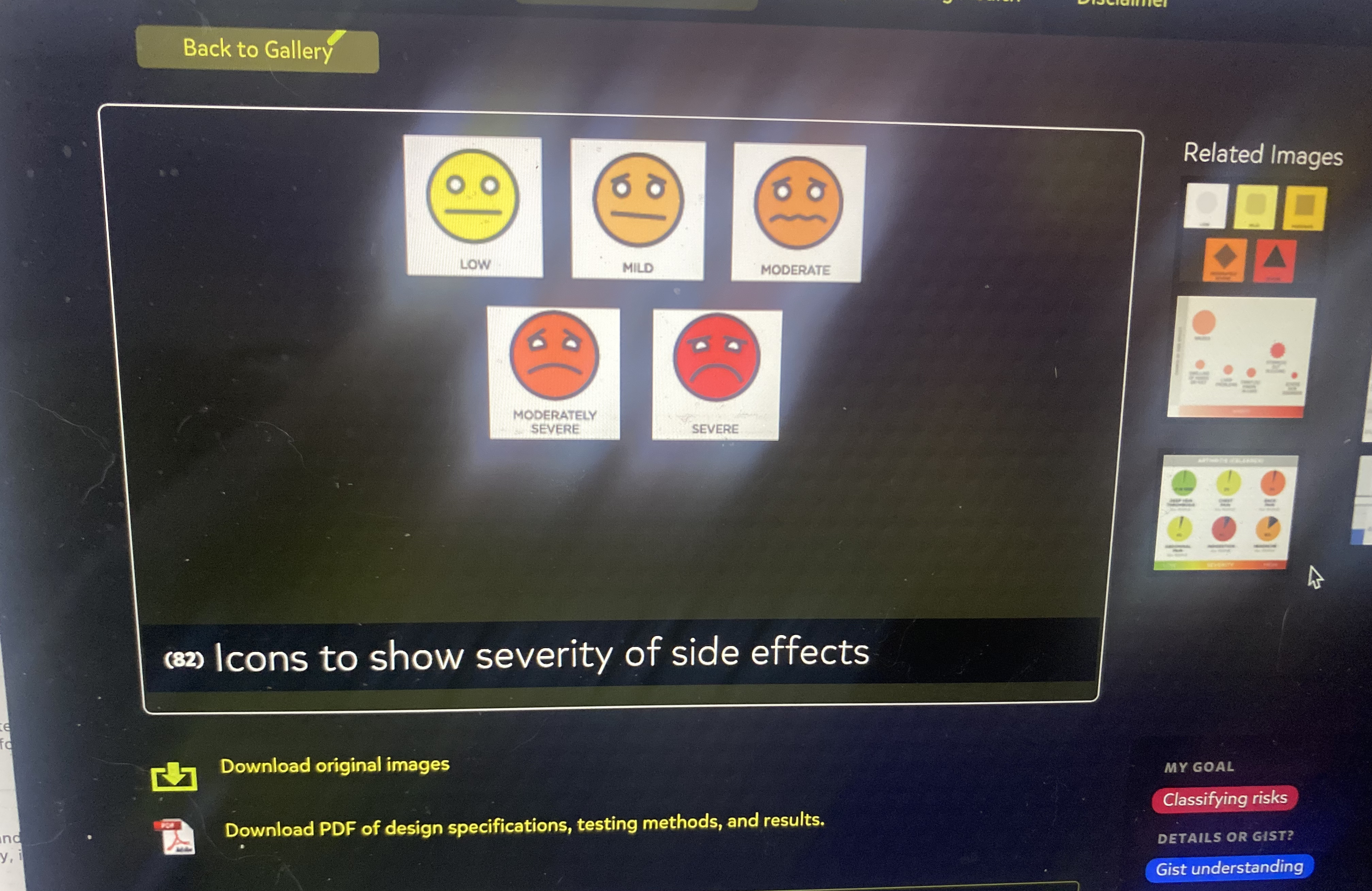
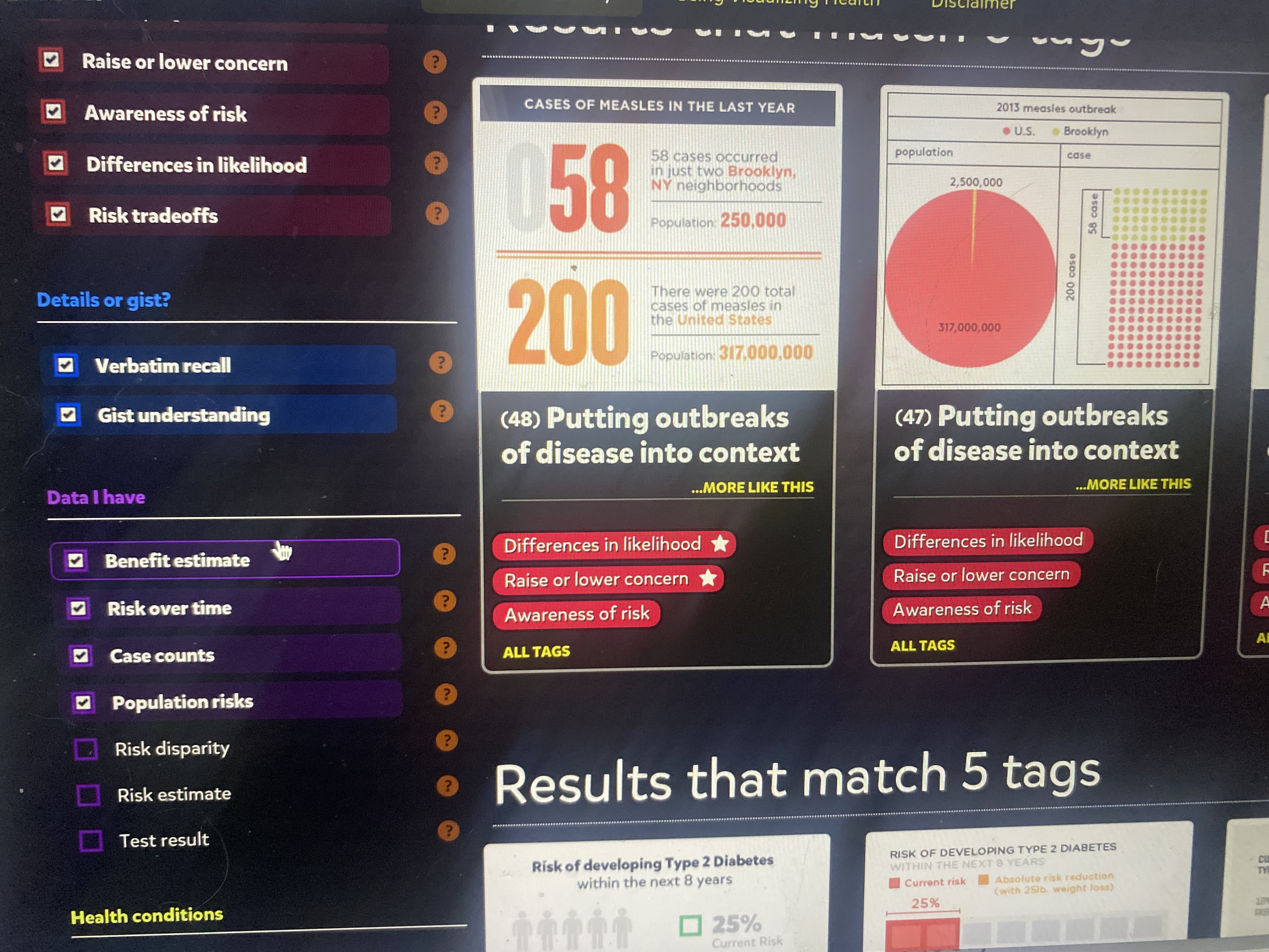
Visualizing Health Commentaries
Visualizing Health is a project website that believes in constructing data in the form of visualization, concerning our health. In short, for people to make the best decision for their health based on certain stats/risks. The Wizard and the gallery on this site provide a functional, structural method to design graphs/charts catered to your data. First, you input the purpose of your data into the Wizard, most times referring to a health risk. What’s helpful is once you click on one primary goal, the Wizard will supply an example for definite measures. Then, you put whether or not there’s a risk that occurs in your data set, and boom the Gallery has selected all its designs that work for your data. On the side panel, you can select multiple additions for your chart/graph and the Gallery will narrow down your best options. Lastly, after choosing a style that best suites your data, you can download that exact image/chart layout. This website is super informational and convenient if/when you want given data on any risks with health topics or you want to create your own using icons/graphs for inspiration.
Below here are screenshots of images/data visualizations, as well as the side panel with various categories and subcategories to choose from:
Infographic Discussing The Benefits of Yoga

Infographic Analysis/Notes: Yoga is my daily passion. Here are the benefits I get and you can get by incorporating yoga into your routine. The person who design this infographic kept the colors mutual yet eye catching, especially how they structured the facts. As your eyes spot the woman in a warrior pose, your eyes then drift to the white dotted lines, which align to each benefit. Then, rather than just putting down stats/words, the pictures and arrows throughout help tie the whole infographic together. For example, there are some images that relate to the fact or that correspond to what yoga is about like; poses, peace of mind, etc. Altogether, the designer of this infographic made the message clear both visually and literally.
Recent Comments