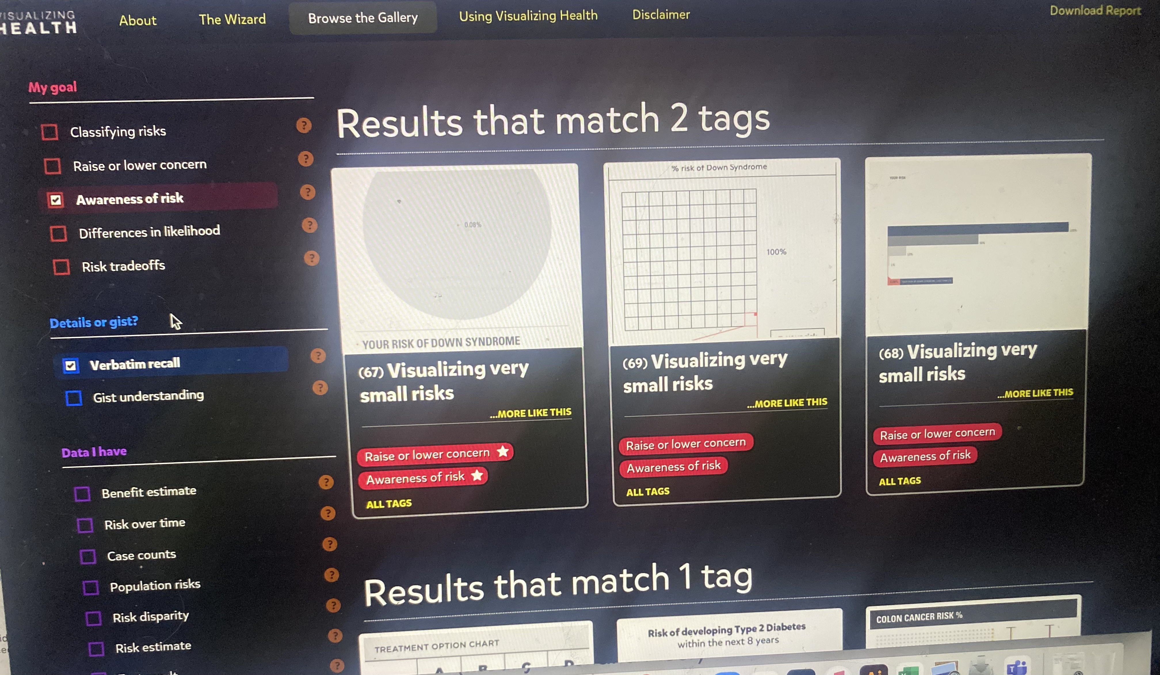
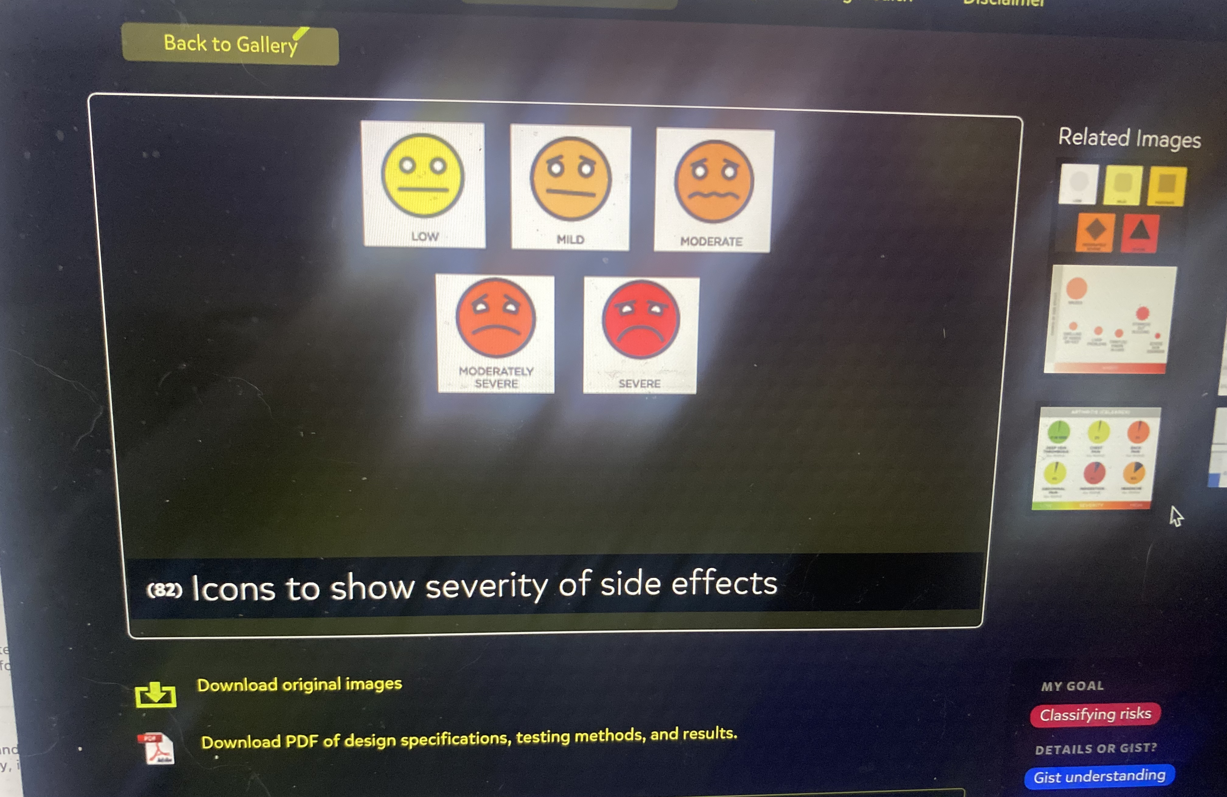
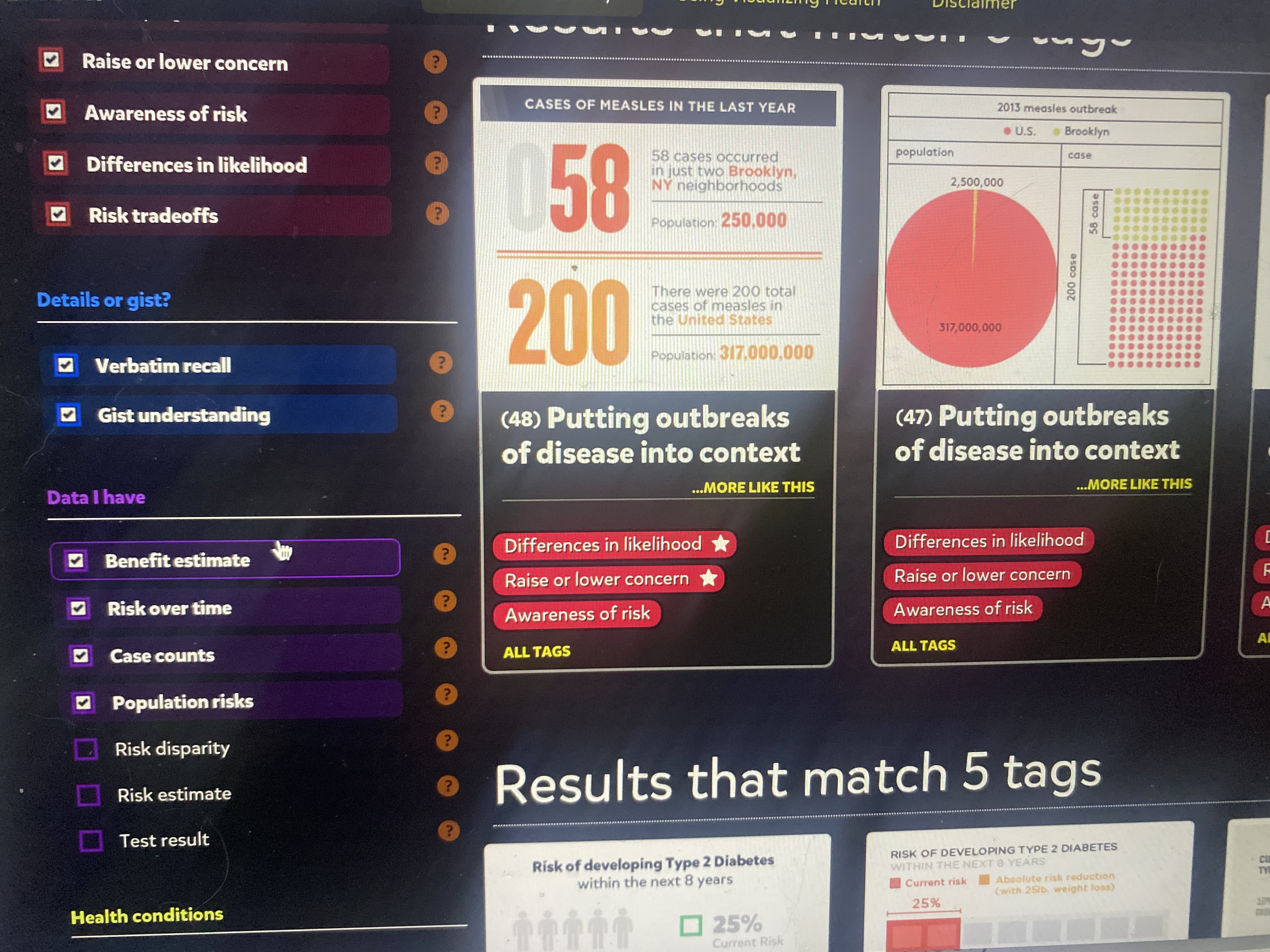
Visualizing Health is a project website that believes in constructing data in the form of visualization, concerning our health. In short, for people to make the best decision for their health based on certain stats/risks. The Wizard and the gallery on this site provide a functional, structural method to design graphs/charts catered to your data. First, you input the purpose of your data into the Wizard, most times referring to a health risk. What’s helpful is once you click on one primary goal, the Wizard will supply an example for definite measures. Then, you put whether or not there’s a risk that occurs in your data set, and boom the Gallery has selected all its designs that work for your data. On the side panel, you can select multiple additions for your chart/graph and the Gallery will narrow down your best options. Lastly, after choosing a style that best suites your data, you can download that exact image/chart layout. This website is super informational and convenient if/when you want given data on any risks with health topics or you want to create your own using icons/graphs for inspiration.
Below here are screenshots of images/data visualizations, as well as the side panel with various categories and subcategories to choose from:
Recent Comments