What are Sankey Visualizations?
According to our text book, Effective Data Visualizations, Sankey visualizations are used to depict a flow throughout different stations over time. The author denotes how these diagrams capture flow from one point to another, and the thickness of those lines represent quantity. Here is the authors example in the text book for a better insight:
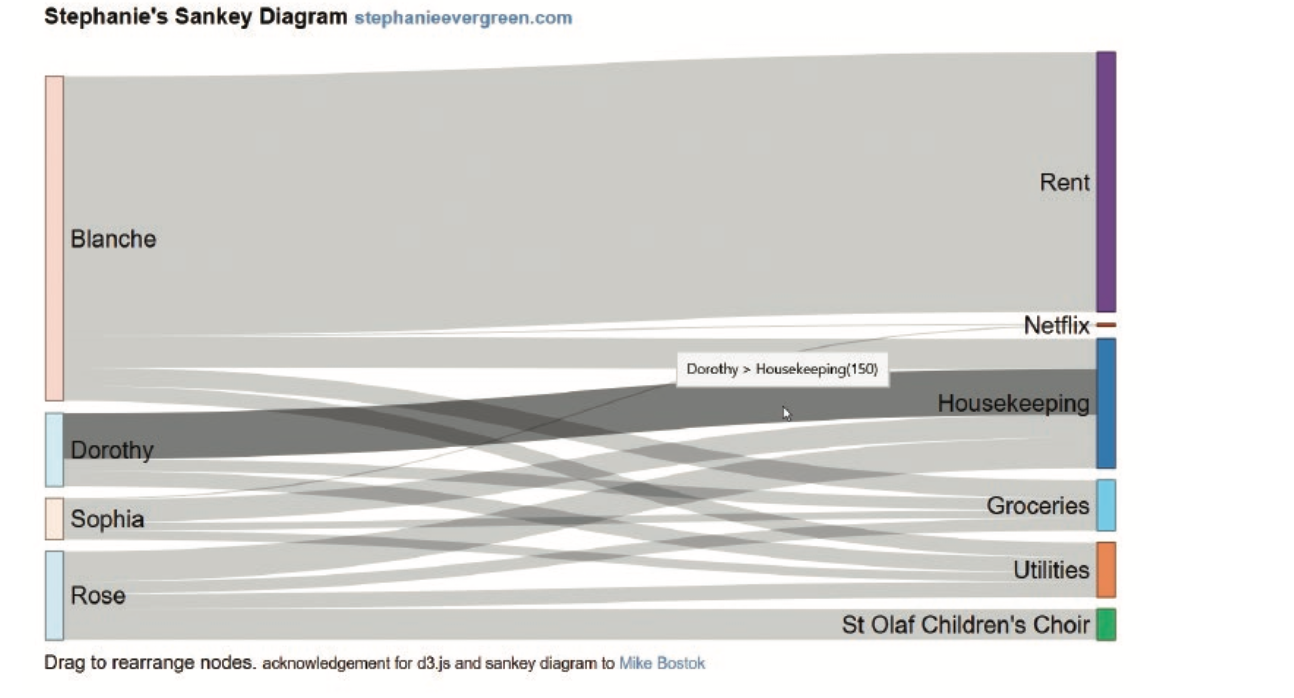
Essentially, these visuals are best used when there are multiple categories between multiple groups, as well as comparing time periods.
Website Review About Sankey Visualizations
What is another example in the real world that would use this type of visual? There is a website that discusses important and interesting information on energy. The title literally being What You Need To Know About Energy, link here: http://needtoknow.nas.edu/energy/interactive/our-energy-system/. The website is nicely organized with several pages, divided into different objectives on energy. The link will bring you right to a section called Our Energy System, which is where the Sankey Visualizations are demonstrated. Below is an image from the site of a Sankey Visualization
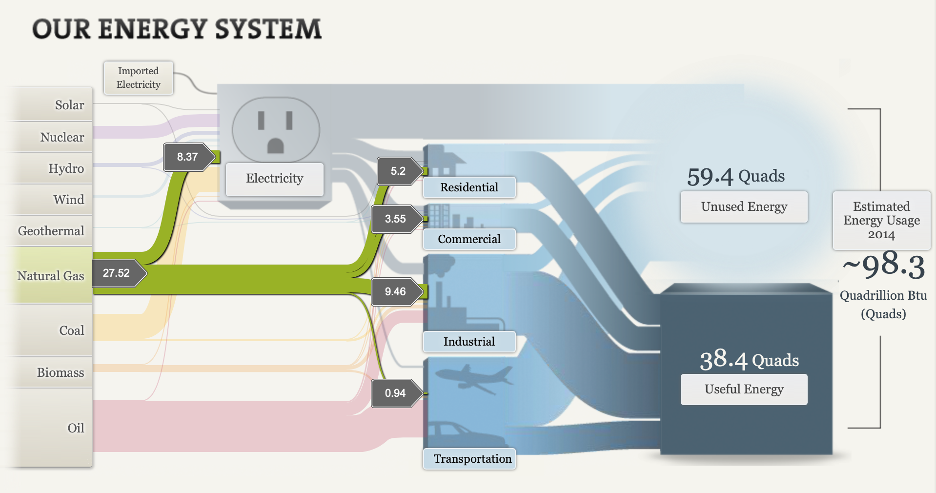
Notice: As you select one of the many categories, Natural Gas selected in this image, it guides you through its process. Those numbers in the gray boxes throughout represent number of quads, traveling along each area’s usage. Though this data was captured back in 2014, the Sankey diagram was a great tool for this example. It certainly captures the flow from one area to another, plus in a very neat way by clicking on different groups and highlighting its path. Not to mention, the website also provides other neat information on different pages, like seen here:
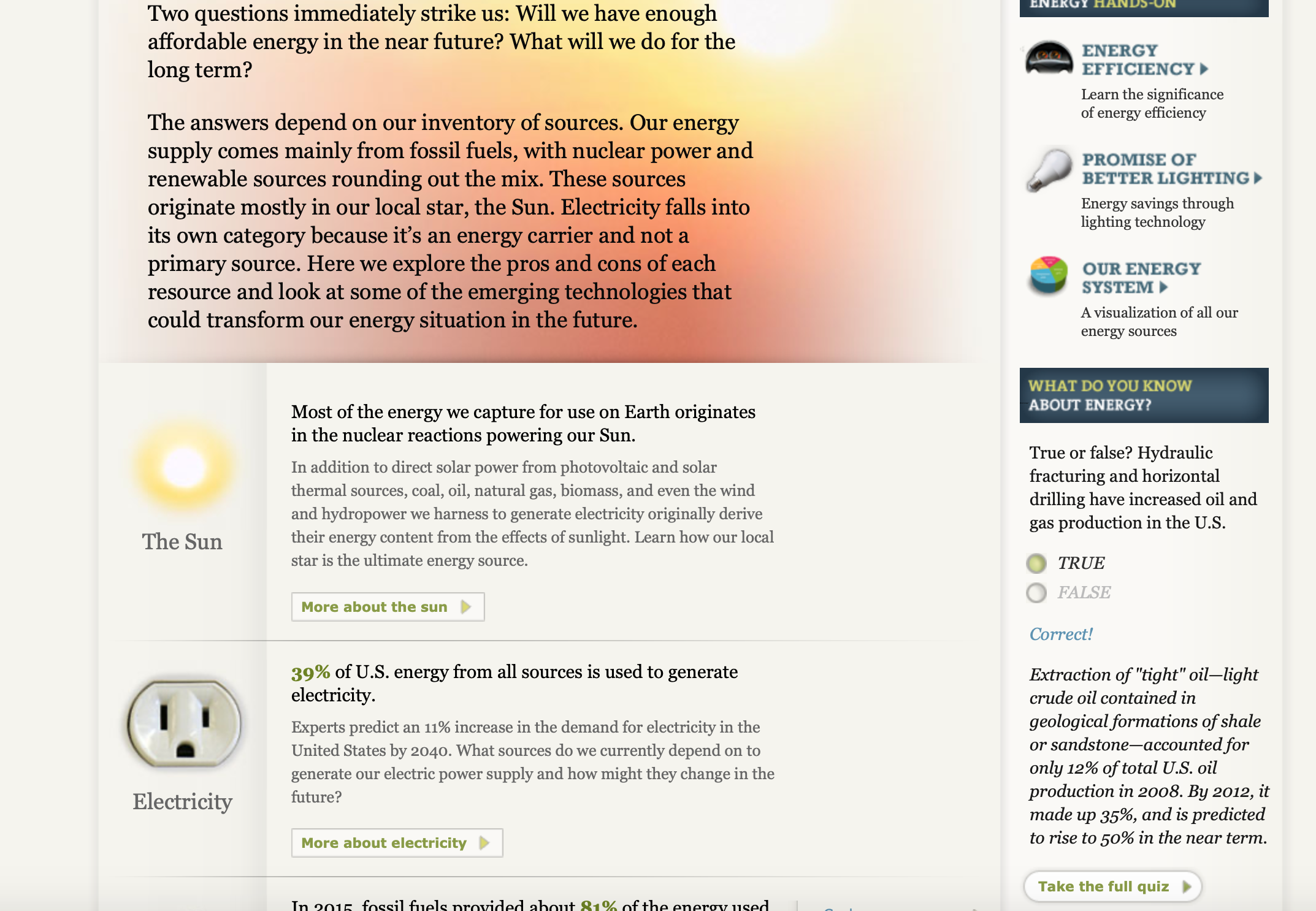
Personally, I like the way they designed the pages with visuals on the side and other information/quiz question on the side panel.
Conclusion
After going over the definition of a Sankey Visual in our text book, it is easier to acknowledge why the website chose that diagram. Overall, the website reviewed in this post helps better explain an idea the world uses everyday in the form of a Sankey diagram. The site also provides other useful facts and statistics throughout to learn more about. There’s bound to be other ways to implement this kind of visualization, so share other every day ideas that would make a great example for a Sankey Visualization down below!
References:
- ISBN: 9781071811832
Recent Comments