Data Visualization Techniques To Help Compare Numbers
What is Data Visualization?
Presenting data in visual graphics such as charts, maps, graphs, etc. to create both an appealing display and to allow the audience to easily understand the information presented
Two Ways To Present Data Visualization
Static: Printouts or web data that limit the viewer to only see and explore the data that is presented at the initial sight.

Interactive: Web data and multiple printouts that allows the viewer to engage in the information by providing various categories and hyperlinks to expand the information for better understanding
Finding The Best Fit
The first step in using data visualization is choosing the right one that will display your data in the appropriate manner. If you choose the wrong one can lead to misinterpretation of your data. These examples and breakdowns of known visualization will help you choose the best one for your data.
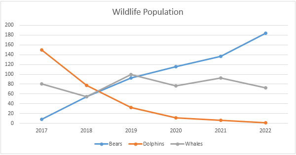
Line Chart(Display Trends)
They demonstrate an overall trend precisely that is hard to misinterpret. Good for showing trends in different categories over an extended period of time to support comparison
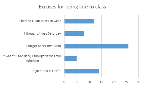
Bar Chart(Simple Break Down)
Great for displaying various values using color coded categories in a horizontal direction. Compared to a line graph you are able to add a specific category to break down the difference in better detail when you have a broader ray of data.
Column Chart(Compare multiple)
This is similar to a bar chart but is used bars in a vertical direction. This easily allows you to compare various data over time.
Pie Chart(Proportional Data)
This is a great choice when displaying percentages or specific numbers in an overall comparison of each other. Each part of the chart must come together to sum up and overall total. In order to create organization and understanding you should only use six categories or less.
Area Chart(Comparison)
Very similar to a line chart, however the areas are completely filled with a color to represent each category. This way each area I stacked on top of each other to better show the comparison. This visualization can be best used to show relative values over a time period.
Pivot Table(Quick Summary)
This is a very popular yet simple ways to show data using visualization. Allows you to quickly summarize, assess, and organize large amounts of data while allowing you to customize your colors, fonts, and focus points of the data as needed to appeal to your audience.
There are many various data visualizations to choose from, however it is important to remember the purpose of the chart to show the best way to display your data in an effective and appealing way to the audience. There are also many free and subscribed softwares you can use based on your skill level that will allow you to create these charts, add your own data, and customize it appropriately such as.
Google Sheets, PowerPoint, Canva, Microsoft excel, etc.
Data Visualizations that Compare Numbers
When presenting raw data in a document, it can be overwhelming for the reader and the message may not be communicated effectively. This is where data visualizations come in to make it easier to understand the relationship and meaning of a data set. To demonstrate, the analysis of electric vehicles can be used when compared to internal combustion engine (ICE) vehicles.
Electric Vehicles vs. ICE Vehicles
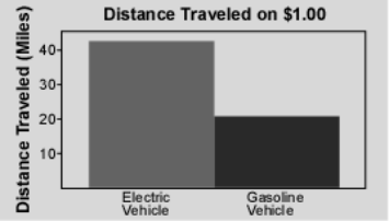
According to a study done by the Idaho National Laboratory, “… the distance that can be traveled for a fuel cost of $1.00 is more than twice as far with an electric vehicle” (INL). To visualize this comparison, they created a graphic that easily communicates this idea;
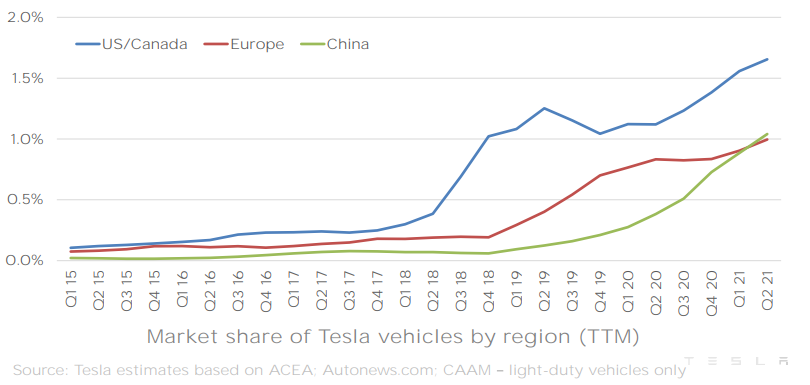
As electric vehicles have improved over the years, the market share for such vehicles has grown along with them. In a quarterly report by electric car manufacturer Tesla, they created a great infographic for their market share growth in different countries;
Comparing numbers can be difficult, but as seen in this example with electric vehicles vs. internal combustion vehicles, data visualizations can help bridge the gap and quickly relay a valuable message.
Comparing Data
Choosing the right chart is crucial when deciding how you want to compare your data. There are do’s and don’ts when selecting the right visualizations.
This article does a nice job at offering advice on choosing the correct graph to compare data and offers a good do’s and don’ts list for those hard to make decisions.
Every type of data has a visualization that would present it best, and it is up to you as the presenter to choose the right one.
Macros: Are they that hard to conquer?
First let’s break down what your Macronutrients. Macro means a large scale and nutrients are a substance that provides nourishment and energy to the body; so to put that together macronutrients are the four categories of nutrients our body mostly gets our energy from. These three main categories include:
-Carbohydrates
-Protein
-Fats
-Fiber
While all of these building blocks are important when it comes to over all health protein is found to be the most effective macronutrient.
Below is what happens when protein intake is low, daily nutrients are low. There is a high percent of carbs but carbs are not a long term energy source because their expenditure is short and fast, while protein gradually gives you supplemental energy through out the day.
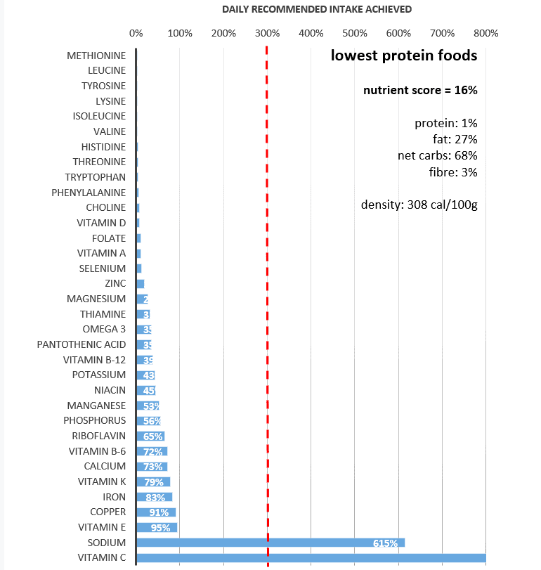
When it comes to protein calorie density is usually less while being more filling and fulfilling in energy.
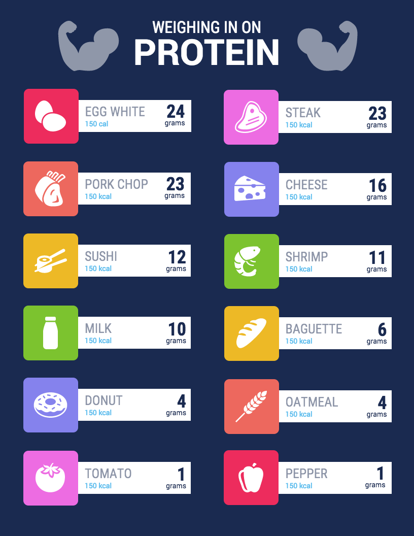
All of the food above has 150 kcal but vary in protein and it is apparent what macro group is lacking in the important nutrient. Carbs. Many people refer to carbohydrates as empty calories, there is usually no benefit besides quick short bursts of energy. That doesn’t mean all carbs are bad tho less process carbs are good for athletes who need those bursts of energy right before a race or game.
Macronutrients may seem hard to understand when you’re not a dietician but with easy to read infographics and sites that provide them like
https://optimisingnutrition.com/macros-vs-micros/
the concept of nutrients no longer seems as hard.
Examples of Insightful data visualizations that compare numbers
Sometimes using regular text instead of data visualizations is the best way to compare numbers.
1/10 people in the United States have a substance abuse problem
However using data visualizations could make the information more appealing to the viewer.

https://www.displayr.com/12-visualizations-to-show-a-single-number/
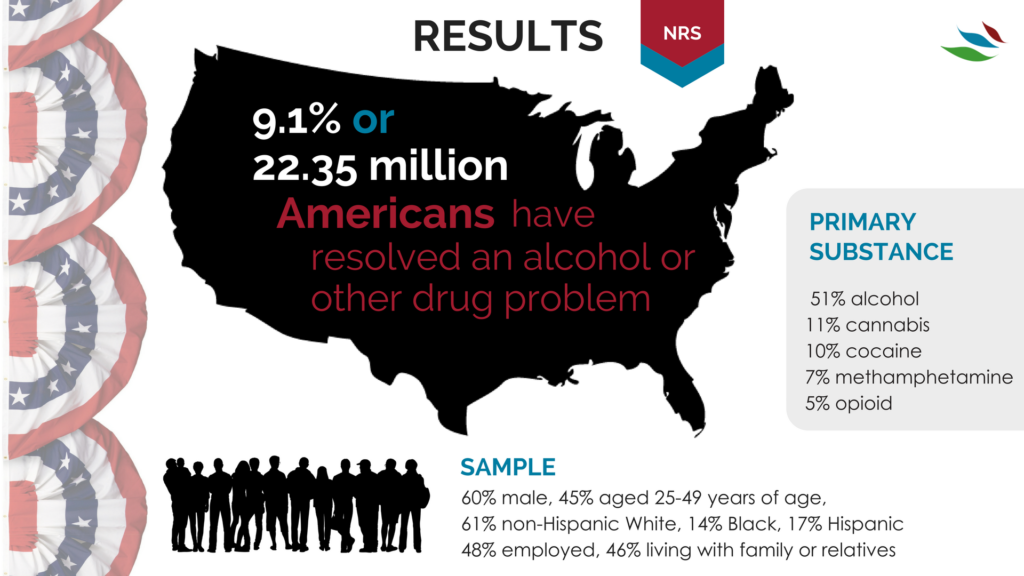
https://www.recoveryanswers.org/research-post/1-in-10-americans-report-having-resolved-a-significant-substance-use-problem/

https://www.displayr.com/12-visualizations-to-show-a-single-number/\
Data visualizations are a great way to display data and compare numbers!
Tools to Compare Numbers
When comparing values, showing differences, similarities, making visualizations to change minds, persuade people, it is important to understanding the readers expectations. Providing the best method to distinguish and compare values, by displaying the numbers in the most effective way. Comparing numbers, and visually representing them correctly comes with research and reconstruction. Including different aspects, seeing many numbers side by side it can lead to confusion and misinterpretations. It is very important to know your audience and determining the best graph and visualization when comparing numbers. There are many tools and software’s available online to help construct visualizations when comparing numbers and finding the best method to represent the data and story.
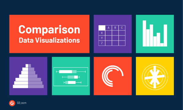
According to G2’s Learn Hub, which is used for marketing, sales, management, HR, technology, software, and all business topics, some charts that are known for effective methods of comparing numbers are:
Bar & Column Charts
Table Charts,
Histograms
Population Pyramids
Box and Whisker Plots
Radial Bar Charts
Radial Column Charts
Tally Charts
There are many different types of data visualization and G2’s Learning hub discusses the “67 Types of Data Visualizations” and how to determine if you are using the right one. In addition to the information provided on G2’s learning hub, the following links provides more options of different charts and tools to use for comparing numbers.
G2’s Learning Hub
Tools for comparing numbers!
https://learn.g2.com/types-of-data-visualizations
TABLEAU
TOOL FOR DATA VISUALIZATION:
TABLEAU
Tableau is another platform and tool that is used to communicate information, present it accurately, and understands the importance of data visualization. Tableau platform was founded in Jan 2003, where data meets design. This website helps view business data in a visual way, and the innovation was focused on visual analysis. Tableau helps people and business see and understand data, and their visual analytics for businesses is helping solve problems and compare numbers. Using these software’s available as tools to help give better understand and using the technology available to generate visualizations of data combined with design to help businesses and reaching target numbers or goals. Attached is a video of how simple and easy comparing profit values, or numbers using Tableau.
Comparing Numbers
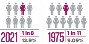
When studying data and analyzing numbers, they can become overwhelming and lose their significance. When numbers are compared the perspective of the data changes giving information more meaning, or less meaning. October is breast cancer awareness month, so many statistics are shared to bring awareness to how many people are diagnosed with cancer. When larger statistics at a larger scale are used it is easier to see how many people are effected by breast cancer. “About 1 in 8 U.S. women (about 13%) will develop invasive breast cancer over the course of her lifetime” (breast cancer.org, 2021). This statistic alone is meaningful and easily recognized as significant. Then when a second statistic is added, the data becomes even more shocking. “Breast cancer became the most common cancer globally as of 2021, accounting for 12% of all new annual cancer cases worldwide, according to the World Health Organization” (breast cancer.org, 2021).
https://www.cancer.org/cancer/breast-cancer/about/how-common-is-breast-cancer.html
Best Tools For Numbers
Tableau has a variety of options available, including a desktop app, server and hosted online versions, and a free public option.
Infogram is a fully-featured drag-and-drop visualization tool that allows even non-designers to create effective visualizations of data for marketing reports, infographics, social media posts, maps, dashboards, and more.
Chart Blocks claims that data can be imported from “anywhere” using their API, including from live feeds.
Datawrapper was created specifically for adding charts and maps to news stories. The charts and maps created are interactive and made for embedding on news websites. Their data sources are limited, though, with the primary method being copying and pasting data into the tool.
Insightful Data Visualization

In this display, we are being shown the possible changes that will be made in the office places. The largest portion of change is the flexibility based competition rather than the competition in the salaries.
Population Pyramids : Comparing Numbers Across Time
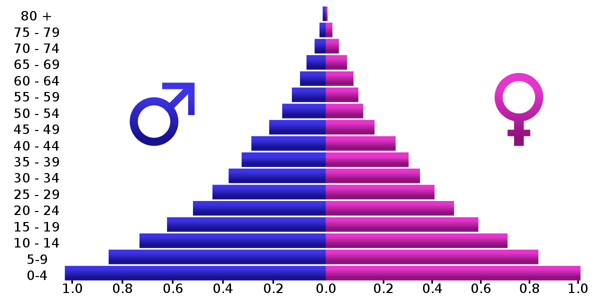
Particular attention of this week’s assignments (and Chapter 3 of Effective Data Visualization) was paid to back-to-back graphs. Although Evergreen’s exercises explored one potential use of back-to-back graphs, perhaps the most common example are population pyramids.
Otherwise known as age-sex pyramids, these graphs aptly measure the distribution of a population based on a sex’s share of age groups. With each graph a snapshot of a particular timeframe (usually for a given year), population pyramids are particularly good at displaying changes over time.
PopulationPyramid.net lets the user explore the age-sex distribution of the world and individual countries. With data from 1950, one can see how populations have changed over time and have been influenced by historic events – for better or worse. One of the most relevant types of statistical data, the site also affords population projections unto the year 2100. With these, organizations and governments can plan ahead in anticipation of what future populations will need; areas with a sizeable young population might consider investing in infrastructure to meet impending housing demands, whereas areas with an aging population might focus on eldercare.
As the video highlights, within a single image, scientists and policymakers are able to gain a “rich and complex understanding of populations and the factors affecting them,” (04:40). Although they might appear as aesthetically plain graphics, population pyramids can be incredibly dense in historical context and implications of what’s to come. An integral part in being able to understand the past and prepare for the future, it is all the more valuable to be able to appreciate the power of population pyramids and properly interpret and utilize them.
Recent Comments