Lollipop Chart
A lollipop chart is useful for showing specific data, that is not a range of information. When looking at the chart it brings the readers eye directly to the significant data point. Other types of charts or graphs show ranges of information, but a lollipop chart is perfect for few numbers that are compared to each other.
Lollipop Charts
Lollipop charts are very similar to bar charts and can be used to show how data behaves over time or to compare data sets. The design is rather self-explanatory where the chart has lines with circles at the end to represent data points which resemble lollipops.
An example of a lollipop chart is one I created after researching data on what the most popular car colors are in the United States.
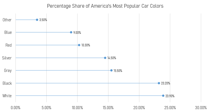
Using this chart creates a minimalistic and readable display of the data that clearly shows that white, black, and gray are the top three colors. Lollipop charts are very versatile and can be a very effective way of visualizing data.
Lollipop Charts
A lollipop chart is very similar to a bar chart. It is used in the same type of scenarios while being more appealing to the eye. It avoids having a cluttered look when comparing multiple data sets and makes it easier to follow along. They can be used horizontally or vertically and are very simple to make. I made mine on excel and it took me no longer than 15 minutes to complete. Region A,B,C, and D are all in order from left to right.
Where and When to Use Lollipop Charts
Lollipop Plot
This type of chart is very similar to a column or bar chart, however it consist of a line running from the x-axis and a dot at the top to pin point the value of each category. The visual replicates as a lollipop hence the name due to its long line as the stick and the point at the top to form a circle.
Common Uses:
- Visual alternative to side by side bars
- Comparison between categories
- When displaying more than 10 categories making it more legible.
Easy and Effective
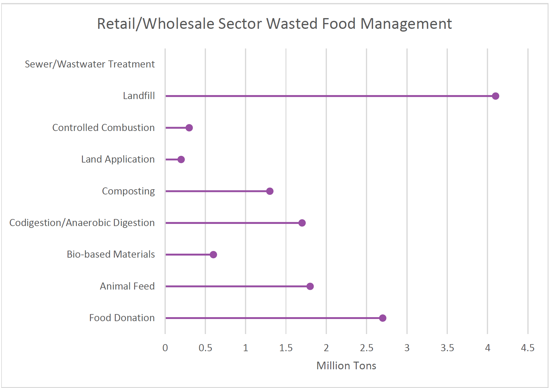
The example below of a Lollipop data chart displays data of how much retail and wholesale organizations manage and dispose of their waste in 2018. This chart is easy to manage and create way to effectively arrange your specific data. that allows the presenter to create unique designs and templates while allowing it to be used for various data forms.
Lollipop Chart – Halloween Candy
The beauty of a lollipop chart is its ability to convey data in a slick and spacious format. Compared to a bar graph and column chart, the amount of space allows you to add details that would be too immoderate for any of the previous charts mentioned.
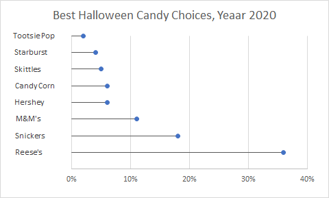
Take this chart for the most popular Halloween Candy surveyed in 2020; the amount of detail can be easily understood and more importantly, is visually pleasing. Each amount of candy can be understood without an actual percentage just by looking at the range and as people say, ‘less is more.’
Loli Pop Chart
This is my loli pop chart and I got it from a regular bar chart by playing with the borders and adding arrows. This type of graph is similar to a bar chart so its best used whenever a bar chart is best used. Usually for looking at linear data
The Lollipop Chart
A lollipop chart is a variation of a bar chart where the bar is replaced with a line and a dot at the end. Just like bar graphs, lollipop plots are used to make comparisons between different items or categories. They are also used for ranking or for showing trends over time.
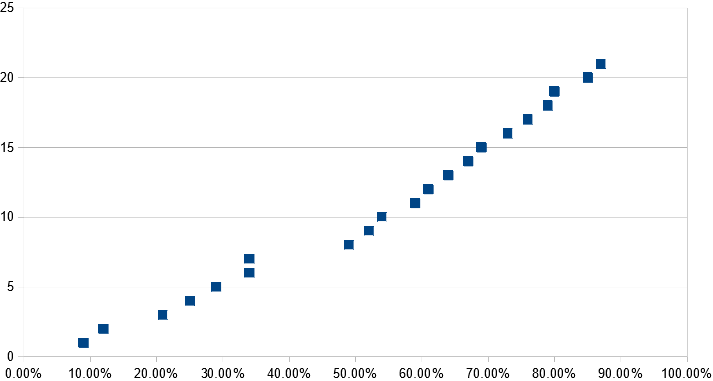
| Lollipop spacing | ||
| Other | 9.00% | 1 |
| South Asia | 12.00% | 2 |
| Generational | 21.00% | 3 |
| Asioan Americans | 25.00% | 4 |
| Muslim Observance | 29.00% | 5 |
| African Americans | 34.00% | 6 |
| Gender Equity | 34.00% | 7 |
| Disability Advocacy | 49.00% | 8 |
| European Americans | 52.00% | 9 |
| Veteran | 54.00% | 10 |
| Islander Americans | 59.00% | 11 |
| Non trad. Students | 61.00% | 12 |
| Religious Equity | 64.00% | 13 |
| Caribbean Americans | 67.00% | 14 |
| Latino/Latina | 69.00% | 15 |
| Middle East | 73.00% | 16 |
| Trans-racial | 76.00% | 17 |
| LBGTQ/Ally | 79.00% | 18 |
| Mixed Race | 80.00% | 19 |
| Jewish Heritage | 85.00% | 20 |
| International Students | 87.00% | 21 |
Lollipop Chart
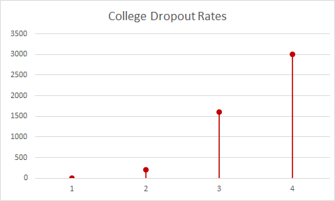
Displayed in my own lollipop graph is a representation of the college dropout rate between the years of 2005 and 2020. A lollipop chart should be used to compare drastic differences in data.
Lollipop Charts : A Sweet Take on Data Visualization
At first glance, lollipop charts might seem like a frivolous adaptation of a bar or column graph. Fundamentally, these types are identical; they show any number of categories’ values with respective figures. However, it is through that “any number” where one loses favor over the other. Stephanie DH. Evergreen notes in Effective Data Visualization that lollipop charts are “especially helpful when [a standard bar or column chart] is overpowering due to its massive ink,” (page 156), a consequence of trying to show too many categories.
For example, consider “Travels’ Choice Best of the Best”: Tripadvisor’s collection of “iconic, can’t-miss destinations”. For 2021, the most popular destinations across the world include twenty-five locations, each with a specific number of “things to do”. These numbers can vary greatly, however, and do not influence a location’s position on the list. With extremes being Playa del Carmen, Mexico at just over one-thousand, and Bali, Indonesia at nearly ten-thousand, it’s clear to see that there is no rhyme or reason when it comes to how much a destination might have to offer.
Graphically seeing this data would help, but with twenty-five points to consider, something like a conventional bar graph could easily become overwhelming. The solution, as Evergreen puts it, is to “remove even more ink,” (page 149). Since the endpoint of each bar is what quantifies the data, that’s all one would need to show. Nevertheless, just having these points can just as easily be confusing; having to trace x-many points back to their labels requires more diligence by the viewer than should be expected. The best of both worlds combines points that indicate value with stems that lead back to the label. Enter: the Lollipop Chart.
Returning to Tripadvisor’s “Best of the Best”, a lollipop chart would compare each location to its number of things to do.
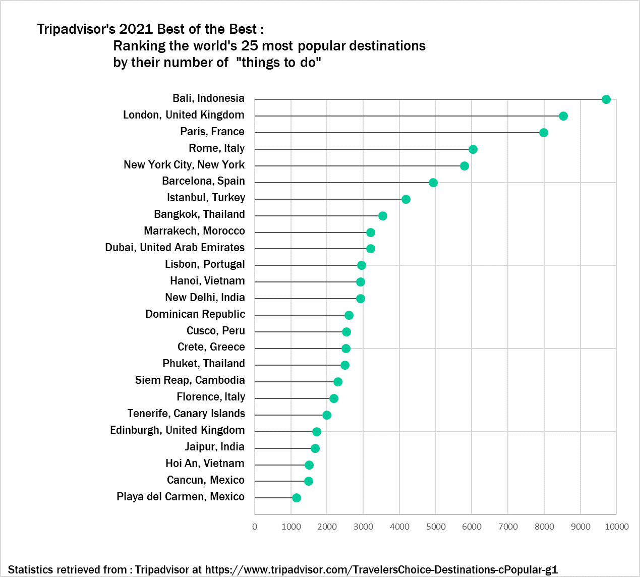
Although specific numbers can only be estimated, a general overview is easy to see with this visual. The viewer can tell how each destination compares to any other and where it falls relative to the entire list. They can also see how the trend differs between the first ten destinations and the rest. If a traveler is looking for a quick reference to see just how much their desired location has to offer (or to see if other locations have even more), then this visual works wonders.
Lollipop Charts
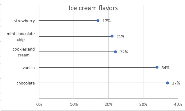
Lollipop charts are minimalistic graphs the are based on line, scatter, and bar graphs. The lollipop chart is easily identified by its long stick with a dot at the top which usually has a percent either inside of the dot or above or in front of the dot depending upon the orientation. Lollipop chart orientations could either be vertical or horzontal. This type of chart is best used for displaying survey data since it shows the percent of responses from a survey group based on the questions asked. They can also be used to make any comparison between two different items or categories. Additionally. they can be used to rank or show trends over time.
In my lollipop chart, I chose to depict survey results for people’s favorite ice cream flavors. The survey posed the question of which flavor people liked the most out of the most popular answers that people have, which are, chocolate, vanilla, cookies and cream, mint chocolate chip, and strawberry.
Recent Comments