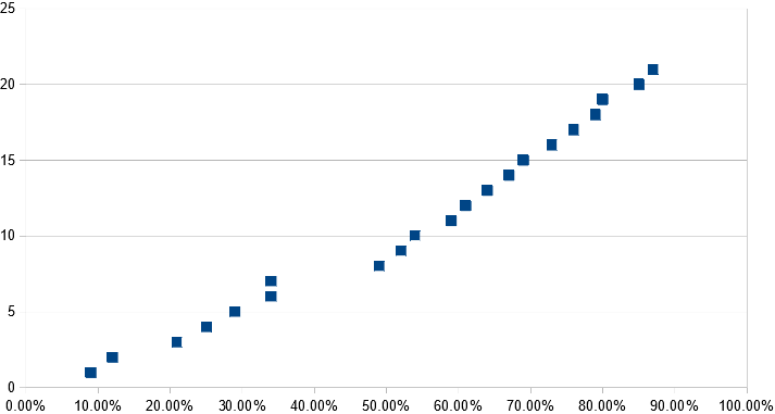
A lollipop chart is a variation of a bar chart where the bar is replaced with a line and a dot at the end. Just like bar graphs, lollipop plots are used to make comparisons between different items or categories. They are also used for ranking or for showing trends over time.
| Lollipop spacing | ||
| Other | 9.00% | 1 |
| South Asia | 12.00% | 2 |
| Generational | 21.00% | 3 |
| Asioan Americans | 25.00% | 4 |
| Muslim Observance | 29.00% | 5 |
| African Americans | 34.00% | 6 |
| Gender Equity | 34.00% | 7 |
| Disability Advocacy | 49.00% | 8 |
| European Americans | 52.00% | 9 |
| Veteran | 54.00% | 10 |
| Islander Americans | 59.00% | 11 |
| Non trad. Students | 61.00% | 12 |
| Religious Equity | 64.00% | 13 |
| Caribbean Americans | 67.00% | 14 |
| Latino/Latina | 69.00% | 15 |
| Middle East | 73.00% | 16 |
| Trans-racial | 76.00% | 17 |
| LBGTQ/Ally | 79.00% | 18 |
| Mixed Race | 80.00% | 19 |
| Jewish Heritage | 85.00% | 20 |
| International Students | 87.00% | 21 |
Recent Comments