Displayed in my own lollipop graph is a representation of the college dropout rate between the years of 2005 and 2020. A lollipop chart should be used to compare drastic differences in data.
Home » Uncategorized » Lollipop Chart
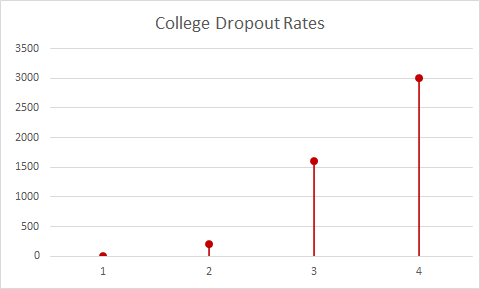
Displayed in my own lollipop graph is a representation of the college dropout rate between the years of 2005 and 2020. A lollipop chart should be used to compare drastic differences in data.
Recent Comments