Lollipop Chart
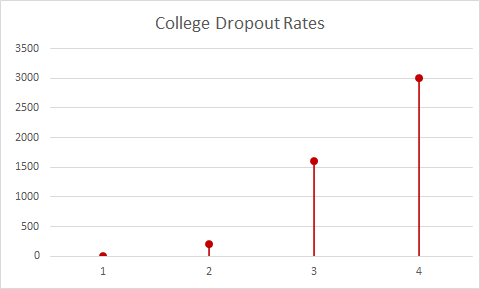
Displayed in my own lollipop graph is a representation of the college dropout rate between the years of 2005 and 2020. A lollipop chart should be used to compare drastic differences in data.
Benchmarking Displayed in NYT Article
New York Times Company (The) Net Promoter Score 2021 Benchmarks | Customer.guru
In this article by the New York Times, there is a graph depicted that entitled “Net Promoter Score for Top Brands Compared with New York Times Company. The way that they benchmark is not only with the change in direction in which the data is facing, but there is a dark shaded dot on the graph to put emphasis on the data change.
Insightful Data Visualization

In this display, we are being shown the possible changes that will be made in the office places. The largest portion of change is the flexibility based competition rather than the competition in the salaries.
Site Review

Constructing Infographics
There are many tools at our disposal (both free and not free) that the public can use in order to construct infographics. There is a free site and app that can be used in order to create infographics, with no prior experience necessary
Canva | Infographic Maker | Design Compelling Infographics | Try Canva Pro

Recent Comments