Examples of Insightful data visualizations that compare numbers
Sometimes using regular text instead of data visualizations is the best way to compare numbers.
1/10 people in the United States have a substance abuse problem
However using data visualizations could make the information more appealing to the viewer.

https://www.displayr.com/12-visualizations-to-show-a-single-number/
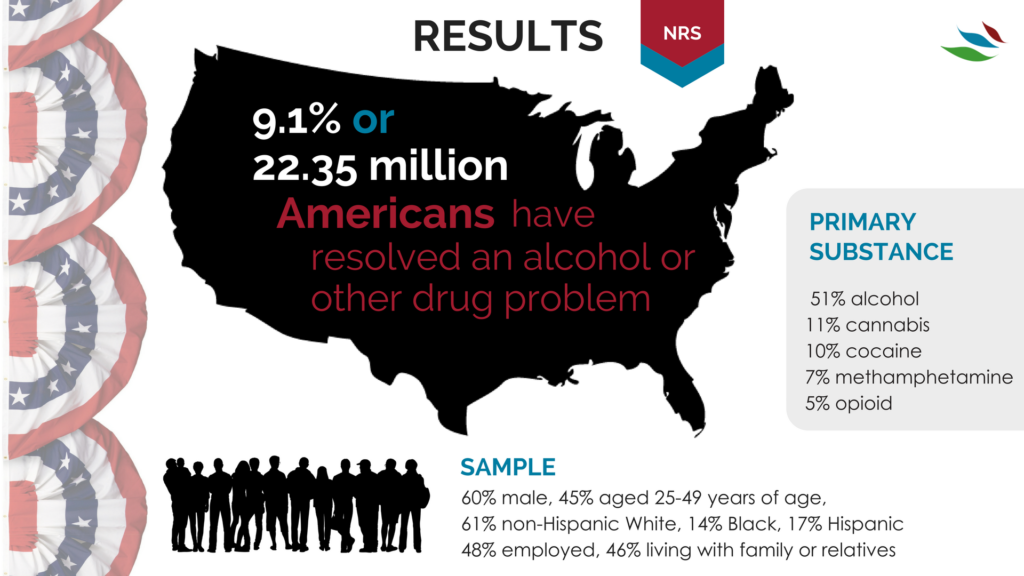
https://www.recoveryanswers.org/research-post/1-in-10-americans-report-having-resolved-a-significant-substance-use-problem/

https://www.displayr.com/12-visualizations-to-show-a-single-number/\
Data visualizations are a great way to display data and compare numbers!
Tools to Compare Numbers
When comparing values, showing differences, similarities, making visualizations to change minds, persuade people, it is important to understanding the readers expectations. Providing the best method to distinguish and compare values, by displaying the numbers in the most effective way. Comparing numbers, and visually representing them correctly comes with research and reconstruction. Including different aspects, seeing many numbers side by side it can lead to confusion and misinterpretations. It is very important to know your audience and determining the best graph and visualization when comparing numbers. There are many tools and software’s available online to help construct visualizations when comparing numbers and finding the best method to represent the data and story.
According to G2’s Learn Hub, which is used for marketing, sales, management, HR, technology, software, and all business topics, some charts that are known for effective methods of comparing numbers are:
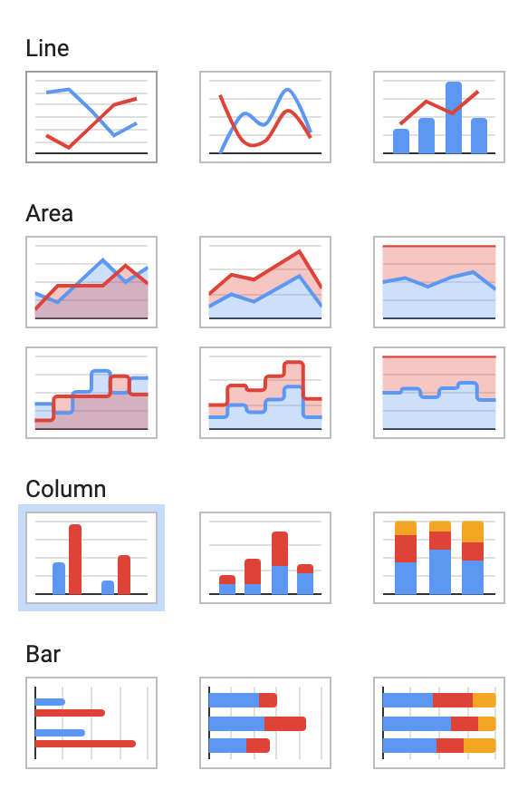
Bar & Column Charts
Table Charts,
Histograms
Population Pyramids
Box and Whisker Plots
Radial Bar Charts
Radial Column Charts
Tally Charts
There are many different types of data visualization and G2’s Learning hub discusses the “67 Types of Data Visualizations” and how to determine if you are using the right one. In addition to the information provided on G2’s learning hub, the following links provides more options of different charts and tools to use for comparing numbers.
G2’s Learning Hub
Tools for comparing numbers!
https://learn.g2.com/types-of-data-visualizations
TABLEAU
TOOL FOR DATA VISUALIZATION:
TABLEAU
Tableau is another platform and tool that is used to communicate information, present it accurately, and understands the importance of data visualization. Tableau platform was founded in Jan 2003, where data meets design. This website helps view business data in a visual way, and the innovation was focused on visual analysis. Tableau helps people and business see and understand data, and their visual analytics for businesses is helping solve problems and compare numbers. Using these software’s available as tools to help give better understand and using the technology available to generate visualizations of data combined with design to help businesses and reaching target numbers or goals. Attached is a video of how simple and easy comparing profit values, or numbers using Tableau.
Comparing Numbers
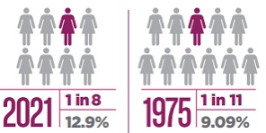
When studying data and analyzing numbers, they can become overwhelming and lose their significance. When numbers are compared the perspective of the data changes giving information more meaning, or less meaning. October is breast cancer awareness month, so many statistics are shared to bring awareness to how many people are diagnosed with cancer. When larger statistics at a larger scale are used it is easier to see how many people are effected by breast cancer. “About 1 in 8 U.S. women (about 13%) will develop invasive breast cancer over the course of her lifetime” (breast cancer.org, 2021). This statistic alone is meaningful and easily recognized as significant. Then when a second statistic is added, the data becomes even more shocking. “Breast cancer became the most common cancer globally as of 2021, accounting for 12% of all new annual cancer cases worldwide, according to the World Health Organization” (breast cancer.org, 2021).
https://www.cancer.org/cancer/breast-cancer/about/how-common-is-breast-cancer.html
Best Tools For Numbers
Tableau has a variety of options available, including a desktop app, server and hosted online versions, and a free public option.
Infogram is a fully-featured drag-and-drop visualization tool that allows even non-designers to create effective visualizations of data for marketing reports, infographics, social media posts, maps, dashboards, and more.
Chart Blocks claims that data can be imported from “anywhere” using their API, including from live feeds.
Datawrapper was created specifically for adding charts and maps to news stories. The charts and maps created are interactive and made for embedding on news websites. Their data sources are limited, though, with the primary method being copying and pasting data into the tool.
Insightful Data Visualization

In this display, we are being shown the possible changes that will be made in the office places. The largest portion of change is the flexibility based competition rather than the competition in the salaries.
Population Pyramids : Comparing Numbers Across Time
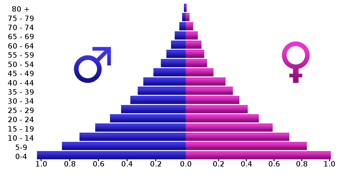
Particular attention of this week’s assignments (and Chapter 3 of Effective Data Visualization) was paid to back-to-back graphs. Although Evergreen’s exercises explored one potential use of back-to-back graphs, perhaps the most common example are population pyramids.
Otherwise known as age-sex pyramids, these graphs aptly measure the distribution of a population based on a sex’s share of age groups. With each graph a snapshot of a particular timeframe (usually for a given year), population pyramids are particularly good at displaying changes over time.
PopulationPyramid.net lets the user explore the age-sex distribution of the world and individual countries. With data from 1950, one can see how populations have changed over time and have been influenced by historic events – for better or worse. One of the most relevant types of statistical data, the site also affords population projections unto the year 2100. With these, organizations and governments can plan ahead in anticipation of what future populations will need; areas with a sizeable young population might consider investing in infrastructure to meet impending housing demands, whereas areas with an aging population might focus on eldercare.
As the video highlights, within a single image, scientists and policymakers are able to gain a “rich and complex understanding of populations and the factors affecting them,” (04:40). Although they might appear as aesthetically plain graphics, population pyramids can be incredibly dense in historical context and implications of what’s to come. An integral part in being able to understand the past and prepare for the future, it is all the more valuable to be able to appreciate the power of population pyramids and properly interpret and utilize them.
Comparing Numbers
Google Analytics is a good free to use site that allows for good data visualizations for business. It allows users to visualize and understand the sales of the business. The site builds visualizations based on data regarding the number of sales, location of sales; whether they are from multiple online sites or store locations, as well as profits, expenses. It is even good to use for marketing to analyze the feedback and receptiveness of the ads that companies are using. Using this tool allows for users and developing businesses to take advantage of free software that will better help them understand and improve different aspects of their business because the relevant data is presented to them in a clear concise manner that allows them to understand the full scope of their business. Other comparable sites do have more features, but they do come with a price tag. Google Analytics even though it is free it is intuitive enough to give users enough features and visual representations in order to help them visualize and compare their data to help them improve and expand as a whole.
Google Analytics may be a little complicated for new users, but the site has plenty of tutorial videos to aid users in creating the necessary visualizations that they require. Having multiple resource tutorials allows new users to not only learn how to use the site but also teaches them which visualizations are the best to convey the message that the data intends to. Users that have a better understanding and grasp of the site and the visualizations to accomplish their intended goal allows them to be in a better position to grow and expand compared to their competition that may not be comparing its data to see in what areas they can improve on to achieve that end goal.
Watch the video below to get a brief overview of Google Analytics:
Click here to read a more in-depth review of Google Analytics.
Helpful Infographic Tools
In order to create an efficient display of information to the reader, one has to make a chart that has the right format. Here is a list of tools that can help create useful graphics from given data that will be needed to be shown to the viewer.
Google Sheets
Google sheets is a free-to-use service from Google that is able to create tables and graphs. This service offers a variety of simple graphs for the user’s disposal, but some functions will require prior experience of similar interfaces. In order to use Google Sheets, you must already have a Google account.
Canva

Canva is another free infographic creator and has a variety of pre-designed charts that are ready to edit that only need the data to be put in and minor adjustments.
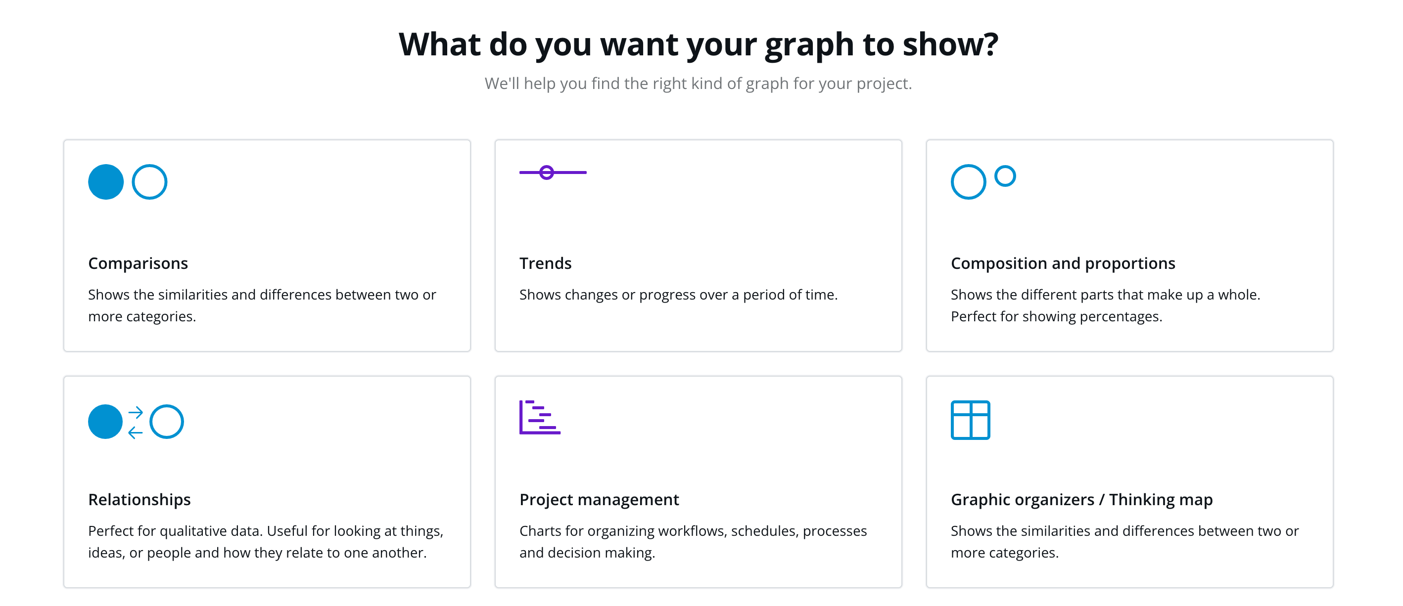
By clicking on “create my graph now” on its table page, the website will give you a questionnaire that will guide the user to creating a chart best fit for their needs.
This website is more beginner-friendly and is useful for many other topics like social media, cards, and designs.
URL: https://www.canva.com/graphs/
Visme
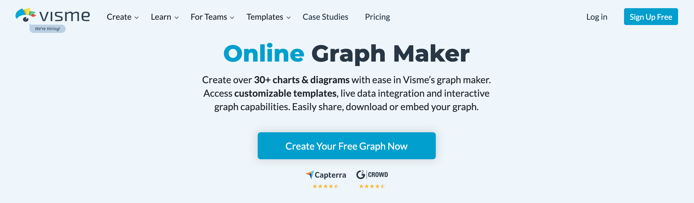
Visme is another website like Canva and has a variety of charts and graphs to choose from. The only drawback of this website is an account needs to be created before accessing the templates and some can only be used with a paid membership. After making an account, the user is able to edit a template, input their data, and save it for their use.
Comparing Percentages of The Most Common Reasons Both Genders Shop Online
Here are statistics based on men vs. women shopping habits online. The pie charts above, blue resembles men and pink resembles women, signify the entire percentage of each gender that shops online. Then, they pull it apart and separate it within the common reasons men shop and common reasons women shop. Finally, as they collect that percent, they then compare the opposing gender’s percent on that same shopping reason. After observing this data visualization, it is quite interesting how most percentages are close between both genders, except for technology. Men spend more time and money wanting computers/technologies than women by almost half percent of the women’s side. Furthermore this information/numbers can definitely help business/marketers and the world see who shops more online and in what category.
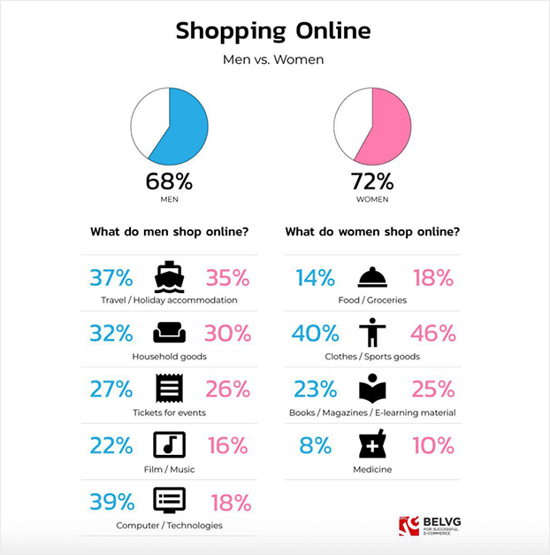
https://belvg.com/blog/men-vs-women-who-runs-the-online-shopping-world.html
VizHealth
What an inspiring website. The infographics shown on this website are phenomenal. This website provides great assistance when one needs to create a specific infographic or display to make a point. As shown below on the VizHealth website the user is allowed select categories detailed towards the health statistics specific to the presentation.
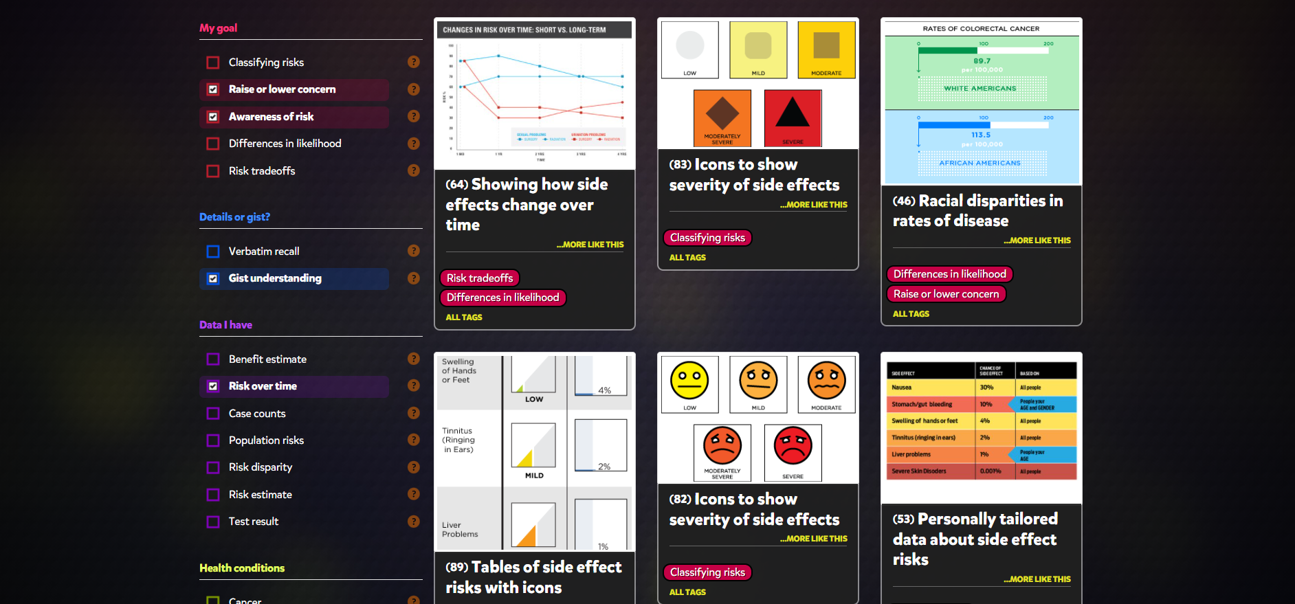
The website Vizhealth is a beautiful tool when creating a presentations. The website generates vibrant images to be used when displaying pertinent information to viewers. The variety of selections available really can help users become creative and select and image best suited for the audience.
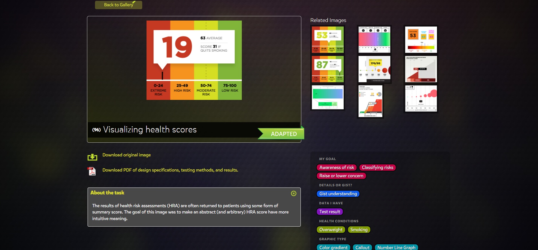
Creating a presentation is not an easy task. VizHealth does the hard part for the one presenting. Generating bold pictures with easy to read statistics can be half the battle. The user simply needs to click the categories that apply to the presentation and the infographic is created. A great tool in the health field or in health classes to teach people of positive and negative impacts ones decisions have on a persons health backed up with statistics.
Recent Comments