PIE CHARTS
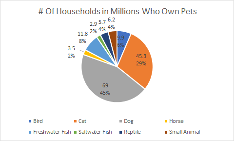
Pie charts are a type of graph that we see often, but not everyone knows how or when to use them properly. Pie charts can become very confusing if they are not labeled properly, or if they have too much data on them. I thought that the perfect case to use a pie chart for was on the types of pets, and how many households own that specific type of pet in the USA. The data I used was from 2019, and it measured the number of households that had specific pets measured in millions. My pet categories included birds, cats. dogs, horses, freshwater fish, saltwater fish, reptiles. and small animals.
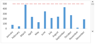
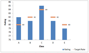
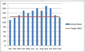
Benchmark comparisons
These were the few benchmark graphs that I have found and are slightly different in each graph. The first graph is similar to the last a regular benchmark line but it is dotted instead of solid. This graph is the easiest to understand and visualize it right away because it is simple.
The middle graph has multiple straight lines rather than one just across. The benchmark isn’t the same as the others that’s why they are all individual. There was another like it but the line went up and down it was all connected and was actually more difficult to visualize it.
Comparing numbers
Data visualizations are a vital component of a data analysis, they summarize large amounts of data in graphical format which is really important when you are reviewing and comparing many numbers. Some of these charts to compare numbers in visualization are bar chart, mulit-set bar charts, line graph, stacked area graph, bubble chart, etc. This article below about how to chose the right data visualization for your information provides great points and facts about different chart visuals.
https://chartio.com/learn/charts/how-to-choose-data-visualization/
This image below is a back to back bar graph that compares a few sets of data numbers and separates it into two graphs that lets you see all the information on one graph. I enjoyed this graph and I think it really helps when you are comparing numbers in data.

Vizhealth
This site is very interesting. It provides you with many visualizations of data. The gallery section is very cool because there is so much information about many different topics all displayed in cool colorful helpful visuals that help you understand the data information well.
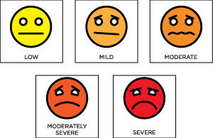
I found this image interesting because you see it in doctors office all the time and it helps children tell the doctor or parent how they really feel. I think it is a really smart way to display the emotion of someone if they are sick or angry.
The wizard is a tool that choses image based on concerns or needs. It is basically designed to clarify your goals. You answer a question in the wizard and then it will guide you to a category that matches your concern. What I liked about this site is the picture that you chose, it has a detailed description of what it is about and the information displayed on it. Overall this was a great site about visualization and the gallery is awesome and the wizard is really helpful.
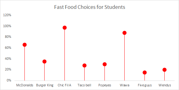
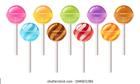
Lollipop Chart
Lollipop chart is a great alternative chart to column and bar graphs. The chart is often easier to read data when its side by side in bar graph format but the lines are thin with the ball at the top so you understand what the chart is explaining. When using mass data, lollipop is helpful because it focuses attention on the values. I like the bar graph when you have less data and the lollipop when you have more because the lines and circles is better to understand rather than clustered bars close together.
Breaking Down Budgeting
Intro
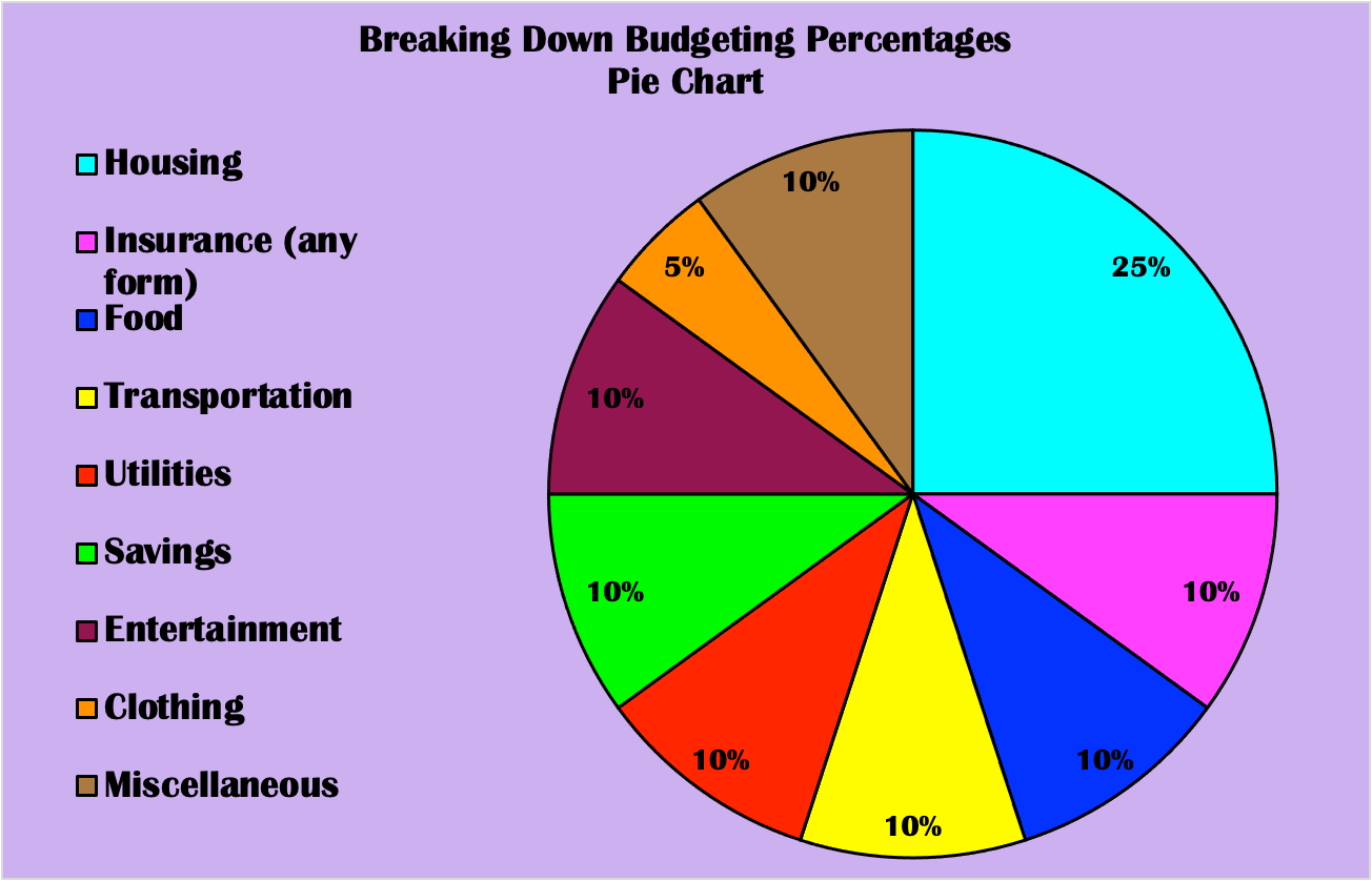
Who plans on living on their own or with someone in the next 5 years? Hey, maybe you currently are, in which you understand how important it is to plan your monthly expenditure. Since just about every home owner will have to put down their expenses, it may come off as a bit of a challenge for some. Every penny counts because one costly purchase can make a huge difference int he end. Not only do home owners have to worry about this organizational process, but so do business owners in order to successfully survive. Honestly, every individual who acquires any amount of cash is in their own way of budgeting. Thus, budgeting is vital and breaking down each percent spent on each category matters. Below is a helpful pie chart that separates each payment category you will have to contribute throughout the month, typically based on your payment period as an adult.
About Pie Chart And Why a Pie Chart is the Best Visual
This information constructed as a pie chart is the perfect chart to use because these expenses count as a whole. Each percent included will total your overall expenditures, which clearly is 100%. The bright colors of the rainbow, which I incorporated on the pie chart, help decipher each category, as well as the labels along the side. The elements that make up the chart are conveniently situated to want to discover a basic yet important topic. The pie chart is manageable to comprehend useful percent divisions for the future. Who knows, you could learn about your spending habits, perhaps even what you may have to give up. The website that the data was gathered on also discusses tips to remember such as; added taxes, staying realistic, and so on.
Summary
Yes, adulting is tough, however, it can be easier to get through the hardships with this given guideline. Owners of any kind will value this guidance in the form of a pie chart. It’s visually interesting, encouraging, and critical. Well, what are you waiting for? Start budgeting or start preparing to budget because each category listed above will be part of your life years to come.
Lollipop Chart
A lollipop chart is useful for showing specific data, that is not a range of information. When looking at the chart it brings the readers eye directly to the significant data point. Other types of charts or graphs show ranges of information, but a lollipop chart is perfect for few numbers that are compared to each other.
Lollipop Charts
Lollipop charts are very similar to bar charts and can be used to show how data behaves over time or to compare data sets. The design is rather self-explanatory where the chart has lines with circles at the end to represent data points which resemble lollipops.
An example of a lollipop chart is one I created after researching data on what the most popular car colors are in the United States.
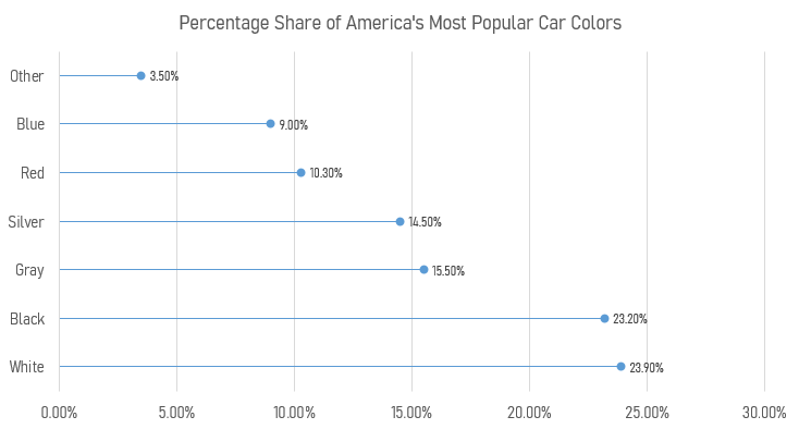
Using this chart creates a minimalistic and readable display of the data that clearly shows that white, black, and gray are the top three colors. Lollipop charts are very versatile and can be a very effective way of visualizing data.
Lollipop Charts
A lollipop chart is very similar to a bar chart. It is used in the same type of scenarios while being more appealing to the eye. It avoids having a cluttered look when comparing multiple data sets and makes it easier to follow along. They can be used horizontally or vertically and are very simple to make. I made mine on excel and it took me no longer than 15 minutes to complete. Region A,B,C, and D are all in order from left to right.
Where and When to Use Lollipop Charts
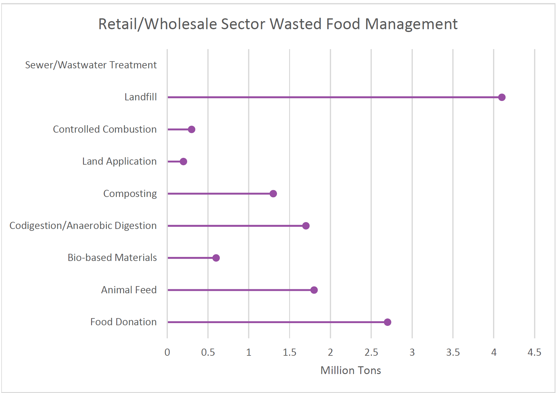
Lollipop Plot
This type of chart is very similar to a column or bar chart, however it consist of a line running from the x-axis and a dot at the top to pin point the value of each category. The visual replicates as a lollipop hence the name due to its long line as the stick and the point at the top to form a circle.
Common Uses:
- Visual alternative to side by side bars
- Comparison between categories
- When displaying more than 10 categories making it more legible.
Easy and Effective
The example below of a Lollipop data chart displays data of how much retail and wholesale organizations manage and dispose of their waste in 2018. This chart is easy to manage and create way to effectively arrange your specific data. that allows the presenter to create unique designs and templates while allowing it to be used for various data forms.
Recent Comments