Pivot Tables
What is a pivot table?
A pivot table is somewhat like a report, however it gives you an interactive view of the data. It allows use to specifically categorize small portions of data into separate units.
Importance of a Pivot Table?
A pivot table is very useful in excel, it allows an individual too easy and effectively create and organize a wide variety of data. I can be used to create reports and analysis within a large data set.
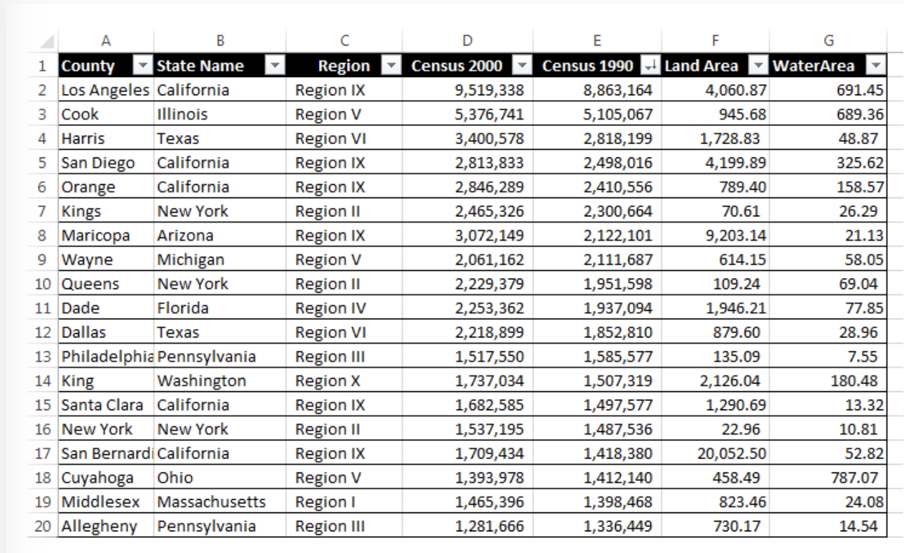
This example pivot table shows various categories of the state and county as a focal point, and then shows the population as well as the square miles of both land and water. This example is a good explanation of how. you can organize and create specific categories to compare side by side while still keeping it in relation to a specific topic in this case it’s the state. As you can see the comparison between census(population) in the 2000’s compared to the. 1990’s.
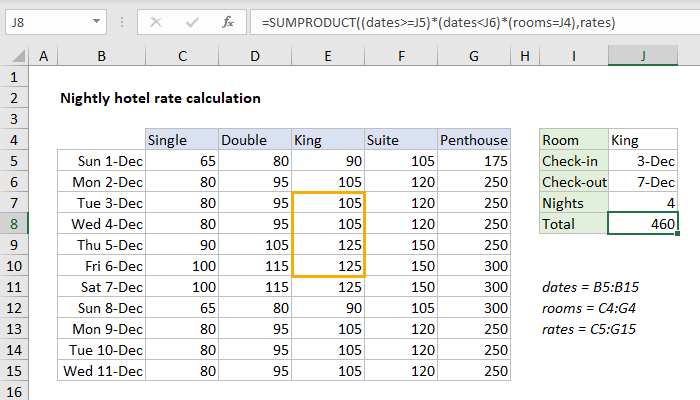
This pivot table is a great example of cost comparison as well as defining them through specific dates within a month. As you can see there are 5 categories defining the specific room type for each date and as the room size gets bigger the price increases. This is a great data set used by hotels, or any company that has packages within their business.
Link to create your own pivot table:
Pivot Table
The main purpose of a pivot table is to summarize data in a quick and concise manner. The function of these is very important because they can turn boring excessive data into clear and concise data. This can allow the user to make quick decisions based on the data which makes it a great tool in the industrial world. One example I have found shows how it can be used in the political world. This second website I found has a plethora of examples and uses that can be very useful for people wanting to learn about their uses.
Pivot Tables
After reviewing the link on www.contextures.com,
I found useful information to assist me in trying to format a organized pivot table. In excel, pivot tables are known to be the most powerful, useful, and beneficial for large data sets. They summarize, sort, and organize information in tables that are easily adjustable. They allow you to interact and explore data in different ways and look at the same data with different perspectives.
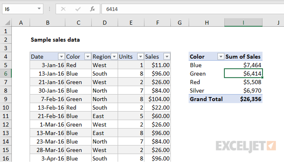
An example of a sales data set, from ExcelJet includes a pivot table that is easy for adjustments because in this case data changes frequently. There are many other benefits to using Pivot Tables, they are easily changeable or flexible. They are accurate, take less time, and you can create pivot charts from the pivot table.
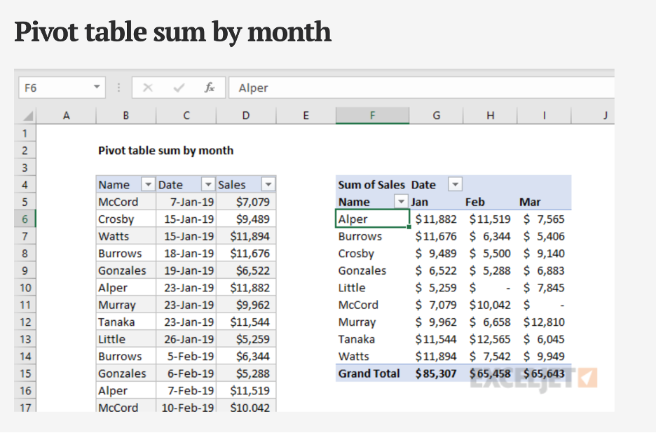
With pivot tables there are many ways to summarize and group data, for example the pivot table sum by the month using the data grouping feature on excel.
The Use of A Pivot Table
What is a Pivot Table?
Excel has a neat feature to input different values into one data set called a pivot table. A pivot table can allow you to then make calculations, comparisons, and trends from a large set. Accountants, Data Analysts, and managers of a product/service are occupational examples that may use a pivot table.
Examples
Below is an example of a pivot table in Excel, most likely based upon produce stock.
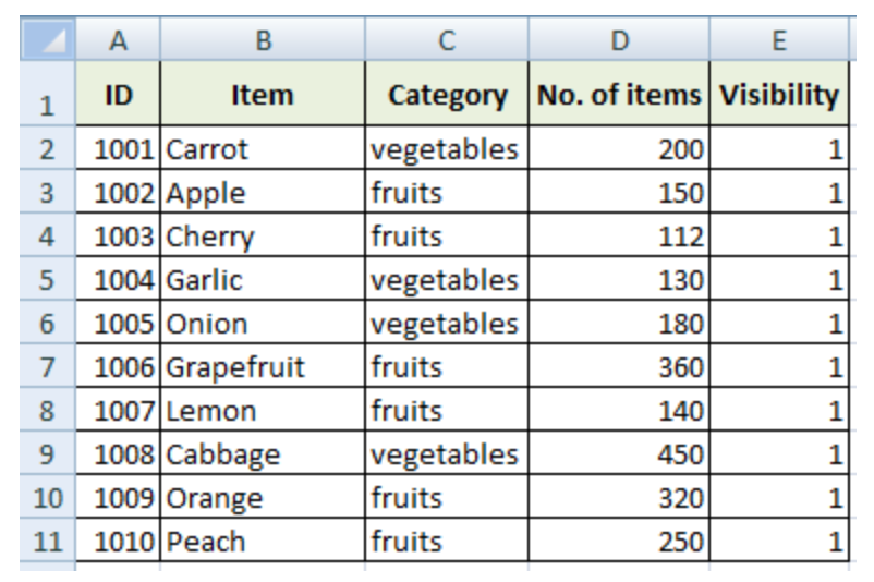
As you can see, there are multiple different categories highlighted in green, which include; ID number, item, type of produce, etc. This is a perfect example of a data set consisting of significant, organized values. Here is another example of a pivot table with an addition to interval of time category.
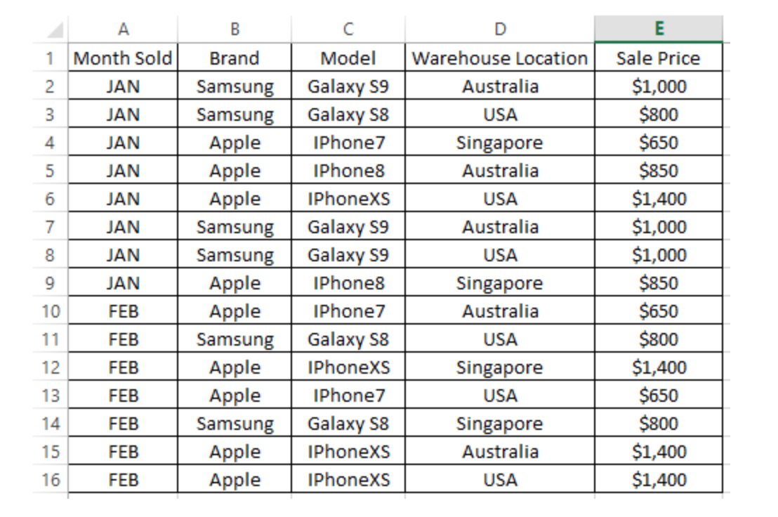
This example is based off two kinds of phones from two different brands. Throughout months of sales for these kinds of phone, plus in different locations, compares then the sales price. Notice how each row breaks down key components for this data example. People are able to compare maybe the prices amongst the different warehouse locations or maybe the Apple IPhone7 sold in U.S from Jan-Feb. Therefore, the business can make an analysis on future sales and/or adjustments to reach success and productivity.
Link to Create Your Own Pivot Table
Sankey
After exploring through the energy section of Sankey I was impressed. Sankey is a cool interactive tool to display information and educate anyone that may be curious. It has art work in the background relating to the topic which is not distracting, and interactive links with excerpts to get information from. You can click away and explore through a topic with ease. One of the things I learned is that “Electricity is called secondary energy because it is derived from other energy sources, mainly coal, natural gas, and nuclear reactions. About 39% of the total U.S. energy supply goes to producing electricity.”
What Energies Sources are Most Important
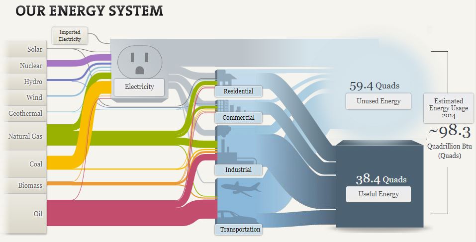
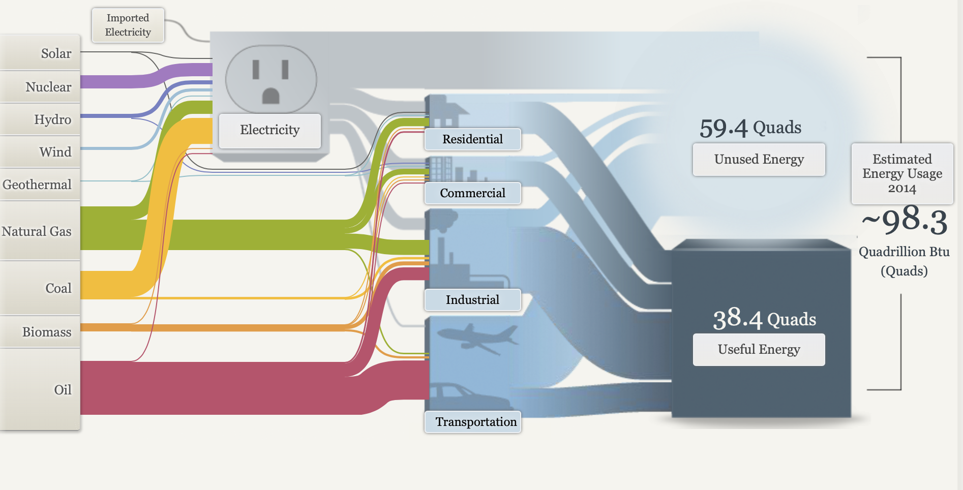
The National Academies of Sciences, Engineering and Medicine have a section of their website where they go over our energy systems. Below you can see each energy and where they go to be used and what energy remains unused.
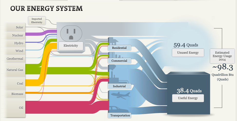
You may notice each line that connects one part of the visual to the next varies in size, this is no random occurrence. This visual adds different sized lines that lead from the energy source to where they’re used. Depending on the amount that energy source is used the larger the initial line, then it splits to more different sized lines depending on how much energy is used where. Below we can see that solar energy is rarely produced and used rarely anywhere, making solar energies line the thinest.
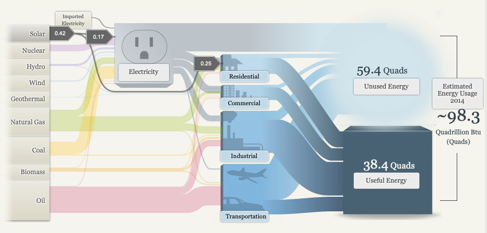
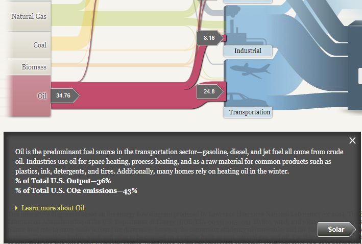
As we all know oil while its the most detrimental energy it is most commonly used making the line the largest and a majority of the initial line flows to transportation as we can see below.
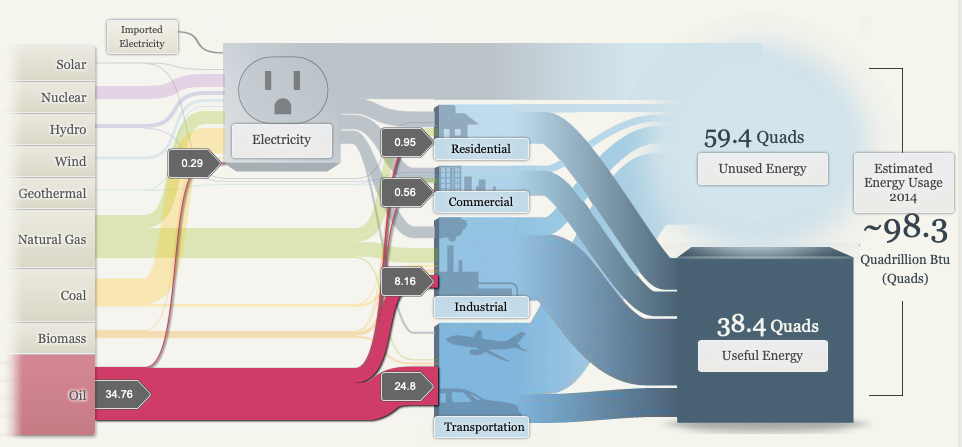
Overall this flow chart is very successful in making a clear presentation of where energies come from where they are used and what remains unused. The use of sizes, images, colors and the flowing pattern all add to the successfulness of this infographic.
SANKEY Data Visualization
The amount of energy used in American households, even wasted throughout the United States has always been astronomical. The diagrams created and provided by SANKEY not only shows the average US energy system, but cost and efficiency of small things like lighting.
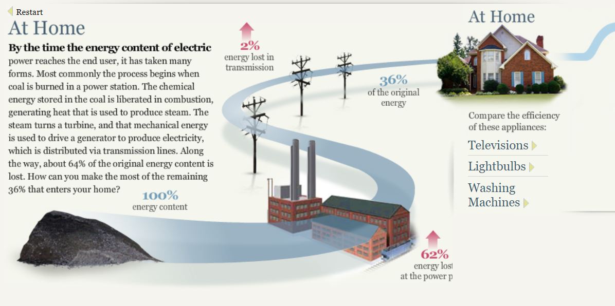
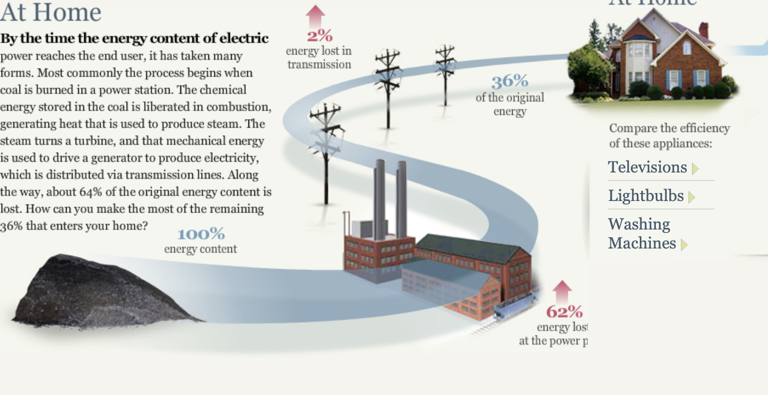
The process of producing energy by coal shows just how much energy is wasted transporting all of it across the regions. Alone a third is shown to reach your household while the other two quarters are lost along the way which is mind boggling.
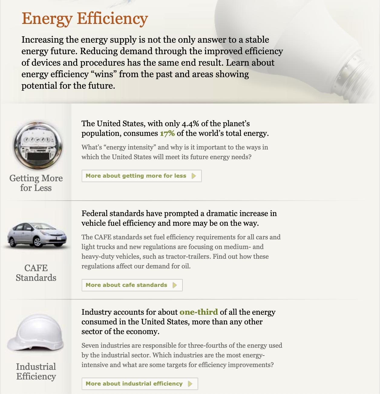
An interesting topic that seems to be growing more is LED lighting. LED lighting not only saves money on electricity but is a massive help to the environment. It not only reduces the harmful effects of consuming large quantities of energy but also does not have mercury.
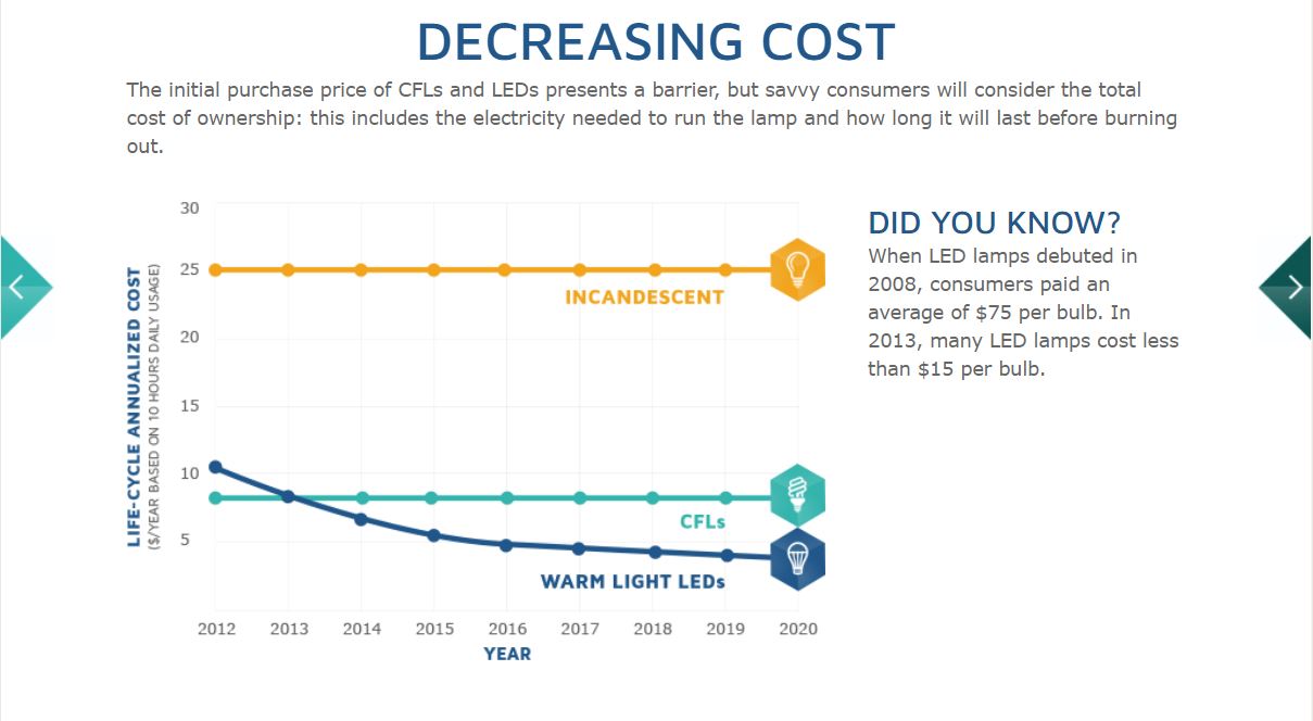
This graphs shows the over the years Warm Light LED bulbs have decreased in price compared to Incandescent and CFL bulbs. Within five years the price alone has dropped $60, starting $75 to $15, a massive change like that can only mean good as the price convenience will convince people to purchase more of LED bulbs.
The Energy System charts showing the National Energy System of the whole nation, Regional System containing MD, OH, PA, and WV, and the State Energy System of California is inconvenient in my opinion as it seems he was trying to portray the data as an energy grid, but came across too confusing for researchers.
NeedToKnow
What I found:
I discovered that not all energy supplied is actually used, and that more than half is lost as waste heat or through inefficiencies. I’m sure I’ve heard that before sometime in my life but being reminded through this website really opens my eyes on how crazy the world works. So much energy wasted and we can’t do much about it.
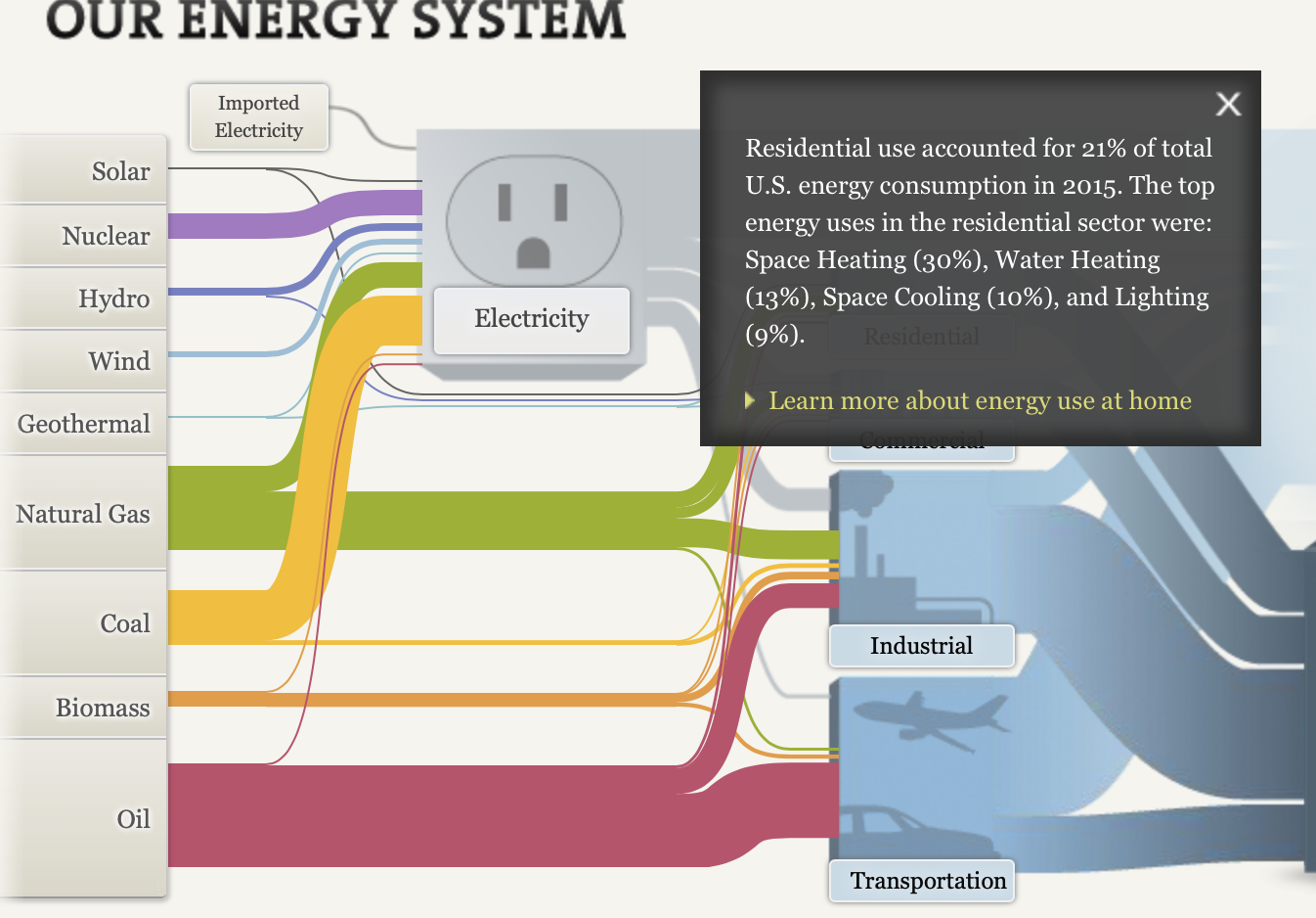
I learned that we divide our energy use among four economic sectors: residential, commercial, transportation, and industrial. Things such as heating and cooling our homes, lighting office buildings, driving cars and moving freight, and manufacturing the products we rely on in our daily lives are all functions that require energy. Without energy, we can’t do any of the things listed above as well as many many more. Energy is a key tool and necessity in life and without it we would struggle a lot just like humans used to in the stone age.
I really liked how interactive their website was, even letting us choose what we want to click on in order to show that it’s our choice to choose what we want to know more about. It doesn’t throw in unneeded information or tries throwing a bunch of summaries at you, it lets you choose what you want to see and read next and that works really well. Their graphs were perfect, all very colorful and perfectly organized with the data and labels that they need. Also on these charts like I said before they would have these interactive tags to have use choose what we want to learn about next which was cool.
Sankey Visualizations
In 1898, Matthew Henry Phineas Riall Sankey developed the Sankey Diagram when he wanted to visualize the energy efficiency of a steam engine. Since then, Sankey diagrams have been used in many different ways across various fields of study to show flow over time between stations. For example, in the webpage titled, “What You Need To Know About Energy” by The National Academies of Sciences Engineering and Medicine, the Sankey diagram is used multiple times to visualize the flow of energy sources throughout the United States and in specific states such as California.
While this may seem very complex at first, it is really not too bad and it effectively visualizes the distribution of energy sources to their respective industries in 2014. It is very interesting to see how important the traditional oil, coal, and natural gas industries still are despite the large pushes towards renewable energies such as solar, wind, and hydro.
Another interesting thing I found on this site is the breakdown and visualization of CO2 emissions from each energy source. Of the nine energy sources, only three contribute to all of the U.S. CO2 emissions. They include, oil (43%), coal (29%), and natural gas (28%). This helps the viewer see and understand how the largest sources of energy are also the largest contributors of carbon dioxide emissions despite the “cleaner” alternatives that are available.
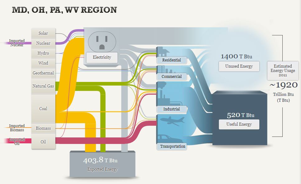
This Sankey diagram looks very similar to the first one but it is slightly different and covers the regional energy system of Maryland, Ohio, Pennsylvania, and West Virginia. In this diagram, it visualizes imports and exports as well as the general energy usage. You can see how the imported energy sources come in on the left and how they are distributed across the grid. It is also important to note how much energy is exported from this region through sources such as coal and natural gas. This is clearly shown from the divergence of these channels that contribute to almost 404 Trillion British Thermal Units of exported energy.
Overall, this is a very informative website that has great examples of effective uses of Sankey diagrams. There is a lot of good information about the energy systems of the United States but also more specific data on related topics such as energy efficiency and the pros and cons of different forms of lighting.
Takeaways of Energy System Website

My first interaction as I started the flow chart is I like the overall theme and organization of the chart, they created different sections based on the appropriate energy source as well as the envier rental areas it has because all these parts can cause a increase or decrease of the amount of energy being made and consumed.
I also love how they give you a quick summary of the specific uses in the residential, commercial, Industrial, ad Transportation areas. Many people don’t know specifically how much energy it takes to power the specific 7. appliances in their house let alone all the other individuals and businesses in their communities.
I also like how they broke down the the different sections between national, regional, and state(CA) because there is a major differentiations between each section and it is appropriate to show at least one state to show how much energy is consumed at a smaller population of individuals at still a high rate.
Overall I feel like they used a lot of visuals and simple explorational designs to help the viewer easily comprehend the extensive background behind energy, how it is obtain, maintained, and consumed by people to supply power.
I also was interested in how they expressed alternatives to decrease the use of energy for the future through innovative and efficient technology. They provided simple visuals to separate each section and provide a visual representation of the overall information.
Recent Comments