The amount of energy used in American households, even wasted throughout the United States has always been astronomical. The diagrams created and provided by SANKEY not only shows the average US energy system, but cost and efficiency of small things like lighting.
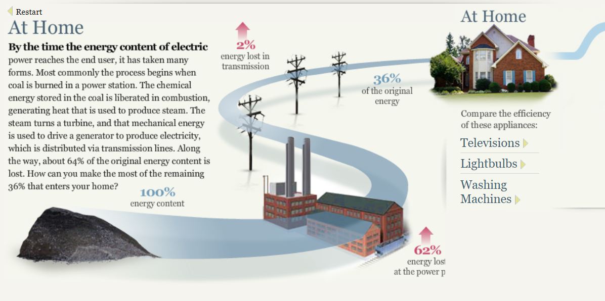
The process of producing energy by coal shows just how much energy is wasted transporting all of it across the regions. Alone a third is shown to reach your household while the other two quarters are lost along the way which is mind boggling.
An interesting topic that seems to be growing more is LED lighting. LED lighting not only saves money on electricity but is a massive help to the environment. It not only reduces the harmful effects of consuming large quantities of energy but also does not have mercury.
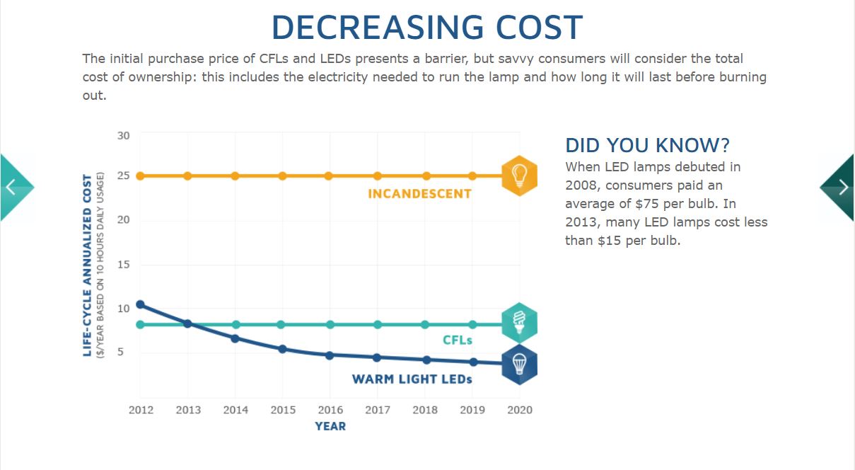
This graphs shows the over the years Warm Light LED bulbs have decreased in price compared to Incandescent and CFL bulbs. Within five years the price alone has dropped $60, starting $75 to $15, a massive change like that can only mean good as the price convenience will convince people to purchase more of LED bulbs.
The Energy System charts showing the National Energy System of the whole nation, Regional System containing MD, OH, PA, and WV, and the State Energy System of California is inconvenient in my opinion as it seems he was trying to portray the data as an energy grid, but came across too confusing for researchers.
Recent Comments