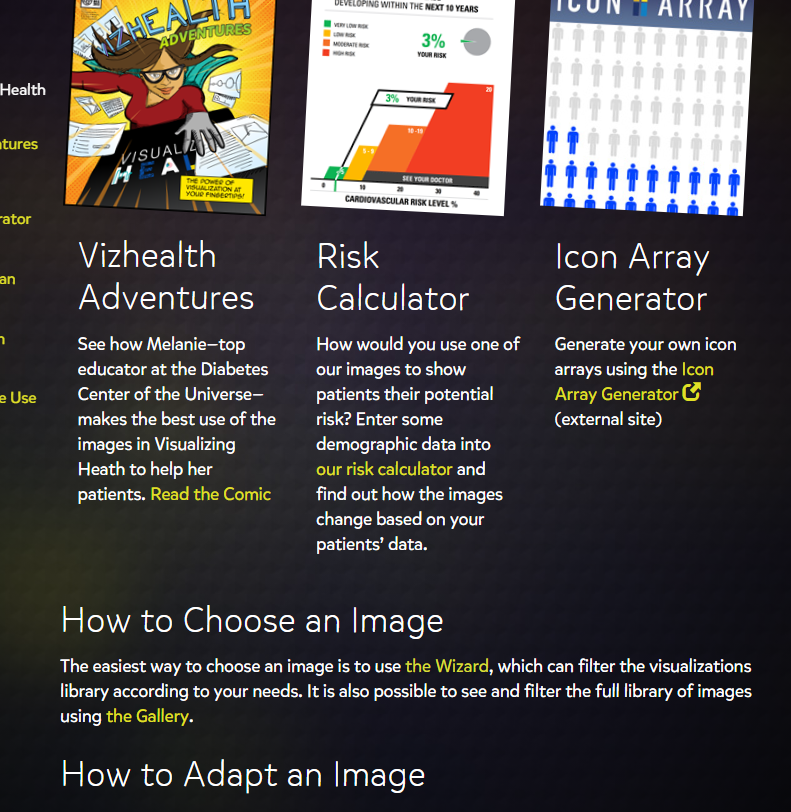
VizHealth
VizHealth is a site that helps users make better decisions about their health to try and help reduce their risks of cancer and diseases. I thought this site was well put together and is extremely useful for people to use to help themselves understand the importance of making good choices to improve their health. The site is very user-friendly and everything you need is clearly labeled and easy to use. Under the using visualizing health tab there are many resources to help users choose and adapt visualizations to their needs. There are even resources to calculate risks by entering demographic data. There are many different visualizations under the browse the gallery section that can be used. The best way that I found to find the visualization that you need is to use the wizard.
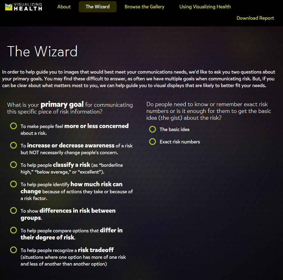
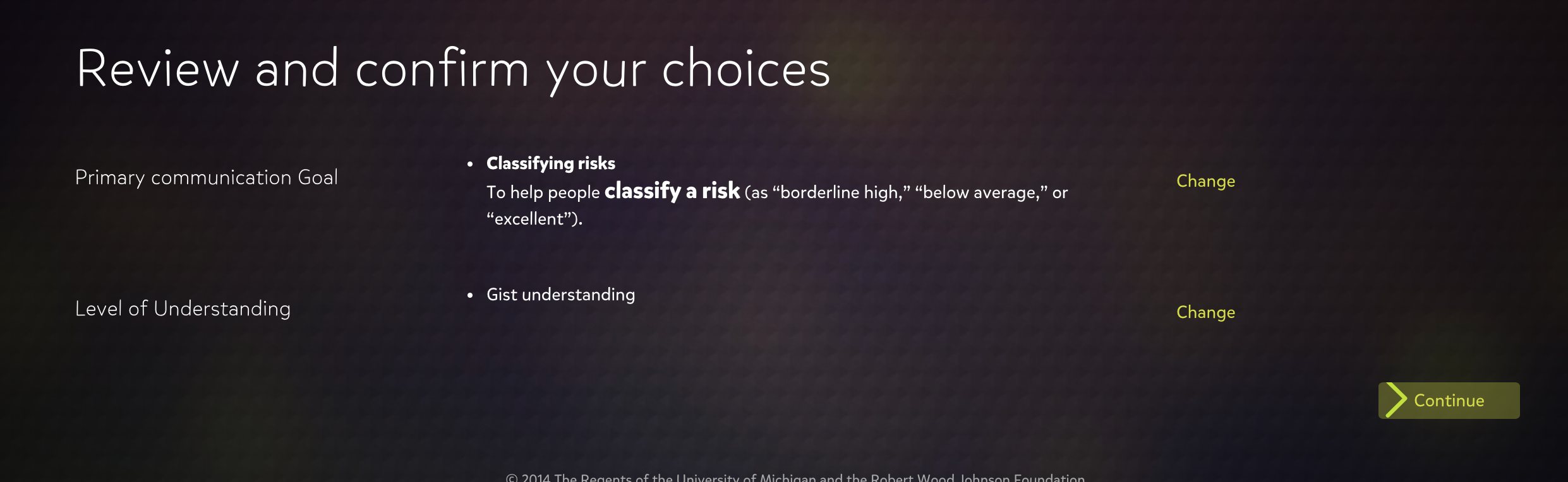
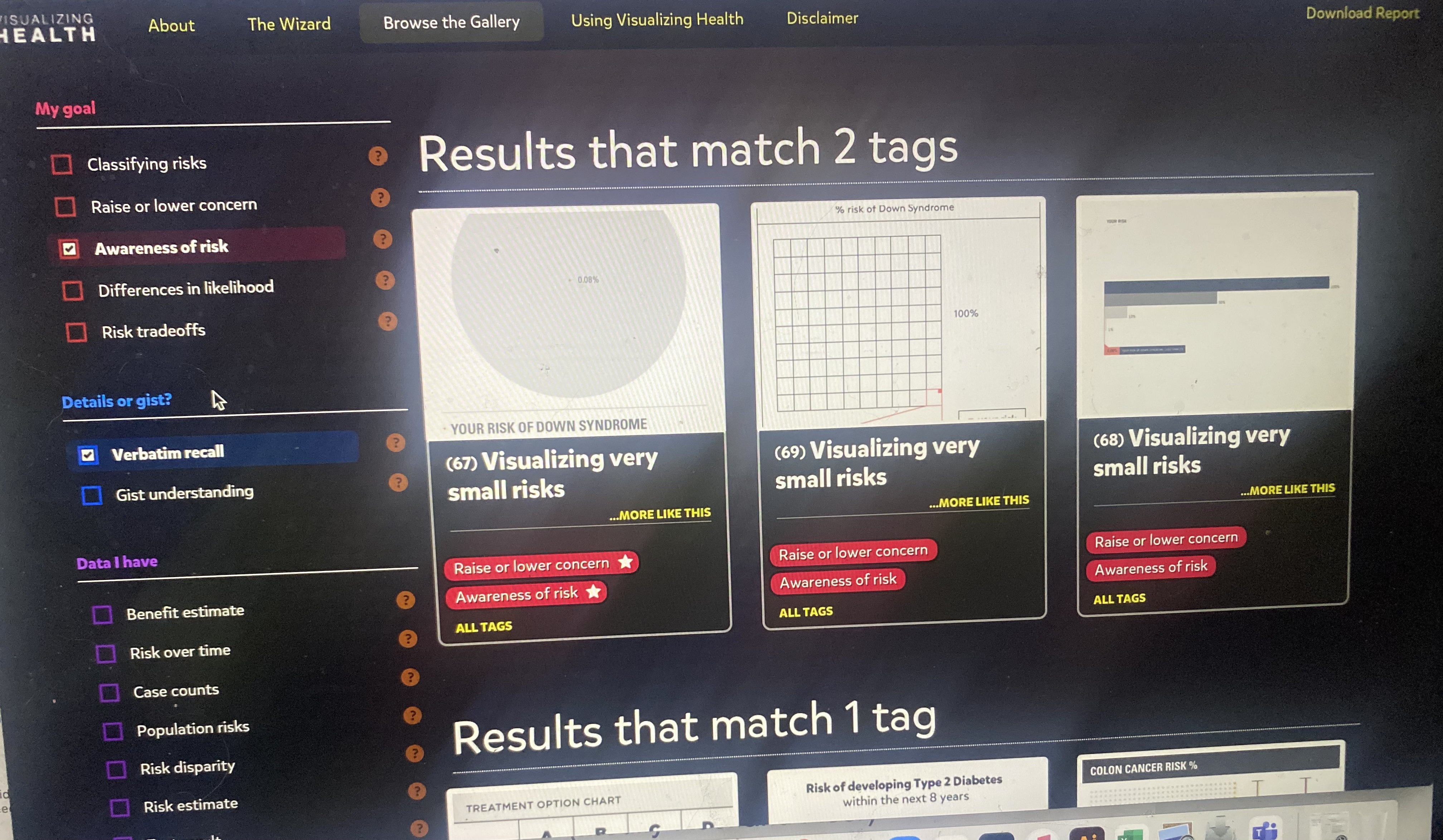
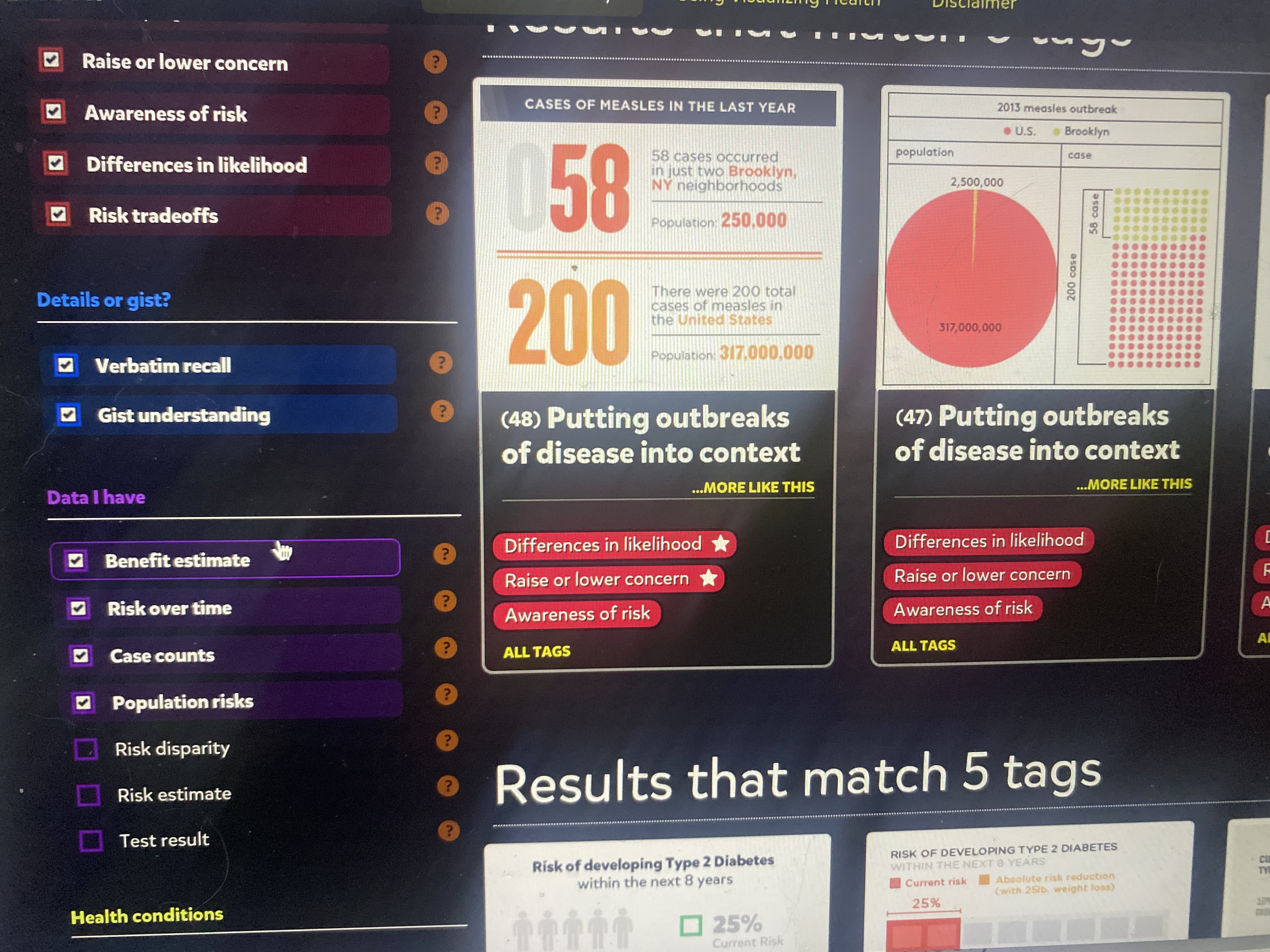
The wizard is a built-in tool that allows users to find the right type of visualization by asking the users questions so the algorithm can obtain the relevant visualizations. This is super useful in narrowing down the immense options that are on the site. Once the user answers the 2 questions the results are shown in two sections. The first section is results that match both tags and the second are the ones that only matched one of the tags selected. Users are also able to add more tags after the initial 2 questions if they want to fine-tune their results more. This is because the wizard serves to use what we deem is the primary goal and it utilizes only 2 categories to do so. These tools allow users to create a suitable experience with the data and visualizations they need. This is an amazing resource for people to use.
Click here to visit VizHealth to give it a try for yourself.
Here is a video from VisHealth explaining the purpose of visualizing health.
Visualizing Health
The layout of this website was very interesting. The website is well designed and straightforward to use. It helps health professionals get health risks across to the public using visualizations. The visualizations have been tested to prove they are effective at getting information across.
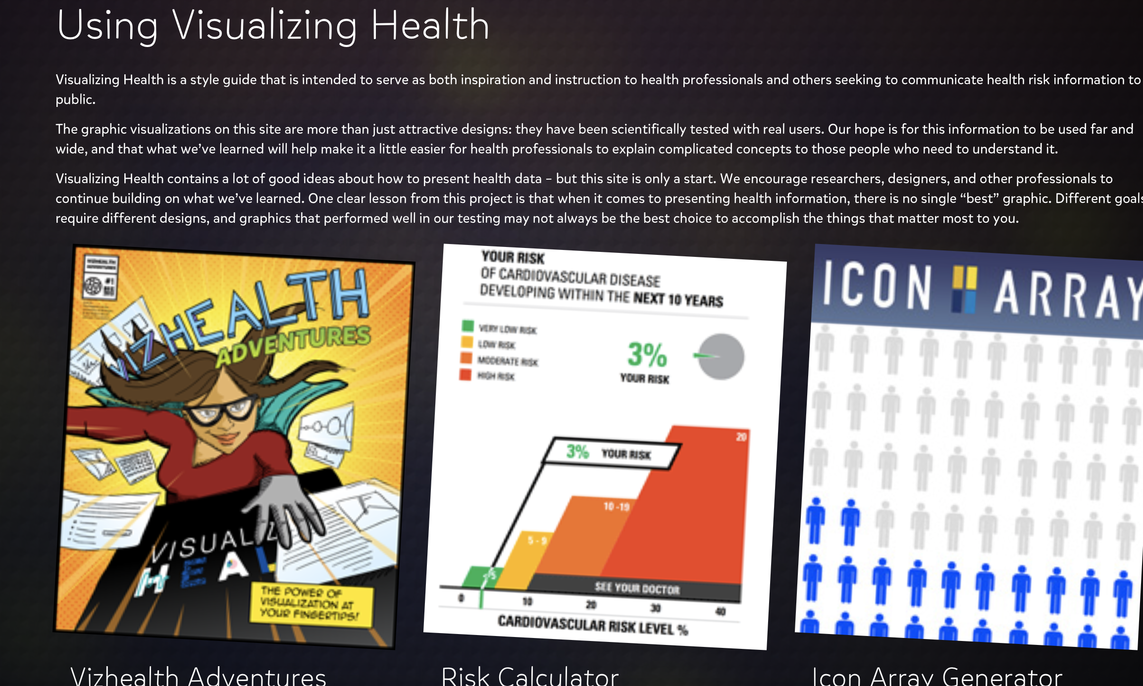
The visualizations included on this page were very appealing visually. Not only that, they also were easy to understand and contained relevant information. This website is a great tool for any one who is interested.
Vizhealth
I found this site to be extremely beneficial when exploring graphics. It allows you to select options to narrow down the best fit visuals for your data, which is very helpful.
I would definitely utilize this site if I was finding it difficult to pick a correct visual for my data and how I want to present it.
Infographics
Infographics – Graphic rich visual representations of information, data or knowledge intended to present information quickly and clearly.
The power of infographics is tremendous when reaching a viewer or audience visually and effectively. Images presented in conjunction with statistical data can have a far greater reach than more traditional charts when conveying data to an audience. Infographics is the combination of the two words “Information” and “Graphics”. Infographics are a win all the way around for presenter and those being presented information. It is a quick friendly snapshot of the information and statistics presented in a fun easy to retain manner. Many templates can be used when creating presentations. Skill sets associated with a successful infographic creations include the ability to clearly present statistics with quirky contagious images bound to stick in the minds of the viewer. The information originates from data on a given subject.
Infographic Examples. What is an infographic? Examples and templates (easel.ly)

Tools that may help us construct Infographics.
Infographics is a really fun and effective visual way to display any information. Infographics are the visual presentation of information and facts supported by graphics, charts, text, and diagrams. The video in the hyperlink shows how easy you can create a well designed effective infographic about any information. There are a number of tools that you can use to create interesting infographics. Some of those tools are:
Canva- Is a go-to tool for editing and touching up images for different social media platforms. Canva offers hundreds of design elements for creating infographics. They have grids, icons, illustrations, and many charts to represent figures in you info graph.
Piktochart- Is another infographic maker that can create interesting infographics. With Piktochart, you can create interactive charts, maps, and graphs. All you have to do is import your numbers, choose the chart or map you want to use for your infographic and you’re done.
Visualizing Health Commentaries
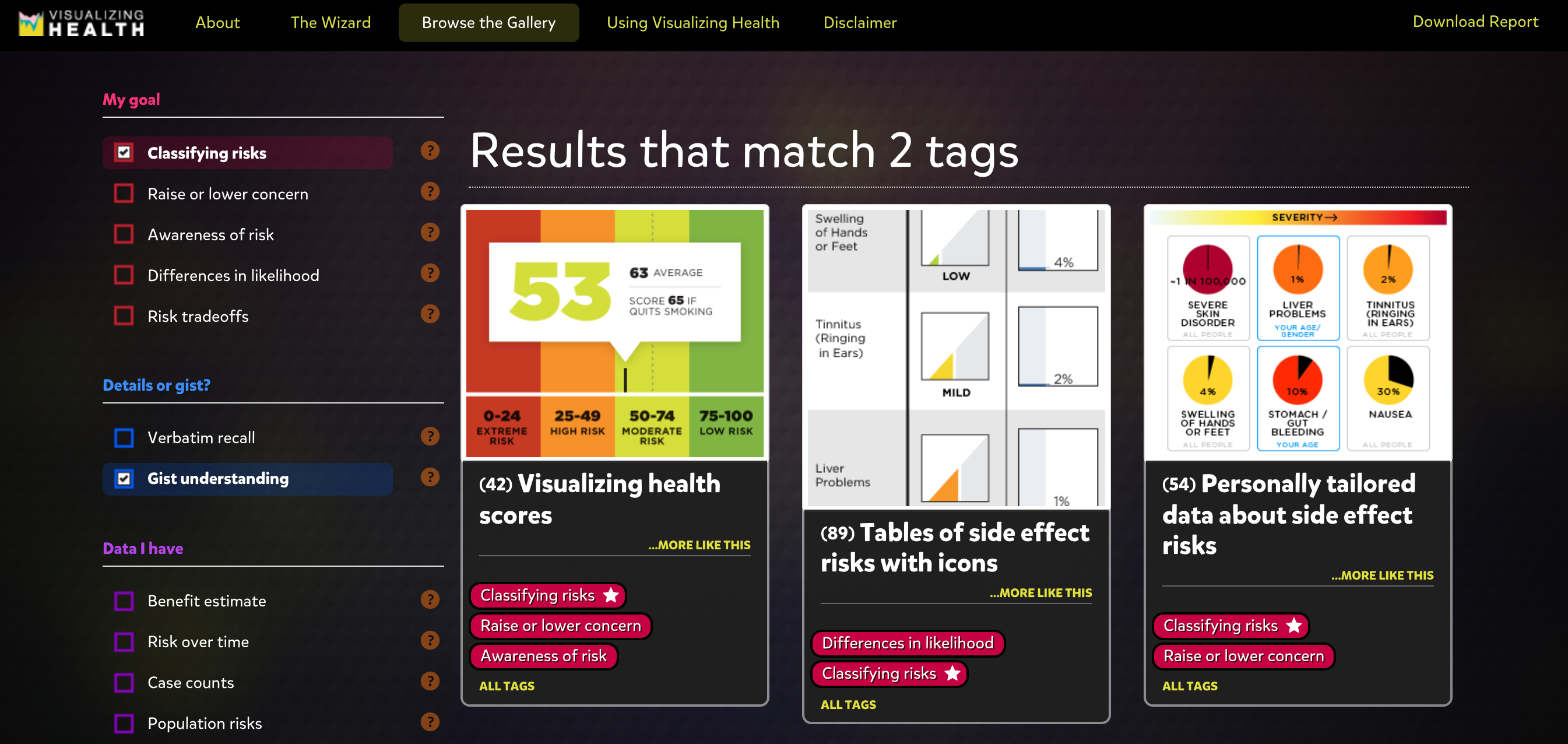
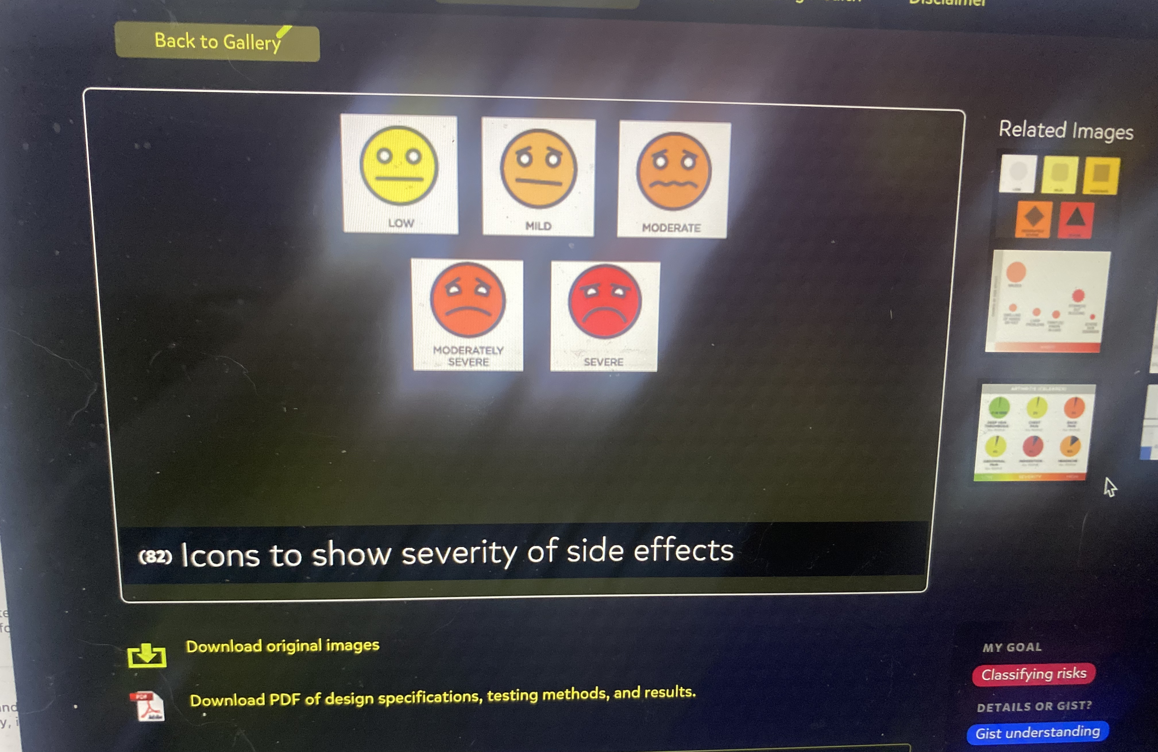
Visualizing Health is a project website that believes in constructing data in the form of visualization, concerning our health. In short, for people to make the best decision for their health based on certain stats/risks. The Wizard and the gallery on this site provide a functional, structural method to design graphs/charts catered to your data. First, you input the purpose of your data into the Wizard, most times referring to a health risk. What’s helpful is once you click on one primary goal, the Wizard will supply an example for definite measures. Then, you put whether or not there’s a risk that occurs in your data set, and boom the Gallery has selected all its designs that work for your data. On the side panel, you can select multiple additions for your chart/graph and the Gallery will narrow down your best options. Lastly, after choosing a style that best suites your data, you can download that exact image/chart layout. This website is super informational and convenient if/when you want given data on any risks with health topics or you want to create your own using icons/graphs for inspiration.
Below here are screenshots of images/data visualizations, as well as the side panel with various categories and subcategories to choose from:
Chances of a hole in one
pinterest.com/pin/47921183521791727/?d=t&mt=login
I have been golfing for many years now and still have yet to hit a hole in one. I know it sounds really hard, but its not impossible. Some people get lucky for example a person who’s ball hits the tree and somehow goes in the cup. It still counts. As the fall approaches I think to myself if I’m ever gonna hit that hole in one. I might have a better chance of hitting one after I turn 50. I bet it is a great feeling, but that day has not come yet. Until then I will continue trying to hit a hole in one.
Infographics
Examples of Insightful Data Visualizations
- Insightful data visualizations should present data in a concise and readable format that efficiently communicates a message to the viewer. Visualizations that present too much information, are too large or small, or present false information are not useful.
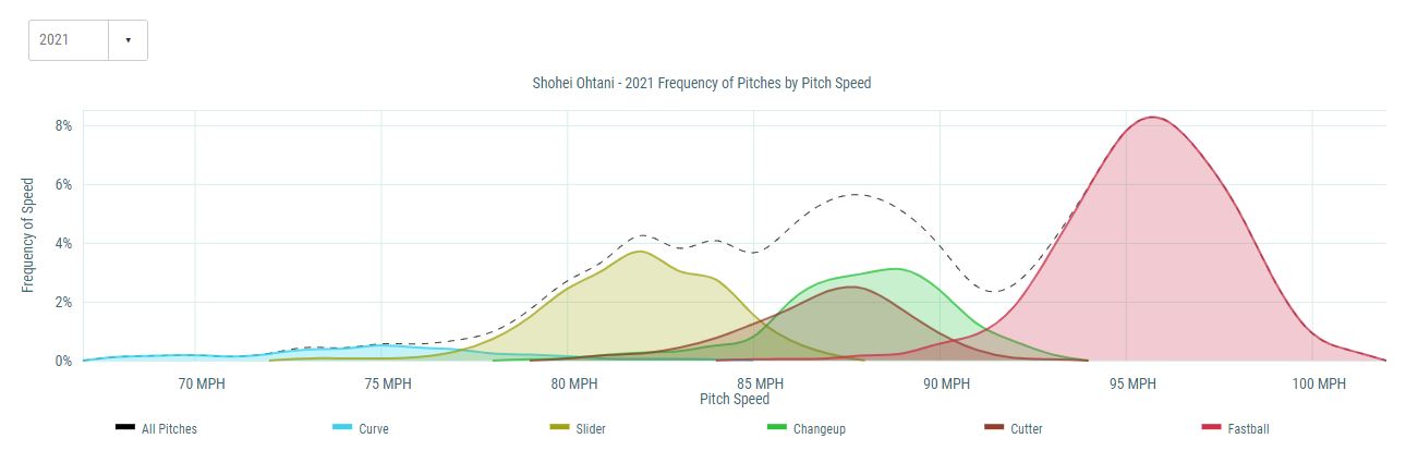
An example of an effective infographic that is used in the real world is the chart shown below displaying the frequency of pitches by pitch speed from the 2021 Major League Baseball season for the Angels pitcher, Shohei Ohtani.
Infographic tools:
One of the best tools for infographics that I found is Infogram. Infogram is a data visualization tool that has over 20 ready made design themes to choose from. It allows people to create customized brand themes with colors, cool logos, and fonts. Infogram also lets the designers create informative charts and maps. This tool also allows the user to create eye-catching designs in a short amount of time which is the most important thing with infographics. They are supposed to be short and to the point while also grabbing the attention of the viewers. Infogram offers subscription based service for personal use or business. Another tool that I saw is called Visme. Visme is free and allows the user to create engaging infographics and presentations. The free tool offers over 100 free fonts, millions of free images, and thousands of quality icons. They have a premium option for more advanced service, but the free option is still great. Overall, finding tools similar to these ones are huge when creating infographics. It saves the user a lot of time while also helping the user create fun informative infographics. Simple and creative is the goal when creating one of these, and that’s what these tools allow. 
INFOGRAPHICS
Infographics are used everyday to visualize information, and give a deeper understanding to data or statistics. By seeing numbers and data, and being able to look at graphs, number and statistics can be easily compared and understood. Infographics are beneficial to use in classrooms, corporate jobs, social media, news outlets, newspapers, anywhere people can access quick information.
“We need relative figures that are connected to other data, so we can see a fuller picture, and then that can lead to us changing our perspective.”
David McCandless, The Beauty of Data Visualization (2010)
Recent Comments