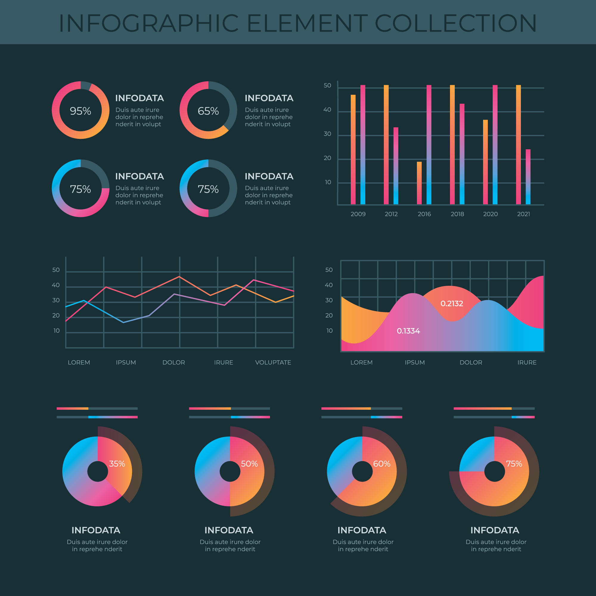
Examples of Insightful Data Visualizations
Visualization is critical to data analysis
This is a great example of data visualization
“Data visualization is a little like herding cattle — it’s expensive and time-consuming, but, ultimately, necessary if you want to generate profits from your cows.” -Angela Hausman, PhD
Using data visualtization the proper way can greatly increase market performance, audience engagement, and overall understanding of the said topic.
Below is a great video explaining what data visualization is and its benefits
Tools For Infographics
There are many tools that can be used to make infographics that you can find easily online. These tools allow people who do not know much about infographics to make infographics in less than an hour. These tools give you layouts and make creating an infographic super easy. The tool that I found that seems to be the most popular and easy to use is called Canva. Canva is an online infographic tool that is free to use unless you want to upgrade to one of the paid options. The free option of Canva has great reviews and is said to be able to take you very far if you do not know much about infographics. You can find Canva here.
Data Visualization (Infographic)

This is an infograph from the 2010 NFL season prior to the Pittsburgh Steelers and the Green Bay Packers playing in Super Bowl 45 comparing the 2 teams defenses during the season compared to the rest of the league. There are multiple infographics comparing both of these teams in the link.
Infographics
Examples of data visualizations. 1 – Cinema: Explaining a movie plot through data visualization. 2 – Art: Analyzing the color palettes of great artworks. 3 – Philosophy: A visual depiction of ideas. 4 – National Geographic: Cartography. 5 – Gastronomy in pictures. 6 – Data visualization through video. Below is a photo of data visualization charts as well as a link on the image to the website I got the photo from. Here is also a link to an article I found where they have a lot of great info on data visualization that helped me with this blog. https://www.tableau.com/learn/articles/data-visualization#:~:text=Data%20visualization%20is%20the%20graphical,outliers%2C%20and%20patterns%20in%20data.
Constructing Infographics
There are many tools at our disposal (both free and not free) that the public can use in order to construct infographics. There is a free site and app that can be used in order to create infographics, with no prior experience necessary
Canva | Infographic Maker | Design Compelling Infographics | Try Canva Pro

“With great power …” : Tools for Building Infographics

It’s no secret that the modern world is saturated in data.
While the potential of data has always been known, exactly how versatile it is continues to grow as more novel ways of gathering, utilizing, and sharing information arise. Stephanie DH. Evergreen alludes to this progression in her book, Effective Data Visualization (Second Edition, 2020, page 2).
… we have so much data we are suffocating in it. So now smart organizations are asking me how to cut through all the data they have and make it useful again.
The great power data affords is followed by the need to make use of it. However, it’s not just companies who have the responsibility to be able to share data in ways that are visually appealing, convincing, and concise. These skills are increasingly becoming an asset for use in the office and in the classroom; so much so, it seem inevitable that they will soon be a requirement.
To meet this rising demand for infographics and other data visualizations, programmes appealing to audiences with varying levels of skillsets and expertise (as well as the even greater variability of the audience the visuals are for) have been created. Offering the ability to start from a template or from scratch with drag-and-drop ease, sites such as Piktochart and Easelly have been hallmarks in the industry for nearly a decade. Others, such as Canva, are seeing a new surge of enthusiasm as the company expands beyond infographics and into other graphic media such as business cards, posters, and even social media posts.
While there is more to effective data visualization than these user-friendly platforms might lead on to, they offer an invaluable resource to those heeding the call to be more responsible with the data they share. With the ability of constructing attractive infographics taken care of, creators can turn their attention towards the more subtle (but, perhaps, the more crucial) traits of being to the point and truthful. A testament to their credibility, what they do with the data – and, indeed, the power – they have at their disposal speaks volumes. After all, with great power …
Tools to easily construct a Infographic
Why Infographics
Infographics allow the present/writer to present information in an interactive way to their audience. In doing so this helps the audience to quickly depict the information more easily as well as retain the information for a longer period of time.
Top 3 useful Infographic sites
#1 Canva
A personal favorite of mine, which is a free and subscription based website as well as app that allows you to create personal infographics, flyers, and many other social media uses. It includes templates for beginners to copy & paste their information easily. It also offers free pictures & even
gifs to appeal to the audience

#2 Infogram
Also an online infographic maker which allows you to easily access templates and tools to create your own personal design. With various charts, graphics, and animations it helps you gain appeal to your information to engage with the audience.

#3 Snappa
Not as much variety as Canva however is alot free and contains various graphics. It is very beginner friendly allowing drag and drop access to manipulate templates into your own.
Why Using Apps is Easier
- Photo shop is too time consuming
- Graphic Designers are too expensive
- Web-based tools too complicated
All theses apps are easy to manage, edit, and share at a click of a button to allow users to use for personal, business, or educational uses.
INFOGRAPHICS & TOOLS
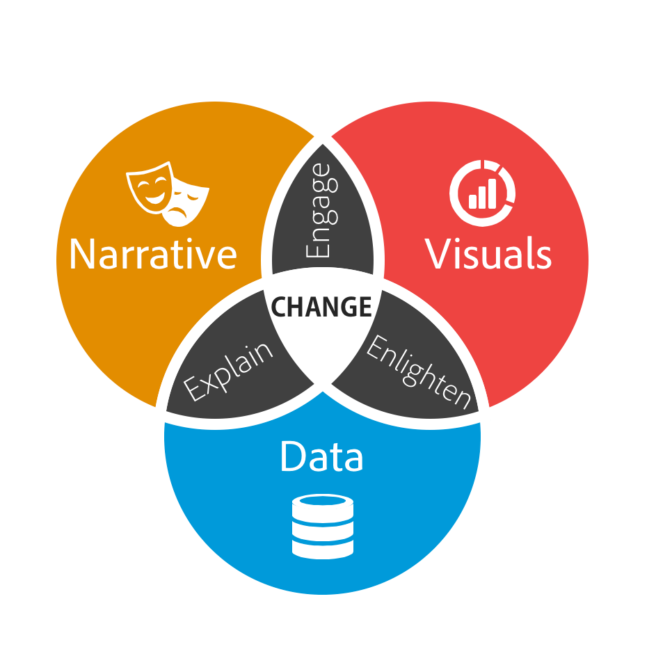
INFOGRAPHIC ARE COLLECTIONS OF IMAGERY, CHARTS, AND TEXT REPRESENTING RESEARCHED AND SIMPLIFIED DATA. DATA VISUALIZATIONS AND INFOGRAPHICS SUPPORT MAIN POINTS BY USING ICONS AND COLORS TO CATCH ATTENTION OF THE AUDIENCE. AIMING TO SHOW, RATHER THAN TELL BY USING VISUALIZATIONS, THE DISPLAYS SHOULD BE CONCISE, EASY TO FOLLOW, AND THE SIZE AND SHAPE OF THE INFOGRAPHICS CAN ASSIST IN STORYTELLING. KNOWING WHAT INFORMATION TO INCLUDE, HOW TO INCLUDE IT, AND HOW TO CREATE THE MOST EYE CATCHING INFOGRAPHIC IS DISCUSSED IN THE FOLLOWING VIDEO.
AIM TO SHOW, rather than tell.

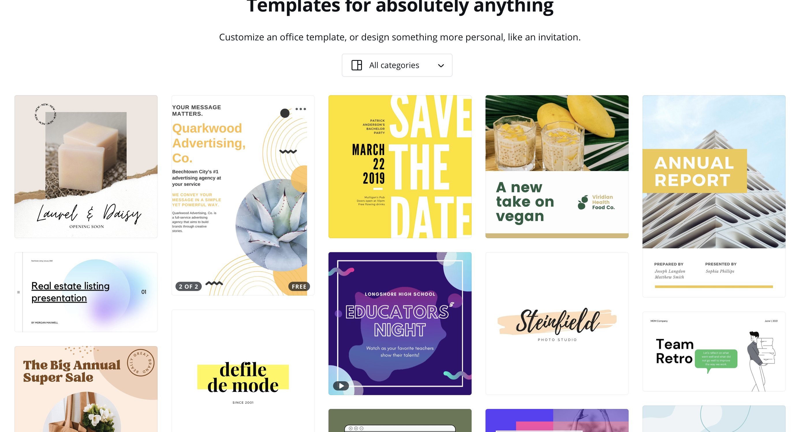
Infographics: Using Canva
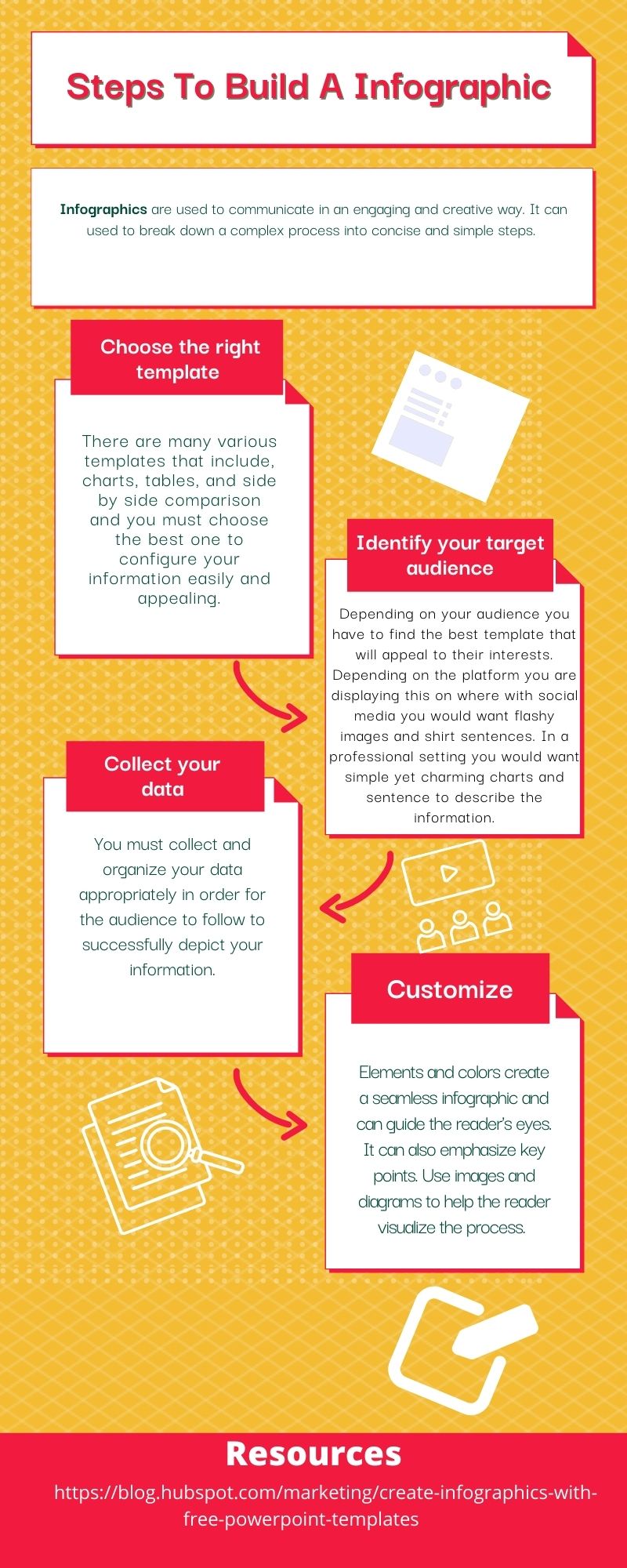
Infographics are a great tool to convey messages and data in a clear manner to viewers. A great tool to help create infographics is Canva. Canva is free but does have a paid subscription for more advanced features. It is very simple to use and only takes an average of 30 minutes to create an infographic. A reason that Canva is easy to use is because of its wide variety of templates that allow the user to input their own information on a prebuilt infographic rather than having to build one from scratch, but that is an option if you wanted to design your own.
Here is an example of a simple infographic create on Canva
I have had personal experience using Canva for the day of service last year with the honors program. We were tasked with designing infographics to teach people American sign language. Before that point, I have never used Canva before, but once I loaded the site it was super simple. It guides the user through each step. First, it’s either picking a template or design your own, then input whatever information or images you desire. Then finally once it’s complete save it to your computer and then you are ready to distribute your newly formed infographic. Canvas interface is easy to use and figure out and by being able to utilize such a simple site, projects you work on in the future will pop more since you will be able to make your own custom infographics.
Also, check out this video on using Canva:
Also, feel free to click here to check out 11 other tools to create infographics
Image link: https://upload.wikimedia.org/wikipedia/commons/f/f9/Platform_Canvas_Original.png
What story are they trying to tell exactly?
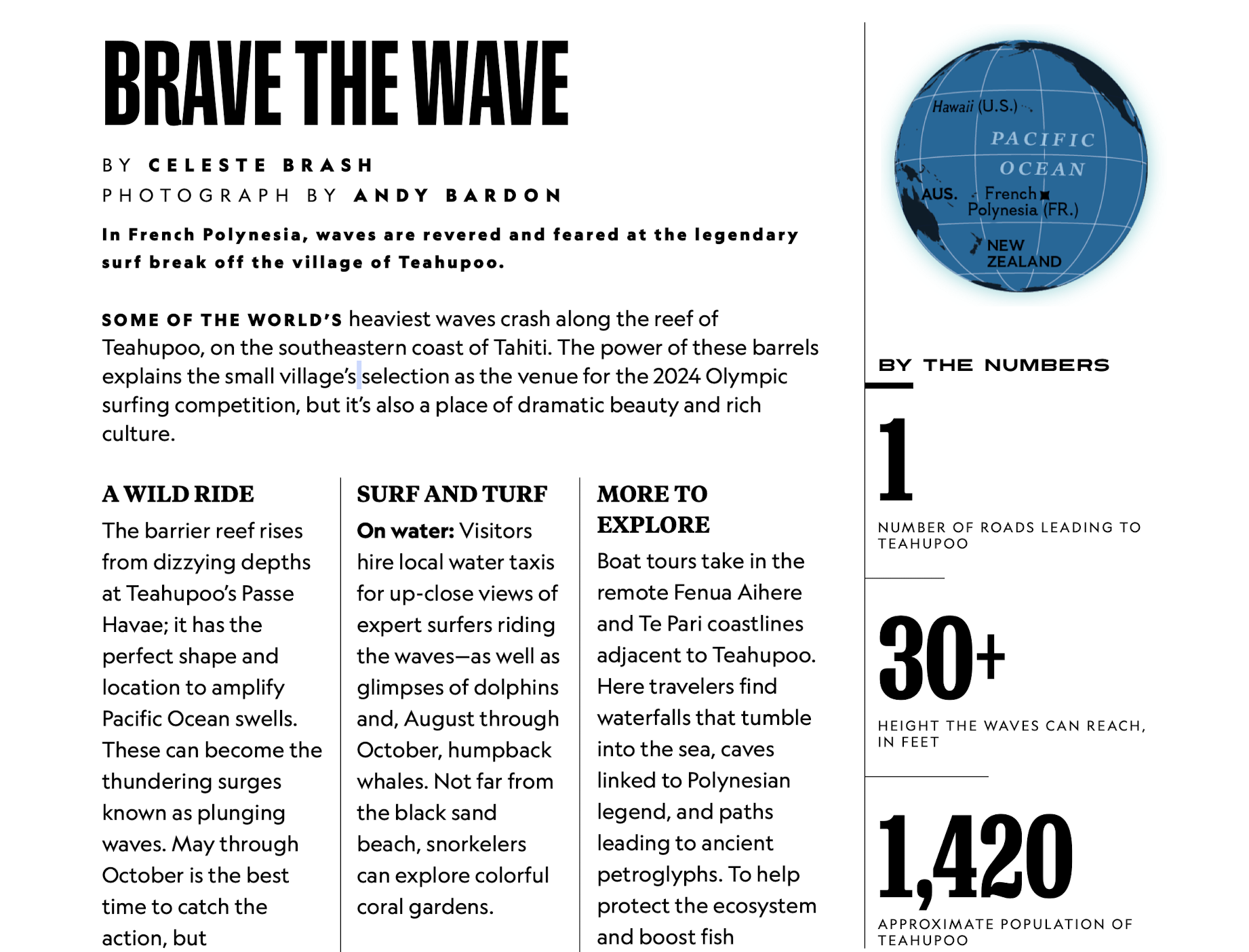
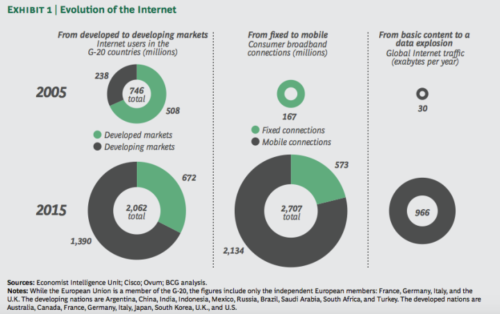
In this article, we see they use big numbers to represent the data. My question is why these selections? Although the design is a good one for representing 3 sets of data, the story they chose to tell is important. I am not sure that I would have selected the population to represent when I read the story.
“These monster waves test even the most daring surfers
In French Polynesia, waves are revered and feared at the legendary surf break off the village of Teahupoo.”
Read in National Geographic: https://apple.news/AtikdhzUeSDOxvZoJQ93Gdw
Recent Comments