Identifying areas of improvement and understand the performance of the company is also done when showing comparison benchmarks using data visualization. Using comparisons benchmark helps with determining the best possible strategies and take advantage of where to gain competitive advantage.
As discussed on The Data School.com, there are ways to find the best the visualizations for your metrics, and showing comparison effectively. With a bar graph, assisting in determining when revenue is greater than cost or how much revenue differs across months. It is easier to compare with Data Visualizations, than just numbers. Understanding the data is easier after being placed in a visual context.

Which is easier to understand?
1 OR 2
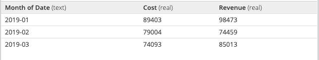
1.
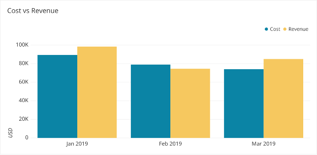
2.
The Data School discusses the best way to visualize your numbers, and how creating these data visualizations for the decision makers to determine future operations is very beneficial for companies. When there are different goals or benchmarks for each category, you can use a combo chart or the many different combinations to represent the information best.
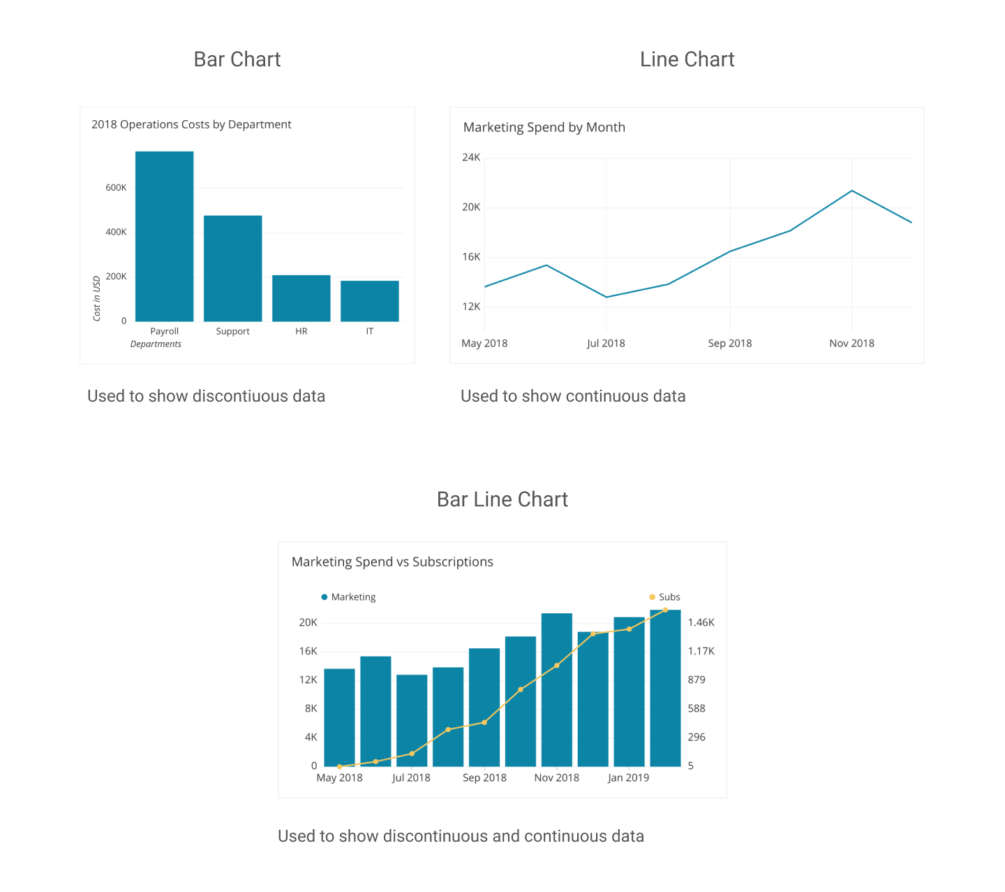
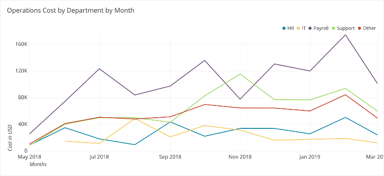
Showing comparison to meet expectations for future, the most direct method for adding comparison on your graph is using a line. This works especially well when all the data share the same comparison point or goal. For example, operation cost by departments in the following data visualization. Including different colors and comparison give the audience a better insight on performance, and this specific charts shows operations costs per month by departments assisting in decisions in future operation costs in multiple departments.
THE DATA SCHOOL : FIND THE BEST VISUALIZATION FOR YOUR METRICS
Recent Comments