Pivot Table
The main purpose of a pivot table is to summarize data in a quick and concise manner. The function of these is very important because they can turn boring excessive data into clear and concise data. This can allow the user to make quick decisions based on the data which makes it a great tool in the industrial world. One example I have found shows how it can be used in the political world. This second website I found has a plethora of examples and uses that can be very useful for people wanting to learn about their uses.
Sankey
After exploring through the energy section of Sankey I was impressed. Sankey is a cool interactive tool to display information and educate anyone that may be curious. It has art work in the background relating to the topic which is not distracting, and interactive links with excerpts to get information from. You can click away and explore through a topic with ease. One of the things I learned is that “Electricity is called secondary energy because it is derived from other energy sources, mainly coal, natural gas, and nuclear reactions. About 39% of the total U.S. energy supply goes to producing electricity.”
Pie Chart
The best time to use a pie chart is when you are comparing multiple categories that add up to 100. It is also important to not have too many categories because that can make the pie chart look cluttered and unappealing. This can also make it hard to read which completely defeats the purpose of having a chart to look at. It is also important to not have too many colors because this can be a distraction as well.
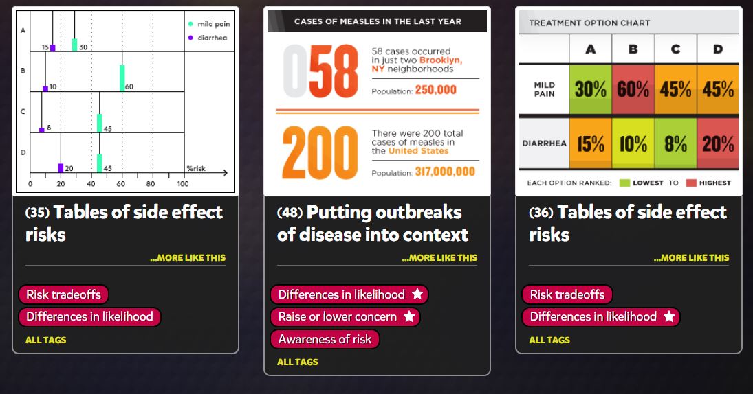
Lollipop Charts
A lollipop chart is very similar to a bar chart. It is used in the same type of scenarios while being more appealing to the eye. It avoids having a cluttered look when comparing multiple data sets and makes it easier to follow along. They can be used horizontally or vertically and are very simple to make. I made mine on excel and it took me no longer than 15 minutes to complete. Region A,B,C, and D are all in order from left to right.
Benchmarks
Benchmarks are used very often in the world we live in. One company, Wall Street Journal, uses benchmarks in more of a business fashion. I went to their market data section of their website and found a graph where you could input different options. Some of these options were gold futures, crude oil futures, yen, S&P 500, etc. All of these were line charts with a solid benchmark line in different locations. I noticed that the New York Times was very similar with how they used graphs and displayed benchmarks. Overall, benchmarks are a great way to enhance a graph or visualization.
Comparing Numbers
One of the best methods to compare numbers/data is a bar graph. They are bars that are used in vertical or horizontal form to represent numbers/data. The length of the bar is used to display the value and the color of the bar is used to label what the number is representing. Bar graphs are the best and simplest way to represent and compare data among different groups easily. Bar graphs can show the major changes in numbers and values in data over time.

Vizhealth: Frank Figurelli
I think this website is a really cool time saver. Vizhealth created a gallery of easy and simple graphs, charts, and images that effectively communicate risk information. I think this is crucial for people because personal health is something that is usually very neglected in this country, especially during the pandemic. The “wizard” section of the website is the most important. It asks you your primary goal of what you are looking for, and if you need exact risk numbers or the basic idea. This narrows down the data and search criteria which will end up giving the user more accurate and useful information. Data visualizations should be quick, easy, and efficient. This website is the prime example of all of those words and is an incredible tool for data visualization and health. Everyone should be looking after their health and certain risks they may have and this website allows people to do that while saving lots of time. I cannot stress enough how useful this site really is. (6) Visualizing Health – YouTube
Infographic tools:
One of the best tools for infographics that I found is Infogram. Infogram is a data visualization tool that has over 20 ready made design themes to choose from. It allows people to create customized brand themes with colors, cool logos, and fonts. Infogram also lets the designers create informative charts and maps. This tool also allows the user to create eye-catching designs in a short amount of time which is the most important thing with infographics. They are supposed to be short and to the point while also grabbing the attention of the viewers. Infogram offers subscription based service for personal use or business. Another tool that I saw is called Visme. Visme is free and allows the user to create engaging infographics and presentations. The free tool offers over 100 free fonts, millions of free images, and thousands of quality icons. They have a premium option for more advanced service, but the free option is still great. Overall, finding tools similar to these ones are huge when creating infographics. It saves the user a lot of time while also helping the user create fun informative infographics. Simple and creative is the goal when creating one of these, and that’s what these tools allow. 
Recent Comments