Pivot Table
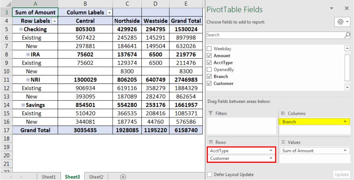
This Pivot Table is an impressive example of what you can do with Pivot Tables can do for you financially. With four labels in the first column, they do a good job showing the existing and new income for the four accounts. The columns labels seems to have to follow the same minimal style the row labels did and it works. It would be unnecessary to include too much information if it’s a simple budgeting and planning table like this. Having two grand totals (row and column) is a welcomed addition, as it provides the necessary detail for each bank account. For the untouched sections in the Legend, I’d be interested to see what the ‘Weekday’ would entail but find the ‘OpenedBy’ section unneeded.
SANKEY Data Visualization
The amount of energy used in American households, even wasted throughout the United States has always been astronomical. The diagrams created and provided by SANKEY not only shows the average US energy system, but cost and efficiency of small things like lighting.
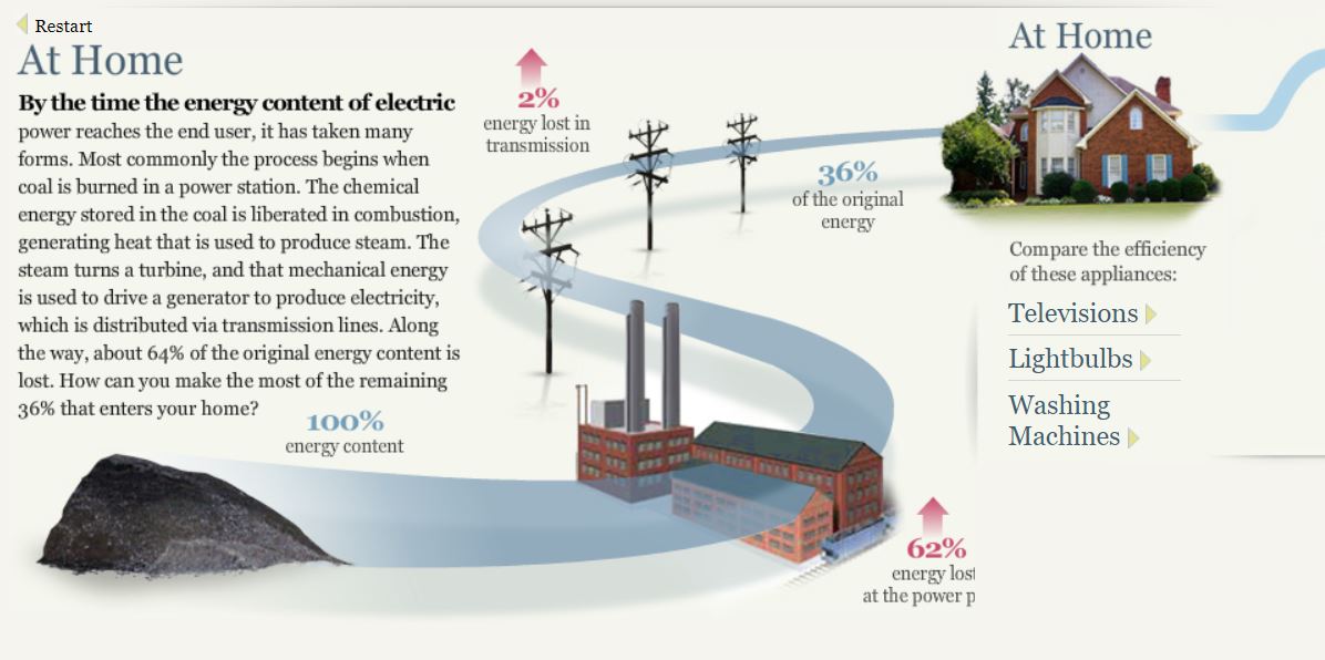
The process of producing energy by coal shows just how much energy is wasted transporting all of it across the regions. Alone a third is shown to reach your household while the other two quarters are lost along the way which is mind boggling.
An interesting topic that seems to be growing more is LED lighting. LED lighting not only saves money on electricity but is a massive help to the environment. It not only reduces the harmful effects of consuming large quantities of energy but also does not have mercury.
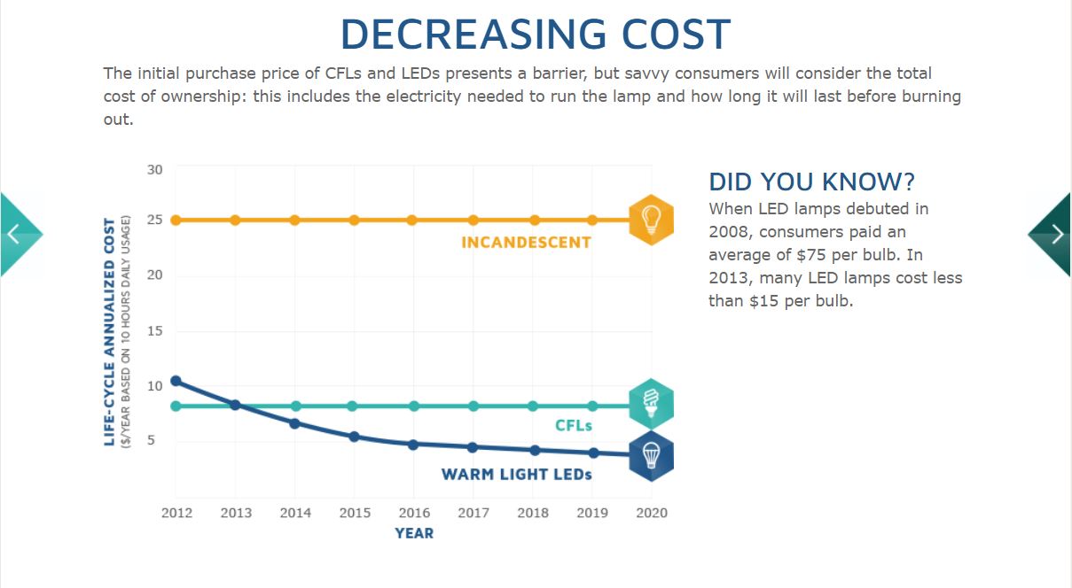
This graphs shows the over the years Warm Light LED bulbs have decreased in price compared to Incandescent and CFL bulbs. Within five years the price alone has dropped $60, starting $75 to $15, a massive change like that can only mean good as the price convenience will convince people to purchase more of LED bulbs.
The Energy System charts showing the National Energy System of the whole nation, Regional System containing MD, OH, PA, and WV, and the State Energy System of California is inconvenient in my opinion as it seems he was trying to portray the data as an energy grid, but came across too confusing for researchers.
Pie Chart – Favorite Movie Genre
Ultimately, pie charts are used to show a slice of data in a complete circle, or a whole of nominal data. Having a variety of uses and are used arguably in business practices the most. They can show a percentage of subjects surrounding types of customer opinions, revenue, and categorization in an easily understandable way. Compared to other charts, keeping only five categories is wise, as you don’t want to overwhelm your audience with too much information and lose interest.
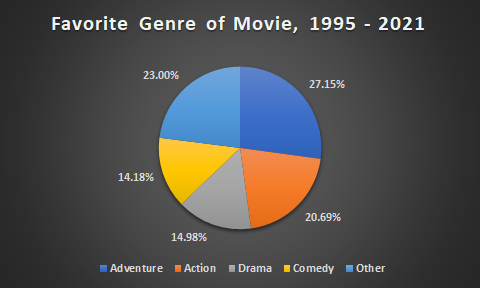
https://www.the-numbers.com/market/genres
This pie chart is a great example, showing popularized genre differences from 1995 to 2021. Each slice is distinguished through color and data, with the percentages shown on the outside to take up unnecessary “white-space.” If you’d like to go more in depth with this information, a bar graph would be preferred as you can display more genres and different groups of people who liked a specific genre.
Lollipop Chart – Halloween Candy
The beauty of a lollipop chart is its ability to convey data in a slick and spacious format. Compared to a bar graph and column chart, the amount of space allows you to add details that would be too immoderate for any of the previous charts mentioned.
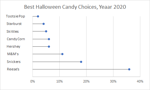
Take this chart for the most popular Halloween Candy surveyed in 2020; the amount of detail can be easily understood and more importantly, is visually pleasing. Each amount of candy can be understood without an actual percentage just by looking at the range and as people say, ‘less is more.’
Visualizing Health
The Vizhealth Wizard upon entering introduces the visitor to a gallery of different graphs with a plethora of information concerning risk and personal health.
I was quite impressed with the categorization on different topics. The screenshot posted does not do the categories justice, having more than 5 different subjects and specified tabs for each of them.
Another impressive feature is the amount of charts provided by Vizhealth and the ability to filter different kinds of charts to fit your liking. Not only that, but the design and customization of each graph makes each of them feel truly unique.
Seeing elements of what we learned so far in the course really shows how valuable infographics truly are and how they can make a positive difference, in this case.
Recent Comments