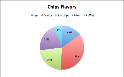
A pie chart is best used when trying to work out the composition of something. If you have categorical data then using a pie chart would work really well as each slice can represent a different category that will all total up to 100%. A pie chart only works well when you have one set of data.
The data that I chose was different chips brand by category. The data is displayed in a pie chart and there are five categories. Each slice of the pie is a different color and is labeled the percentage of students on campus that prefer that chip brand. I think the best way to present this data would be a pie chart. An alternative can be a bar graph which would make sense and work, but a pie chart is the best visual choice for the data. Some design tips that i came across were the color choices and the format data labels which allowed me to add the percentages to each slice to help understand the data because sometimes the slices are close to size. This just gave my pie chart a better look for presenting.
Recent Comments