Choosing the right chart is crucial when deciding how you want to compare your data. There are do’s and don’ts when selecting the right visualizations.
This article does a nice job at offering advice on choosing the correct graph to compare data and offers a good do’s and don’ts list for those hard to make decisions.
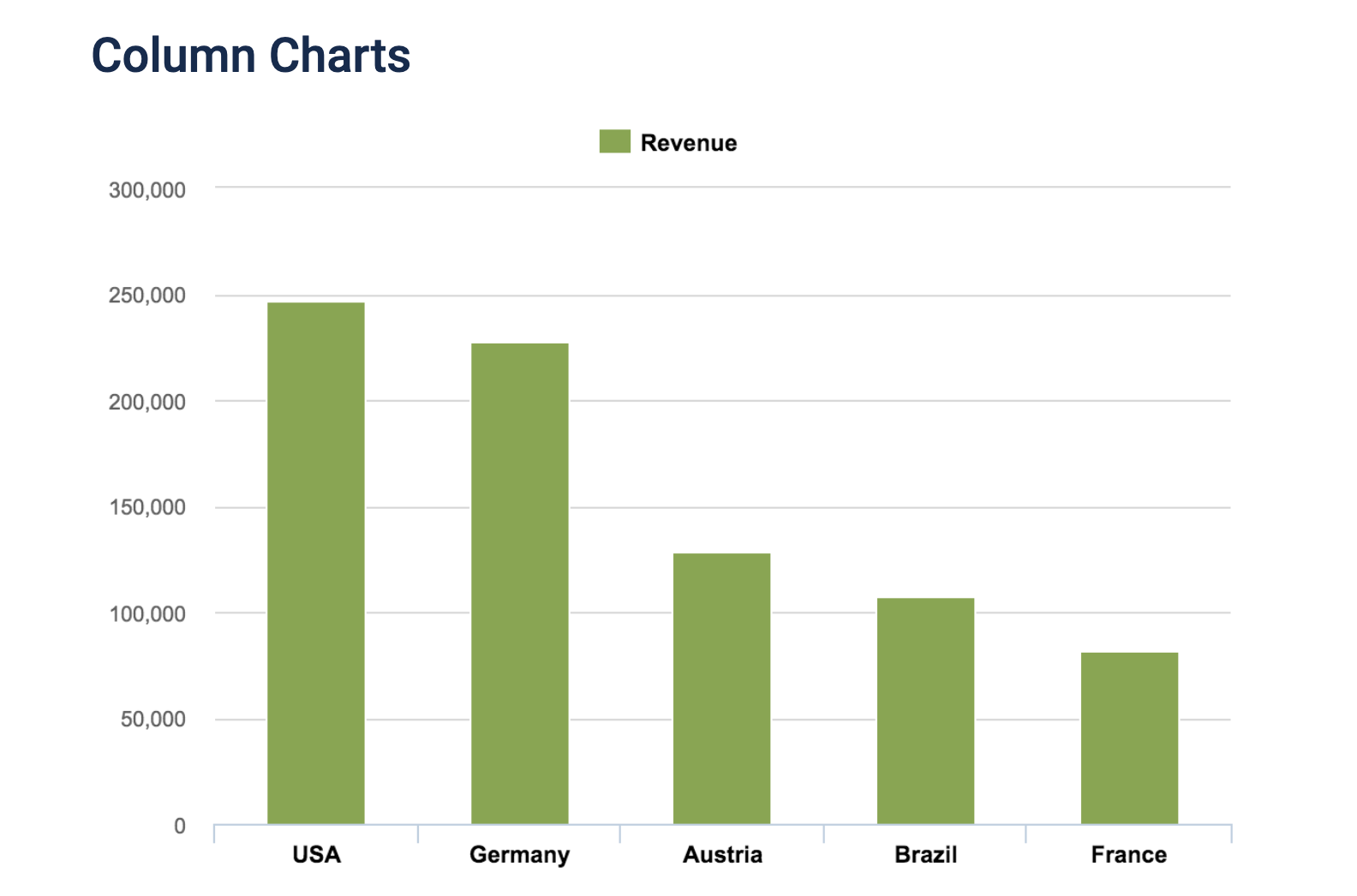
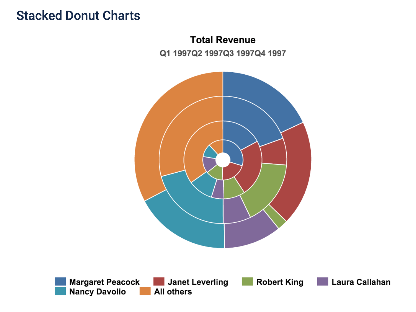
Every type of data has a visualization that would present it best, and it is up to you as the presenter to choose the right one.
Recent Comments