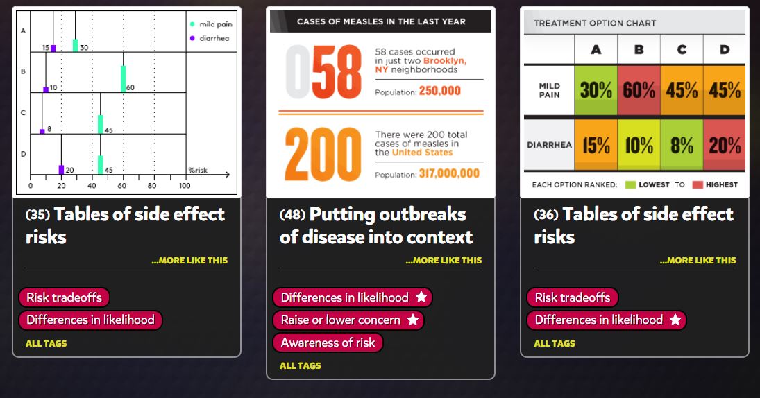
I think this website is a really cool time saver. Vizhealth created a gallery of easy and simple graphs, charts, and images that effectively communicate risk information. I think this is crucial for people because personal health is something that is usually very neglected in this country, especially during the pandemic. The “wizard” section of the website is the most important. It asks you your primary goal of what you are looking for, and if you need exact risk numbers or the basic idea. This narrows down the data and search criteria which will end up giving the user more accurate and useful information. Data visualizations should be quick, easy, and efficient. This website is the prime example of all of those words and is an incredible tool for data visualization and health. Everyone should be looking after their health and certain risks they may have and this website allows people to do that while saving lots of time. I cannot stress enough how useful this site really is. (6) Visualizing Health – YouTube

Recent Comments