At first glance, lollipop charts might seem like a frivolous adaptation of a bar or column graph. Fundamentally, these types are identical; they show any number of categories’ values with respective figures. However, it is through that “any number” where one loses favor over the other. Stephanie DH. Evergreen notes in Effective Data Visualization that lollipop charts are “especially helpful when [a standard bar or column chart] is overpowering due to its massive ink,” (page 156), a consequence of trying to show too many categories.
For example, consider “Travels’ Choice Best of the Best”: Tripadvisor’s collection of “iconic, can’t-miss destinations”. For 2021, the most popular destinations across the world include twenty-five locations, each with a specific number of “things to do”. These numbers can vary greatly, however, and do not influence a location’s position on the list. With extremes being Playa del Carmen, Mexico at just over one-thousand, and Bali, Indonesia at nearly ten-thousand, it’s clear to see that there is no rhyme or reason when it comes to how much a destination might have to offer.
Graphically seeing this data would help, but with twenty-five points to consider, something like a conventional bar graph could easily become overwhelming. The solution, as Evergreen puts it, is to “remove even more ink,” (page 149). Since the endpoint of each bar is what quantifies the data, that’s all one would need to show. Nevertheless, just having these points can just as easily be confusing; having to trace x-many points back to their labels requires more diligence by the viewer than should be expected. The best of both worlds combines points that indicate value with stems that lead back to the label. Enter: the Lollipop Chart.
Returning to Tripadvisor’s “Best of the Best”, a lollipop chart would compare each location to its number of things to do.
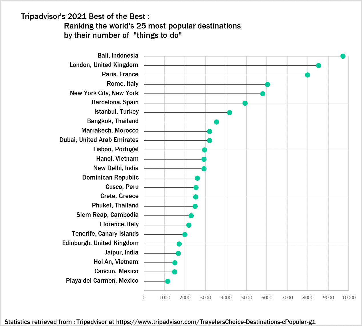
Although specific numbers can only be estimated, a general overview is easy to see with this visual. The viewer can tell how each destination compares to any other and where it falls relative to the entire list. They can also see how the trend differs between the first ten destinations and the rest. If a traveler is looking for a quick reference to see just how much their desired location has to offer (or to see if other locations have even more), then this visual works wonders.
I really enjoyed reading your blog post. I thought your lollipop visualization was put together nicely. I liked the color scheme you used it made the cart pop. The only suggestion that I would make to improve your lollipop chart is to put the units or percentages in front of the lollipop head just to make it easier for the viewers to quickly analyze and interpret the chart.
Wow, so much information on Lollipop charts in your post! You did not leave any data out and explained perfectly what exactly this chart is and how it is best used in certain graphs. Was there ever a time when you used this graph for something? Like in high school or another college class? Great job on your post! The only suggestion I have is to maybe take out some unneeded information!
Anthony
I agree with your statement, “Graphically seeing this data would help, but with twenty-five points to consider, something like a conventional bar graph could easily become overwhelming.” Too much detail ruins a graph and makes it displeasing visually.
Your post was absolutely beautiful, I was blown away. I sometimes view lollipop charts as a “race”. You can see what option is more likely to lead against the other sets. Great post!
This post is really impressive and I like the vocabulary used in the beginning. Your chart is also a good example of how lollipop charts avoid cluttering and make things easier to understand. Have you ever used a lollipop chart before? Great post!