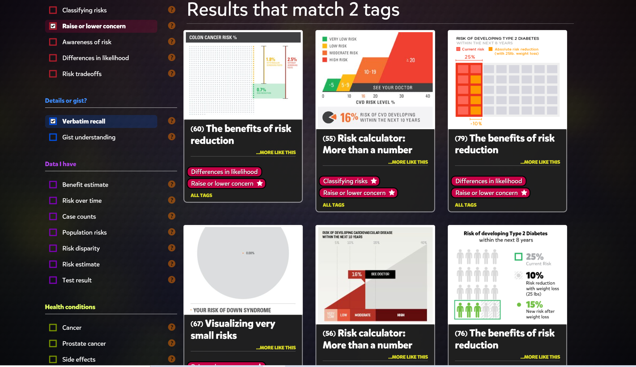
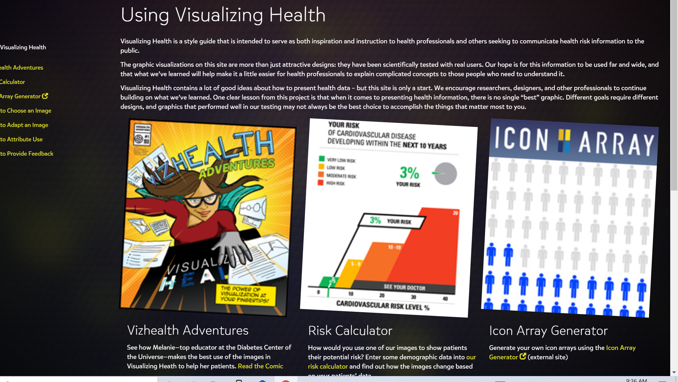
The first thing I see when I opened up the website was this page and to me it looked really confusing and almost caused me to lose interest. But once I realized it was only asking me to answer two questions which isn’t so badI was then brought to this image and it seems pretty cool because I can chose which ever of the 6 options and they all look pretty interesting. And over to the left you can filter topics which helps pinpoint what you’re tying to look for For the tab Using visualizing health, it shows 3 examples of how images can be used to inspire health professions and inform the public. Something that I found interesting about this page is the risk calculator

Recent Comments