Examples of Insightful Data Visualizations
- Insightful data visualizations should present data in a concise and readable format that efficiently communicates a message to the viewer. Visualizations that present too much information, are too large or small, or present false information are not useful.

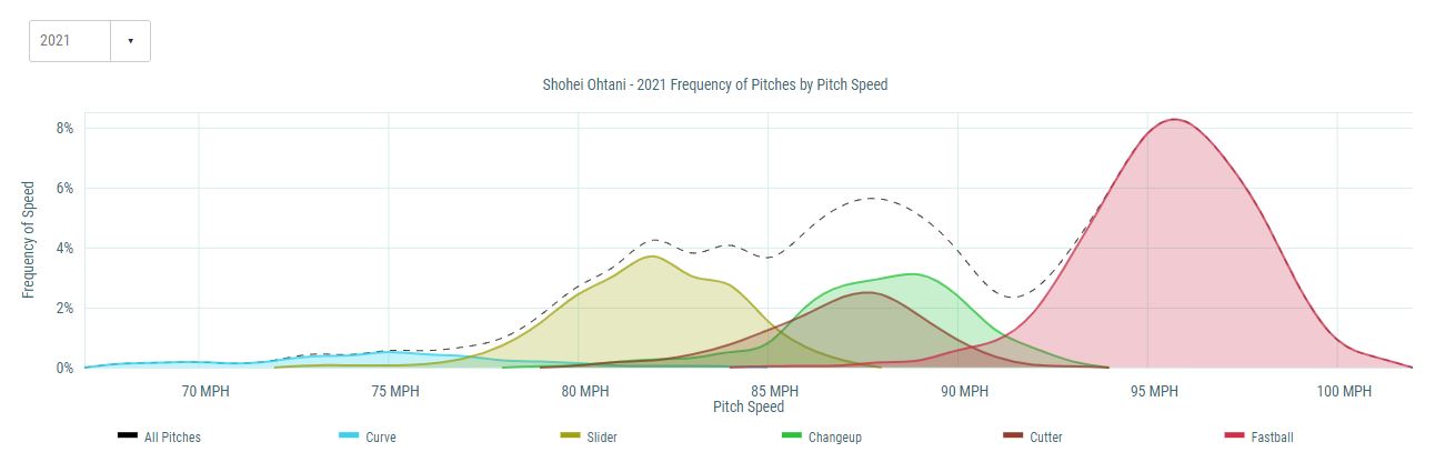
An example of an effective infographic that is used in the real world is the chart shown below displaying the frequency of pitches by pitch speed from the 2021 Major League Baseball season for the Angels pitcher, Shohei Ohtani.
Recent Comments