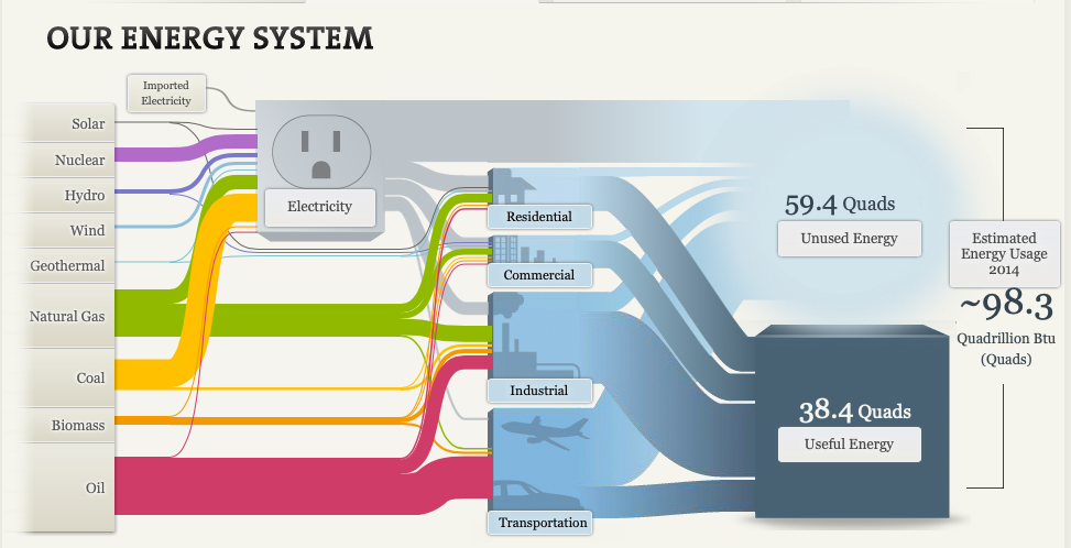
The National Academies of Sciences, Engineering and Medicine have a section of their website where they go over our energy systems. Below you can see each energy and where they go to be used and what energy remains unused.

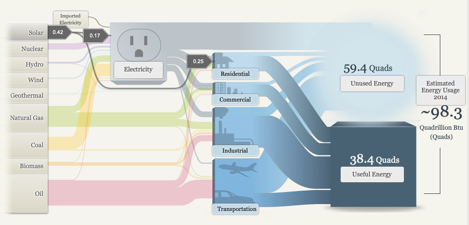
You may notice each line that connects one part of the visual to the next varies in size, this is no random occurrence. This visual adds different sized lines that lead from the energy source to where they’re used. Depending on the amount that energy source is used the larger the initial line, then it splits to more different sized lines depending on how much energy is used where. Below we can see that solar energy is rarely produced and used rarely anywhere, making solar energies line the thinest.

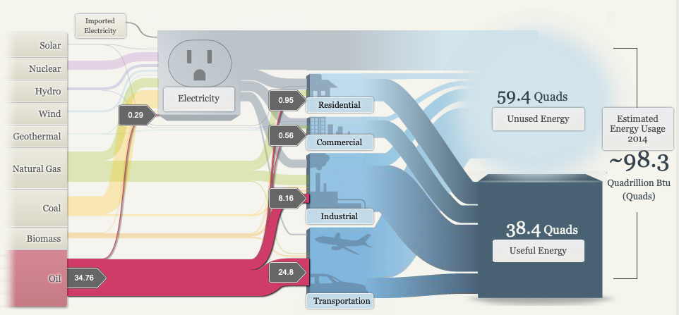
As we all know oil while its the most detrimental energy it is most commonly used making the line the largest and a majority of the initial line flows to transportation as we can see below.

Overall this flow chart is very successful in making a clear presentation of where energies come from where they are used and what remains unused. The use of sizes, images, colors and the flowing pattern all add to the successfulness of this infographic.
Recent Comments