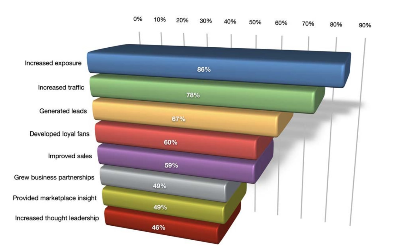
These are three benchmark data visuals below that discuss the same idea. Each one presents statistics around advertisements, marketers, brands, etc, however, they all are presented in different ways.

For example, the very first one displays several kind of content brands use to reach out to consumers. Videos, emails, and more are the categories that are shaded in different colors with different percents, since brands may use on for the other or even multiple. Overall, the main discovery of this benchmark is how videos help brands get their idea/products seen and sold out to the world.
Marketing for Social Media

Now, the second benchmark also has numerous categories catered to a similar idea, which is the ways marketing on social media can help. The top is increased exposure of the business, but what is different in compared to the last is the 3D model. Not to mention, this benchmark inserted the percent(%) throughout the grid to help viewers read the numbers and compare the numbers easier.

As for the last set of data, this one separated the age groups along with genders for who uses social media for brand research. Here we just have two colors, the red and the orange, that separate females and males, all in 5 age ranges. Viewers can notice the drop in social media brand research the older people get, as well as the usual audience of each group, asides from ages 55-64, being females. The data labels are also put above the benchmarks throughout, which is another way each of these graphs differ from one another. In conclusion, there are various ways to construct and/or explain topics in the form of a benchmark, even with little changes to the color, labels, angles, etc.
Recent Comments