INFOGRAPHICS & TOOLS
INFOGRAPHIC ARE COLLECTIONS OF IMAGERY, CHARTS, AND TEXT REPRESENTING RESEARCHED AND SIMPLIFIED DATA. DATA VISUALIZATIONS AND INFOGRAPHICS SUPPORT MAIN POINTS BY USING ICONS AND COLORS TO CATCH ATTENTION OF THE AUDIENCE. AIMING TO SHOW, RATHER THAN TELL BY USING VISUALIZATIONS, THE DISPLAYS SHOULD BE CONCISE, EASY TO FOLLOW, AND THE SIZE AND SHAPE OF THE INFOGRAPHICS CAN ASSIST IN STORYTELLING. KNOWING WHAT INFORMATION TO INCLUDE, HOW TO INCLUDE IT, AND HOW TO CREATE THE MOST EYE CATCHING INFOGRAPHIC IS DISCUSSED IN THE FOLLOWING VIDEO.
AIM TO SHOW, rather than tell.

Infographics: Using Canva
Infographics are a great tool to convey messages and data in a clear manner to viewers. A great tool to help create infographics is Canva. Canva is free but does have a paid subscription for more advanced features. It is very simple to use and only takes an average of 30 minutes to create an infographic. A reason that Canva is easy to use is because of its wide variety of templates that allow the user to input their own information on a prebuilt infographic rather than having to build one from scratch, but that is an option if you wanted to design your own.
Here is an example of a simple infographic create on Canva
I have had personal experience using Canva for the day of service last year with the honors program. We were tasked with designing infographics to teach people American sign language. Before that point, I have never used Canva before, but once I loaded the site it was super simple. It guides the user through each step. First, it’s either picking a template or design your own, then input whatever information or images you desire. Then finally once it’s complete save it to your computer and then you are ready to distribute your newly formed infographic. Canvas interface is easy to use and figure out and by being able to utilize such a simple site, projects you work on in the future will pop more since you will be able to make your own custom infographics.
Also, check out this video on using Canva:
Also, feel free to click here to check out 11 other tools to create infographics
Image link: https://upload.wikimedia.org/wikipedia/commons/f/f9/Platform_Canvas_Original.png
What story are they trying to tell exactly?
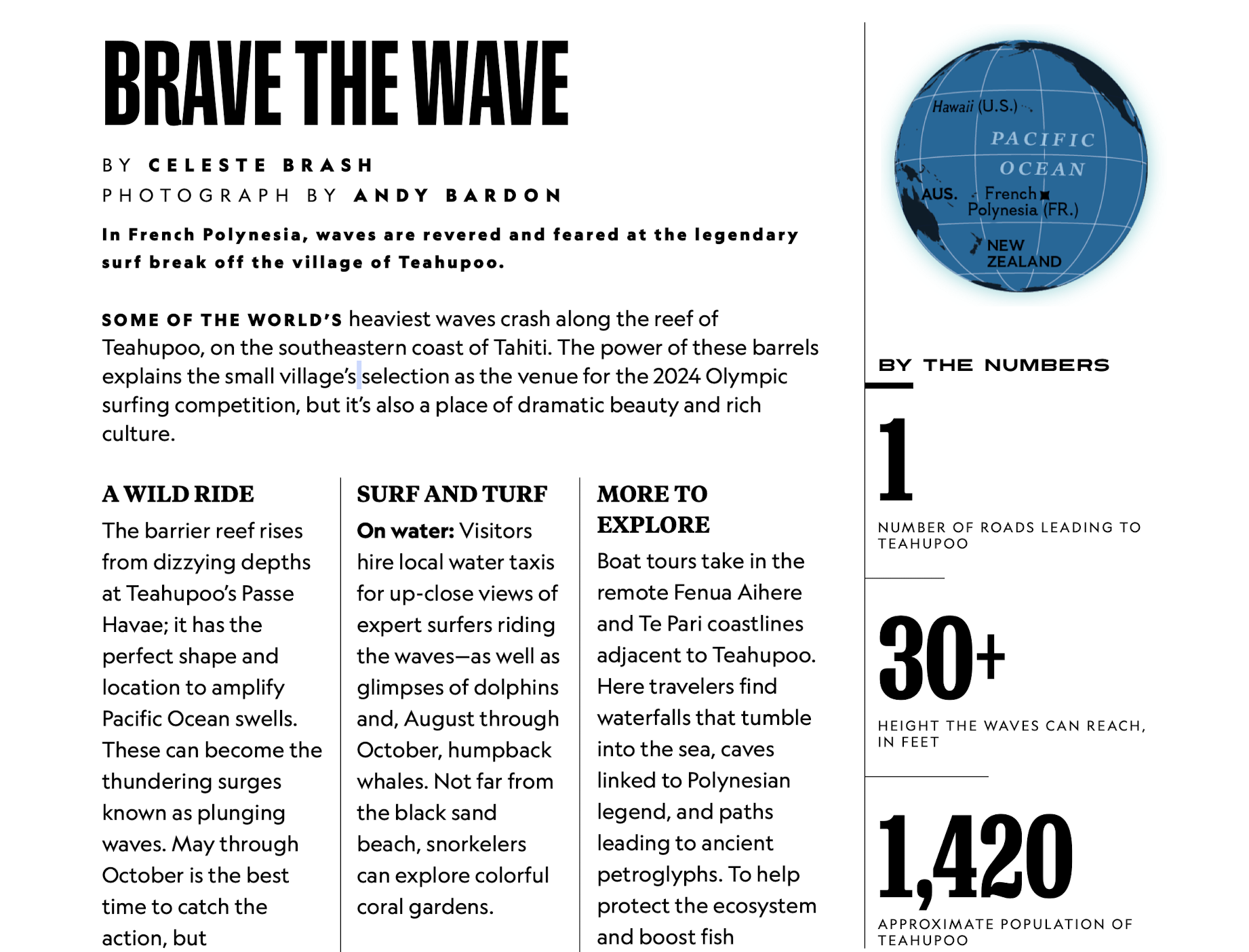
In this article, we see they use big numbers to represent the data. My question is why these selections? Although the design is a good one for representing 3 sets of data, the story they chose to tell is important. I am not sure that I would have selected the population to represent when I read the story.
“These monster waves test even the most daring surfers
In French Polynesia, waves are revered and feared at the legendary surf break off the village of Teahupoo.”
Read in National Geographic: https://apple.news/AtikdhzUeSDOxvZoJQ93Gdw
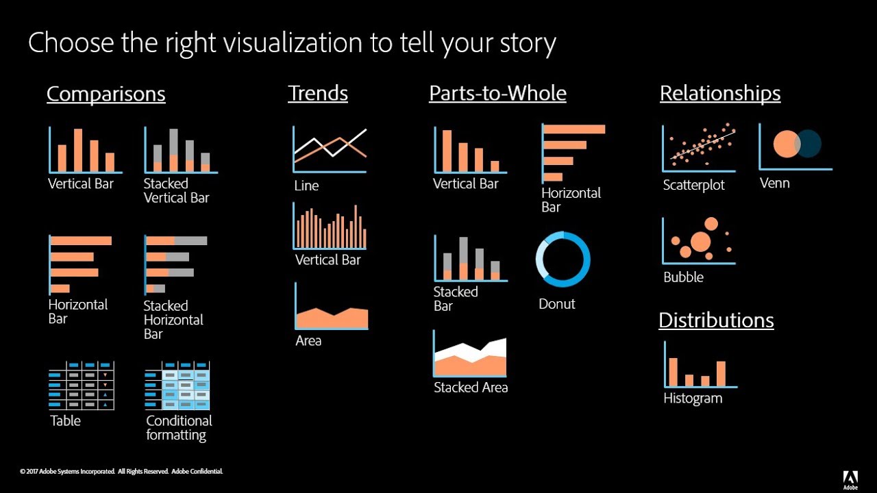
Examples of insightful data visualizations:
When creating data visualizations, one must be mindful of how their targeted audience will read their information, how easy it is to access, and if it can be interpreted easily without much background information or interpretation. Articles like these, explain how important it is to decide what graphic one will use when presenting their data. The author provides great examples such as websites to use, things to consider, and introduces and explains example graphs.
For beginners getting into data visualizations, Excel and Google Sheets may be a good starting point. Once you’ve learned more, it would be beneficial to use a software like SPSS or Tableau. These two softwares are helpful when needing to compile data into a visual, and adding different elements that Excel or Google Sheets may not have had.
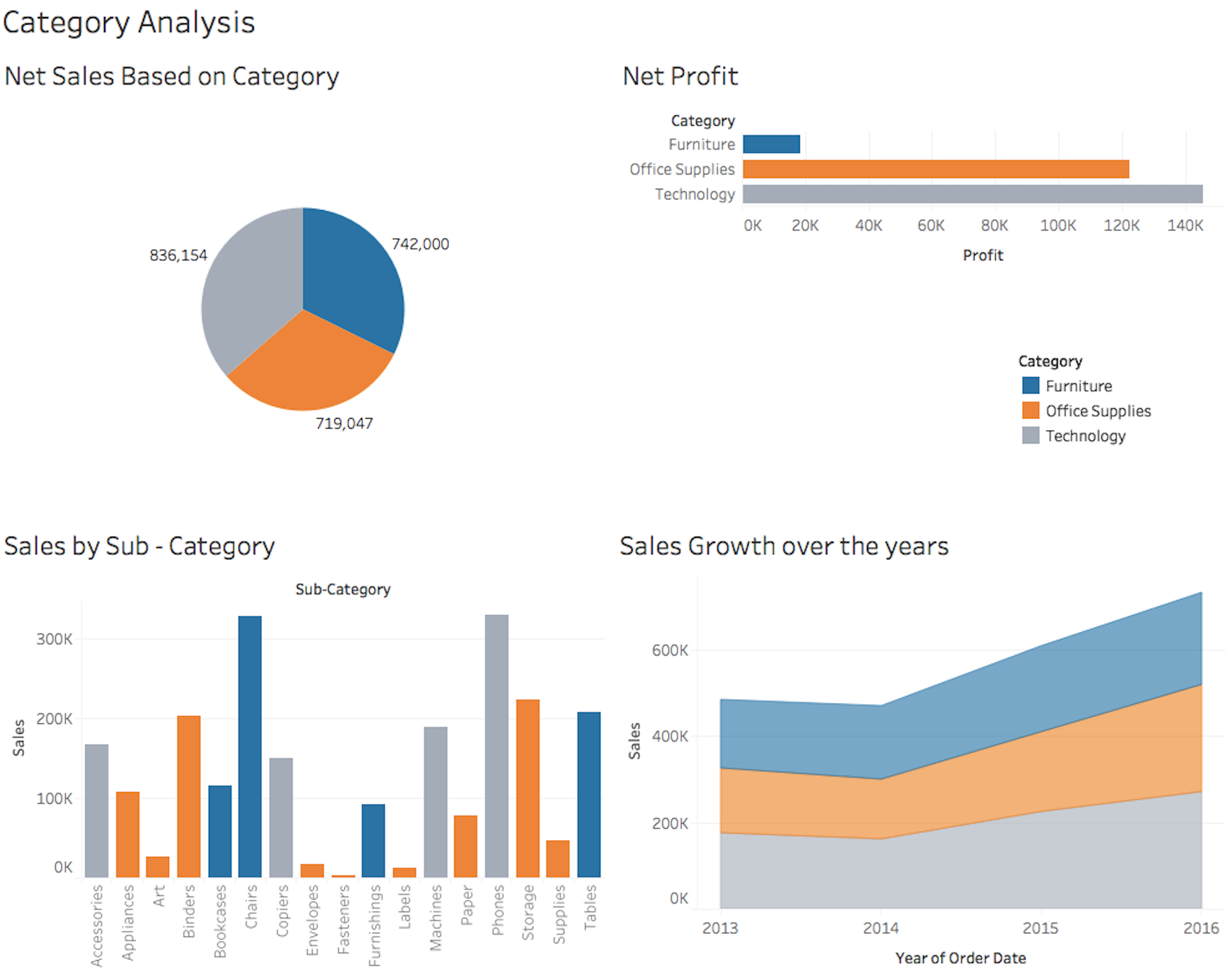
The visualization to the left is an example of what Tableau can produce when used by someone who knows the best way to visualize data. There is a pie chart, a bar graph, and a few other visualizations. It’s important to know that when creating such visualizations, coloring, font, size, and type all matter when determining how to best represent your data.
Infographic Discussing The Benefits of Yoga

Infographic Analysis/Notes: Yoga is my daily passion. Here are the benefits I get and you can get by incorporating yoga into your routine. The person who design this infographic kept the colors mutual yet eye catching, especially how they structured the facts. As your eyes spot the woman in a warrior pose, your eyes then drift to the white dotted lines, which align to each benefit. Then, rather than just putting down stats/words, the pictures and arrows throughout help tie the whole infographic together. For example, there are some images that relate to the fact or that correspond to what yoga is about like; poses, peace of mind, etc. Altogether, the designer of this infographic made the message clear both visually and literally.
Welcome Post
So happy to meet our Fall 2021 class. This is a shared blog we will all use.

Recent Comments