My experience on Vizhealth.org developed a better understand of how beneficial visualization can be. This website was very clear, informative, and very user friendly. The website generates visualization designs for patients to understand in a quick and effective way, for doctors who are trying to communicate some complicated information. The primary goal is communication, and the “wizard” is available to explain the giving data with the best design options. Visualizations help lead to decisions and when facing health issues these visualizations below very helpful. The following video was published on their site, and explains how many different health concerns can be confusing. With this easily accessible visualization of health designed by Robert Wood Johnson Foundation and the University of Michigan Center for Health Communications Research , is to give them a better understanding on the goal and the purpose.
I had no issues with the user-friendly navigation of the site and gained a lot of insight from the many ways of presenting data. This site explained to me that different goals or communication needs requires different designs and graphics for the reader to understand and grasp the concept.
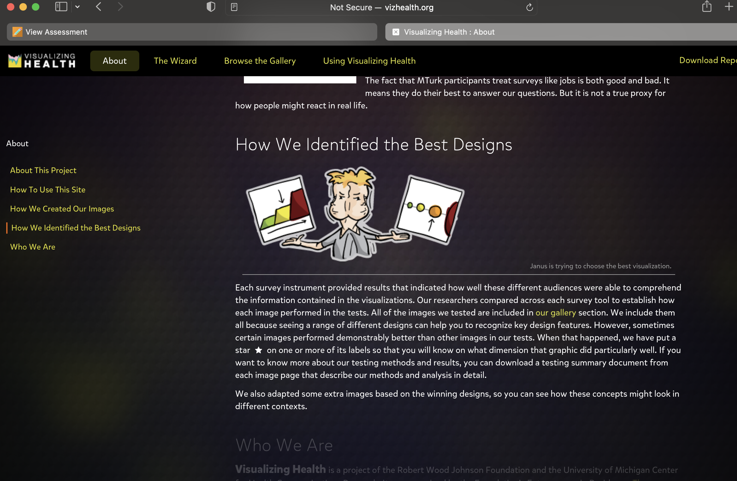
The “wizard” is an assistant in meeting communication needs, and meeting the goal when it involved risk information. It gives multiple ways to design the data, what is best and most comprehendible. With options to input data and edit for example, specific health conditions, different forms of cancer, and if you smoke or are overweight.
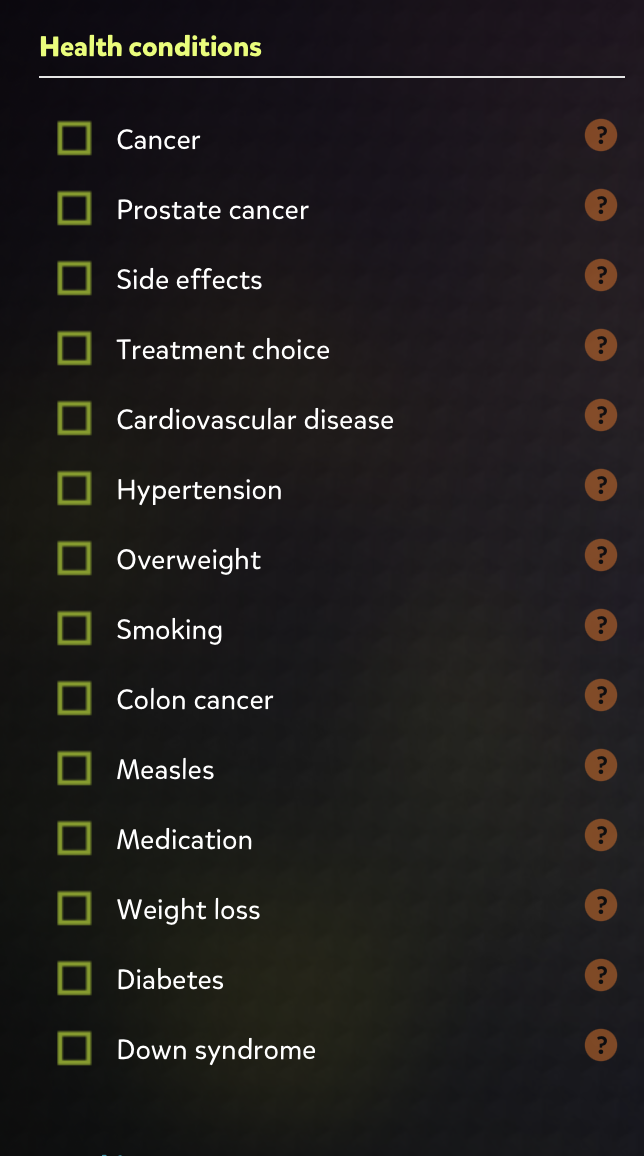
Allowing the doctor to input these different aspects and generate the basic idea with options. The ability to edit data and choose the best visualization, including the most relevant information will help assist in explanations. The patient understanding the data in the most effective way is the goal, and there are many options to choose from. The gallery is available to see the best designs and displays a wide range of designs assisting in the determination of what visualization is best.
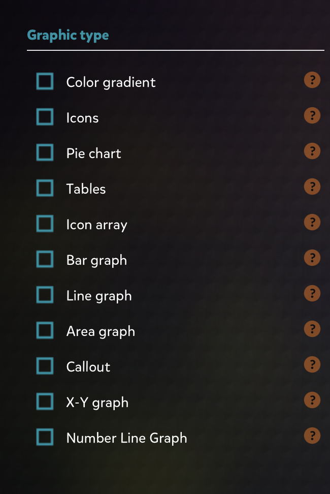
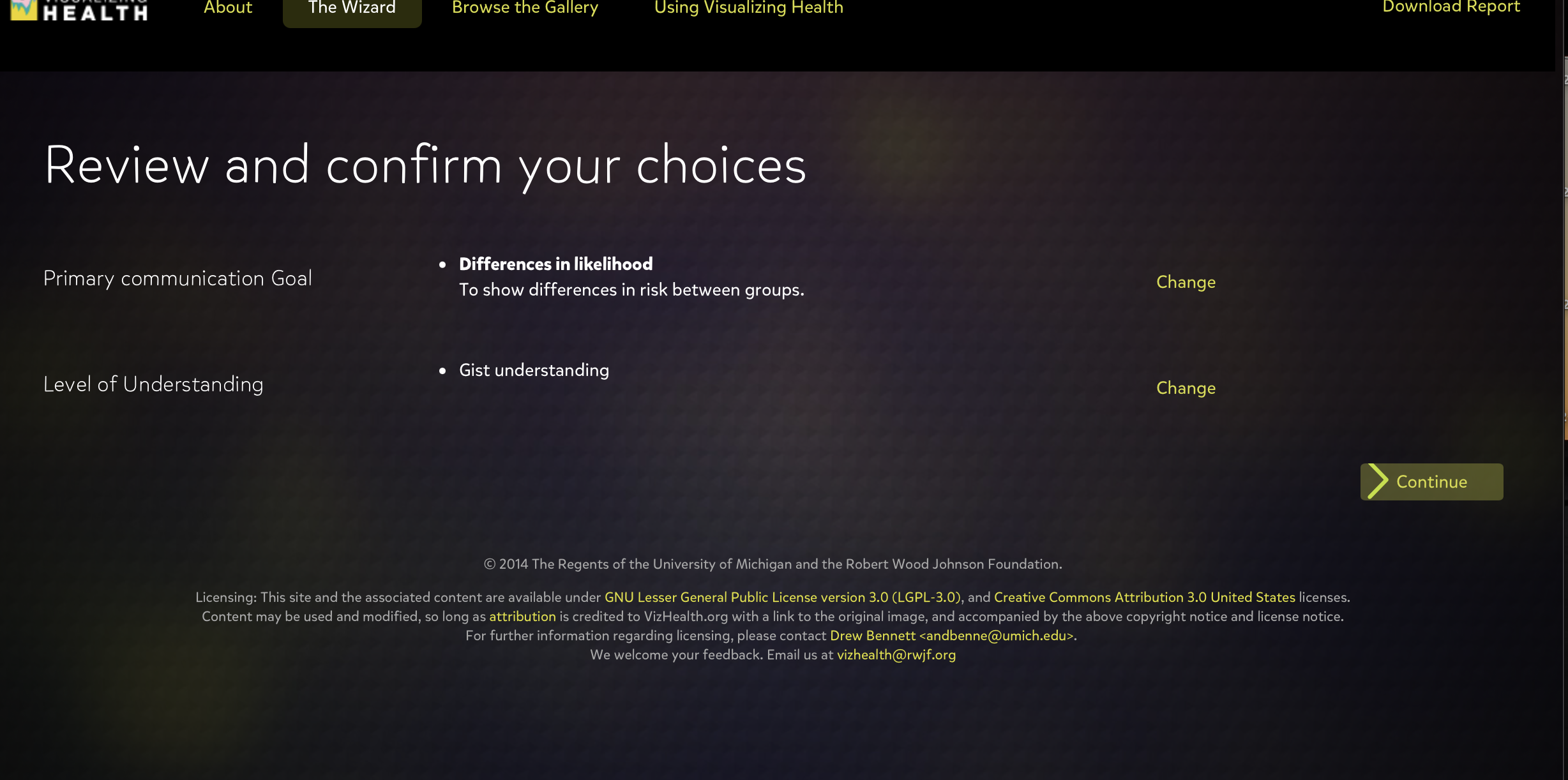
This tool rapidly generates results to choose from to assist in visualizing health issues. Making the patient have a better understand of the risks of their issues and what is the best approach to medications, treatments, and other medical decisions. Visualizing Health gives options for the primary communication goal, and the level of understand whether you want to give basic information or exact numbers.
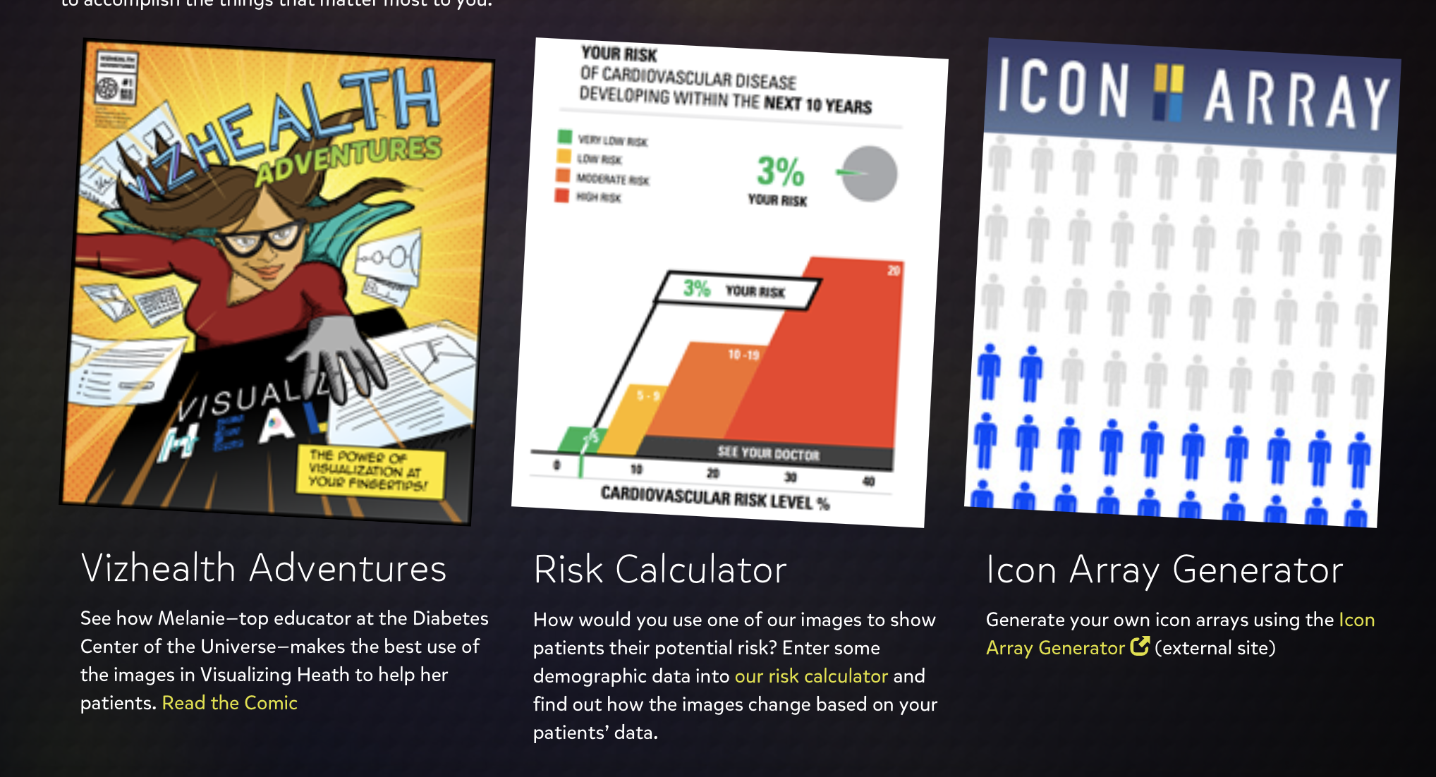
This site is beneficial to both doctors and patients when communicating life threatening sicknesses, medications, raise or lower concerns, and inform about the risks. The wide variety of helpful visualizations, and my overall experience with this scientifically vetted style guide for communicating health data was simple yet very informative. I grasped the concept of visualization in a more effective way, understanding the many possible ways to present data and how someone will interpret it based on the design.
Recent Comments