Pivot Tables and It’s Importance
A Pivot Table is used to summarize, sort, reorganize, group, count, total or average data stored in a table. It allows us to transform columns into rows and rows into columns. It allows grouping by any field (column), and using advanced calculations on them. They give us the ability to get a summary or recap of the data rather than scrolling down to find each subtotal.
Here are some examples of Pivot Tables.
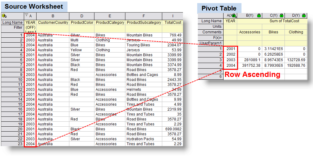
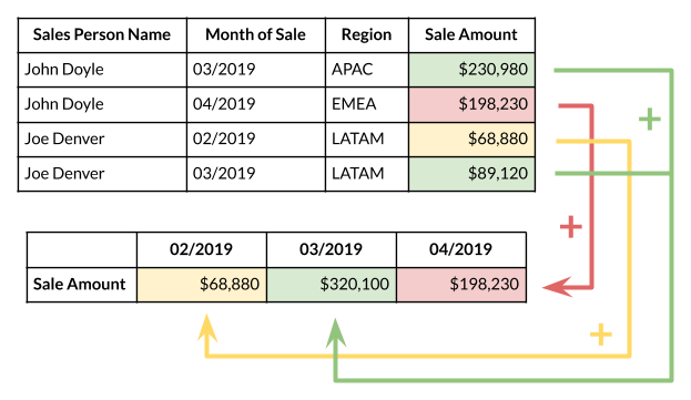
An important advantage of pivot tables is that it is easy to use. You can easily summarize data by dragging the columns to different sections of the table. The columns can also be re-arranged as you wish with the click of a mouse. With the help of excel pivot tables, you can handle large quantities of data in one single go. These tables allow you to take a large amount of data and work on it in such a way that you need to view only a few data fields. This helps in the easy analysis of large amount of data.
NeedToKnow
What I found:
I discovered that not all energy supplied is actually used, and that more than half is lost as waste heat or through inefficiencies. I’m sure I’ve heard that before sometime in my life but being reminded through this website really opens my eyes on how crazy the world works. So much energy wasted and we can’t do much about it.
I learned that we divide our energy use among four economic sectors: residential, commercial, transportation, and industrial. Things such as heating and cooling our homes, lighting office buildings, driving cars and moving freight, and manufacturing the products we rely on in our daily lives are all functions that require energy. Without energy, we can’t do any of the things listed above as well as many many more. Energy is a key tool and necessity in life and without it we would struggle a lot just like humans used to in the stone age.
I really liked how interactive their website was, even letting us choose what we want to click on in order to show that it’s our choice to choose what we want to know more about. It doesn’t throw in unneeded information or tries throwing a bunch of summaries at you, it lets you choose what you want to see and read next and that works really well. Their graphs were perfect, all very colorful and perfectly organized with the data and labels that they need. Also on these charts like I said before they would have these interactive tags to have use choose what we want to learn about next which was cool.
Health Conditions
Wow this website was amazing, how it asks exactly what you’re looking for in terms of exact numbers of statistics or rather just an estimate, then once completing the questions a bunch of interesting graphs about all you can think of show up and you are just sitting there wondering which one you want to click on first. It has so many options between the risks you want to see, what you want to see of such as health conditions, as well as the data they provide, you can choose anything you want and you’ll have the information pop up for you.
Here is a screenshot of a data graph I chose on side effects of health conditions. Look how much information is provided! Incredible, it tells you how it is affected, what’s special about the graph itself, as well as how it does. Great website.
Pie Chart For Browser Usage
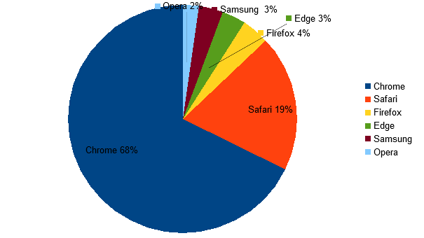
Pie charts are used to represent the proportional data or relative data in a single chart. The concept of pie slices is used to show the percentage of a particular data from the whole pie. Making them different colors can help the reader to differentiate each result. Pie charts show the proportion of the whole that is taken by various parts.
The Lollipop Chart
A lollipop chart is a variation of a bar chart where the bar is replaced with a line and a dot at the end. Just like bar graphs, lollipop plots are used to make comparisons between different items or categories. They are also used for ranking or for showing trends over time.
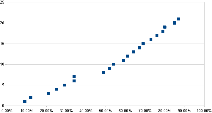
| Lollipop spacing | ||
| Other | 9.00% | 1 |
| South Asia | 12.00% | 2 |
| Generational | 21.00% | 3 |
| Asioan Americans | 25.00% | 4 |
| Muslim Observance | 29.00% | 5 |
| African Americans | 34.00% | 6 |
| Gender Equity | 34.00% | 7 |
| Disability Advocacy | 49.00% | 8 |
| European Americans | 52.00% | 9 |
| Veteran | 54.00% | 10 |
| Islander Americans | 59.00% | 11 |
| Non trad. Students | 61.00% | 12 |
| Religious Equity | 64.00% | 13 |
| Caribbean Americans | 67.00% | 14 |
| Latino/Latina | 69.00% | 15 |
| Middle East | 73.00% | 16 |
| Trans-racial | 76.00% | 17 |
| LBGTQ/Ally | 79.00% | 18 |
| Mixed Race | 80.00% | 19 |
| Jewish Heritage | 85.00% | 20 |
| International Students | 87.00% | 21 |
Differences between Charts.

Here above is an example of a line graph from the NewYorkTimes that I found. I will also post another example of a similar but different visual ofthis same graph.
Here is the same type of graph but with a target line in it to show what the average or should be line for the data.
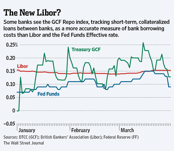
It’s very interesting to see how many ways data can be graphed into these types of graphs/charts. The same type of graph can produce so many different visuals and data representations that it is unreal! Thank you for checking out my blog on this.
Best Tools For Numbers
Tableau has a variety of options available, including a desktop app, server and hosted online versions, and a free public option.
Infogram is a fully-featured drag-and-drop visualization tool that allows even non-designers to create effective visualizations of data for marketing reports, infographics, social media posts, maps, dashboards, and more.
Chart Blocks claims that data can be imported from “anywhere” using their API, including from live feeds.
Datawrapper was created specifically for adding charts and maps to news stories. The charts and maps created are interactive and made for embedding on news websites. Their data sources are limited, though, with the primary method being copying and pasting data into the tool.
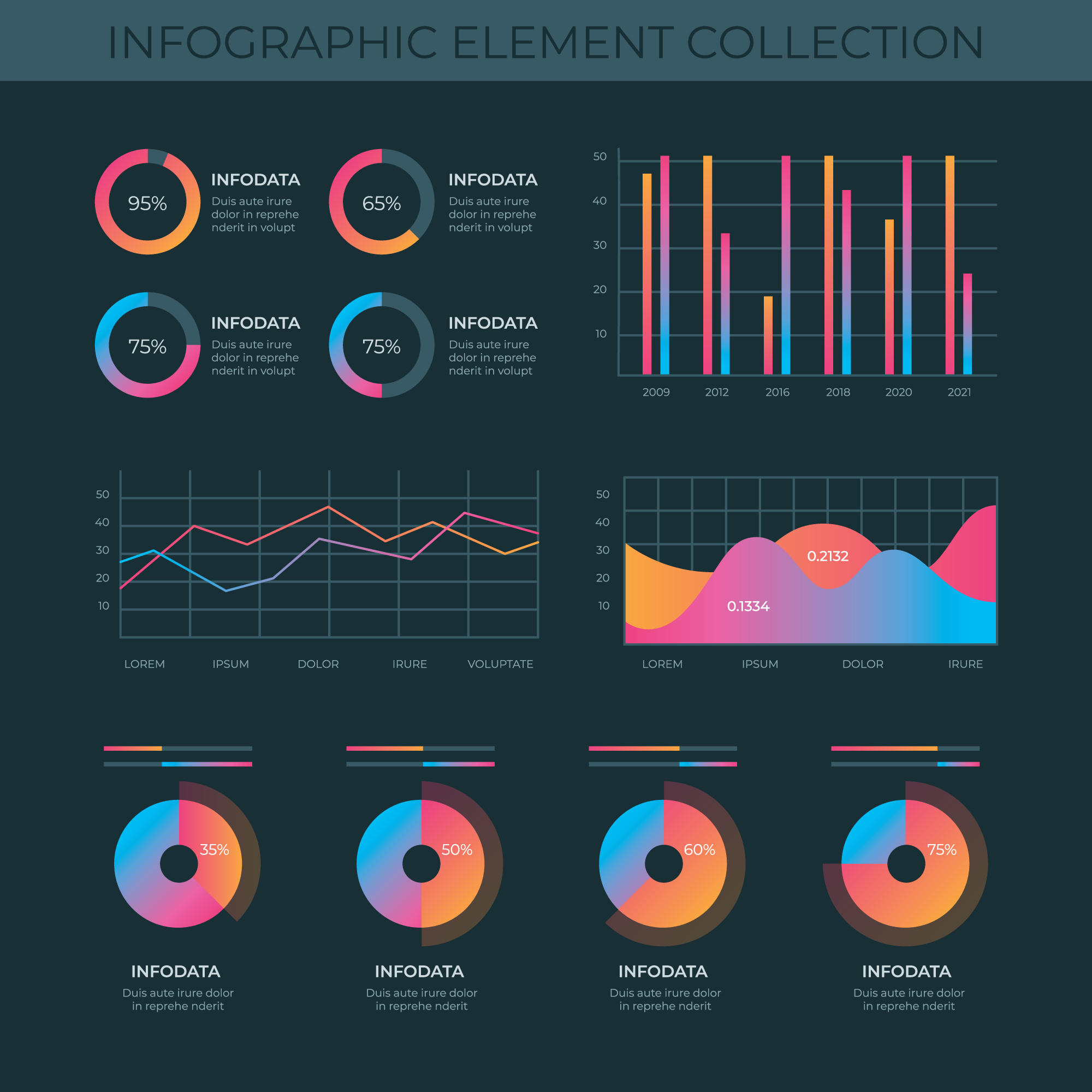
Infographics
Examples of data visualizations. 1 – Cinema: Explaining a movie plot through data visualization. 2 – Art: Analyzing the color palettes of great artworks. 3 – Philosophy: A visual depiction of ideas. 4 – National Geographic: Cartography. 5 – Gastronomy in pictures. 6 – Data visualization through video. Below is a photo of data visualization charts as well as a link on the image to the website I got the photo from. Here is also a link to an article I found where they have a lot of great info on data visualization that helped me with this blog. https://www.tableau.com/learn/articles/data-visualization#:~:text=Data%20visualization%20is%20the%20graphical,outliers%2C%20and%20patterns%20in%20data.
Recent Comments