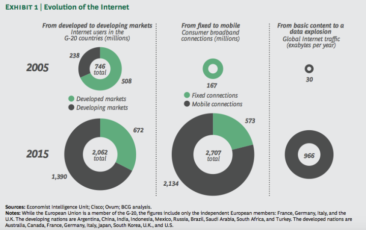
Examples of Insightful data visualizations that compare numbers
Sometimes using regular text instead of data visualizations is the best way to compare numbers.
1/10 people in the United States have a substance abuse problem
However using data visualizations could make the information more appealing to the viewer.

https://www.displayr.com/12-visualizations-to-show-a-single-number/
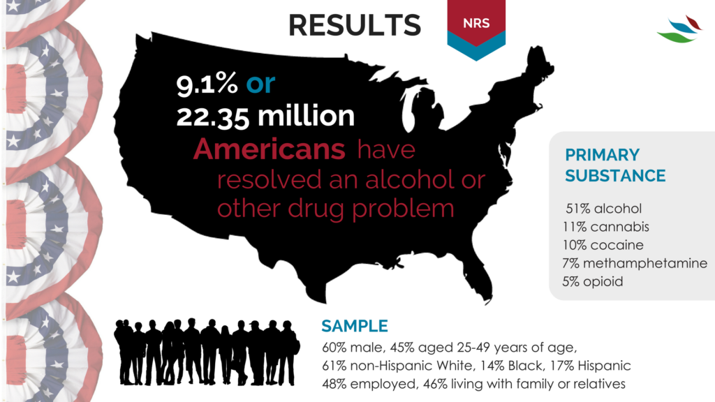
https://www.recoveryanswers.org/research-post/1-in-10-americans-report-having-resolved-a-significant-substance-use-problem/

https://www.displayr.com/12-visualizations-to-show-a-single-number/\
Data visualizations are a great way to display data and compare numbers!
Examples of Insightful Data Visualizations
Visualization is critical to data analysis
This is a great example of data visualization
“Data visualization is a little like herding cattle — it’s expensive and time-consuming, but, ultimately, necessary if you want to generate profits from your cows.” -Angela Hausman, PhD
Using data visualtization the proper way can greatly increase market performance, audience engagement, and overall understanding of the said topic.
Below is a great video explaining what data visualization is and its benefits
Recent Comments