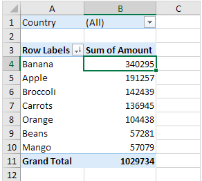
Pivot tables are similar to any other tables made to show data the difference is they are interactive. With just one click on data you can further and further break down that data into different categories.

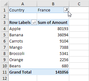
While the chart above looks simple its actually more complex than you think. More specific information can be filtered by clicking the drop down arrows and choosing information relative to what you need. Here we have fruits and how much each is sold for accumulative of all countries but let’s say we just want to see how much France is selling fruit for.

Just click drop down of countries and select France! Pivot takes a lot of data narrows it down or makes it very broad and general so the reader can chose what they want to see making these charts efficient data resources.
Recent Comments