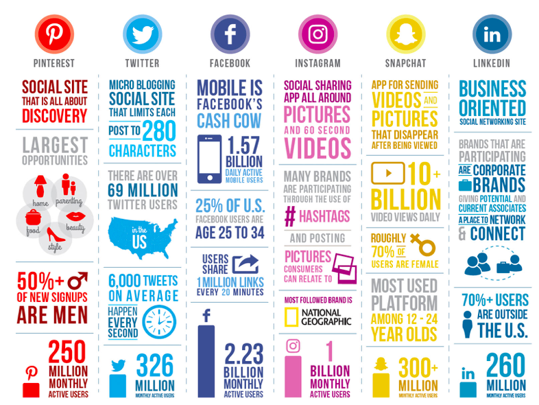
This infographic is a very relevant one to today population. Almost all people have some form of social media and this infographic clearly and successfully shows who has what and why these platforms are needed.

The different colors used is an excellent way to separate each platform while making it clear which data belongs to who. We can see that facebook has the most monthly users standing at 2.23 billion, and at the bottom of the other columns are other monthly user standings. This infographic is a great example of why infographics are useful when done correctly, it’s easy to read has relevant information and is eye catching.
Recent Comments