
My first interaction as I started the flow chart is I like the overall theme and organization of the chart, they created different sections based on the appropriate energy source as well as the envier rental areas it has because all these parts can cause a increase or decrease of the amount of energy being made and consumed.
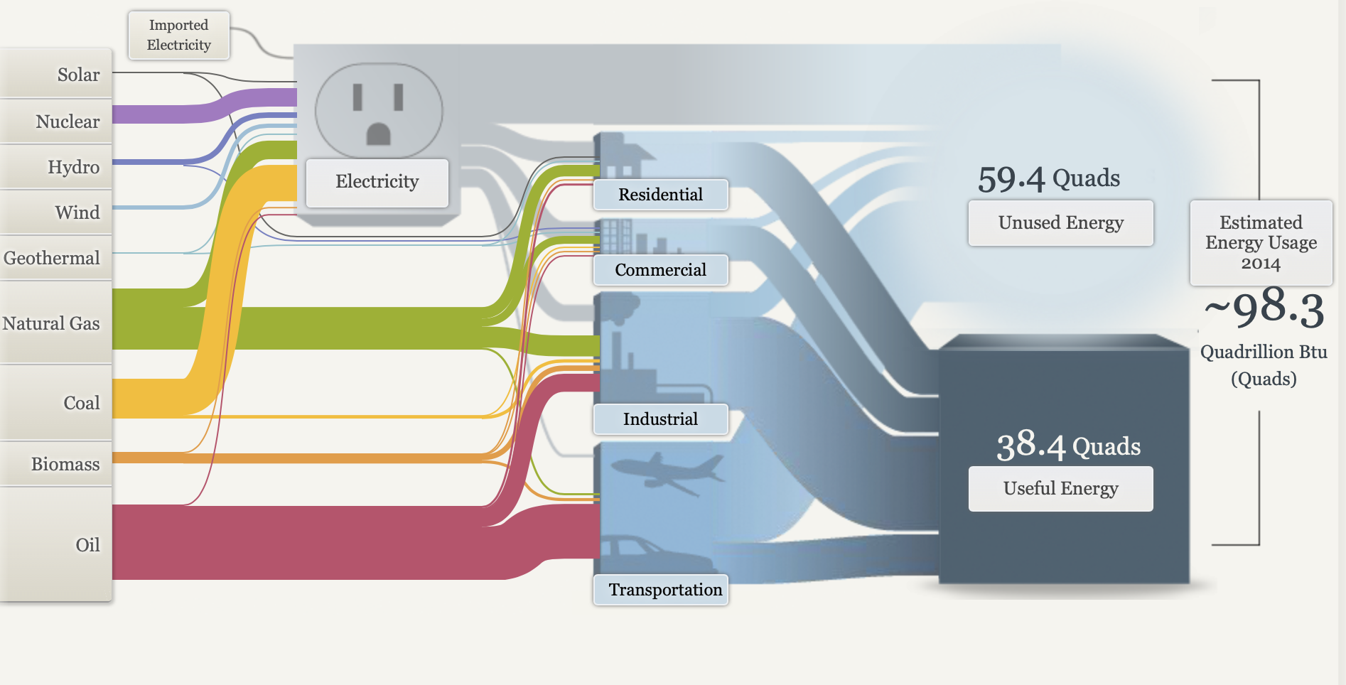
I also love how they give you a quick summary of the specific uses in the residential, commercial, Industrial, ad Transportation areas. Many people don’t know specifically how much energy it takes to power the specific 7. appliances in their house let alone all the other individuals and businesses in their communities.
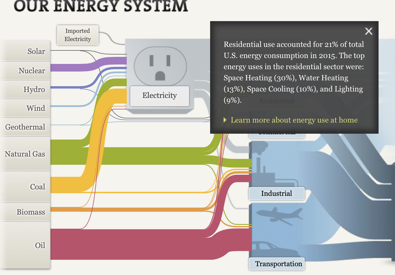
I also like how they broke down the the different sections between national, regional, and state(CA) because there is a major differentiations between each section and it is appropriate to show at least one state to show how much energy is consumed at a smaller population of individuals at still a high rate.
Overall I feel like they used a lot of visuals and simple explorational designs to help the viewer easily comprehend the extensive background behind energy, how it is obtain, maintained, and consumed by people to supply power.
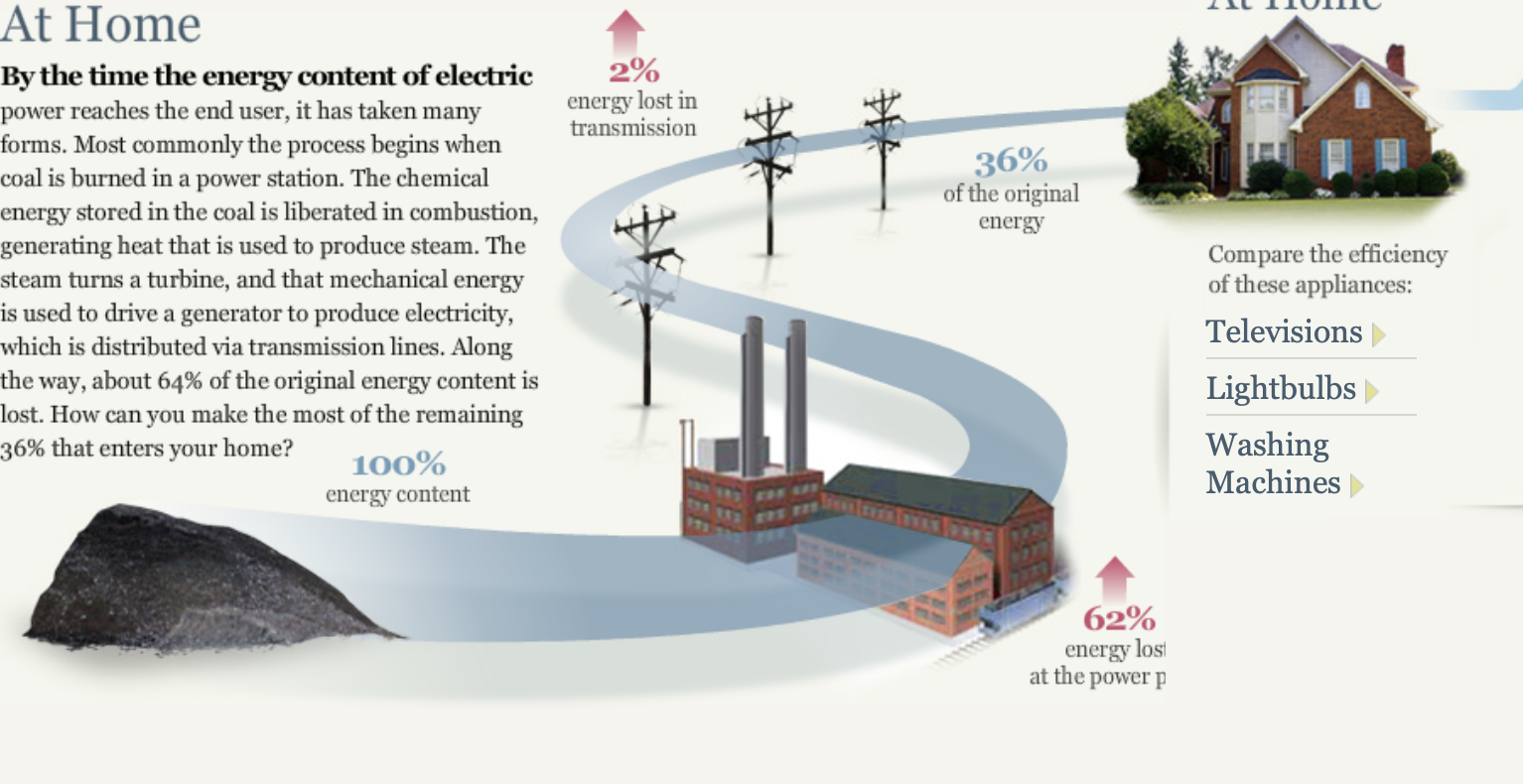
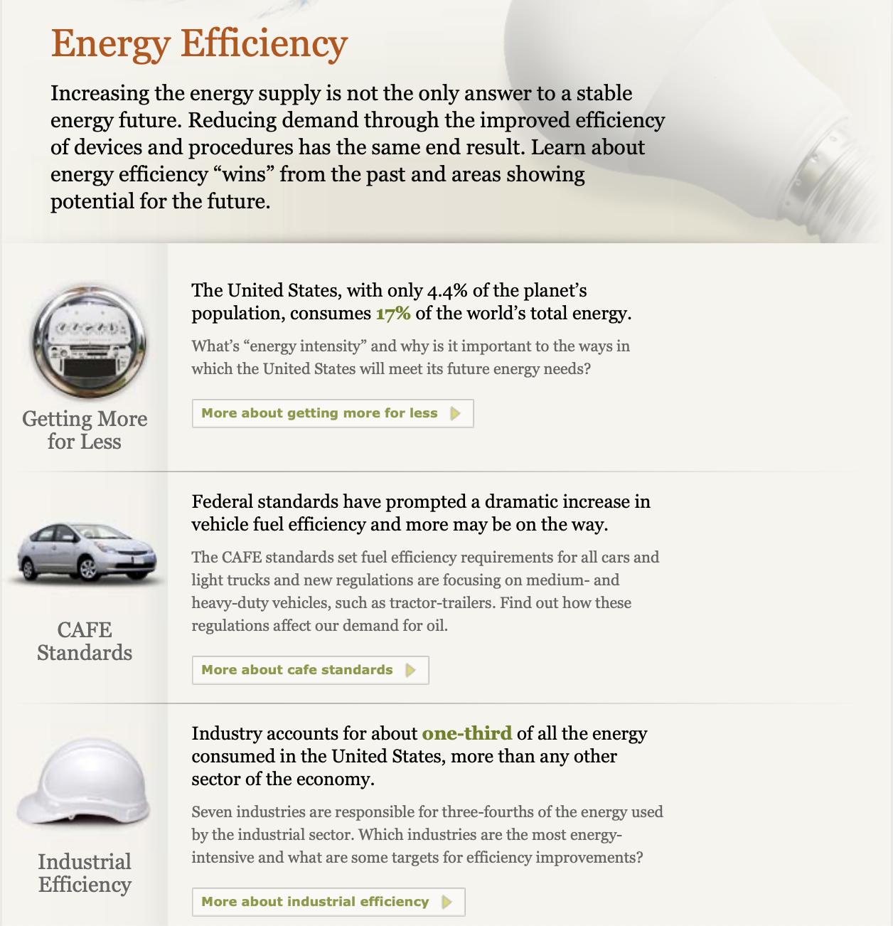
I also was interested in how they expressed alternatives to decrease the use of energy for the future through innovative and efficient technology. They provided simple visuals to separate each section and provide a visual representation of the overall information.
Recent Comments