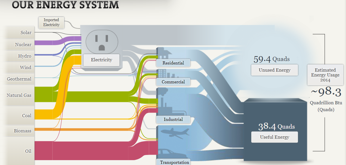
I liked the interactive aspects of Sankey’s visualizations, but or the visualization that you see above of the U.S energy system is a bit confusing. The reason that I find it confusing is all the lines that stem from the energy sources to other destinations are hard to follow due to the sheer amount of other lines and sizes that are present. This in turn makes it harder for viewers to follow the flow of energy from one source to another, which does hinder their understanding. To combat this issue the small thin lines should have been made bigger so they are easier to follow and when intersecting the bigger and fatter lines they should run over the top of them so they can still be followed easily. This does not only apply to the U.S. energy system visualization, it can be applied to the regional energy systems visualization and the California state energy system.

Continuing on, I feel that there were too many interactive visualizations. Take this for example under the understanding efficiency tab there are multiple tabs to click on for television, lightbulb, washing machines, and car usages. In each section there is also a dial with other options to click on that changes the visualization. What seemed cool originally turned into an annoying process for me when viewing the visualizations. It elongated the process of analyzing the visualizations when they could have just displayed all the visualizations for that tab on the page with titles indicating what it was presented instead of adding extra steps to see all of them. I did like the way that they chose to represent that data. I thought it was easy to read and compare the different models.
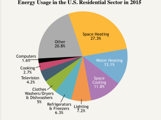
The pie chart above is very cluttered which serves as a distraction to the viewer sincethere are too many slices. If its possible they should combne slices that are related in order to reduce the number of slices making the visualization more appealing. I think this visualization would be better suited as a bar graph rather than a pie chart. I feel this is the right choice since they could represent and compare all the points better in that form rather than this cluttered part of a whole depiction.
Recent Comments