Ultimately, pie charts are used to show a slice of data in a complete circle, or a whole of nominal data. Having a variety of uses and are used arguably in business practices the most. They can show a percentage of subjects surrounding types of customer opinions, revenue, and categorization in an easily understandable way. Compared to other charts, keeping only five categories is wise, as you don’t want to overwhelm your audience with too much information and lose interest.
https://www.the-numbers.com/market/genres
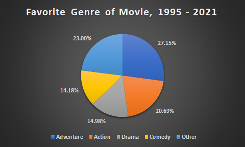
This pie chart is a great example, showing popularized genre differences from 1995 to 2021. Each slice is distinguished through color and data, with the percentages shown on the outside to take up unnecessary “white-space.” If you’d like to go more in depth with this information, a bar graph would be preferred as you can display more genres and different groups of people who liked a specific genre.
Recent Comments