Home » Pie Charts
Category Archives: Pie Charts
Perfect Use Case for a Pie Chart
Introduction
Pie charts are an ideal way to display parts of a whole, especially when showing proportional data. In this post, I’ll illustrate why the pie chart is a perfect fit for visualizing the global market share of mobile vendors, where each segment represents a clear percentage of the total market. With clear, distinct categories, a pie chart effectively communicates the dominance of each vendor relative to its competitors.
Visual: Mobile Vendor Market Share Worldwide – September 2024
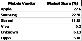
For this data, I’ve created a pie chart that clearly shows Apple, Samsung, and Xiaomi as the top three competitors, with other vendors representing smaller segments. This format enables viewers to quickly assess the relative size of each brand’s market share.
Argument for Using a Pie Chart
The pie chart works well here because:
- Distinct Categories: Each vendor represents a distinct, easily identifiable part of the mobile market.
- Relative Comparison: With Apple leading at 27.6%, the chart’s circular form highlights the gap between top competitors like Samsung (22.91%) and others.
- At-a-Glance Readability: For readers looking to grasp key takeaways on market share distribution quickly, the pie chart’s simplicity and proportional representation make it an excellent choice.
Alternative Visualisations
Though the pie chart serves this data well, a bar chart could be used to show exact values more precisely. However, in this context, the pie chart’s layout emphasises the proportions without requiring precise numeric comparison, which is sufficient for understanding general market dominance.
Design Tips for Effective Pie Charts
Here are some design tips that helped me make an effective pie chart:
- Limit the Number of Slices: Too many slices make pie charts hard to read. Keeping it to significant players (Apple, Samsung, Xiaomi, etc.) helps maintain clarity.
- Use Contrasting Colors: Each segment should stand out visually without overwhelming the chart. For this chart, I used distinct, brand-associated colors for the top brands.
- Label Percentages Directly on the Chart: Avoiding a legend makes it easier for readers to associate values with segments directly.
Pie Charts
Pie charts are a popular, but often misused, tool for displaying data. They are best used when illustrating proportions or parts of a whole. Typically, they are divided into slices to represent numerical values as percentages with each slice corresponding to a category. These characteristics make pie charts ideal for comparing the relative size of different components.
Displaying proportions, categorical data, and non-complex comparisons are all instances in which pie charts are a proper choice for graphical visualization. Pie charts also offer visual simplicity for the audience and can easily be displayed in presentations or reports because of their simple and straightforward appearance.
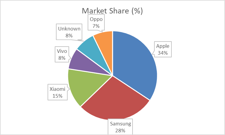
The pie chart below displays the proportion of streamed Spotify songs for a survey group, organized by decade.
The data in this pie chart, showing the distribution of most played Spotify songs by decade, is a good choice for pie chart representation because it effectively illustrates proportions and highlights significant contrasts.
One of the key strengths of this data set is that a significant majority (91.14%) of the most streamed songs for this survey group were released between 2013 and 2023. The pie chart visually emphasizes this dominance with a large, unmistakable slice. The overwhelming size of the 2013 – 2023 segment makes the dominant trend immediately clear, which is exactly what pie charts are designed to do — highlight proportions.
Although there are several other decades included in the survey, their contributions are relatively small. The remailing decades, such as 2003 – 2012 (4.00%) and 1993 – 2002 (2.27%), have much smaller slices. A pie chart allows for quick, visual comparisons between these smaller values without having to actually read through numbers. For instance, it’s easy to see that the 2003 – 2012 period represents about double the share of 1993 – 2002, but both are much smaller compared to the dominant period shown.
I believe that visualizing data such as this is important because it allows artists and producers to quickly assess whether they should be making new music or if older music should be re-worked and released. If the data showed that Spotify users were more consistently streaming songs from 1983 – 1992, then artists and producers may want to use songs from that time period in their own work in an effort to boost streaming numbers.
Pie Charts
Pie Charts are a great way to show different pieces of a whole. In other words, as long as your data can be represented as 100% it can be represented as a Pie Graph. Pie Graphs are the easiest to understand at a glance and require little to no in depth explanation. When your data can be represented as 100% as a whole, the only reason where you wouldn’t use a pie graph is when most of the separate values are so similar that they can not be differentiated at a glance. In those cases the best graph to use would be a bar graph.
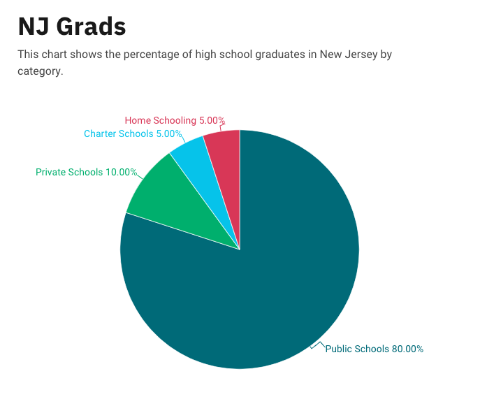
Pie Charts
The ideal uses for pie charts are to illustrate the corresponding ratios of components to a whole and to demonstrate how a whole is divided into its individual pieces. When properly sized categories are present pie charts can be used for straightforward, equal comparison. For more in-depth comparisons a bar graph would work better than a pie chart. Labeling, ordering, and limiting slices are some tips when creating a pie chart. When labeling, verify that the appropriate number or percentage is written on the label of each slice. To keep a pie chart organized slices can be arranged from largest to smallest or smallest to largest. Use a different chart type if the chart includes more than five slices to limit clutter. There are certain cases where pie charts are not the ideal option. When there are too many categories in the data or the data values are too similar a pie chart would not be the best fit. If the data contains any values that are not positive integers, a pie chart is not the right choice.
Below I have included a good example of a pie chart that is properly labeled, ordered, and contains limited data.
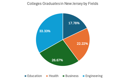
Pie charts provide a clear visual representation of percentages and proportions, which makes it easier to understand data distribution. Making judgments based on data representation is simple with the use of pie chart analysis. Pie charts offer an immediately comprehensible visual depiction. Pie charts make it simple to compare different areas and provide information about those with the greatest impact. Pie charts are very helpful in the business world. They can guide investments and have an impact on plans for advertising and the creation of products. Decision-making based on data can be substantially improved by the use of pie charts and their interpretations.
Below is a pie chart that I created in excel. It represents college graduates in New Jersey by fields.
Pie Chart Use Cases
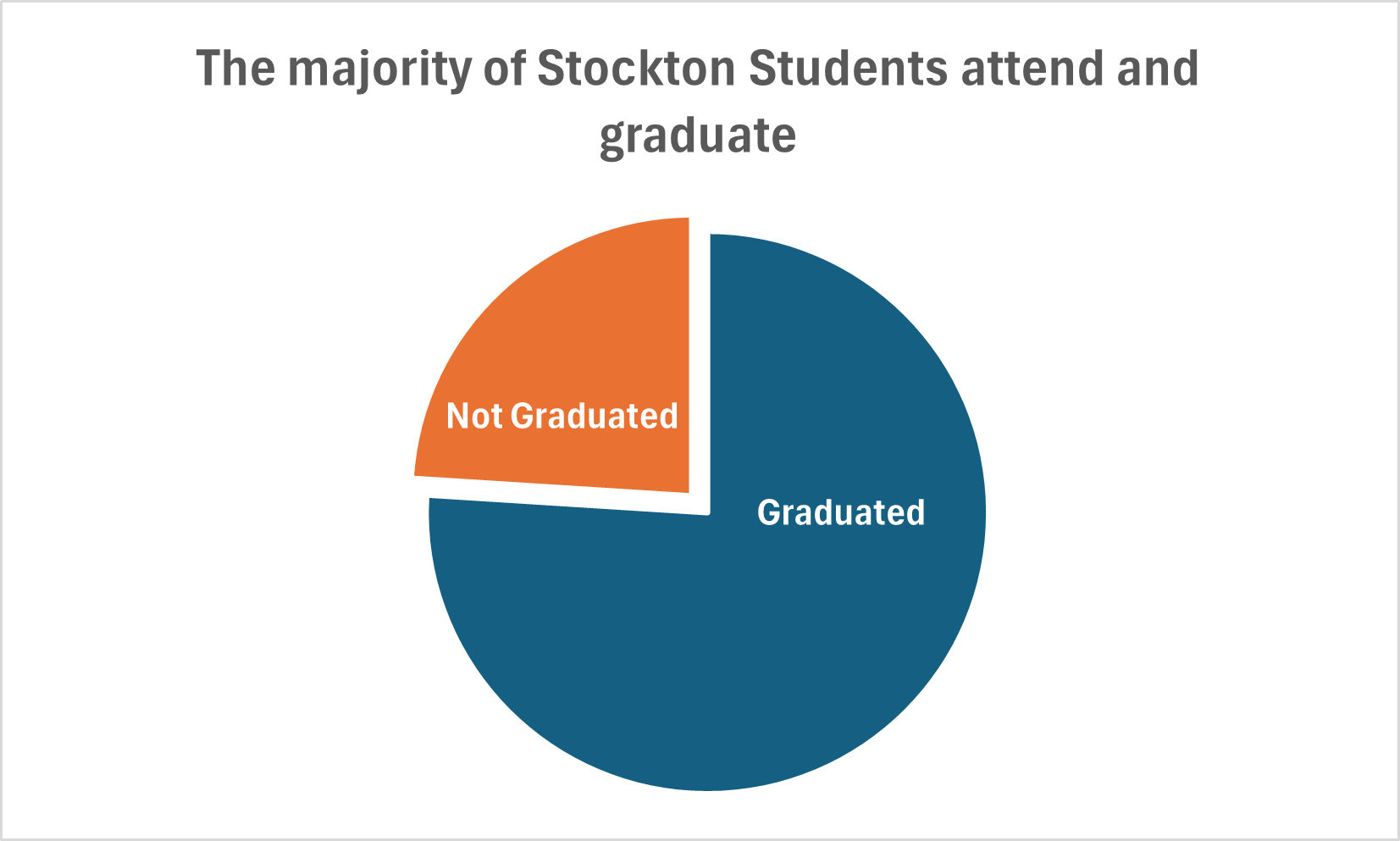
Lamar Miller
Here you will find data used to construct a simple pie chart with two data comparisons. The data I used was comparing Stockton University’s average student graduation rate vs those not graduated (out of 100% of students). It is discussed in our text that the best use cases for pie charts are when comparing a part to a whole. In addition, it is also recommended to begin the largest portion of data at 12 o’clock as most viewers begin there and view clockwise. It is recommended to use pie charts when we are showing four or less parts of a complete whole or 100%.
It’s stated in the text that most audiences relate well to circles as they are universally accepted as a whole. I believe this chart is the best example to display this data because we are simply comparing two parts of a whole. If we were comparing a larger data set, it may not be the best use case as viewers tend to have opportunity when viewing angles.
I believe Excel is sufficient to create this graphic and is easy to use for this particular example. The explosion option allows you to segment a part of the pie in order to highlight a particular piece of data and provide emphasis on the story you wish to tell.
Pie Charts
What is a Pie Chart?
A Pie Chart is a common type of visualization that demonstrates parts of a whole. Each section represents a value in relation to the entire composition. The slices should be proportionate to the amount in each data set so that the viewer can compare each section by size to determine its value.
When should I use a Pie Chart?
A Pie Chart is a great visual for a part-to-whole relationship. It should be used when displaying the “percent of…” or “part of…” something. StorytellingWithData provides two primary use cases for a pie chart:
- having a general sense of the part-to-whole relationship is more important than comparing the precise sizes of the slices
- to convey that one segment is relatively small or large in comparison
The percentages should sum to 100% so that the visual is relative in size to its value.
The Perfect Pie
I created the “perfect pie” in Excel using 2024 Coffee Statistics by DriveResearch. I will break down what makes this a perfect use case as well as design tips for creating an effective pie. You can click on the image below to open my Excel spreadsheet.
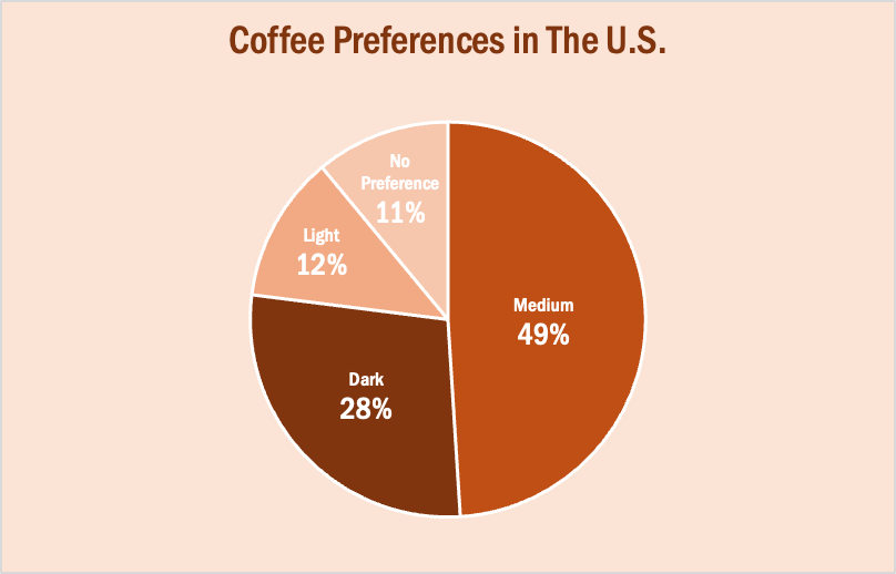
The data in this set is great for a pie chart because it equals 100% and one value is significantly larger than the others. It is also split up into 2-5 categories which is not too overwhelming for the viewer. The coffee preferences are all parts of a whole, making a pie chart the best choice over bar charts and other visualizations. To make it aesthetically pleasing to look at, I used different shades of brown throughout the entire chart which correlates with the coffee theme. I deleted the legend for a more minimalistic appearance, which the author of our textbook reiterates throughout each chapter. Because the values for Light Preference and No Preference are very similar, I added data labels to each segment so it is easy to comprehend. I also increased the font size for the numbers to make them stand out. Stephanie D.H. Evergreen suggests “unwrapping the pie” by making the largest slice start at noon and run clockwise in descending order (as seen above). When creating this chart, I was sure to avoid 3D and exploding effects in order to increase legibility. For more information, I suggest checking out this article on Tableau, which provides more examples of effective and ineffective pie charts.
Pie Charts
Pie charts are used to show portions of a whole. An amount is divided into categories by percentage and the slice sizes are relative to the percentage of the category. Pie charts are great to use in showing the results of polls if there are a limited number of categories. If you have too many categories the chart becomes difficult to read. Below I have created two pie charts based on data from Pew Research regarding Americans’ views on money in politics.
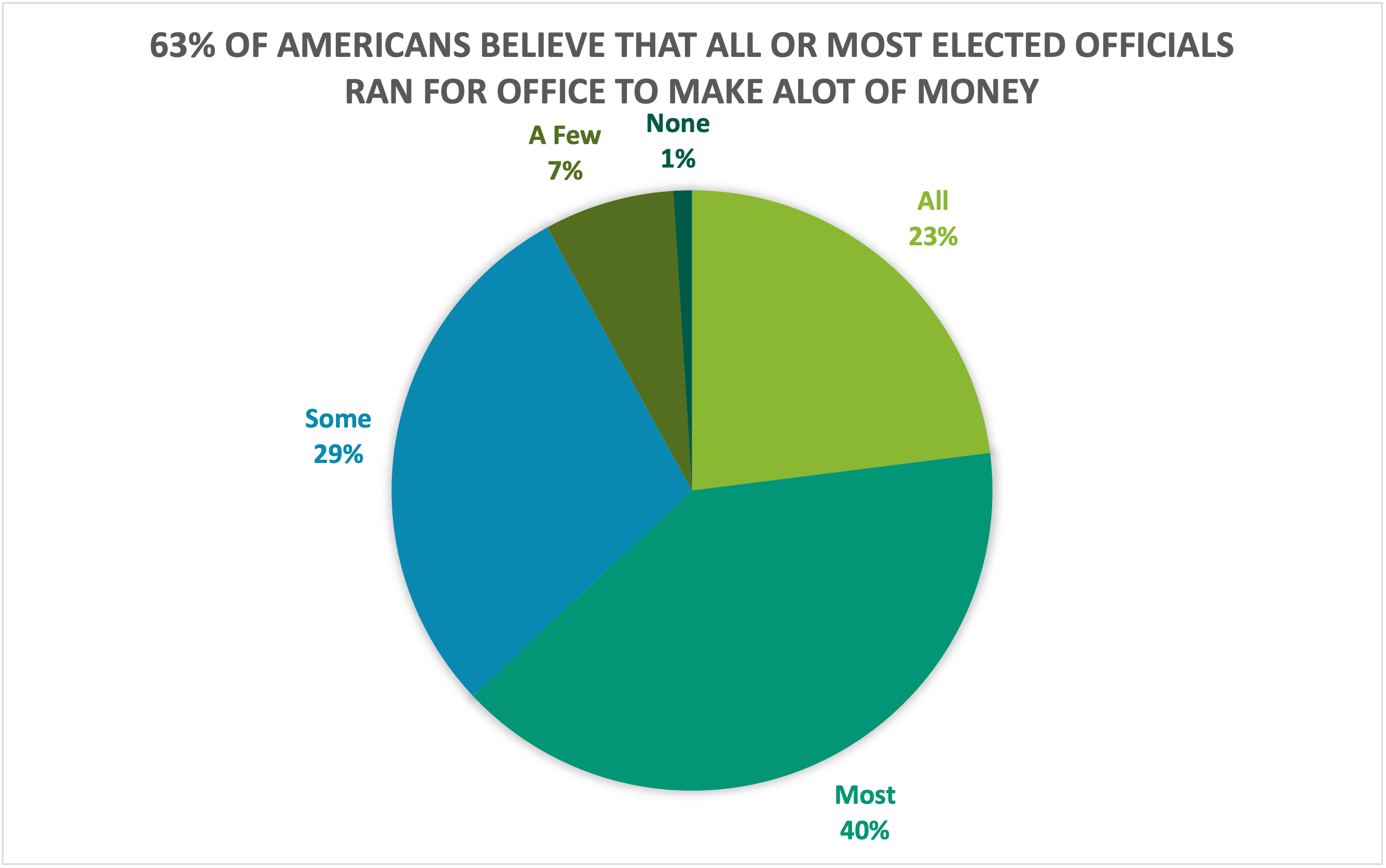
The above chart highlights what a higher proportion of respondents believe while the chart below highlights what a lower proportion of respondents believe. Choosing the right chart but also a good title for the chart is key for letting viewers know what information is important.
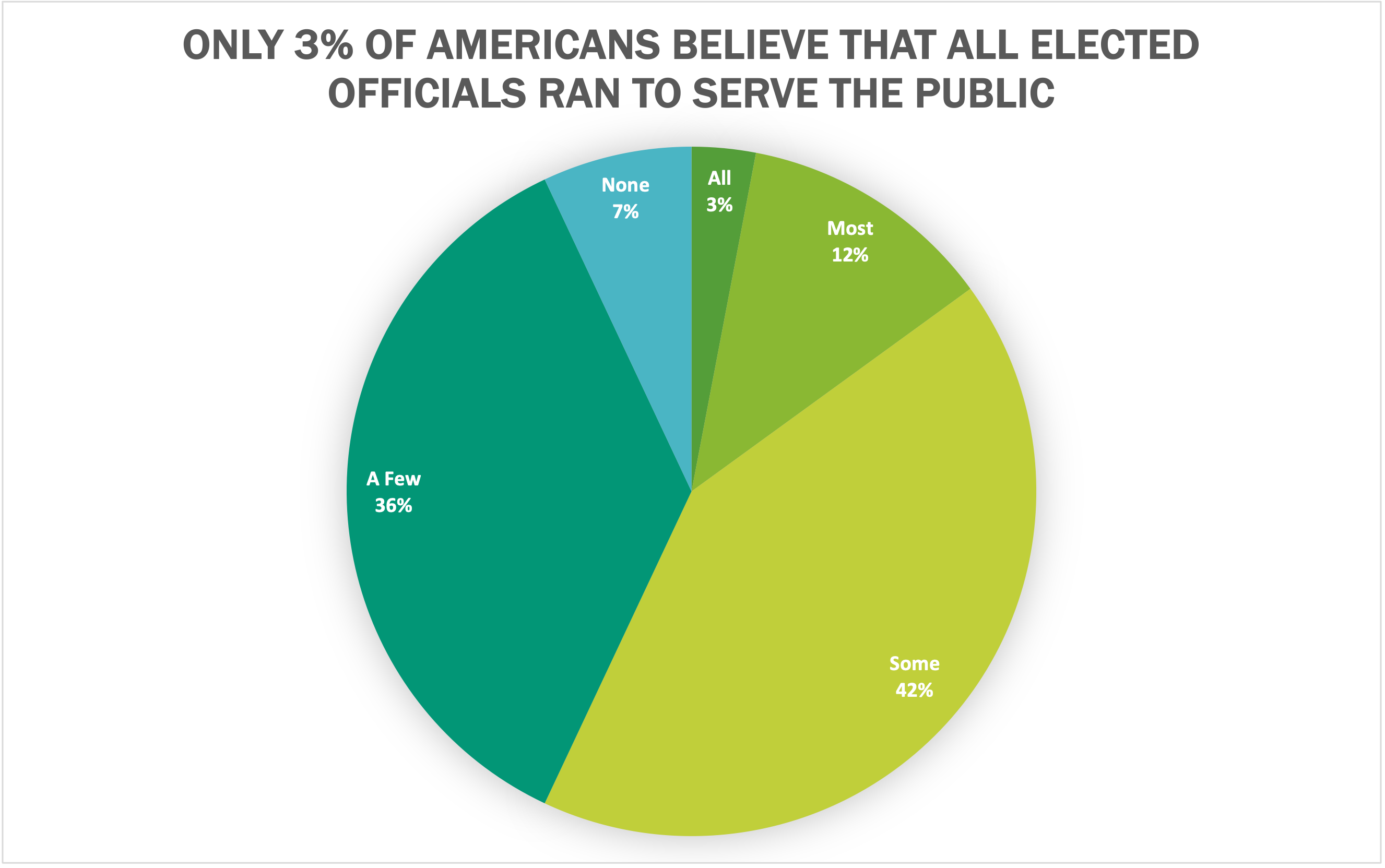
I believe that both of these datasets are great use cases for pie charts because they show what portion of respondents. Other good uses of pie charts is in finance. Household budgets are well represented by pie charts. Pie charts are also a great tool to use when visualizing portfolio allocations. One of the most important things to avoid with pie charts is using incompatible data. If the proportions do not sum to 100%, the data is not a good use case for a pie chart. There are many different options for visualizations and a pie chart is great for a simple and quick way to represent proportional data effectively to viewers.
Pie Charts
Pie charts are something that we are used to seeing, and have been practically since elementary school. They are commonly used for comparisons because they help people visualize a difference and also allow them to understand different categories and severities of things. For this reason, it is always important to make sure a pie chart is used properly, otherwise information can become too overbearing and confusing.
When tasked with creating a pie chart, I felt that it was important to pick something that was equally important to me and had data that was easily comparable, as this is what would work best for a pie chart. The image below shows the pie chart I created with sample data taken from Statista about the percentage of college students who are diagnosed with some sort of mental disorder.

One thing that not many people are aware of (unless they were or are in college) is the amount of stress and hard work that comes with the role as well. More often than not, these stresses cause college students to be diagnosed with some sort of mental disorder, and I felt that as a college student who is also suffering from the stress and pressure put on me, this was a good thing to talk about. The pie chart features five different types of mental disorders that college students are most commonly diagnosed with, with anxiety and depression being the highest amongst them.
I think this data was best shown in this pie chart because it puts the numbers and diagnoses into perspective about how significant and problematic the pressures of college are on a student. Due to the two large percentages taking up more than half of the circle, you get an idea of the severity of it.
As previously mentioned, this sample data was taken from a larger data set on Statista. However, Statista showed this information on a horizontal bar graph (as shown below).
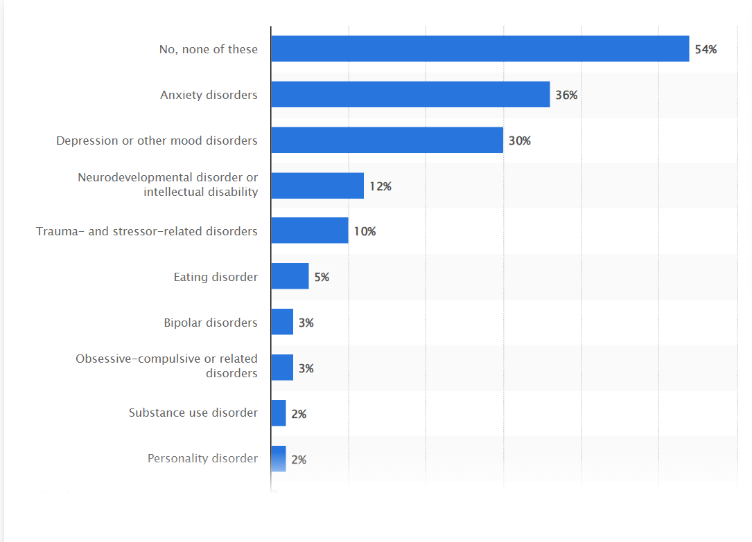
While the bar graph is still a great way to display this information, I think that taking the higher percentages/more common disorders and displaying them on the pie chart created a more urgent and dramatic effect that may not have been seen or fully acknowledged in the bar graph. On the other hand, if I were to include all of this information in the pie chart created, I do not think the pie chart would have as much of an effect or impact as it currently does.
In all, a pie chart is a great way to display certain types of information, including my sample data set on mental disorders in college students. It shows comparison of different categories and allows for easy interpretation and understanding of data. One thing that I discovered while creating this pie chart is that Excel has several hidden tools and features to help you create the pie chart to your liking, including pre-made color palettes that make it easy to keep a theme, as well as different examples of pie charts using your data. For instance, I found that it looked better to have the percentage and category labels on the outside of the pie chart rather than the inside due to clutter and I was able to do so with a simple click of a button. I think it is important to note these features because certain types of information and pie charts may need to be created depending on the data used, and Excel provides easy navigation to do just that!
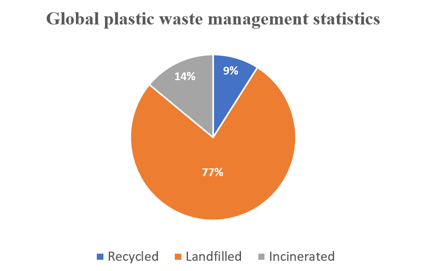
Global Plastic Waste Management Statistics – The Use of a Pie chart
I used a pie chart to visualize the data below because it best fits it and makes it extremely easy to consume and understand. The data highlighted in this blog is in proportions. It is also categorical data.
WHY PIE CHARTS
Anytime you try to show that the thing you are talking about adds up to 100%, you are telling a story about parts of a whole. Alternatively, whenever you need to describe the proportionate components of a group, this is a story about a part-to-a-whole. In the plastic-related case highlighted above, it is convenient to use pie charts to visualize the dataset. However, there is a caveat: do not use a pie chart to tell a story about parts to a whole if there are five or more wedges. This clutters the information presented in the diagram and makes it difficult to comprehend. I believe that a pie chart best fits the data set discussed above. Any other visualization used will defeat the overall purpose.
Below are a few design tips to consider when constructing a pie chart:
- Use presentable fonts
- Do not use colors that are too bright
- Do not use 3-D designs
- Always use legends for easy comprehension of the data.
- Do not use pie charts when there are five or more wedges.
The Perfect Use Pie Chart
By Nick Ligameri
When you think about charts, the pie chart is probably the first chart that comes to your mind. It is one of the most well-known types of chart. Because of this notoriety, pie charts tend to be misused. This misuse leads to pie charts getting a negative reputation. According to storytellingwithdata.com, there are two main reasons to use a pie chart. These reasons are to how a part (slice) relates to the whole (pie) and to show that one slice is larger or smaller compared to the pie.
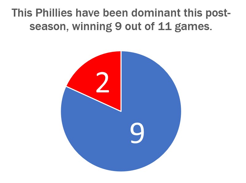
The graph shown above just so happens to convey both of these uses very well. Today, 24 October 2022, is a day after the Philadelphia Phillies won the National League Pennant and secured their spot in the World Series. I thought it would be appropriate to show how dominant the Phillies have been in the post-season. They have played eleven games so far and have won nine of them.
Storytellingwithdata.com explains that we perceive the area that a slice takes up. This pie graph shows that the Phillies’ nine wins cover most of the pie. It also shows that the Phillies are winning a high percentage of their playoff games. This is why this specific pie chart does a great job showing how the Phillies’ nine wins convey a sense of the part-to-whole relationship and is relatively large compared to their two losses.
The design of this graph was kept very simple. We are only working with two numbers so there is no need to get crazy on the design. The colors that I used were the Phillies’ colors, red and blue, for the two slices. The message I am trying to convey to the audience is that the Phillies are a dominant force right now, and this design shows this in a straightforward way. The data I used was sourced from www.baseball-reference.com. I had to click on a few links and do some basic counting and math to aggregate the data I wanted.
Go Phillies!