Infographics

This is an example of a mind map that can be made on a tool called Canva. Canva helps create info graphics. These graphics just don’t stop at minds it also expands further making charts, and diagrams. This tool makes it easy to map out where you would like to set elements to make your graphic easy to understand and fun to look at!
Comparing Numbers (McDonalds Age Demographics)

This graph was pulled from our final project and it highlights the comparison of ages that frequent McDonalds. This graph also highlights the most popular demographic, that being the ages 25-34. This age group visually is larger than the others and also can be seen through a number. Showing how large this demographic really is.
Pivot Charts
An interactive method for instantly summarizing a lot of data is a pivot table. Finding patterns and trends, organizing data, creating reports, and being more efficient are all made possible by pivot tables. These are a helpful tool for analyzing and summarizing a lot of data. Pivot tables are also a good way to make sure that your data is automatically staying up-to-date.
In this example below, it shows Raw Data vs. Pivot Report. As you can see, the data in the Pivot Report is much more organized and clear to read than the raw data. The data is condensed into a less complex chart that is interactive and automatically updates calculations.


The Beauty of PivotTables
PivotTables are a useful type of table within Excel that allow for automatic aggregation and summary of data for easy retrieval. For example, in a spreadsheet filled with people’s favorite choices of food and drink, a PivotTable can be used to automatically count how many people chose Coca-Cola as their favorite drink.

This article showcases ways to use PivotTables on a set of data. By selecting different fields, a PivotTable can be used to automate summation of a column. This is useful so that you don’t have to keep manually updating the sum whenever the data changes or gets added to.
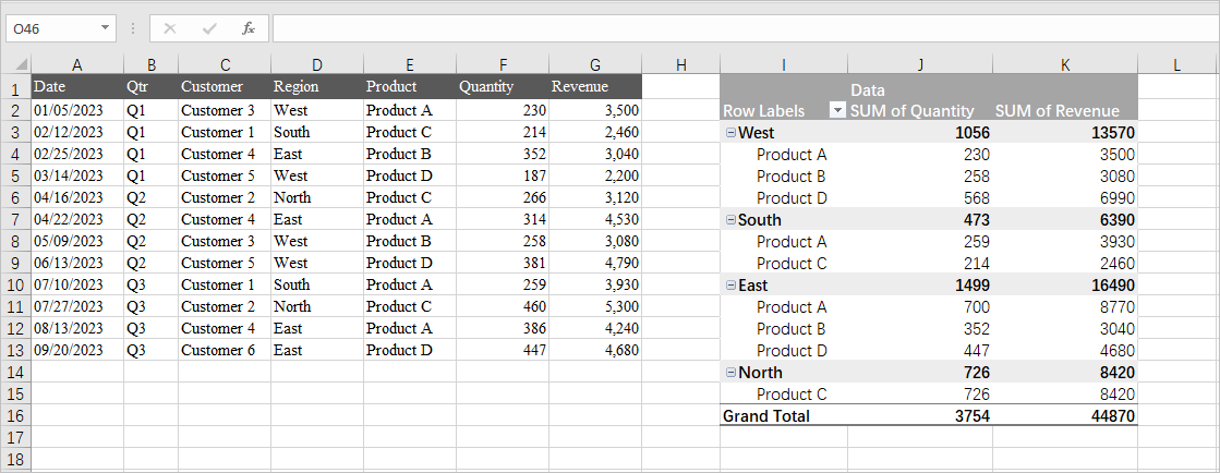
These tables have a lot of have flexibility too. In this example from Medium, a PivotTable is used to add together quantities within regional subsets of data while simultaneously calculating revenue. The usefulness of PivotTables comes from their ability to quickly pull data matching specific conditions and efficiently summarize them in a readable format. I personally foresee PivotTables dramatically reducing the amount of effort it takes for me to summarize my data.
Importance of Pivot Tables
Pivot Tables are an essential tool in Excel that are useful for organizing and grouping large amounts of information. They are extremely versatile and can be used for a numerable amount of ways. By using pivot tables you can turn clumps of data into meaningful and insightful information that can be used for analysis. Some practical uses are in finance analysis, sales analysis, product information, inventory analysis, and more.
Above, we see sales analysis for produce. It is well organized and easy to interpret.

Above, we see another practical use of pivot tables for sales analysis. We can see here the sales for each product, the year it was made, and the category each product falls under.
Overall, pivot tables are useful for anything that needs to be organized into multiple different categories. From there, you can filter using the drop down arrows that prove to be extremely useful with many entries. Since in Excel, you can then make charts and other analysis more readily.
Real world use of Pivot Tables

This screenshot shows a real world example of how any company can quickly sort and summarize candidates for interviews. This pivot table houses over 1000+ people that are interviewing for different roles within a company. For a single person to manage this data and collect performance with experience is tough even through an excel sheet. A Pivot Table can make it easy for anyone to manage people to this size!
Pivot Tables
Any situation where you need to quickly summarize and compare large datasets across multiple variables, making it easy to identify trends and patterns, can benefit from the use of a pivot table. Examples of these scenarios include analyzing sales data by product and region, tracking website traffic by source and time of day, examining customer demographics by purchase history, evaluating employee performance metrics across departments, or summarizing project progress based on team members and deadlines.
You can use pivot tables to:
- Run automatic calculations on summed or counted values
- Create percentages of totals
- Segment data by date, the user, or other variables and calculate totals
Here are some examples of how to use pivot tables in Excel:
- Summarizing Data: Pivot tables can automatically summarize data, such as combining view totals for duplicate blog posts.
- Counting Rows: Pivot tables can count rows that have something in common, such as the number of employees in each department.
- Analyzing Sales Data: Pivot tables can be used to analyze sales data, such as total revenue by month and region.
- Calculating percentages:
Here is an example from ExcelJet.
- Excel builds a two-way pivot table that breaks down sales by color and region:

- Swap Region and Color:

The Importance of Pivot Tables
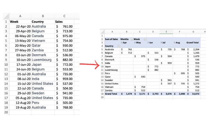
The picture above exemplifies a pivot table and one of the many different ways it can be utilized. One of the main reasons pivot tables can be such amazing tools for representing data is how interactive they can be. The table above shows sales by each country sorted chronologically by week. The table is very easily changed to reinterpret the data to be sorted by country instead of by time. Pivot tables allow the user to represent their total sales by region, or even be specific salespersons. They also can allow the ser to group data into even more specific groups such as other time periods (months, years, etc), or other custom grouping methods. This is shown in the pivot table below.
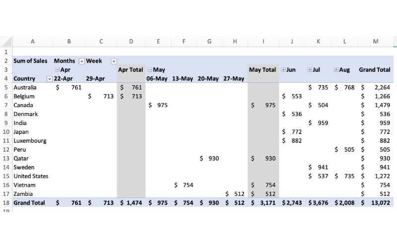
In terms of efficiency, there is no better table to use than a pivot table. They can save you hours by allowing the user to quickly change how a data set is represented. They also add a sense of flexibility. Pivot tables make it very easy to incorporate any new data that may be found instead of having to create a whole new table/chart.