Home » LolliPop Chart
Category Archives: LolliPop Chart
Lollipop Chart
A lollipop chart is basically a combination of a bar chart and a dot plot or scatterplot. It can be used anywhere that a bar/column chart would be appropriate. Lollipop charts are great for reducing visual clutter and making use of white space, which can make important data stand out more and make the differences between data points more apparent. Numpy Ninja makes the point that one strength of lollipop charts are that they are highly customizable. One of the weaknesses is that the circular markers can create some ambiguity in where the actual datapoint lies, making it more difficult to discern scale. This type of chart actually works best when there is a large discrepancy between datapoints such as in the below. The second chart I made has much less deviation between data points so the chart overall is less impactful. This is one of those things that you have to see for yourself to understand that there really is a best chart for different types of datasets.
I was recently at Disney and got the sales pitch for DVC timeshares. I thought a fun lollipop chart would be to show how many one bedroom villas each different resort has. This can be important information for a family looking into which resort to purchase if they need a specific room type. This chart clearly shows that a family that requires a one bedroom villa to be comfortable should stay away from purchasing at certain resorts or they may not be able to book the room they desire due to low availability. This lollipop chart was created in Excel.
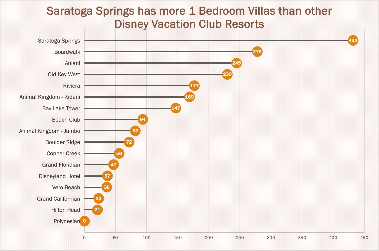
https://www.dvcfieldguide.com/blog/disney-vacation-club-1-bedrooms
I tried to create a lollipop chart in Tableau using data on consumer spending. I found some information on what categories of purchases consumers intend to splurge on in 2023. This application can be tricky to figure out, but I love that I can export my charts with tooltips for readers to interact with. 37 percent of consumers intend to splurge on something in 2023 and this chart breaks it down into categories. We can see that most people intend to splurge on restaurants and groceries and the fewest people intend to splurge on fitness and household essentials.
Lollipop Charts
A lollipop chart is a novel spin on the classic and universally appreciated bar chart. Applicable in the same situations as the illustrious bar chart, lollipops serve the same purpose but have the added benefit of cutting back on unnecessary clutter. When your data has a large number of data points being compared or you’re just aiming for a simpler visualization (that saves on ink!) a lollipop chart stands out as a strong alternative.
Some research (Blasio & Bisantz, 2002) even shows that lollipop design can lead to faster response times and greater accuracy (Gillan & Richman, 1994). Some other studies have shown (Inbar, Tractinsky & Meyer, 2007) that lollipop charts are not viewed as visually appealing as the timeless bar chart. As time goes on and these new minimalists styles of data visualization command more mainstream use, who knows what the future holds?
Below is a chart showing the percent of National GDP each of the top ten states makes up:

A simple, no-frills method that shows the single important value for each data point clearly and quickly, that is the strength of the lollipop chart.
Lollipop Chart
By Joseph
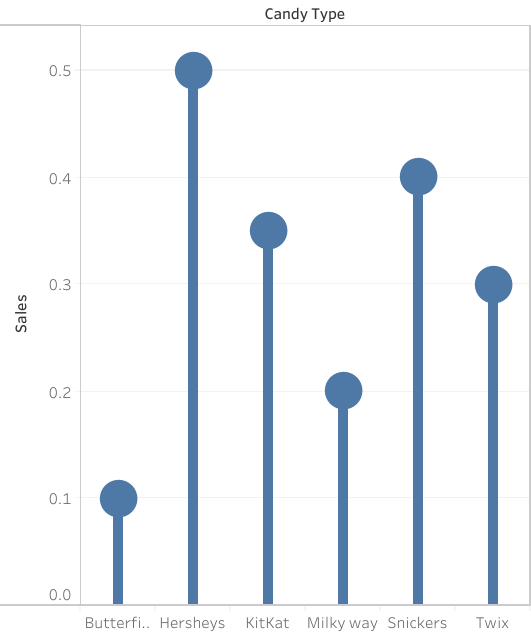
A lollipop chart is a great way to portray large number values in the form of percentages in a simple and easily understandable way. As you can see by the chart above, the data shows the candy type and the percentage of sales generated by the company. Simply by looking at the chart and using the lollipop visualization, one can tell which values are higher and which ones are lower. Much like a bar graph, a lollipop chart is very straightforward in the data that it is representing, there is not a correlation between data points to be determined nor is there significant distribution between the information given. However, one aspect that can be said to be better than a bar graph would be the fact that a lollipop chart is more efficient when it comes to avoiding a cluttered appearance as a result of many data points. Often times, a data graph can look cluttered as a result of too many data points being represented. Furthermore, a lollipop chart can be somewhat inaccurate without the percentage values being included withing the circles at the tip of the line. As shown by the graph, it is somewhat difficult to tell where the value ends with the circles and what value it represents. With that being said, there will always be pros and cons regardless of what chart one decides to use in order to represent data. A lollipop chart is also a great way to be catch the readers attention with its set of tall columns that are evenly spaced out, but it could also be seen as an inefficient method to portray data trends or comparisons. It is up to the individual to decide what kind of visualization is best for the data that they want to portray.
Lollipop Chart
As we continue to learn throughout the course of this class, there are dozens of ways to display data aside from the typical charts that we are used to seeing. One such example of this is a lollipop chart. A lollipop chart is a great alternative to displaying a significant amount of data that may be too overwhelming to look at and compare in a bar graph due to all of the shapes, shading, and numbers. It can also be helpful with a smaller set of data that may look odd or misplaced in other types of graphs. A lollipop graph – which gets its name due to the fact that it replicates what a lollipop looks like – takes this significant data and displays the same information in a much simpler way due to the design of it. Many people describe it as being a more “minimalistic” graph compared to the typical bar graph and prefer to use it when some data are similar.
A lollipop chart can be created a few different ways, however, the two ways I chose to use started with a scatter plot and a line graph. The scatter plot gives the horizontal lollipop look (due to the way it formats) whereas the line graph creates a vertical lollipop shape, once again due to the way it formats. Using Excel, I decided to create both types of graphs using the same data to compare how it looks.

The image above shows the lollipop graph in a horizontal display, while the image below shows the graph in a vertical format. The main difference between the two is accuracy. As we read about in the textbook, the vertical lollipop graph looks “prettier” but is not always as accurate due to the size that the lollipops are made in order to look more “put together”. For this reason, I prefer the horizontal look better as it is easier for me to comprehend, and yes also more challenging to make!
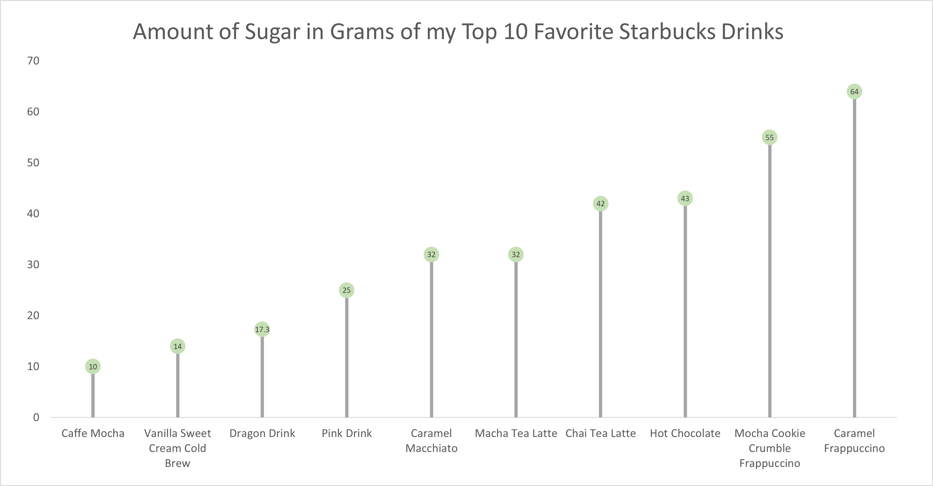
As for the actual data shown in each graph, I chose to create my own data based on research of the grams of sugar in my top ten favorite Starbucks drinks. The reason I chose to do this was because I am constantly getting Starbucks and attempting to “hop on the trends” of newer drinks, so I wanted to inform not only myself, but other people who like these popular drinks about how much sugar is in them. The grams of sugar are based on their “grande” size, although I typically end up getting a “venti”. As you can tell in the chart, which goes in order from least grams of sugar to most grams of sugar, nearly every drink with the exception of a few, has more than twenty grams of sugar in one of the smallest sizes available. Once again, this information presented is very eye-opening and something to be aware of. I ultimately think a lollipop chart was an easy and effective way to present this data because it is easy to get the important information and comparisons without getting overwhelmed.
Lollipop Chart
Lollipop charts are flexible tools for comparing data, ranking items, showing distributions, tracking changes, and highlighting outliers. They are great for revealing the order and values of data points. Lollipop charts work well when you want to focus on individual data points or unusual values, serving as a handy alternative to regular bar charts with clear data labels. Lollipop charts should be used when you want to emphasize individual data points or highlight specific values in a clear and simple manner, they are especially effective for showing comparisons between a small number of data points.
Here are some other examples of charts –

For the lollipop chart I constructed, I choose to use excell since its the eastest and most effectice tool I know how to access and use. For the data set I used a website called https://generatedata.com/, this is where I can get all my random data sets from.

SNL SCREENTIME STATS
By John Wickham
One of things that I do when I work on something is to try to put numbers into the things that I enjoy watching. For example, sometimes when I watch an episode of television is tracking to see how much screentime they have in an episode. This helps really show the importance of each cast member in the whole of show. However, until I was unsure of how to best display this data in a form to enjoy, until I read this chapter
The chart below shows the percentage of time each cast member was on screen in the very first episode of Saturday Night Live. The original cast (Laraine Newman, Jane Curtin, Dan Aykroyd, Garrett Morris, Chevy Chase, Gilda Radner, John Belushi and the short-term cast members George Coe and Michael O’Donoghue) was a boom in the 70’s comedy scene. Without them, both comedy and modern SNL would not exist to this day. However, it is hard to get a picture of the impact on the actual show.
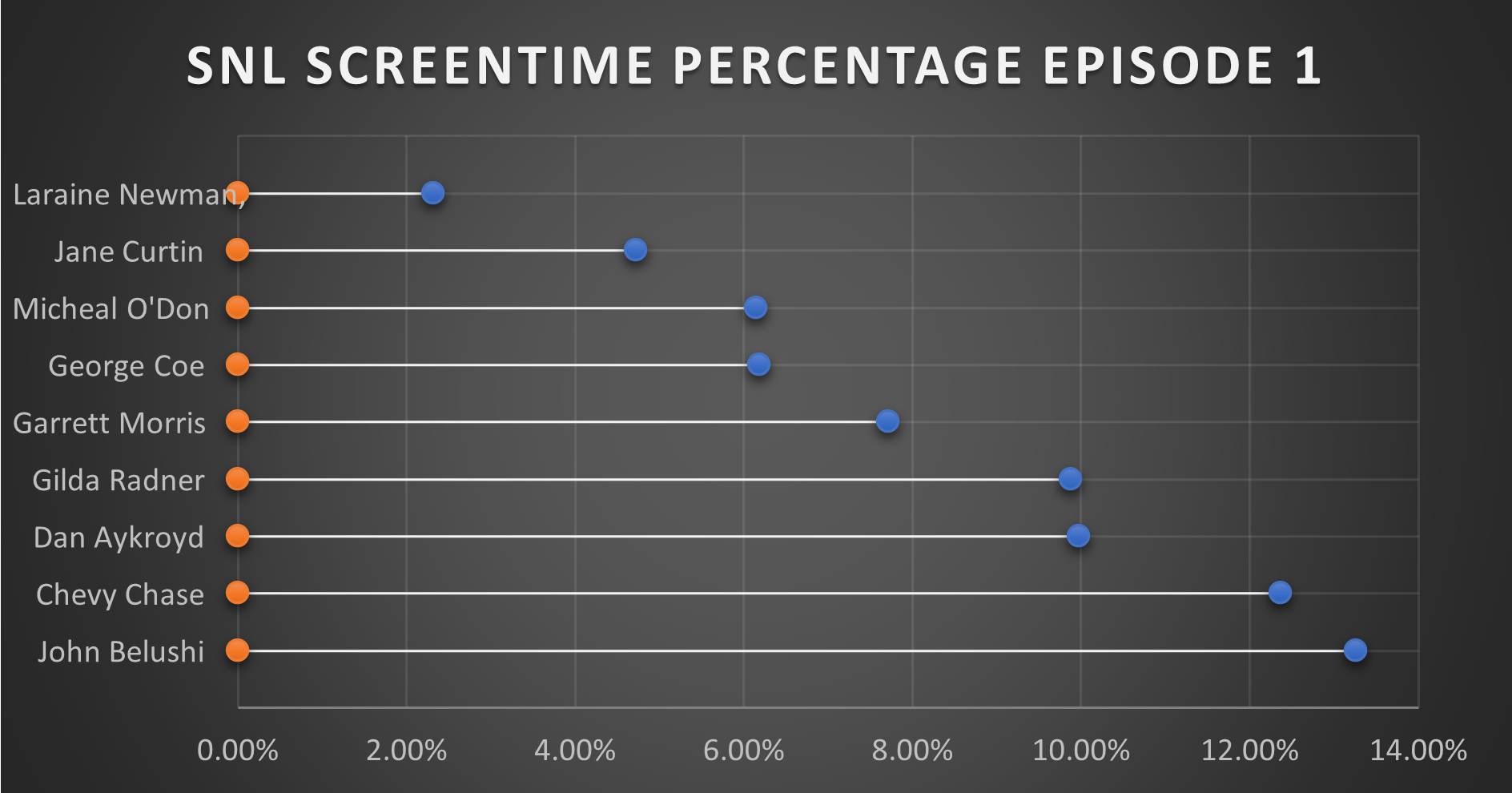
This is where this chart comes together in a quantitative fashion. From the data, you can see that John Belushi, Chevy Chase, Dan Aykroyd, and Gilda Radner where the frontrunners right away. Those would be the major stars on the show, and even in episode 1, the show had some faith in them. The other cast members had some work.
It is interesting that George Coe and Michael O’Donoghue (cast members who would be off the show in episode 5) had a decent amount of screen time in these first episode. Even more than long-term cast members Jane Curtin and Laraine Newman. It is a very interesting figure in the history of Saturday Night Live.
You can watch the first episode of Saturday Night Live on Peacock.