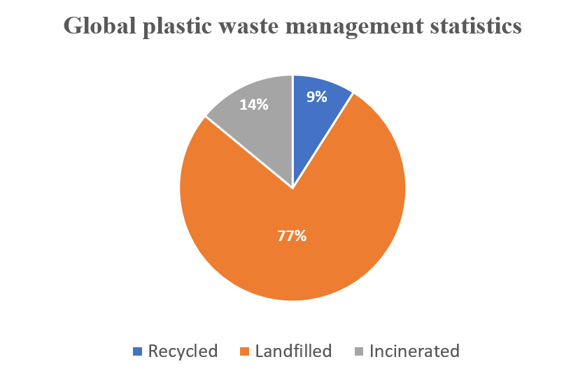
I used a pie chart to visualize the data below because it best fits it and makes it extremely easy to consume and understand. The data highlighted in this blog is in proportions. It is also categorical data.
WHY PIE CHARTS
Anytime you try to show that the thing you are talking about adds up to 100%, you are telling a story about parts of a whole. Alternatively, whenever you need to describe the proportionate components of a group, this is a story about a part-to-a-whole. In the plastic-related case highlighted above, it is convenient to use pie charts to visualize the dataset. However, there is a caveat: do not use a pie chart to tell a story about parts to a whole if there are five or more wedges. This clutters the information presented in the diagram and makes it difficult to comprehend. I believe that a pie chart best fits the data set discussed above. Any other visualization used will defeat the overall purpose.
Below are a few design tips to consider when constructing a pie chart:
- Use presentable fonts
- Do not use colors that are too bright
- Do not use 3-D designs
- Always use legends for easy comprehension of the data.
- Do not use pie charts when there are five or more wedges.