Home » Articles posted by prince osei
Author Archives: prince osei
Pivot Tables
Pivot tables can be classified as a data analysis technique that can summarize large datasets and allows one to extract the significance from them. It sorts and summarizes large datasets, automatically.
Below is a typical example of a pivot table:
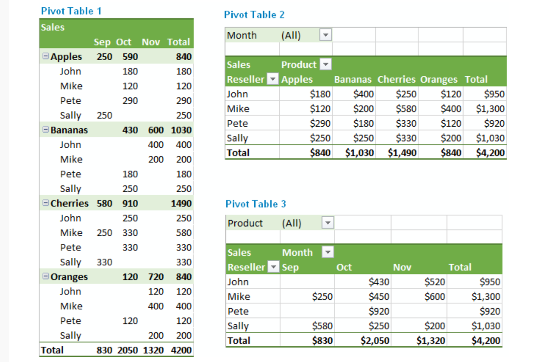
The pivot table above summarizes large data sets, making it easy to comprehend. In pivot table 1 above, the apples are summed up in the fourth column and first row. It categorizes the total number of apples owned by John, Mike, et cetera. Pivot tables may appear to be cumbersome when trying to create them for the first time. However, they are very easy to create once the steps are followed carefully.
There are many uses for pivot tables. The list includes, querying large amounts of data in many user-friendly ways, subtotaling and aggregating numeric data, summarizing data by categories and sub-categories, et cetera.
This link teaches you how to create a pivot table within few minutes.
SANKEY VISUALIZATIONS.
Sankey Diagram is a visualization technique that allows the display of flows. Many experts argue that Sankey diagrams do a better job than pie charts, visualizing flows in their proportions. The things connected are called nodes and the connections are known as links. Sankey diagrams are also perfect for showing many-to-many mapping relationships.
They are very good at showing particular kinds of complex information:
- Energy flow
- Budget flow ( where the money came from and went to
- Number of people migrating from one country to another
- The flow of goods from one place to another
SANKEY VISUALIZATIONS – OUR ENERGY SYSTEM
A Sankey diagram was used to visualize the primary energy source supply directly to the residential, industrial, commercial, and transportation sectors in the USA. It also showed how electricity was generated from a list of primary sources.
The diagram appeared complex at first view but very with careful observation, it gives out detailed information.
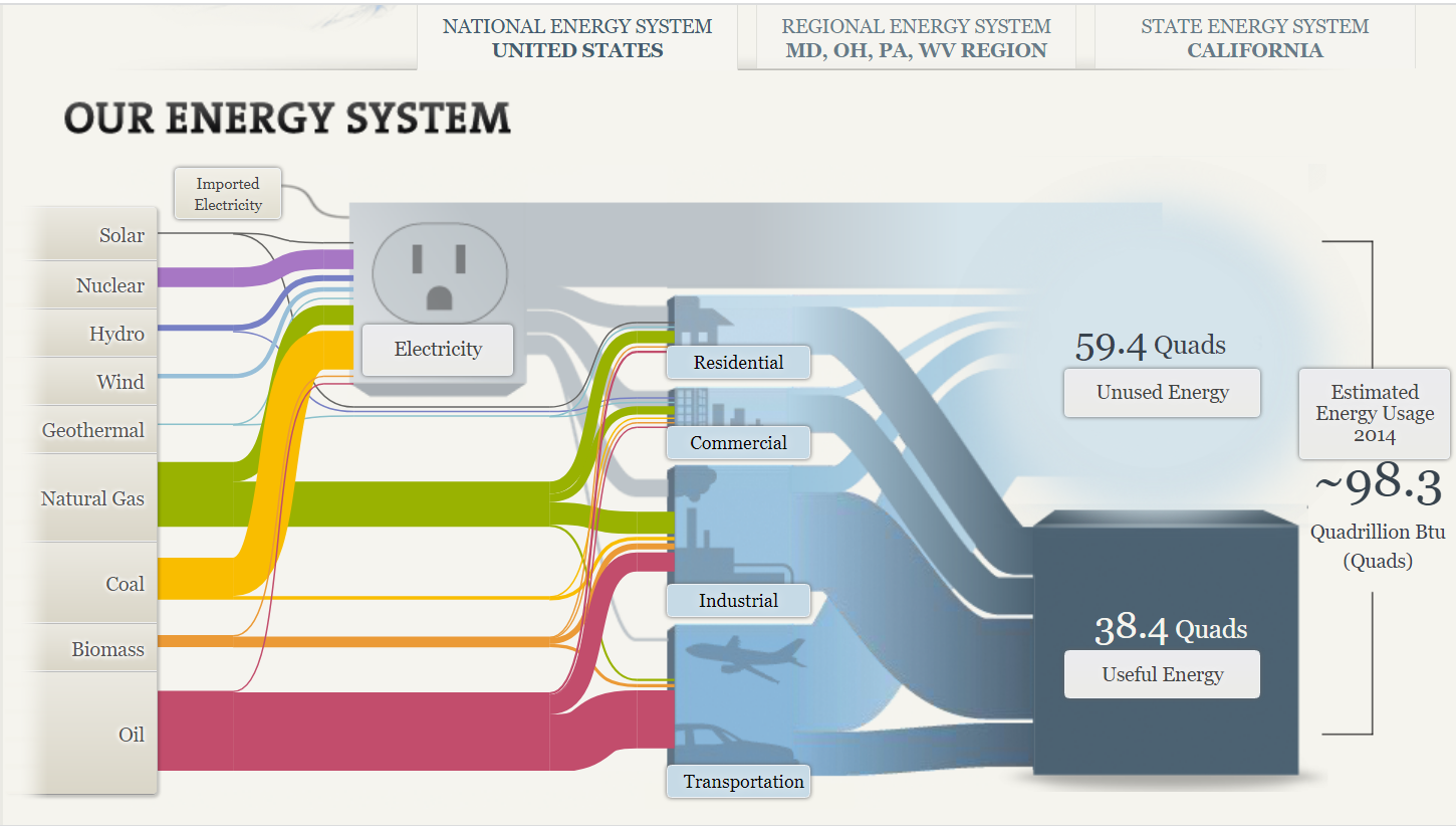
The Sankey diagram shows the primary sources of energy: solar, nuclear, hydro, wind, geothermal, natural gas, coal, biomass, and oil. The colored links show the flow of energy from these primary sources to their destinations: residential, commercial, industrial and transportation uses. The width of the links shows the proportion of energy flow to its primary source.
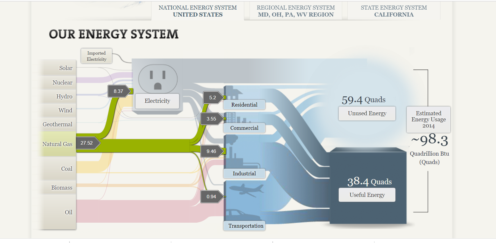
The visualization allows you to click on a primary “source of energy” to examine its “flow of energy.” It places the other categories in the rear and reduces the clutter of information. The use of labels also helps ascertain the value of the amount of energy flowing from the primary source to its destination.
Sankey diagrams can be very effective in displaying visual information about complex data. The caveat is to be very cautious of cluttering information due to its complexity.
Benchmark comparisons
According to Merriam-Webster, a benchmark can be defined as something that serves as a standard by which others may be measured or judged. There are several benchmarking techniques used by businesses and individuals around the world. A few examples are benchmark lines, combo charts, overlapping bars, et cetera.
In this post, I am going to discuss how others use benchmarking techniques. The first example discussed in the blog highlights the use of line graphs to compare the performance of a stock to the S&P 500 (the industry average). The second example compares Arizona valley’s fire response time. Benchmarking can also help organizations identify areas, systems, or processes for improvements—either incremental (continuous) improvements or dramatic (business process re-engineering) improvements
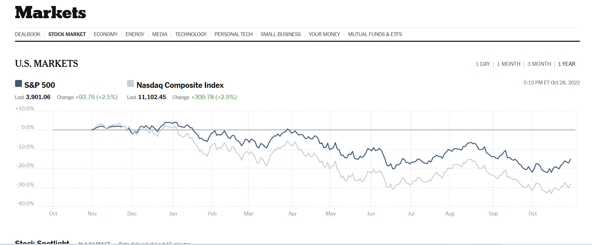
The data visualization above was sourced from The New York Times‘s website. Two line graphs are used to show how Nasdaq composite Index compares against the S&P 500. The S&P 500 acts as the industry benchmark. From this visualization, it is clear to see NASDAQ stocks are more volatile than the S&P 500. This helps investors to make informed decisions about their investments.
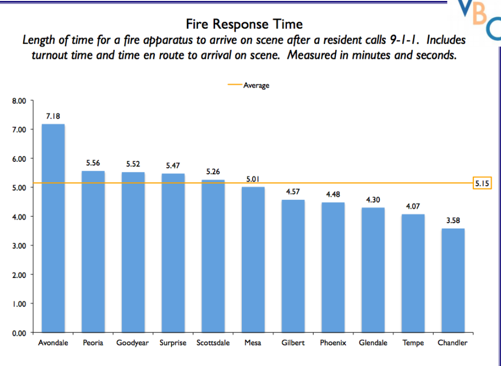
The author of this post uses external benchmarking to compare fire response times across multiple jurisdictions. Adding a benchmark line to a graph gives loads of content to the viewer. You can easily see that the benchmark mark response time for all the categories is 5.15 seconds. Several jurisdictions showed up minutes after the benchmark time while other categories also showed up before the benchmark time. A combo chart is used when each category is compared to a different benchmark
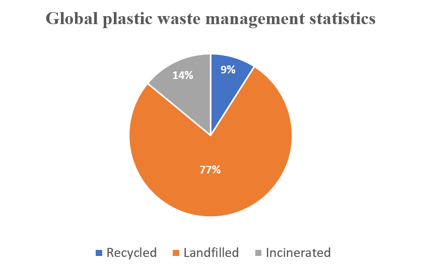
Global Plastic Waste Management Statistics – The Use of a Pie chart
I used a pie chart to visualize the data below because it best fits it and makes it extremely easy to consume and understand. The data highlighted in this blog is in proportions. It is also categorical data.
WHY PIE CHARTS
Anytime you try to show that the thing you are talking about adds up to 100%, you are telling a story about parts of a whole. Alternatively, whenever you need to describe the proportionate components of a group, this is a story about a part-to-a-whole. In the plastic-related case highlighted above, it is convenient to use pie charts to visualize the dataset. However, there is a caveat: do not use a pie chart to tell a story about parts to a whole if there are five or more wedges. This clutters the information presented in the diagram and makes it difficult to comprehend. I believe that a pie chart best fits the data set discussed above. Any other visualization used will defeat the overall purpose.
Below are a few design tips to consider when constructing a pie chart:
- Use presentable fonts
- Do not use colors that are too bright
- Do not use 3-D designs
- Always use legends for easy comprehension of the data.
- Do not use pie charts when there are five or more wedges.