According to Merriam-Webster, a benchmark can be defined as something that serves as a standard by which others may be measured or judged. There are several benchmarking techniques used by businesses and individuals around the world. A few examples are benchmark lines, combo charts, overlapping bars, et cetera.
In this post, I am going to discuss how others use benchmarking techniques. The first example discussed in the blog highlights the use of line graphs to compare the performance of a stock to the S&P 500 (the industry average). The second example compares Arizona valley’s fire response time. Benchmarking can also help organizations identify areas, systems, or processes for improvements—either incremental (continuous) improvements or dramatic (business process re-engineering) improvements
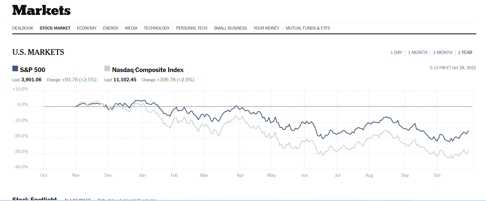
The data visualization above was sourced from The New York Times‘s website. Two line graphs are used to show how Nasdaq composite Index compares against the S&P 500. The S&P 500 acts as the industry benchmark. From this visualization, it is clear to see NASDAQ stocks are more volatile than the S&P 500. This helps investors to make informed decisions about their investments.
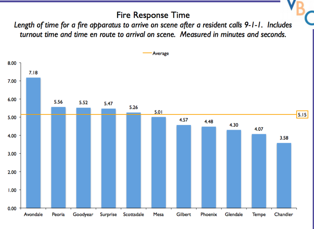
The author of this post uses external benchmarking to compare fire response times across multiple jurisdictions. Adding a benchmark line to a graph gives loads of content to the viewer. You can easily see that the benchmark mark response time for all the categories is 5.15 seconds. Several jurisdictions showed up minutes after the benchmark time while other categories also showed up before the benchmark time. A combo chart is used when each category is compared to a different benchmark