By Nick Ligameri
When you think about charts, the pie chart is probably the first chart that comes to your mind. It is one of the most well-known types of chart. Because of this notoriety, pie charts tend to be misused. This misuse leads to pie charts getting a negative reputation. According to storytellingwithdata.com, there are two main reasons to use a pie chart. These reasons are to how a part (slice) relates to the whole (pie) and to show that one slice is larger or smaller compared to the pie.
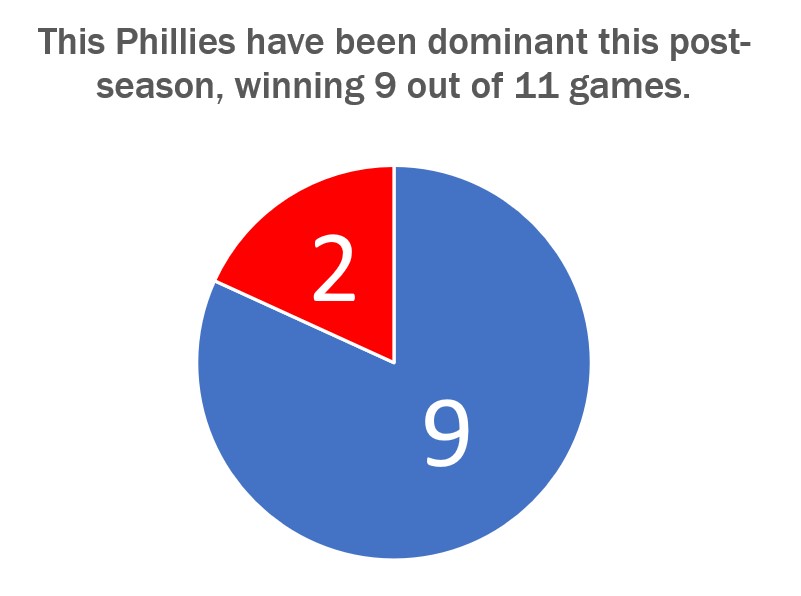
The graph shown above just so happens to convey both of these uses very well. Today, 24 October 2022, is a day after the Philadelphia Phillies won the National League Pennant and secured their spot in the World Series. I thought it would be appropriate to show how dominant the Phillies have been in the post-season. They have played eleven games so far and have won nine of them.
Storytellingwithdata.com explains that we perceive the area that a slice takes up. This pie graph shows that the Phillies’ nine wins cover most of the pie. It also shows that the Phillies are winning a high percentage of their playoff games. This is why this specific pie chart does a great job showing how the Phillies’ nine wins convey a sense of the part-to-whole relationship and is relatively large compared to their two losses.
The design of this graph was kept very simple. We are only working with two numbers so there is no need to get crazy on the design. The colors that I used were the Phillies’ colors, red and blue, for the two slices. The message I am trying to convey to the audience is that the Phillies are a dominant force right now, and this design shows this in a straightforward way. The data I used was sourced from www.baseball-reference.com. I had to click on a few links and do some basic counting and math to aggregate the data I wanted.
Go Phillies!