Benchmark comparisons
According to Merriam-Webster, a benchmark can be defined as something that serves as a standard by which others may be measured or judged. There are several benchmarking techniques used by businesses and individuals around the world. A few examples are benchmark lines, combo charts, overlapping bars, et cetera.
In this post, I am going to discuss how others use benchmarking techniques. The first example discussed in the blog highlights the use of line graphs to compare the performance of a stock to the S&P 500 (the industry average). The second example compares Arizona valley’s fire response time. Benchmarking can also help organizations identify areas, systems, or processes for improvements—either incremental (continuous) improvements or dramatic (business process re-engineering) improvements
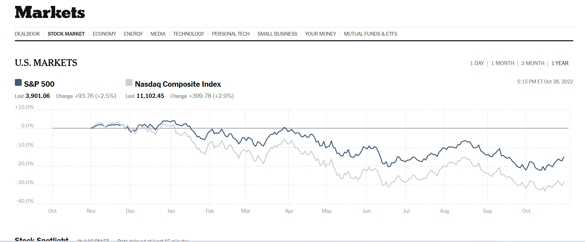
The data visualization above was sourced from The New York Times‘s website. Two line graphs are used to show how Nasdaq composite Index compares against the S&P 500. The S&P 500 acts as the industry benchmark. From this visualization, it is clear to see NASDAQ stocks are more volatile than the S&P 500. This helps investors to make informed decisions about their investments.
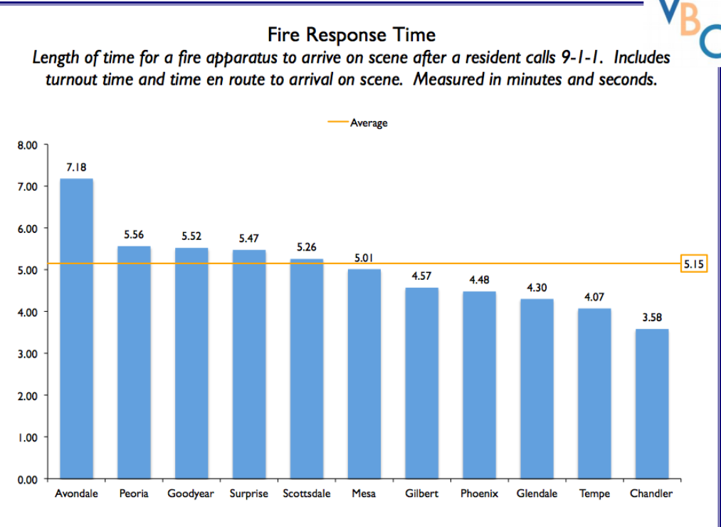
The author of this post uses external benchmarking to compare fire response times across multiple jurisdictions. Adding a benchmark line to a graph gives loads of content to the viewer. You can easily see that the benchmark mark response time for all the categories is 5.15 seconds. Several jurisdictions showed up minutes after the benchmark time while other categories also showed up before the benchmark time. A combo chart is used when each category is compared to a different benchmark
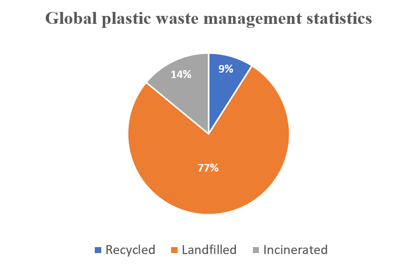
Global Plastic Waste Management Statistics – The Use of a Pie chart
I used a pie chart to visualize the data below because it best fits it and makes it extremely easy to consume and understand. The data highlighted in this blog is in proportions. It is also categorical data.
WHY PIE CHARTS
Anytime you try to show that the thing you are talking about adds up to 100%, you are telling a story about parts of a whole. Alternatively, whenever you need to describe the proportionate components of a group, this is a story about a part-to-a-whole. In the plastic-related case highlighted above, it is convenient to use pie charts to visualize the dataset. However, there is a caveat: do not use a pie chart to tell a story about parts to a whole if there are five or more wedges. This clutters the information presented in the diagram and makes it difficult to comprehend. I believe that a pie chart best fits the data set discussed above. Any other visualization used will defeat the overall purpose.
Below are a few design tips to consider when constructing a pie chart:
- Use presentable fonts
- Do not use colors that are too bright
- Do not use 3-D designs
- Always use legends for easy comprehension of the data.
- Do not use pie charts when there are five or more wedges.
The Perfect Use Pie Chart
By Nick Ligameri
When you think about charts, the pie chart is probably the first chart that comes to your mind. It is one of the most well-known types of chart. Because of this notoriety, pie charts tend to be misused. This misuse leads to pie charts getting a negative reputation. According to storytellingwithdata.com, there are two main reasons to use a pie chart. These reasons are to how a part (slice) relates to the whole (pie) and to show that one slice is larger or smaller compared to the pie.
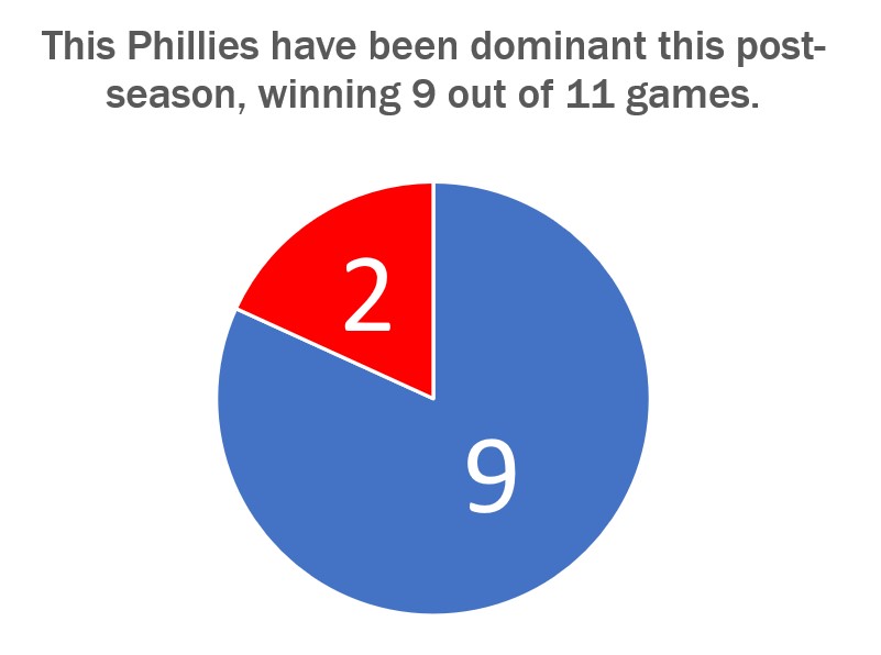
The graph shown above just so happens to convey both of these uses very well. Today, 24 October 2022, is a day after the Philadelphia Phillies won the National League Pennant and secured their spot in the World Series. I thought it would be appropriate to show how dominant the Phillies have been in the post-season. They have played eleven games so far and have won nine of them.
Storytellingwithdata.com explains that we perceive the area that a slice takes up. This pie graph shows that the Phillies’ nine wins cover most of the pie. It also shows that the Phillies are winning a high percentage of their playoff games. This is why this specific pie chart does a great job showing how the Phillies’ nine wins convey a sense of the part-to-whole relationship and is relatively large compared to their two losses.
The design of this graph was kept very simple. We are only working with two numbers so there is no need to get crazy on the design. The colors that I used were the Phillies’ colors, red and blue, for the two slices. The message I am trying to convey to the audience is that the Phillies are a dominant force right now, and this design shows this in a straightforward way. The data I used was sourced from www.baseball-reference.com. I had to click on a few links and do some basic counting and math to aggregate the data I wanted.
Go Phillies!
Pie Chart/ Practice
By John Wickham
Pie charts are weirdly one of controversial bits of infographics scene. People say that they are very common in the space, but most people do not understand how to make. People make it hard to understand with problems such as not understanding the percentages or just having to many slices for the chart.
Pie charts are best used to show comparisons between small number of different categories (2-5 different sections) and when you want to highlight one specific piece of data.
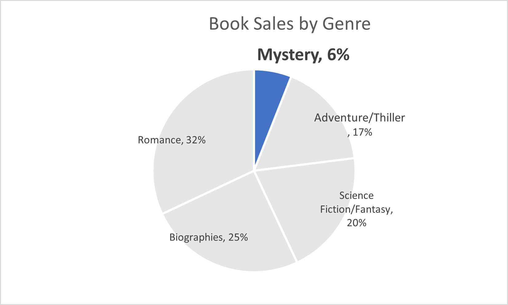
This pie chart above is about the sales of books within a group of genres. The main point I wanted to show was the low number of sales from the mystery genre. This highlights that more people should by mystery sections
UN CONTRIBUTION: Pie Chart Edition
Pie charts are a difficult tool to use because they require very specific scenarios to be the most applicable. For my perfect-use case I decided to display the contributions of countries to the UN budget, shown as a percentage.
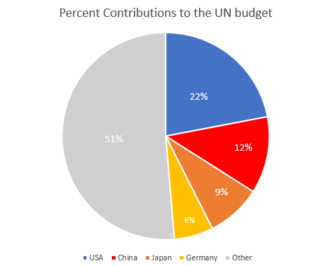
I think this is a perfect data set to use a pie chart because it’s simple and doesn’t have an excess of labels. This data set as it’s shown tells you that the US contributes almost one quarter of the total UN budget, and that the top four countries combined contribute nearly as much as the remaining 130 members combined. You may be able to add a fifth or sixth country to this pie chart, but then you lose the 50:50 narrative that is very easily read here.
Source: www.auswaertiges-amt.de/
-Jack Swenson
Pie Charts
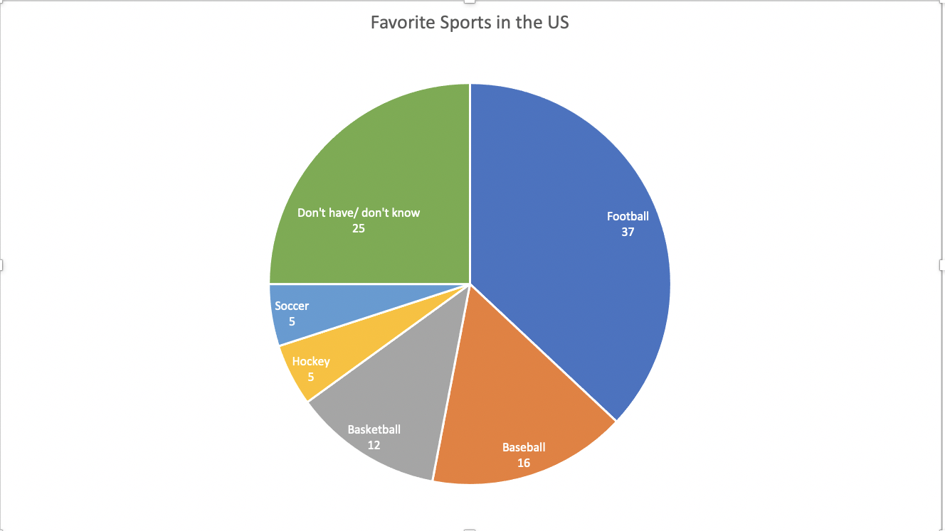
This data set is a perfect case for a pie chart. The percentages add up to 100. This means that all of the parts add up to a whole, which is a crucial part of a pie chart. A pie chart is also good to use here because there are only 6 categories. There is not too much going on and the chart does not look cluttered. It is very easy to read and the audience can easily compare the sizes of the slices to each other to tell which sport is more popular.
The data here is not served better as something other than a pie. A bar chart would work, but a pie chart is the most effective visualization for this data set.
I came across multiple design strategies to make this pie chart more appealing. First I color coded the different slices. This makes it easier to differentiate the slices from one another. Another thing I did was I put the category name and percentage in every slice of the pie. The percentage provides a more in depth look at the data. Also, adding the category name allowed me to take away the legend. This makes it easier for the reader to digest the information. They no longer have to glance at the legend, then to the chart, then back and forth. All of the information is in the pie chart.
PIE CHART – A PERFECT USE CASE
A pie chart is a graphical representation technique that displays data in a circular-shaped graph. A pie chart best suits the parts-to-whole relationship for categorical or nominal or proportional data which sums up to a whole, mostly 100% or 1. Due to its unique display of data, it is better to not use so many data points in order to keep it simple and attractive. Often time, people use large amounts of data points which displays a crowded chart with many points of less significance making the chart not relatable or difficult to analyze.
make sense to show a parts-to-whole relationship for categorical or nominal data. The slices in the pie typically represent percentages of the total.
Pie charts should be considered when the data possesses the following,
- Few components
- No time representation
- Distinct parts
- Easy visualization
Figure 1.00 is a simple display of data on a pie chart. It has fewer data point and the total of the proportions sums up to 100%.
Though the data as presented in figure 1.00 can be presented in a column chart and would make sense just as the pie chart, I would still prefer the use of the pie as it is more engaging compared to a column chart. Figure 1.01 below show a column chart of the same data as in figure 1.00. Though simple, audience will naturally not be able to tell the proportions of each column or what the total is so in this case I will prefer to use the pie chart for much convenience and easy visualization.
There are some few design tips to consider when designing a pie chart and some of these are;
- Avoid using 3-D designs
- Use colors that match your data
- Avoid too many slices
- Use presentable fonts
- And many more…
Using Pie Charts to Represent NHL Playoff Percentages
Using pie charts is beneficial for showing percentages that display the proportions of the data. Each section of the pie chart resembles a different piece of data. For my pie chart example, I decided to take the Metropolitan NHL Teams and researched their percentages of making it into the NHL playoffs. It is still early in the season, so the data I have researched changes weekly. My information is based on playoff chances as of Sunday, October 23rd, 2022. Using monkeypuck, I took the percentages of all the Metropolitan Division Teams, which can be found on the NHL’s official website.
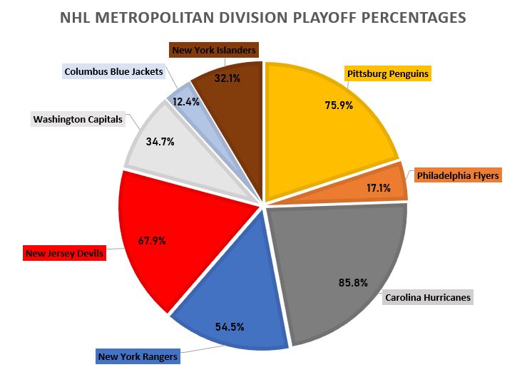
As I was making my pie chart, it was rather easy to display the numbers and data. I then realized, if I moved the data labels while they are outside of the pie chart, it would automatically draw a line to the corresponding data. I made each data label color match the corresponding team as well as each slot in the pie chart. For example, the Philadelphia Flyer’s team consists of black, orange, and white. As shown on the pie chart, you can see the Philadelphia Flyer’s slot is colored orange. I also related the colors of the other teams, to the boxes as well, which can be seen in my pie chart. I also changed the fonts and font sizes, along with adding text boxes for the percentages of each team, inside the pie chart. Specifically for the data set I used, the pie chart is the best way to display this data. Otherize, a bar graph could be used as well, but I do not think it is as visually appealing in this scenario. I believe this data is better served as a pie chart to visually see the different percentages of each team’s playoff odds.
Pie Charts
A pie chart can be an exceptional tool when trying to display the totals out of 100% compared to other kinds of charts and graphs. When using a pie chart to break down complete totals it helps the viewer visualize the 100% since the whole pie is right there and they can see the portions of it cut out relative to the percentage.
This is an example pie chart I made which breaks down the weekly phone screen time usage between a handful of apps on my phone.
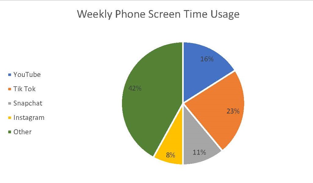
As one can see the slices very clearly show how 100% of a weeks worth of phone screen time can be broken up between these 5 subjects. One tip however for creating an effective pie chart is to limit yourself on how many slices or subjects are in the chart. If there starts to become too many then it makes it harder for the viewer to see each respective slice. In that situation than something like a bar graph will be more effective.
For more on the effectiveness of pie charts, click here.
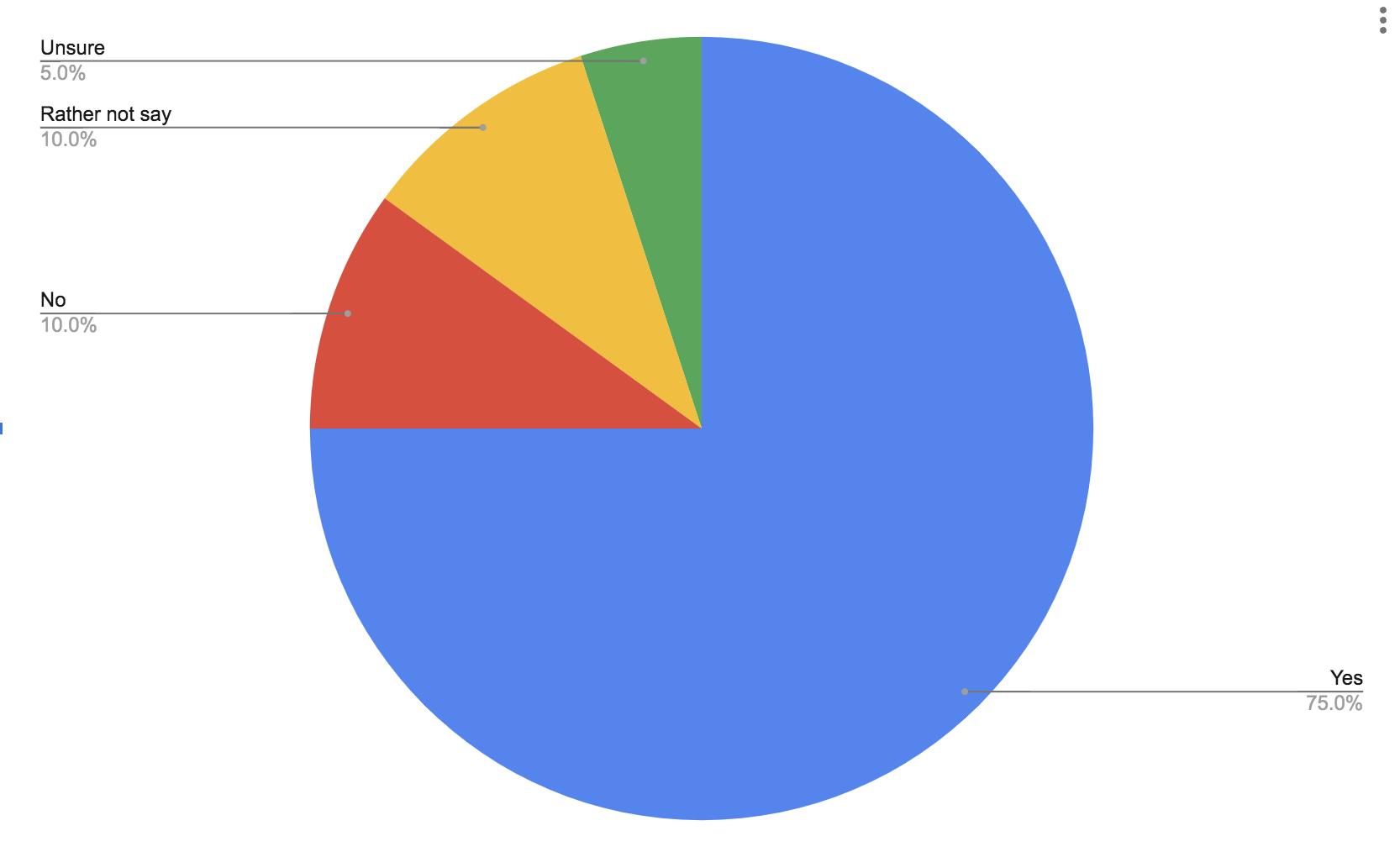
Pie Charts
Part charts extremely easy to make and they can get the point of your data across very clearly. Pie charts tend to do better with a few categories rather than more because they can also become too busy very quick. Here is a pie chart to show data from a simple poll of whether people like ice cream or not.