Home » Posts tagged '#tools'
Tag Archives: #tools
Using the Visualizing Health tool
The website titled “Visualizing Health” is a scientifically vetted tool created by the University of Michigan in order to help healthcare professionals and others alike to communicate data about health. It contains graphic displays of health data through different types of visuals and imaging. It’s goal is to assist audiences in making informed decisions about their health, and also helps aid healthcare professionals in their efforts to seamlessly communicate health risk information to the public.
The website makes it accessible and shares an easy-to-use guide on how to create data visualizations. Below, I have made one as an example based on information from the World Health Organization. This is one of the many ways these tools can be used to communicate data to an audience.
Comparing Products to Find the Best Fit
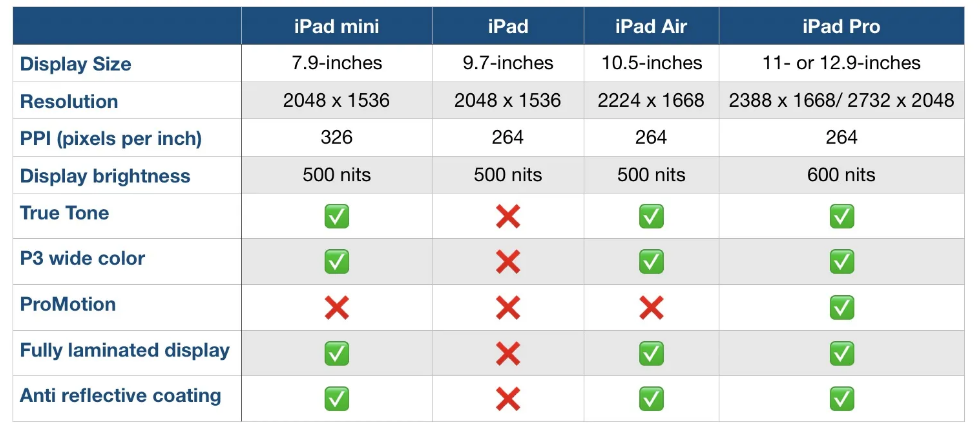
Comparison charts are a great way for consumers to compare multiple products from a company in order to determine which one is right for them. Let’s take the company Apple for instance. They provide many options on buying an IPad, but how do you know which one to get? There are many different charts that you can look at in to determine which one is best for you. First let’s start with the basics. Think about what you are using the IPad for. If you are simply taking notes then a regular IPad will do just fine. However if you plan to use it for editing or designing you might want to look closer at display sizes and resolution options.
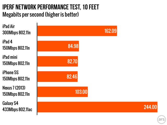
Another way to compare them is how well they perform. Someone who needs this device for high demanding and important work may wanna go with the IPad that has a higher megabit speed.
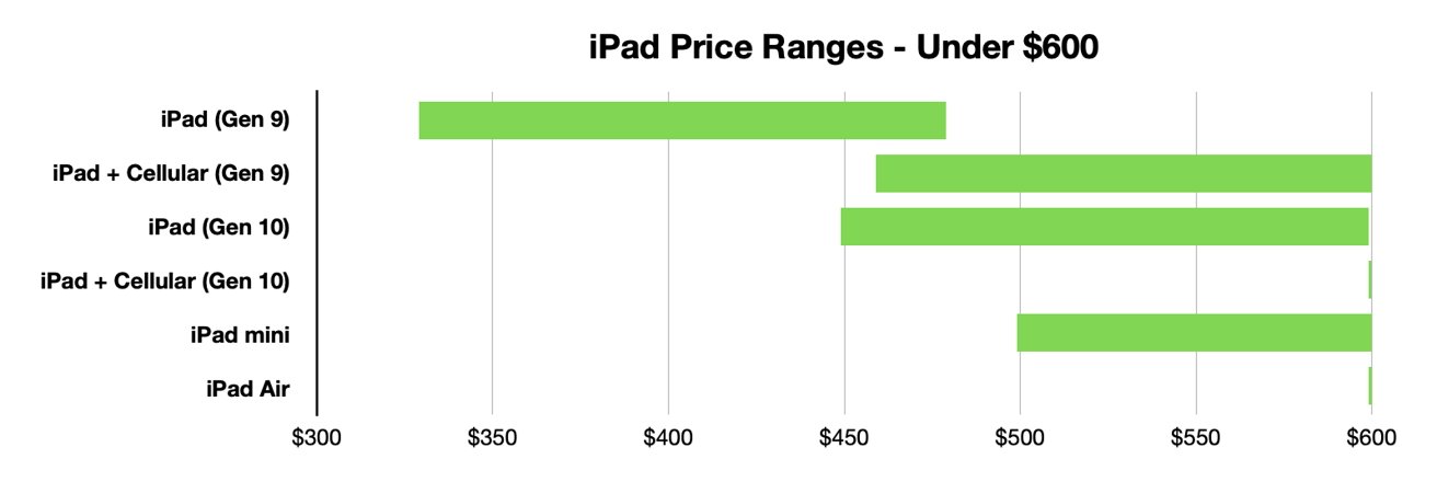
Lastly, and I think the most important to a lot of people, is how much each device costs. Comparison charts like this allow you to gauge how much this investment could cost you. Charts like the one below or the two above can usually be found on the company’s website or online forums for tech users.
Resources and Further Reading
Art of Information: Free Infographic Tools
There are many websites that offer free, easy to use, infographics. I found one called Piktochart. Very easy to sign up at (piktochart.com).
With infographics, we know there is visual engagement, storytelling, clarity and simplification if done correctly. With the right visual, it becomes more memorable and sharable. People tend to remember information that is presented with an infographic.
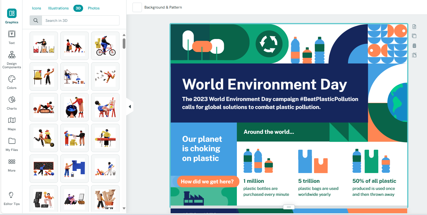
Below is an example of an infographic and its editing tools.