Home » Posts tagged '#sankey'
Tag Archives: #sankey
Sankey Diagram
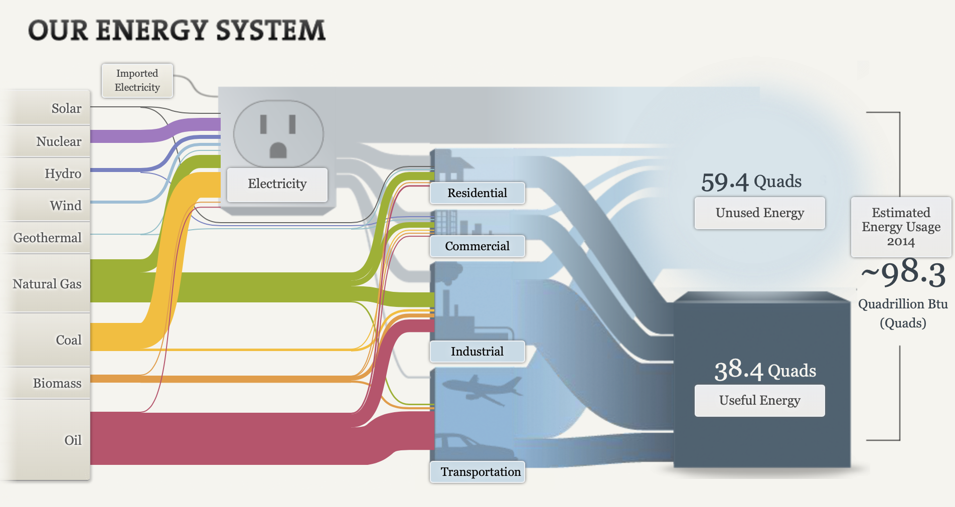
The Sankey Diagram originated in 1898 to show the energy efficiency of a steam engine. This makes it the perfect choice of visualization to depict the efficiency and usage of our energy systems in the United States. I appreciate that the diagrams show how different states aggregate their energy to show that the United States is not a monolith in energy production and consumption. Our energy use is nuanced and these diagrams show that our energy production and usage is very inefficient. This first screenshot shows the amount of energy that solar contributes to our total power usage. It is very low at 0.23%. I was actually shocked that less than ¼ of a percent of our energy is produced by solar. When you click on solar it also shows that most of our solar usage is going directly to residential homes and very little is going into the grid.

The second screenshot shows the MD/OH/PA/WV region, who are major exporters of coal energy. The diagram shows that the region has much lower energy efficiency than the nation due to the use of coal. 73% of energy is unused in this region because the region is heavily reliant on the coal, biomass, and oil.

The last slide shows energy production and import in California. California is one of the most energy efficient states in the country and this diagram shows why. The top 6 sources of energy listed: solar, nuclear, hydro, wind, geothermal, and natural gas are much more efficient than the bottom three. This results in 41% of California’s energy produced being usable.

I would say that this is one of the best use cases for a Sankey Diagram. It allows the user to easily follow the flow of information (energy) and understand more about the topic than many other types of charts. All of the relevant information was able to captured in three different versions of the same diagram, so when users move on to the second and third charts they are expert users and it makes analysis more streamlined. This was a great way to show inefficiencies and areas of opportunity in a simple and easy to understand way. My mind works in percentages so the only thing I would have done differently is include percentages in the useful and unused energy labels or tooltips. Lastly, the only thing that I don’t really like about this Sankey Diagram is that all of the numbers are not visible without clicking around. Many people prefer to be able to see all of the information and just be able to explore visually without interaction.
Sankey Visualizations
A Sankey Diagram is a visualization that Is used to depict a flow from one set of values to another. They help locate the most important contributions to a flow. Sankey visualizations are best used when the topic is energy, time, or money.
Although there is a ton of information presented in this visualization and it seems cluttered, I think this is the most effective way to view this data. This visualization is super effective considering that there are so many different aspects on this chart that are combined into one piece. Firstly, the energy system is broken down into the types of energy on the left hand side. The visualization allows you to click on each tab. When you click on each type of energy, it shows you what percentage of energy is expended and where it goes. For example, when you click on solar energy it shows you that solar energy accounts for 0.42% of all energy expended, and that 0.17% goes to electricity, and 0.25% goes to residential use. The infographic then breaks it down even more. It shows the amount of energy that is unused, and used from each category (electricity, residential, commercial, industrial, transportation). The thickness of the flow indicates the amount of energy. For example, you can see that most of the energy from transportation is unused because a larger flow moves from transportation to unused energy. All in all, there is so much information that can be digested from this visualization. It appears to be a lot, but when you break it down into pieces it is very effective. I believe this is the best way to display this information.
