Home » Posts tagged 'sankey'
Tag Archives: sankey
Sankey Interpretations
Lamar Miller
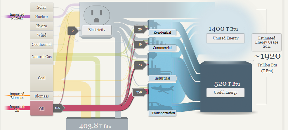
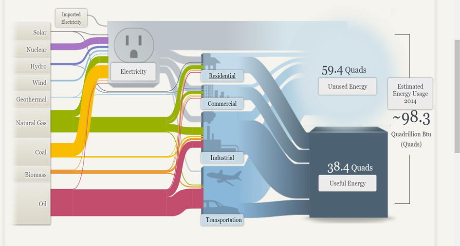
Based on what I learned about Sankey visualizations, it appears coal is our largest resource contributing to electricity production. In addition, oil is used primarily for transportation. Overall, I would say this is a good use of a Sankey visual. The color coding within the visuals allows the viewer to decipher between the different resources. The thickness of each bar indicates the quantity. The flow of each resource to its intended use case shows which resources flow into which utility. Source

In the MD, OH, PA, WV region there is a large amount of coal production.
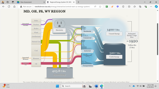
California has very minimal coal production but uses natural gas as an energy source more commonly.

Sankey
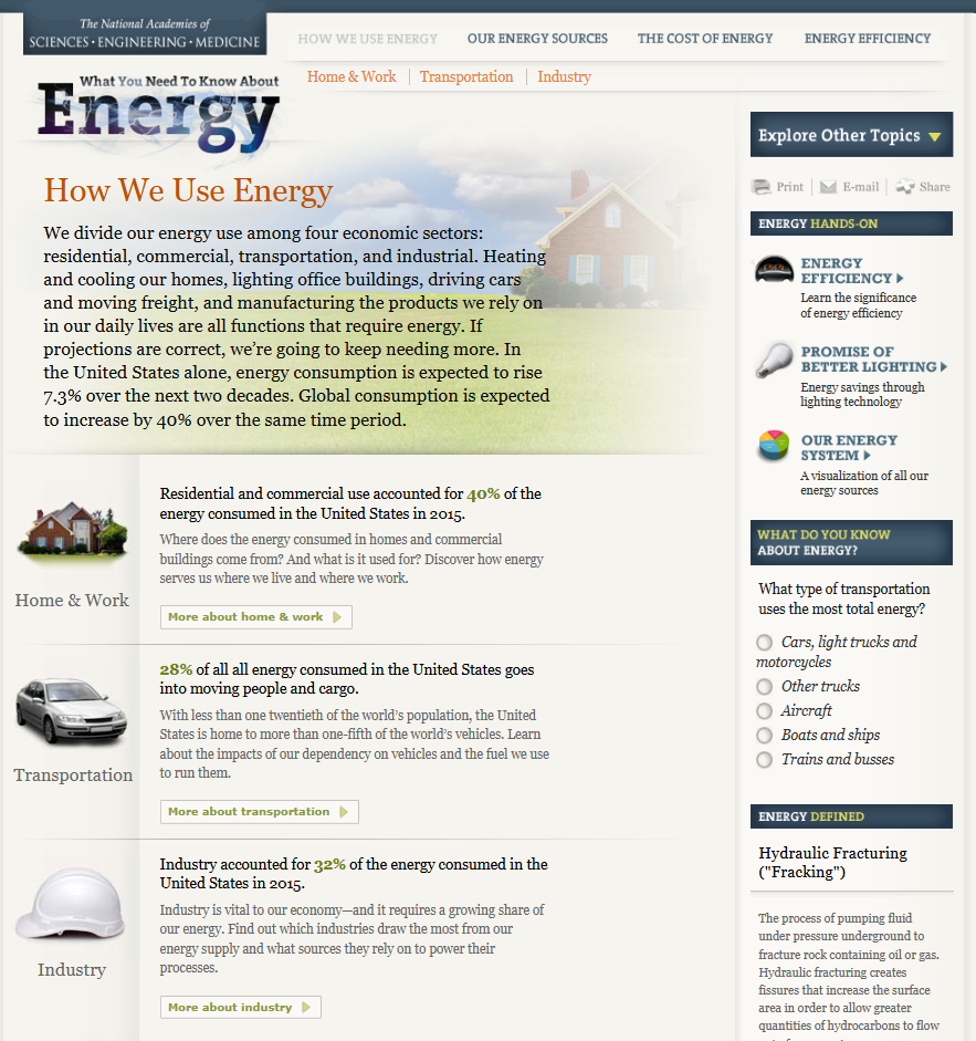
After reviewing the blog titled “What You Need To Know About Energy” (http://needtoknow.nas.edu/energy/energy-use/) i really enjoyed how the information is presented and how the site is laid out. At the top of the page we have four main navigation buttons that give the broad topic about what that page is going to cover. Within that page the data is broken down into other sub topics based on the main topic. Each sub topic has a small blurb about it and uses colors and a slightly larger text to highlight key points of the sub topic. I had no idea how much our energy consumption affects things such as security and the different energy generation forms we can use to create energy.
If you click on the sub topic you will get a more in depth explanation about it and reveals any charts used to represent the data.

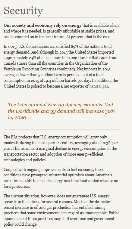
While this seems to be more of a professional setting and display of data I believe the author could have used more visuals and less text to more efficiently display the various statistics referenced throughout the blog. For example this page does not have any visual representation. Rather then writing about the international energy estimates the author could have used a single large number or even a donut or pie chart with a large percentile and contrasting color to highlight the significances of this estimate and what it means specifically for our security in this instance.
Sankey Visualizations
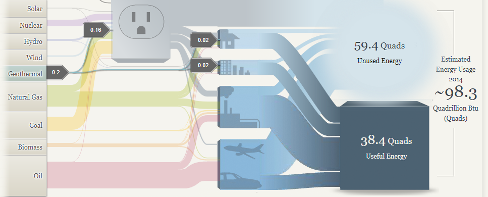
I think the Sankey graphics have some upsides and downsides. I like the interactivity of the website, and I feel like in certain ways it can give you a good perspective of the energy breakdown nationally and regionally but other places it starts to faulter. In particular I don’t like the vagueness of how certain energy streams translate to used and unused power. In the first picture you can see that geothermal energy accounts for an extremely low percentage of total energy usage nationally, but then the avenues that it goes down have varying degrees of how much power is unused. When you have this discrepancy it’s hard to tell how efficient each power source actually is.
I do like the energy breakdowns for the regional map because I think this chart makes it easy to draw some conclusions about the plausibility of renewable energy reliance. As a disclaimer I am a large proponent of sustainable energy conversion, however, I think from the below two pictures you can see that this isn’t an easy task. Especially when you look at where the sources are going. The transportation sector is still dominated by oil, so there is a significant amount of progress that needs to be made in creating more efficient energy systems that can support the use of clean energy.
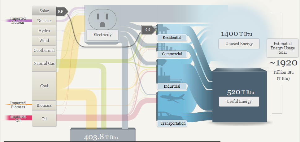
In conclusion I think that this website does some things right and some things wrong. A chart is supposed to guide the audience through the data that’s compiled, but I found myself questioning how accurate the numbers were, and without a lot of context for how much energy “.9” or “300” meant, it was hard to see the magnitude of differences. In terms of layout I thought the chart did a good job of graying out what wasn’t being actively clicked on, and that helped guide my eye through the different pathways that would otherwise be tangled up with each other.
-Jack Swenson
SANKEY
After playing around with the simulators within our energy system on National Academics: What You Need To Know About Energy, I am actually quite shocked. Within their page, there are multiple different walkthroughs of how to conserve wasted energy at home and even on the road. When I first started going through the pages, the first one that popped up stuck out to me.
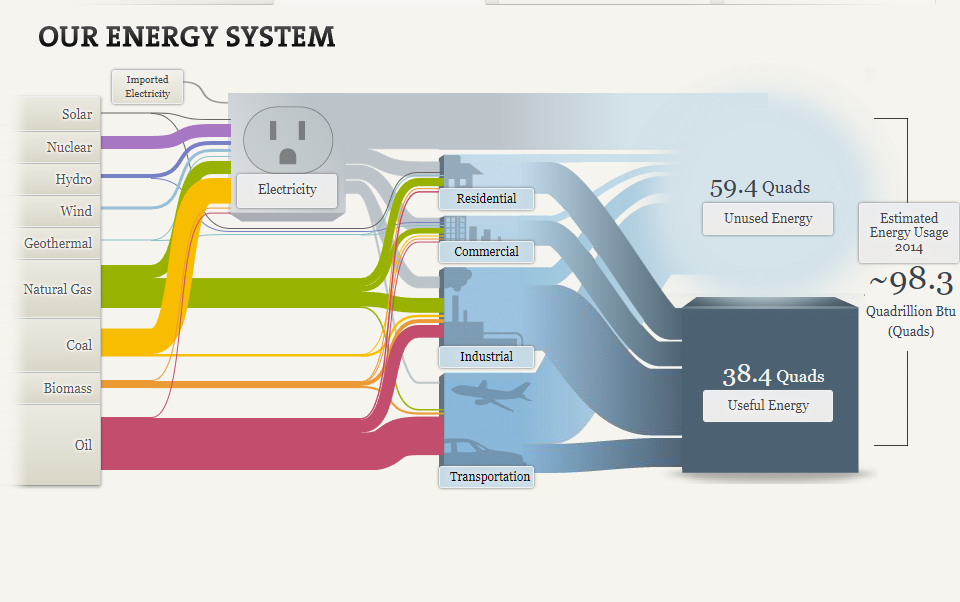
The picture above is one of the simulators on their website that shows you our energy system. Each category of energy is on the left side and it shows you where it goes to. What blew my mind was in the end, there were 38.4 Quads of useful energy, but there were 59.4 Quads of unused energy. Keep in mind “quads” is really quadrillion BTU. This is more than the used energy! I also liked how within this visualization, each category had a different color so you could see exactly where it goes to. For example, Natural Gas which is the color green goes to Industrial, commercial, and residential.
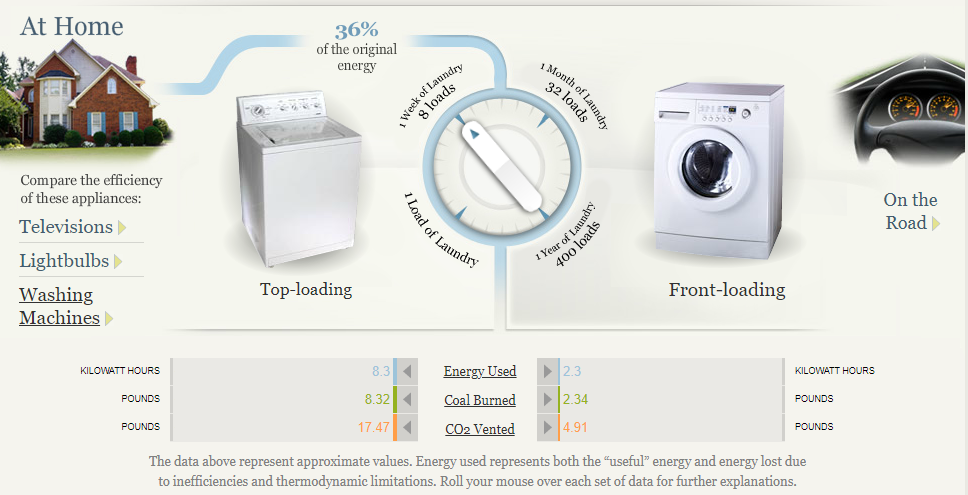
Another part of this website that I thought was beneficial, was the ways to conserve energy at home and on the road. Within the at-home section, you could choose between television, lightbulbs, and washing machines. I decided to play around with the washing machines page, which I thought was really cool. Washing machines were reported to use 36% of the original energy. You can turn the dial to either one load of laundry or 1 week of laundry. You could do the same with 1 month, and 1 year. You can see on each one how much energy you use, how much coal burns, and the CO2 vented between Top-loading and front-loading. This website is definitely beneficial to someone who could be looking to learn more about ways to conserve energy and interact with different pages of useful information.
Sankey Visualization
By Nick Ligameri
According to www.ifu.com, a Sankey diagram is a “specific type of flow diagram used for visualization of material, cost or energy flows. They show energy or mass flows with arrows proportional to the flow quantity. They have directed arrows featuring flows in a process, production system or supply chain.” Given this definition, it is easy to understand why this visualization was chosen to represent the flow of energy within our country.
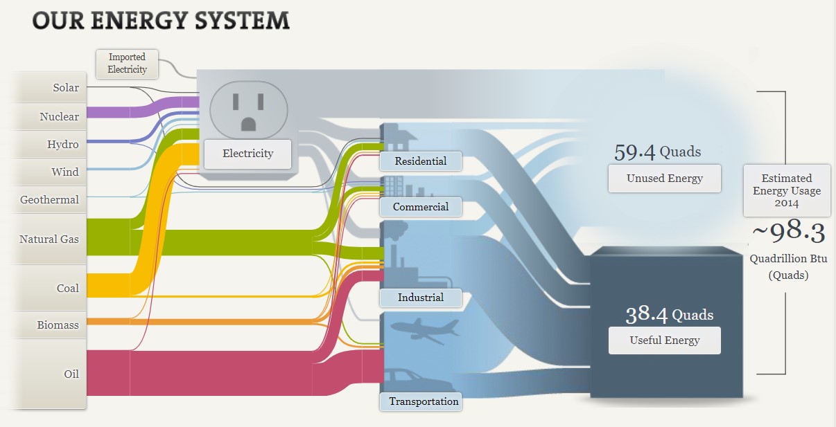
The above Sankey visualization does a wonderful job at taking a complex dataset and showing not only how much of each resource is used, but where it is used. At a glance, the visualization does seem a bit messy, but I like to think of it as organized chaos. What I like about this is that you can quickly see what resource we utilize the most and, more importantly, what industries have the most waste.
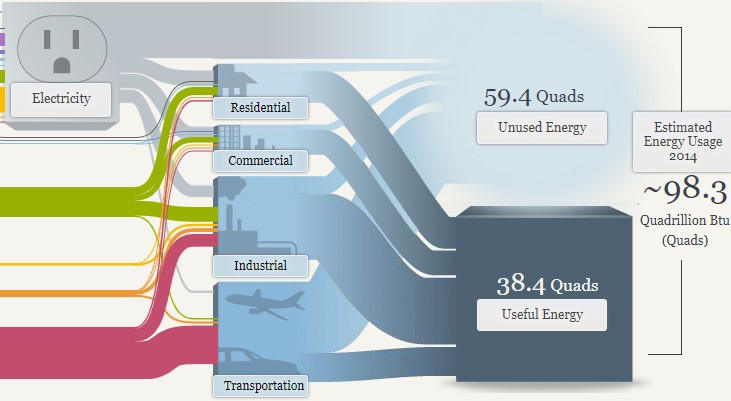
In the above image, you can see that the most waste is generated from electricity and the transportation industry. When you click on the Unused Energy button, it explains that the waste comes in the form of heat that is generated when converting energy into a different form of energy. It is striking that we produce more wasted energy than we consume. From this diagram, you can quickly determine the need to produce a more efficient energy source.

This website also shows two different energy systems besides the national system. My immediate thought was to compare these two systems. To do that, I had to click back and forth between each page. I think this tool would be even more powerful if the author could have provided an easier way to compare the two. This is even more important considering that California consumes roughly three times more energy than Maryland, Ohio, Pennsylvania, and West Virginia combined. I would want to highlight this somehow, possibly with some variation of a column or bar chart.
Overall, I feel this Sankey visualization does an effective job of communicating a complex story in a relatively simple way. The user interactions feel intuitive and lead the viewer along. This type of visualization seems like it would be difficult to learn how to build, but completely worth the effort.
Sankey
This Sankey Visualization is in interaction visualization that shows how our energy system works in the US and how how it is used throughout the company. This tool is a great way to display this type of information. Being that it is interactive, you are able to click your way through and learn about the Energy System.
The column on the left side is interactive and shows information bases off of each tabs topic. Depending on which tab you click on, the information is unique that that tab and shows different numbers and links to the column in the middle. This shows which tabs down the left are connected to the tabs down the middle. While clicking through all the tabs, little blurbs pop up explaining each tab and the number in detail.
Sankey Visualizations are great tools to use to display this type of data such as how things work, and how subcategories of certain topics are linked to each other and all equate to one thing. Sankey Visualizations show how a topic’s information can relate to other topics that show the general idea of something. I think they are very easy and simple to follow. They are also not overwhelming to look at because there is information hidden in each tab with a link to explain the information in more detail.