Home » Posts tagged '#pivottables'
Tag Archives: #pivottables
Real world use of Pivot Tables

This screenshot shows a real world example of how any company can quickly sort and summarize candidates for interviews. This pivot table houses over 1000+ people that are interviewing for different roles within a company. For a single person to manage this data and collect performance with experience is tough even through an excel sheet. A Pivot Table can make it easy for anyone to manage people to this size!
The Importance of Pivot Tables
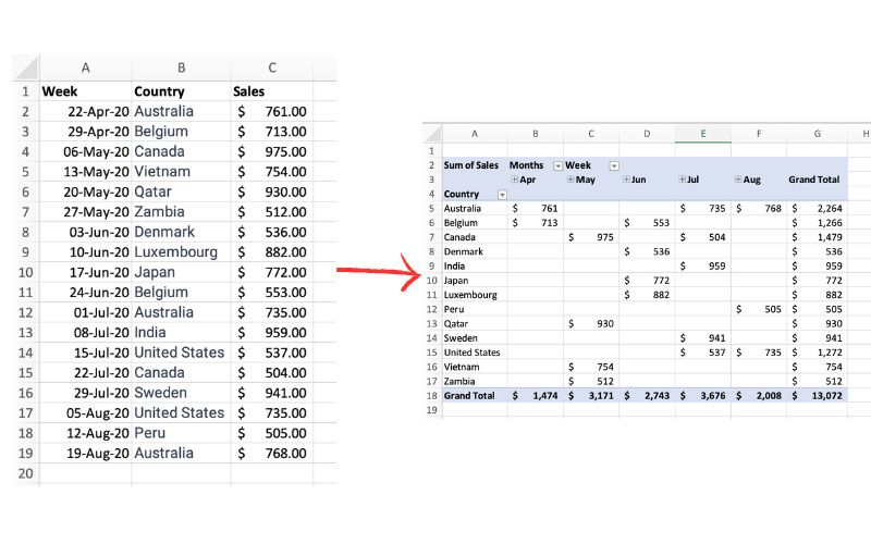
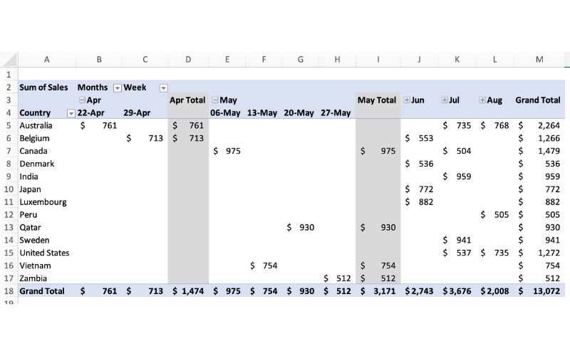
The picture above exemplifies a pivot table and one of the many different ways it can be utilized. One of the main reasons pivot tables can be such amazing tools for representing data is how interactive they can be. The table above shows sales by each country sorted chronologically by week. The table is very easily changed to reinterpret the data to be sorted by country instead of by time. Pivot tables allow the user to represent their total sales by region, or even be specific salespersons. They also can allow the ser to group data into even more specific groups such as other time periods (months, years, etc), or other custom grouping methods. This is shown in the pivot table below.
In terms of efficiency, there is no better table to use than a pivot table. They can save you hours by allowing the user to quickly change how a data set is represented. They also add a sense of flexibility. Pivot tables make it very easy to incorporate any new data that may be found instead of having to create a whole new table/chart.
Using Pivot Tables
Lamar Miller
In our text, we learn that pivot tables are a great tool that allow us to see the relevant data within a flat file or summary table. A summary table is where your raw data are aggregated so you can build a graph.
A flat file has each piece of data on its own line. Here, you will find a site that explains use cases for pivot tables as well as what they can do to help us export and visualize data.
Some elements of a pivot table include values, rows, columns and filters.

Pivot tables can help with various real-world examples such as sales volume by country. This data can be aggregated in a way where it is simplified down to the relevant data when telling a data story. This data can be sorted by country, year, quarter and dollar amount. This is useful when presenting to clients at your job or helping analyze trends for your own business.

After editing your data to your liking, you will be able to create the example above. This example depicts multiple categories of data which have been aggregated to include sub-categories, timelines and financials.
Pivot Tables
Pivot Tables are a highly useful interactive way to quickly summarize large amounts of data. It takes user-specified data fields and converts the headers into a data option that can be easily manipulated. Data can be summarized in numerous ways, including averages and frequencies. Lorman Education published an informative article about pivot tables. They describe 6 benefits of using a pivot table in Excel:
- Simplicity
- Data Analysis
- Data Summaries
- Pattern Recognition
- Quick Reports
- Decision Making
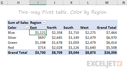
The image above is an example of a pivot table created by ExcelJet. It clearly demonstrates Sum of Sales by color in each region. Colors are sorted by row and regions are sorted by columns. The table also includes a total row according to each color and region, as well as a grand total.

This is another example of a pivot table created by ExcelJet using the same data, just with the rows and columns switched. There is a simple drag-and-drop method that can change the parameters of the table within seconds. ExcelJet also provides a few benefits of pivot tables:
- Simplicity
- Speed
- Flexibility
- Accuracy
- Formatting
- Updates
- Filtering
- Charts
Pivot Tables
Pivot tables are an incredibly powerful tool for organizing, analyzing, and summarizing large datasets. They enable users to transform raw data into meaningful insights with minimal effort.
Pivot tables allow you to quickly group, filter, and aggregate data. For example, you can calculate totals, averages, or counts with ease. Users have the ability to customize rows, columns, and values to focus on the specific insights that they need from their data.
The pivot table below shows the sum of sales over several years, broken down by product colors. It aggregates data annually from 2016 to 2019 and provides a grand total for each color across all years.

This layout is useful for identifying trends in sales performance for each color over time, helping businesses to determine which of their products have consistent demand from customers.
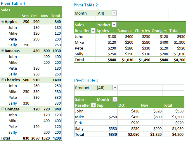
This next pivot table displays the sum of sales quantities for various fruits and vegetables across different countries. It also calculates grand totals for each product and country.

The above pivot table provides insights into the regional demand for specific products, supporting decisions on regional marketing strategies or inventory management.
The last pivot table, displayed below, summarizes monthly household spending across different categories for January, February, and March. It shows total amounts per category for each month and overall. This table is great for personal budgeting or financial analysis, offering a clear breakdown of expenses across categories over a defined period.

Pivot tables are indispensable for anyone who needs to make sense of data, whether for work, school, or personal use. They help you organize and summarize large amounts of information in a clear and easy-to-understand way. By grouping and analyzing data, pivot tables can show important patterns or trends, like which products sell best or where most money is being spent.
In short, pivot tables make data simple and actionable, helping you make better decisions with less effort.
Pivot Tables
Pivot tables are an extremely important data visualization tool. While they are usually not fancy eye catching infographics or your everyday chart you are used to seeing they are immensely important when it comes to summarizing data. According to an article posted by Lorman Education (https://www.lorman.com/resources/the-6-benefits-of-using-a-pivot-table-in-excel-17423?srsltid=AfmBOorilMT3KbGTr5SUhkNiuLVKiUIeKvuuAmAej7E1n-N3S3G7kmtX) there are 6 main benefits for using pivot tables:
- Simplicity
- Data Analysis
- Data Summaries
- Pattern Recognition
- Quick Reports
- Decision Making
Pivot tables can be helpful in distilling down large raw data into a summary of thousands or more entries to create a report based on data collected. For example, our book gives us a couple thousand survey entries on student’s gender, race, whether their parent has a college education, free or reduced lunch. high school name, graduation year, and other data. It becomes a sea of data to comb through and calculate.

This is where pivot tables come into play. It takes messy raw data like this and converts it into this.

It also gives us the ability to change the parameters of the chart if we want to examine it a different way. The applications of pivot tables could be endless such as business financials evaluations, evaluating performance, and any other thing that you collect data on!
Demystifying Pivot Tables: A College Student’s Guide to Data Analysis
Introduction:
Just a little bit of interest and a desire to try something new will do; coding is not anything to be concerned about. We’ll dispel common misconceptions about pivot tables, go over their applicability, and demonstrate how to utilize them to make an impression on potential employers and teachers in this blog post.
What Makes Pivot Tables So Special?
“How on earth do I make sense of all this?” is undoubtedly on your mind as you look at this enormous spreadsheet filled with figures. Presenting pivot tables, your newfound ally in the data analysis space. You can organize and summarize your data using these useful tools without having to be a Ph.D. spreadsheet expert.
How Do They Work?
Think of pivot tables as virtual LEGO blocks for your data. You can drag and drop your columns into different areas to create a customized table that highlights the trends and insights you’re looking for. It’s like magic, but for data geeks like us.
Cool Features You Need to Know:
Summarize Like a Pro: Want to know the average, sum, or count of your data? Pivot tables have got you covered.
Filtering Magic: Zoom in on the stuff that matters by using filters to focus on specific data points.
Grouping Goodness: Let pivot tables do the heavy lifting by automatically grouping your data by date, category, or any other field you fancy.
Make it Pretty: Customize the look of your data with formatting options. Impress your friends with a sleek and professional-looking report.
Real-Life Applications for College Life:
Grade Analysis: Wondering which classes are your strong suits? Pivot tables can help you break down your grades by subject or semester.
Budget Crunching: Keep track of your spending habits by categorizing expenses and creating a budget overview.
Extracurricular Excellence: Use pivot tables to analyze your involvement in clubs, sports, or other activities. Spot trends and areas where you can level up.
Conclusion:
Pivot tables might sound a bit intimidating at first, but trust us, they’re a game-changer for anyone dealing with data – and that includes you, college student! As you navigate through your academic and personal life, having these skills in your toolkit will make you stand out. So, grab that spreadsheet, give pivot tables a spin, and get ready to conquer the world of data analysis with confidence!
Pivot Tables
Pivot tables are a powerful excel features that allows users to organize their data with the click of a button. Useful for quickly analyzing large sets of data, pivot tables allow you to quickly find the measures of central tendency, frequency of data entries, as well as sums, products, and more. To dig into an example, check out the pivot table below:
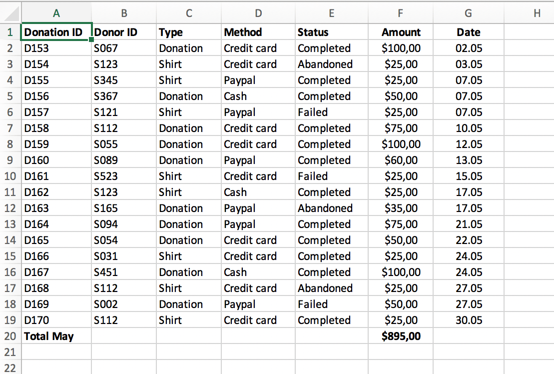
To highlight some useful functions, imagine a business that has a system of keeping track of client transactions. The table above contains information regarding the donorID, which is a unique identifier for each donor. If a business owner was interested in keeping track of their most frequent and largest donors, trending dates in which donations are more likely, or the average donation, all of this information would be available at the click of a button.
Source: https://www.perfectxl.com/excel-glossary/how-to-use-pivot-table-excel/
Pivot Table for Garlic
For my example of uses for pivot tables I decided to make a pivot table for some research I’ve been doing for the past 3 years at Stockton looking at yield data for garlic harvests.
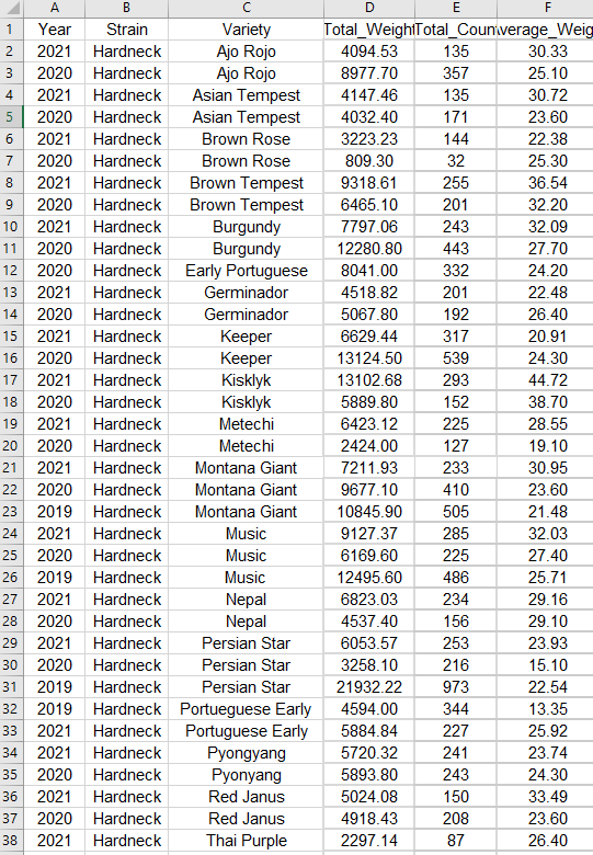
The above screenshot is just a segment of the stacked data in its raw format. It floods you with numbers and is difficult to sort through and get any information out of. That’s where a pivot table comes in. These let you easily select data to look at with the click of a button, and they also have a huge amount of customization to get the exact information you need.
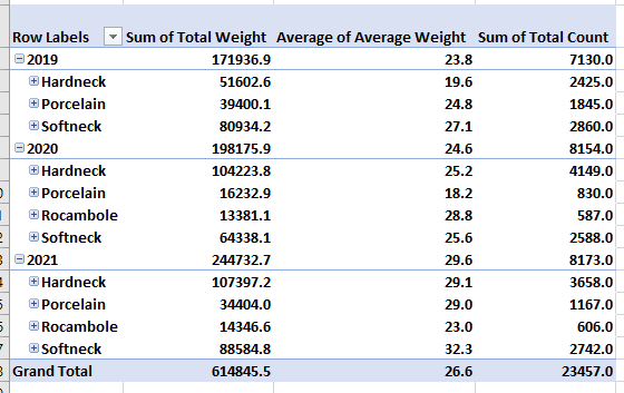
This first example shows how well each type of garlic grew during each year of the study. We can see from this that the top grower varied from year to year. Hardnecks were often grown in the highest volumes, making their total weight the highest, but either Rocambole or Softnecks had the highest average weight during each year. This means that if these varieties were grown in higher volumes they may outcompete the hardnecks.
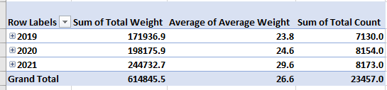
Another factor we can look at is time. This pivot table selection shows us that overall, we grew larger crops with each year. This is probably because with each year we learned how to take better care of the garlic, as well as we selectively picked the best garlic to grow each year. These are factors that you have to take into consideration.
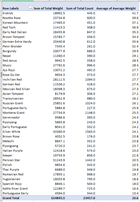
The final pivot table I made looks at each variety of garlic and is ranking them based on their average weight. We can see from this that on average, Kisklyk was the most successful variety. I like to have these numbers next to the total count and sum of the harvest weights because we can see the best producing garlic isn’t always the one that has the highest total weight. This graph shows us that Silver white is our highest producer because we also happened to grow way more of it then our other varieties.
In the end this process of creating pivot tables can give us answers to our experimental questions. However it also leads us to more questions, which we can answer with further experimentation or reasearch.
-Jack Swenson