Home » Posts tagged '#pivottable'
Tag Archives: #pivottable
Pivot Charts
An interactive method for instantly summarizing a lot of data is a pivot table. Finding patterns and trends, organizing data, creating reports, and being more efficient are all made possible by pivot tables. These are a helpful tool for analyzing and summarizing a lot of data. Pivot tables are also a good way to make sure that your data is automatically staying up-to-date.
In this example below, it shows Raw Data vs. Pivot Report. As you can see, the data in the Pivot Report is much more organized and clear to read than the raw data. The data is condensed into a less complex chart that is interactive and automatically updates calculations.


Pivot Tables
A pivot table is a data analysis tool that can be used to organize and summarize large data sets. Large data sets can be cumbersome and include extraneous data that does not pertain to the use case. A pivot table can create an organized chart that functions to create a subset of data that can be explored in a more dynamic way.
Pivot tables are great for interactive dashboards that aid in data analysis. They can simplify very large and complex data sets. Pivot tables can be simple or more advanced using techniques like slicers and calculated fields. Slicers are great for dashboards because they allow users to select different groups of data to view. Users have a more granular view of the dataset that is relevant to specific information they may be looking for. Slicers also allow users to navigate dashboards like the example in the textbook. I’ve tried creating pivot tables multiple software and have found that Excel is the best application and Numbers is also easy to use.
Myexcelonline.com has a great tutorial to create a pivot table. They also have a picture of the final table showing the different elements of a pivot table.
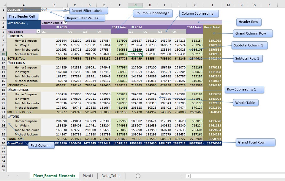
https://www.myexcelonline.com/blog/customising-pivot-table-styles/
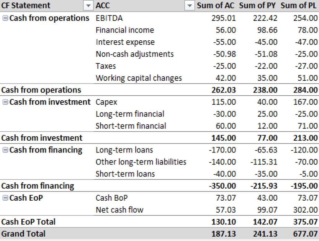
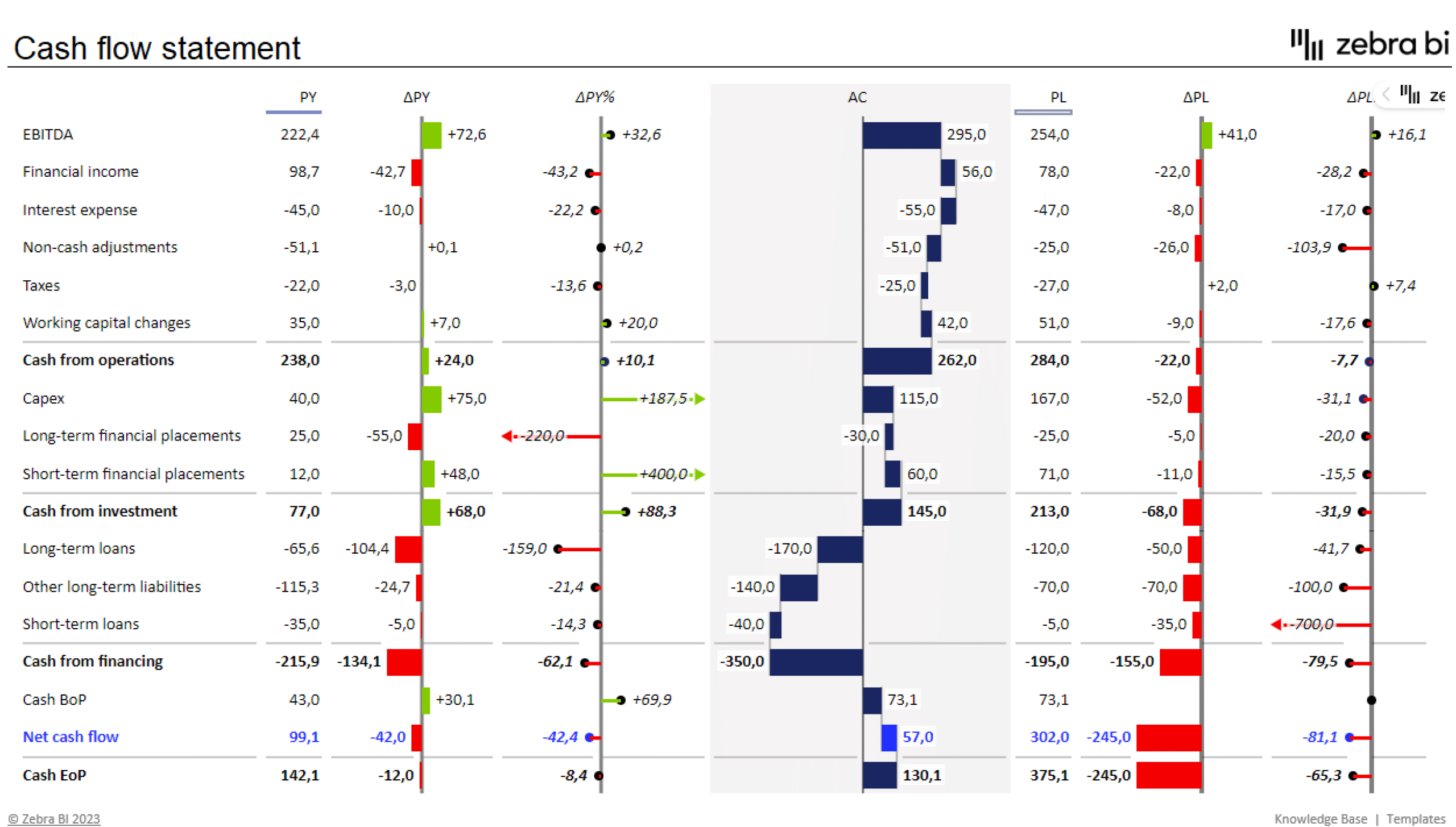
I would actually like to master pivot tables because I know that they are ideal for use in financial reporting. Financial datasets tend to be overwhelmingly large and difficult to summarize. Zebrabi.com suggests using a tabular hierarchy pivot table as shown below along with visuals for financial reporting.