Home » Posts tagged '#piecharts'
Tag Archives: #piecharts
Pie Charts

Shown above is a pie chart I created based on the percentages of total energy use. Knowing when to use a pie chart can be a difficult skill to master. The following link including provides evidence as to why this type of chart is best for this data. The given data set represents different parts of whole adding the percentages of each data variable adds up to 100% as a whole. Additionally, a pie chart shouldn’t be used when you have too many different data points. This infographic only uses 5 which means a pie chart is a perfect fit for this data set. This pie chart has the appropriate amount of data points and data labels to make it effective at relaying this information to the reader.


Podcast: Play in new window | Download
Pie Charts
Probably one of the first charts we learned at a young age was a pie chart. I can remember learning percentages in elementary school and seeing pie charts used to help us visual what a percentage represented. According to story story telling with data (https://www.storytellingwithdata.com/blog/2020/5/14/what-is-a-pie-chart) “pie charts are probably better than any other visual for expressing part to a whole relationship.” There are two primary uses for a pie chart and when they make the most amount of sense. First, if you want an audience to have a sense of a part to whole relationship and the size of the slices is less important. This leads us into our second best use is to convey a piece of something that is small or large. This is beneficial when emphasizing how small or large a percentage is in reference to the whole thing. When piece of the pie are similar in size it makes it difficult for us to understand the significance of those pieces.
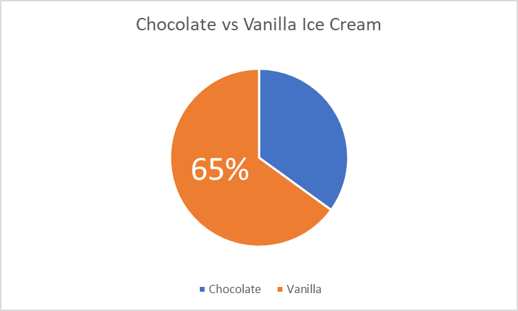
I made a pie chart comparing two items with data that i completely made up for educational purposes. This helps show parts of a whole in large and small proportions in order to convey a message. I do not think that displaying this data would be done in a better way and believe to be the best possible option for these scenarios.
Pie Charts
The ideal uses for pie charts are to illustrate the corresponding ratios of components to a whole and to demonstrate how a whole is divided into its individual pieces. When properly sized categories are present pie charts can be used for straightforward, equal comparison. For more in-depth comparisons a bar graph would work better than a pie chart. Labeling, ordering, and limiting slices are some tips when creating a pie chart. When labeling, verify that the appropriate number or percentage is written on the label of each slice. To keep a pie chart organized slices can be arranged from largest to smallest or smallest to largest. Use a different chart type if the chart includes more than five slices to limit clutter. There are certain cases where pie charts are not the ideal option. When there are too many categories in the data or the data values are too similar a pie chart would not be the best fit. If the data contains any values that are not positive integers, a pie chart is not the right choice.
Below I have included a good example of a pie chart that is properly labeled, ordered, and contains limited data.
Pie charts provide a clear visual representation of percentages and proportions, which makes it easier to understand data distribution. Making judgments based on data representation is simple with the use of pie chart analysis. Pie charts offer an immediately comprehensible visual depiction. Pie charts make it simple to compare different areas and provide information about those with the greatest impact. Pie charts are very helpful in the business world. They can guide investments and have an impact on plans for advertising and the creation of products. Decision-making based on data can be substantially improved by the use of pie charts and their interpretations.
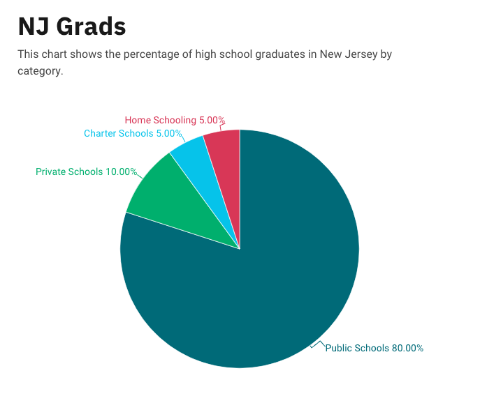
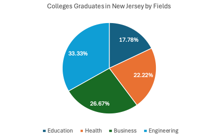
Below is a pie chart that I created in excel. It represents college graduates in New Jersey by fields.
Pie Chart Use Cases
Lamar Miller
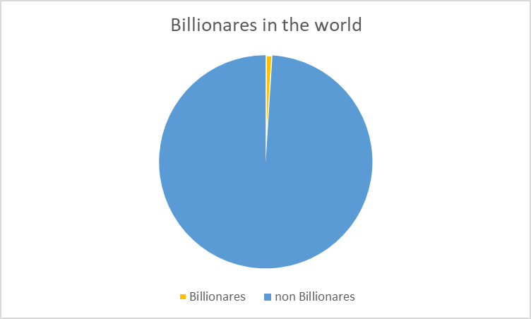
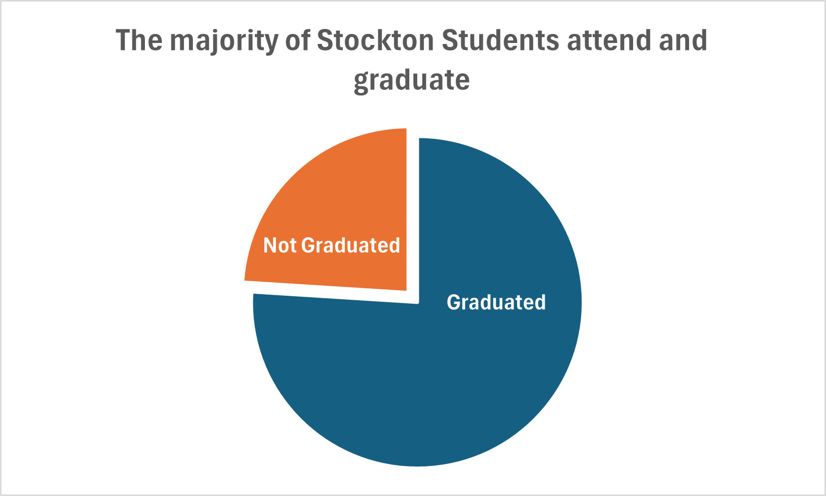
Here you will find data used to construct a simple pie chart with two data comparisons. The data I used was comparing Stockton University’s average student graduation rate vs those not graduated (out of 100% of students). It is discussed in our text that the best use cases for pie charts are when comparing a part to a whole. In addition, it is also recommended to begin the largest portion of data at 12 o’clock as most viewers begin there and view clockwise. It is recommended to use pie charts when we are showing four or less parts of a complete whole or 100%.
It’s stated in the text that most audiences relate well to circles as they are universally accepted as a whole. I believe this chart is the best example to display this data because we are simply comparing two parts of a whole. If we were comparing a larger data set, it may not be the best use case as viewers tend to have opportunity when viewing angles.
I believe Excel is sufficient to create this graphic and is easy to use for this particular example. The explosion option allows you to segment a part of the pie in order to highlight a particular piece of data and provide emphasis on the story you wish to tell.
Pie Charts
What is a Pie Chart?
A Pie Chart is a common type of visualization that demonstrates parts of a whole. Each section represents a value in relation to the entire composition. The slices should be proportionate to the amount in each data set so that the viewer can compare each section by size to determine its value.
When should I use a Pie Chart?
A Pie Chart is a great visual for a part-to-whole relationship. It should be used when displaying the “percent of…” or “part of…” something. StorytellingWithData provides two primary use cases for a pie chart:
- having a general sense of the part-to-whole relationship is more important than comparing the precise sizes of the slices
- to convey that one segment is relatively small or large in comparison
The percentages should sum to 100% so that the visual is relative in size to its value.
The Perfect Pie
I created the “perfect pie” in Excel using 2024 Coffee Statistics by DriveResearch. I will break down what makes this a perfect use case as well as design tips for creating an effective pie. You can click on the image below to open my Excel spreadsheet.
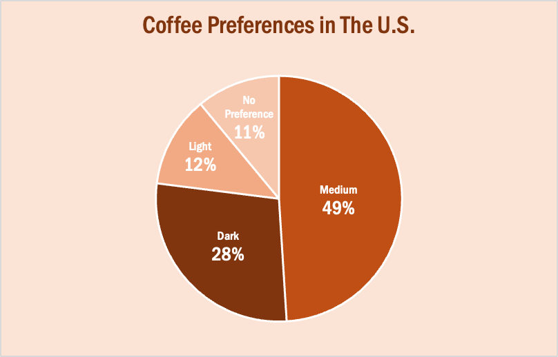
The data in this set is great for a pie chart because it equals 100% and one value is significantly larger than the others. It is also split up into 2-5 categories which is not too overwhelming for the viewer. The coffee preferences are all parts of a whole, making a pie chart the best choice over bar charts and other visualizations. To make it aesthetically pleasing to look at, I used different shades of brown throughout the entire chart which correlates with the coffee theme. I deleted the legend for a more minimalistic appearance, which the author of our textbook reiterates throughout each chapter. Because the values for Light Preference and No Preference are very similar, I added data labels to each segment so it is easy to comprehend. I also increased the font size for the numbers to make them stand out. Stephanie D.H. Evergreen suggests “unwrapping the pie” by making the largest slice start at noon and run clockwise in descending order (as seen above). When creating this chart, I was sure to avoid 3D and exploding effects in order to increase legibility. For more information, I suggest checking out this article on Tableau, which provides more examples of effective and ineffective pie charts.
Comparing Numbers
The photo above is included in the linked article of this post. The article demonstrates the importance of using the correct infographic when comparing different data sets. It discusses the importance of making comparison charts, the best types of data comparison charts, and when to use each type of chart. One of the most commonly used comparison charts is the pie chart which is shown above. Pie charts are most effectively used when comparing sizes or percentages of numbers within a single data set.
Podcast: Play in new window | Download
Comparing Numbers
Examples of Insightful Data Visualizations that Compare Numbers
Data visualizations can be a great tool to use when comparing numbers. Comparing numbers can show many different stories, including the following examples:
“Option A is better than Option B”
“Posttest scores are higher than pretest scores in almost all subject areas”
“Group F and Group G disagree on five of the eight measures”
“There were no differences between the treatment and control groups”
“Youth rates are significantly lower than adult rates”
“We have equal participation from boys and girls with the exception of girls ages 10 to 13”
“All sites increased performance, but Site L did so at a faster rate than other sites”
“The performance of Class L is in contrast to Class K”
Results such as these can be shown in various types of charts. Below are some examples of insightful data visualization that compare numbers.
- Pie Chart

2. Bar Chart
3. Histogram

4. Line Chart

5. Doughnut Chart

6. Overlapping Area Chart

Pie Charts
Pie charts are used to show portions of a whole. An amount is divided into categories by percentage and the slice sizes are relative to the percentage of the category. Pie charts are great to use in showing the results of polls if there are a limited number of categories. If you have too many categories the chart becomes difficult to read. Below I have created two pie charts based on data from Pew Research regarding Americans’ views on money in politics.
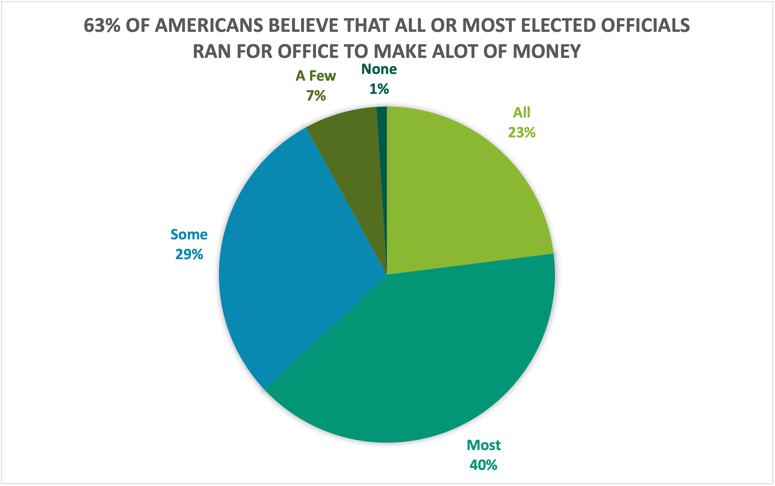
The above chart highlights what a higher proportion of respondents believe while the chart below highlights what a lower proportion of respondents believe. Choosing the right chart but also a good title for the chart is key for letting viewers know what information is important.
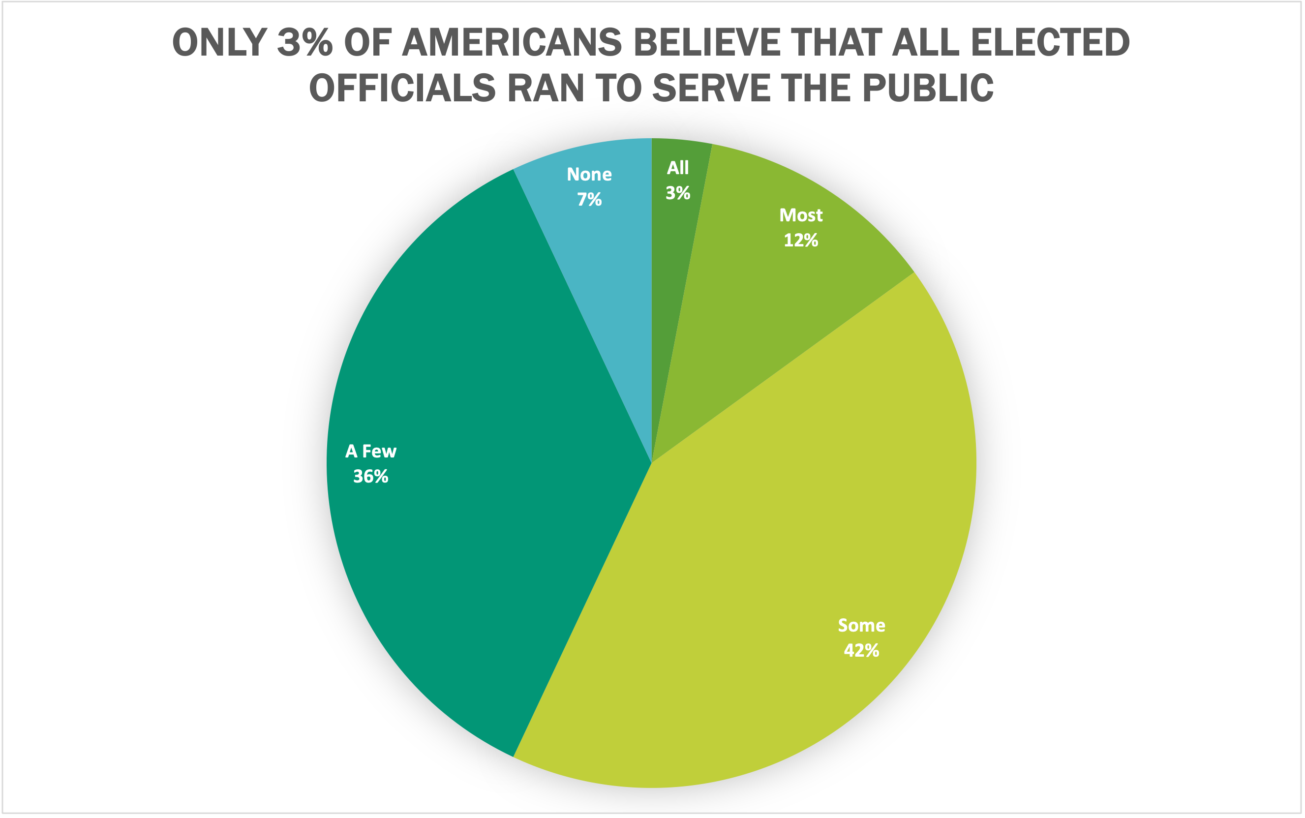
I believe that both of these datasets are great use cases for pie charts because they show what portion of respondents. Other good uses of pie charts is in finance. Household budgets are well represented by pie charts. Pie charts are also a great tool to use when visualizing portfolio allocations. One of the most important things to avoid with pie charts is using incompatible data. If the proportions do not sum to 100%, the data is not a good use case for a pie chart. There are many different options for visualizations and a pie chart is great for a simple and quick way to represent proportional data effectively to viewers.
Pie Charts
Pie charts, when done the right way, can portray some of the simplest data in a very uniform and easy to comprehend way. The easiest data to portray using a pie chart would be data that represents “parts of a whole”, but this is not the only data that can be used in a pie chart. We can also use percentages to show contributions to a whole. One of the most important things to remember though when creating a chart to show this type of relationship, is that the data values within the pie chart must always add up to 100. It is also important to remember that pie charts, as well as any other chart or infographic, are used to tell stories. Because of this, we have to remember to keep the story as straightforward and concise as possible. Always remember to keep your infographics as clear as possible and to not jumble too much information or design in the graphic.
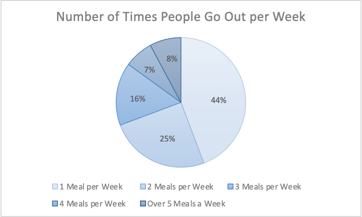
The information I gathered was from a study done of 626 restaurant goers, asking how many times a week they go out to eat. This information gathered from Tasting Table, I believe is best suited in a pie chart because it was presented to me in percentages of people. Percentages are easiest represented in a pie chart because it represents part of the 626 people surveyed.
Link to study: https://www.tastingtable.com/912246/new-survey-shows-how-often-people-typically-eat-out/
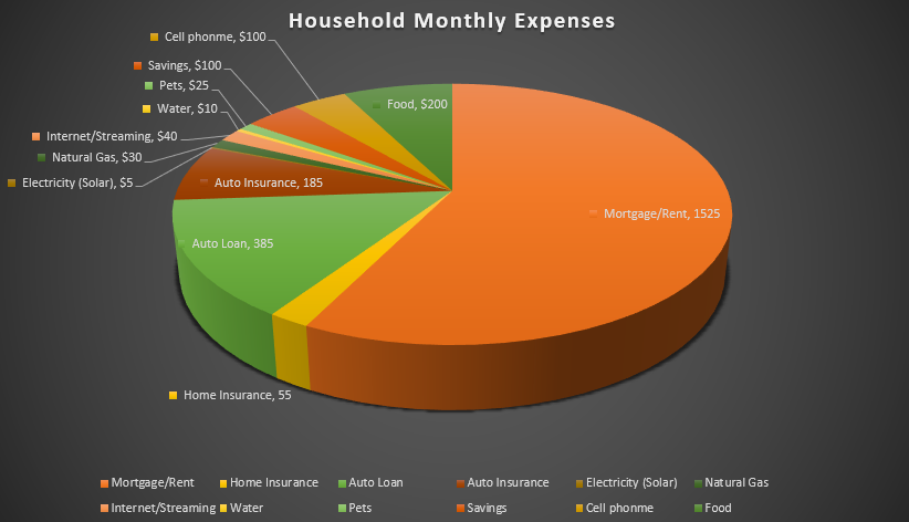
Pie Charts
I felt a pie chart was an ideal choice to show monthly household expenses. It provides a clear and visually appealing way to represent various expense categories within a budget in proportion. Viewers can quickly identify the larger and smaller slices, thus providing immediate understanding where the money is going. You are able to make comparisons and it helps with seeing where spending is a priority and make informed decisions. I referred to From data to Viz | Find the graphic you need (data-to-viz.com) which helps you choosing an appropriate graph for your data and excel itself had tutorials that walked you through choosing correct pie chart. I also think a bar chart could work in this example as well.